Logo Comparison Study
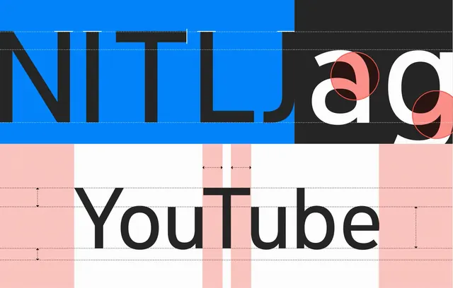
A side-by-side visual comparison of the logos for 'NITL' and 'YouTube' showcasing different design approaches.
Summary
A side-by-side visual comparison of the logos for 'NITL' and 'YouTube' showcasing different design approaches.
Visual description
The top half features a blue and black logo with sharp, geometric lettering. The bottom half features the YouTube wordmark in black against a white background with a red grid overlay.
Key takeaway
The image highlights the contrast between heavy, blocky geometric branding and clean, recognizable wordmark typography.
Reuse notes
Use as a reference for comparing brand weight and typographic clarity.
StyleMinimal, Corporate Clean, Geometric
ColorHigh Contrast, Vibrant
TypeSans Serif, Oversized, All Caps
MoodProfessional, Bold
Tagscomparison, branding, typography, logos
Palette
#FADFDE
#262729
#0782F5
More like this
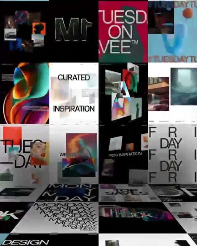 Design Inspiration Moodboard
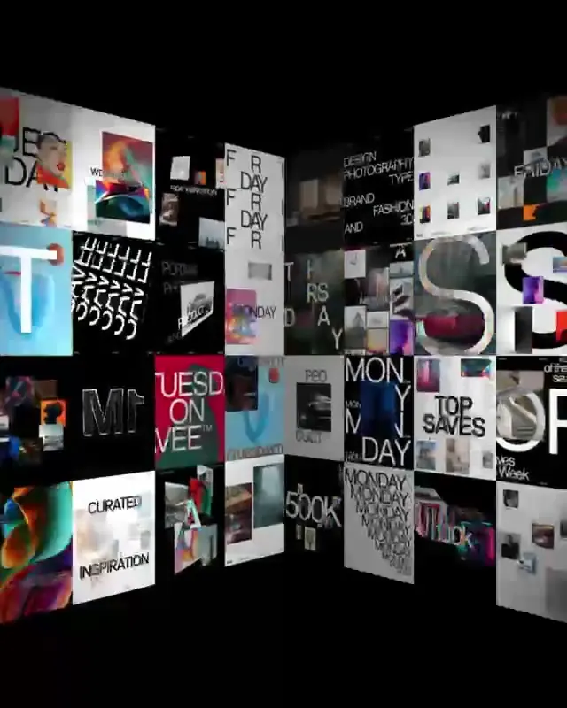 Logo and Wordmark Collection
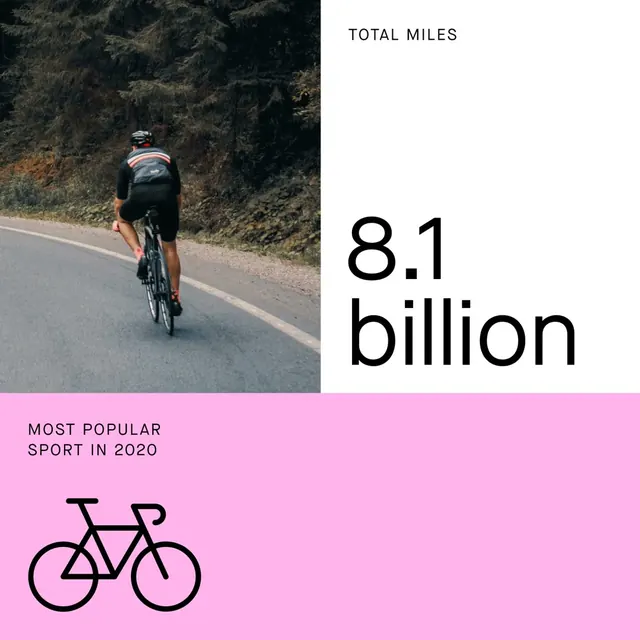 Cycling Statistics Infographic
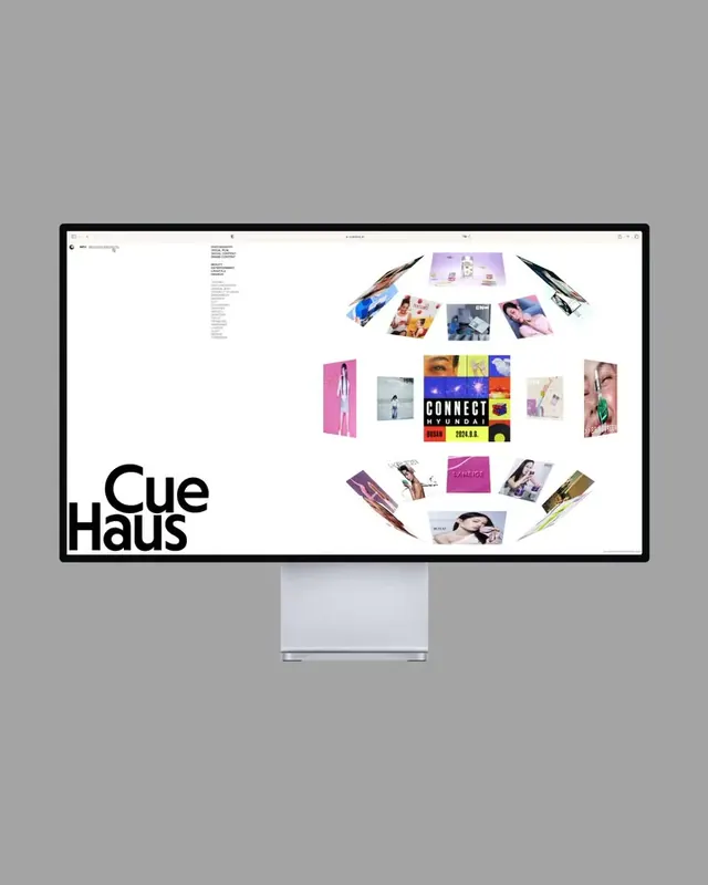 Cue Haus Identity System Mockup
 Sydney Design Festival Wordmark
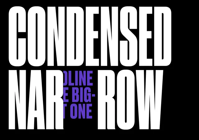 Condensed Narrow Type Specimen
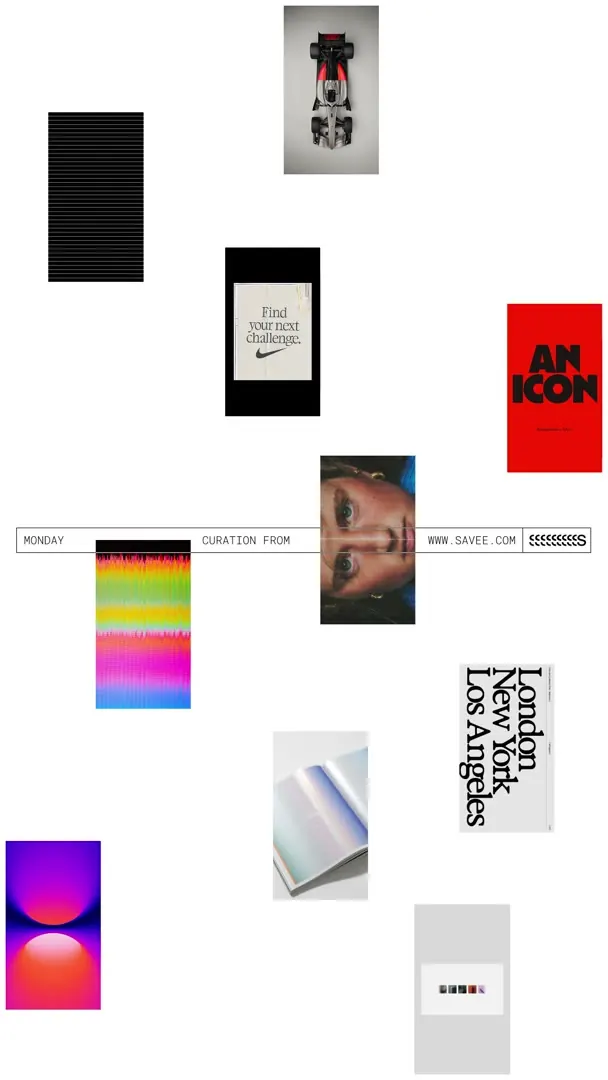 Multi-brand Identity Collection
 David Lebreton Wordmark
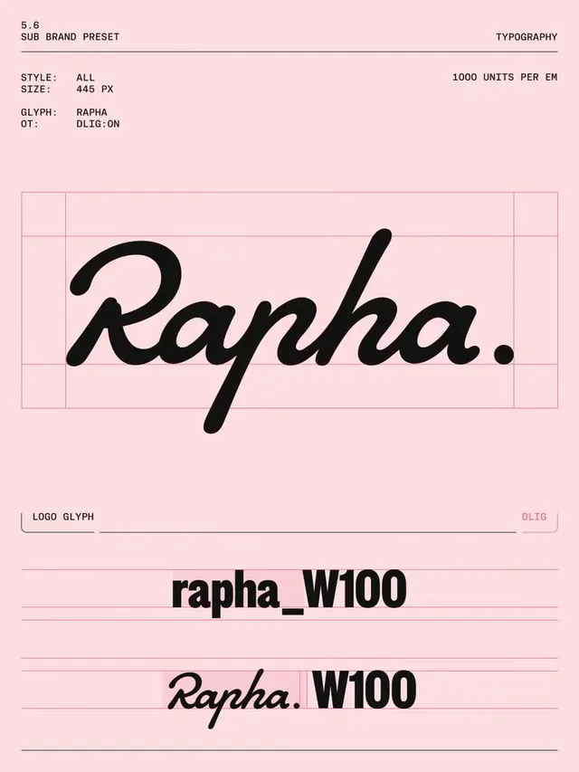 Rapha Wordmark and Logo System
 CERCA Wordmark and Tagline
 Geometric HM Logo
 Sports Branding Identity Mockup
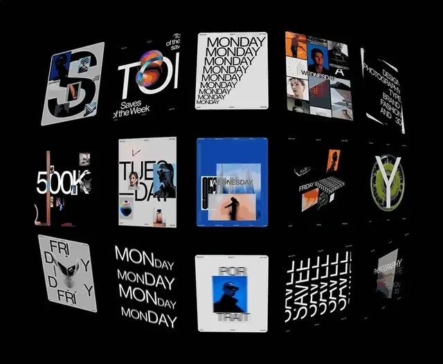 Modern Typography and Branding Identity Collection
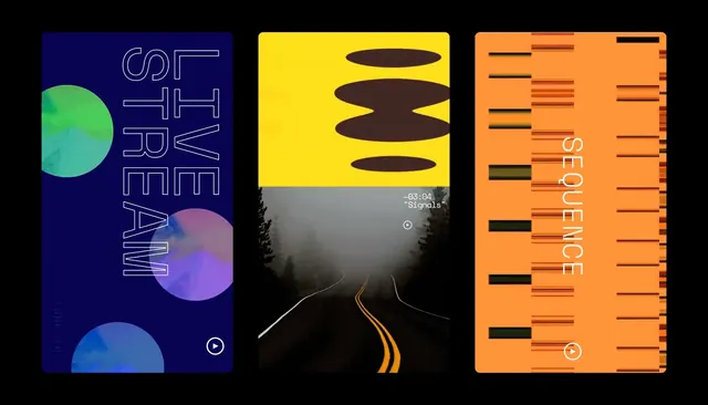 Graphic Design Style Reference Board
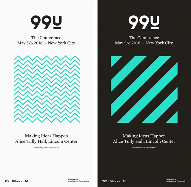 99u Conference Identity
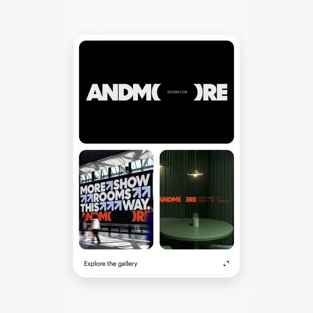 ANDMORE Identity System
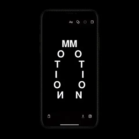 MMOTION Mobile Display
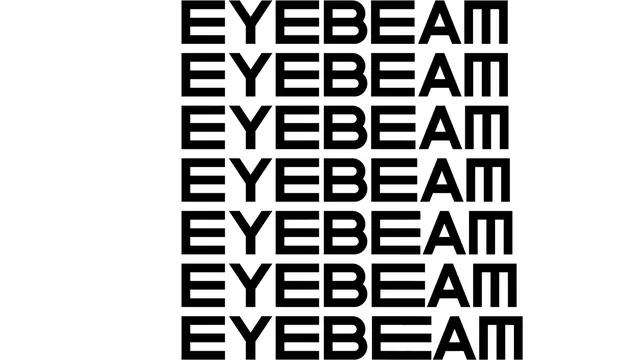 EYEBEAM Wordmark Variations
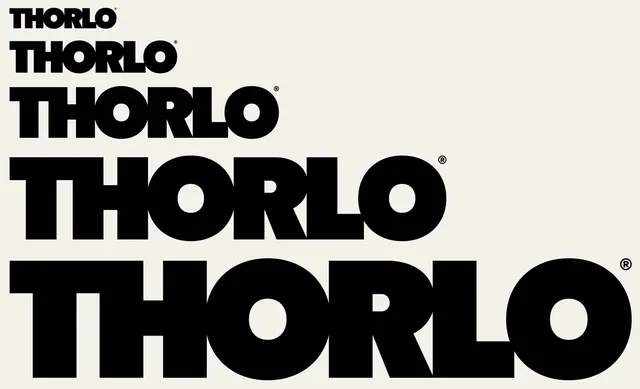 Thorlo Wordmark Variations
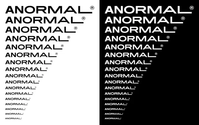 ANORMAL Wordmark Variations
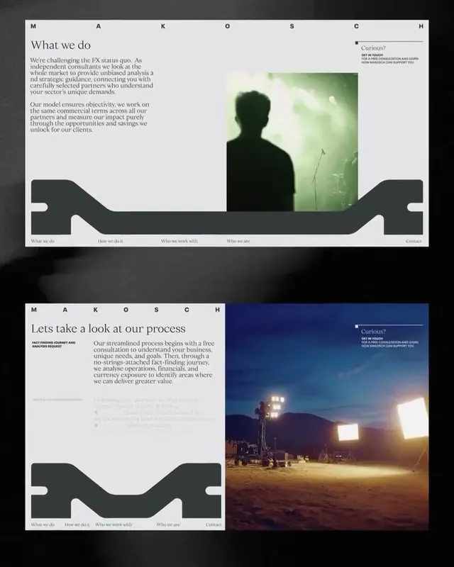 Corporate Identity and Web Layout
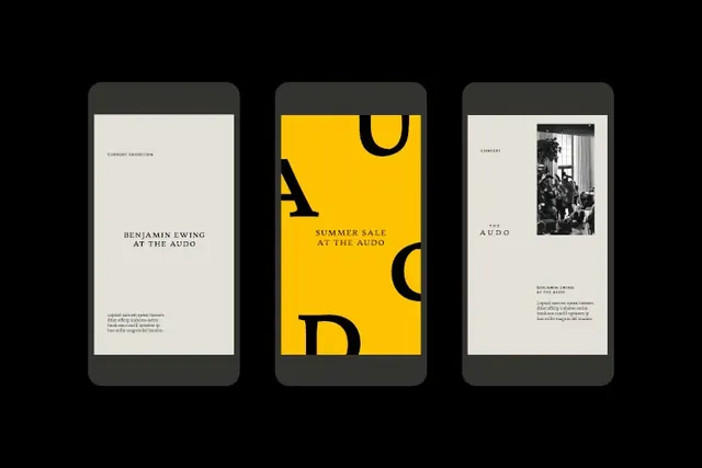 Minimalist Editorial Layouts
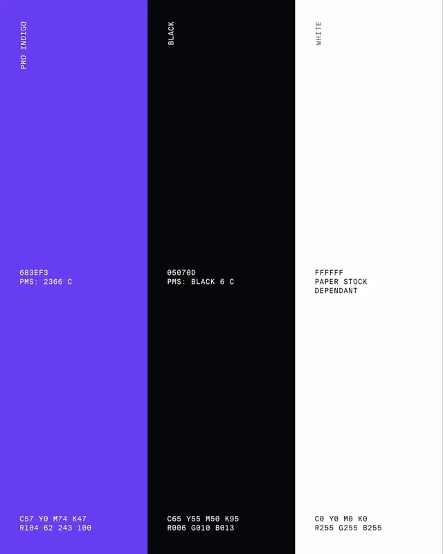 Protege pitch deck carousel, AI data marketplace (slide 8)
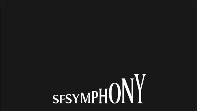 Symphony Wordmark