99u Conference Identity
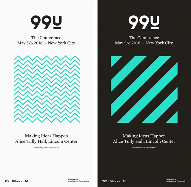
A dual-tone visual identity for a conference featuring a geometric pattern and bold typography.
Summary
A dual-tone visual identity for a conference featuring a geometric pattern and bold typography.
Visual description
A split-screen layout showing a light and dark version of a conference poster. Both feature a large '99u' logo, a repeating zigzag pattern in cyan, and centered text details.
Key takeaway
The design uses high-contrast color blocking and a consistent geometric pattern to create a recognizable brand system.
Reuse notes
The zigzag pattern and bold typography can be adapted for social media assets and physical signage.
ColorHigh Contrast, Monochrome, Vibrant
TypeSans Serif, Oversized, All Caps
MoodBold, Professional, Technical
Tagspattern, geometric, branding, conference, graphic design
Palette
#241E1E
#2ED9CA
#F29B96
More like this
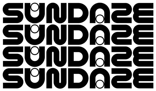 SUNDAYS 22 Wordmark Pattern
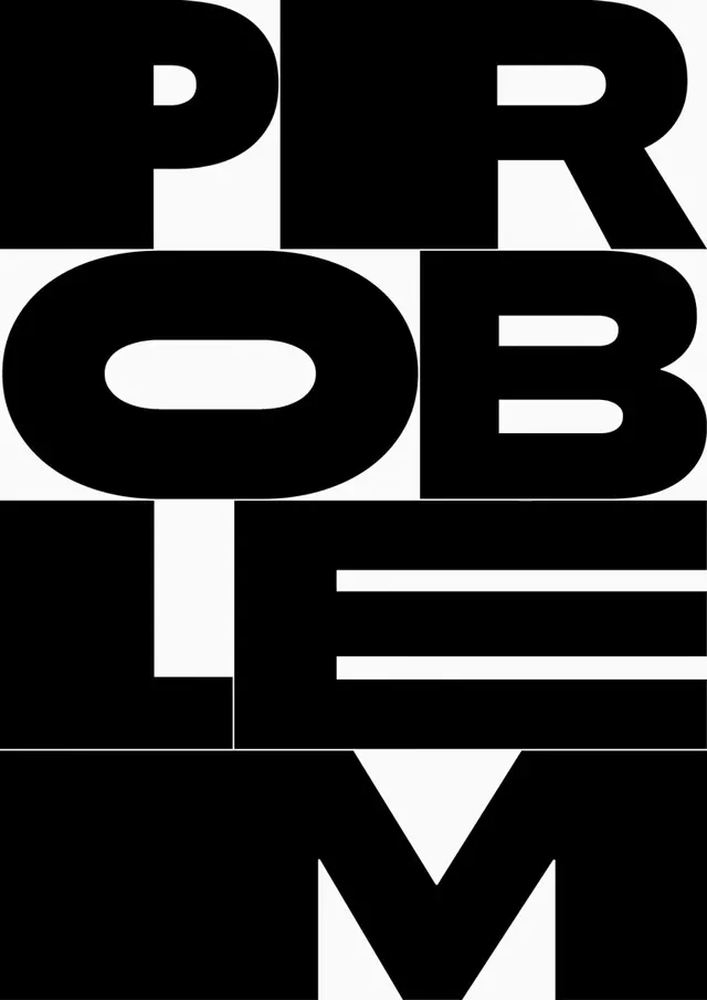 PROBLEM TYPE Wordmark
 Modern Typography and Branding Identity Collection
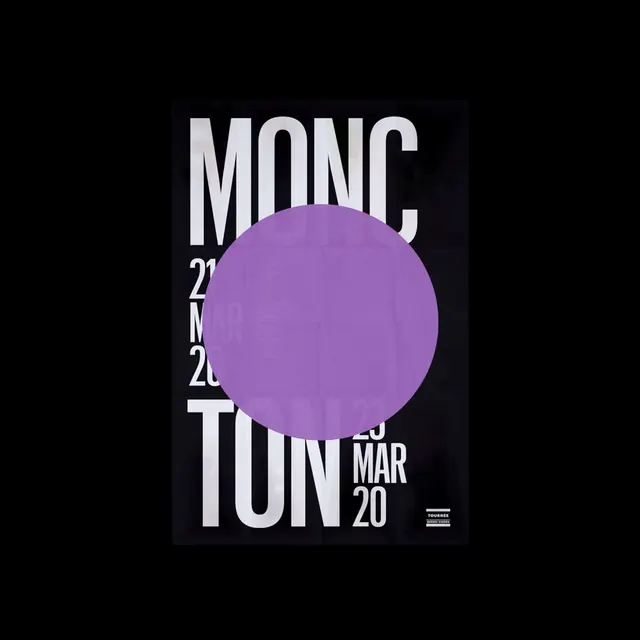 MONC 2020 Poster Design
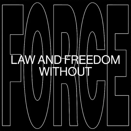 Law and Freedom Without Wordmark
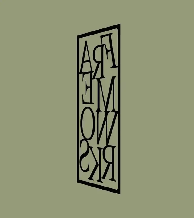 Vertical Typography Box Design
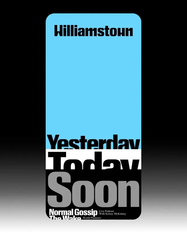 Williamstown Typography Layout
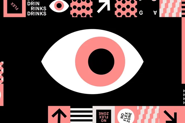 Abstract Eye Identity System
 Condensed Wordmark Design
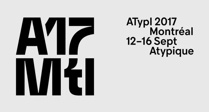 ATypI 2017 Montréal Identity
 Geometric Letterform Pattern
 Design Inspiration Moodboard
 Rare Techno Classics Detroit Design Reference
 Curated Design Reference Board
 INTERSENSIVE Branding Identity
 ANDMORE Identity System
 Typography and Symbolism Grid
 Pound Wordmark Poster
 NOW Wordmark and Identity System
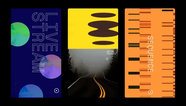 Graphic Design Style Reference Board
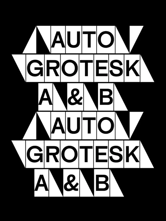 Auto Grotesk A & B Type Specimen
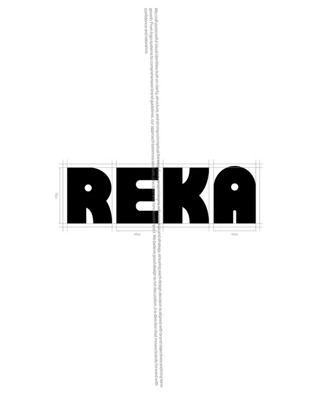 REKA Wordmark Design
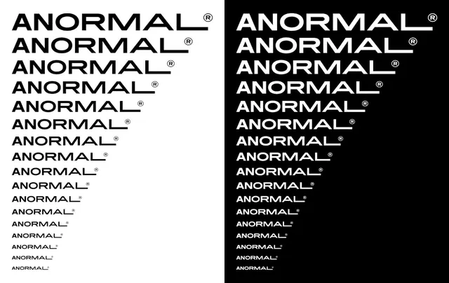 ANORMAL Wordmark Variations
 MAXXED OUT Wordmark