ANORMAL Wordmark Variations
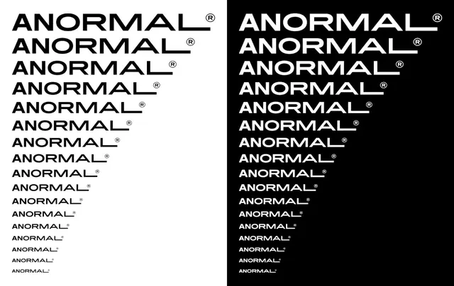
A side-by-side comparison of the wordmark 'ANORMAL' in two different color schemes, featuring various typographic weights and styles.
Summary
A side-by-side comparison of the wordmark 'ANORMAL' in two different color schemes, featuring various typographic weights and styles.
Visual description
The image shows two columns of the word 'ANORMAL' stacked vertically. The left side features black text on a white background, while the right side features white text on a black background, showcasing different font weights and styles.
Key takeaway
The design demonstrates how consistent typography can be adapted across different color modes to maintain brand identity.
Reuse notes
This can be used as a reference for exploring font weights and high-contrast color schemes in branding.
StyleMinimal, Swiss, Monochrome, Brutalist, Geometric
ColorHigh Contrast, Monochrome
TypeSans Serif, All Caps, Oversized
MoodBold, Technical, Professional
IndustryAgency, Developer Tool, Marketing, Media
Palette
#FAFAFA
#050505
More like this
 ANORMAL Wordmark Variations
 ANDMORE Identity System
 PROBLEM TYPE Wordmark
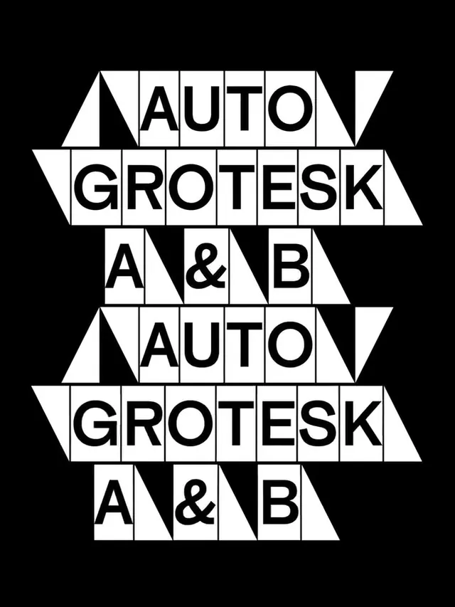 Auto Grotesk A & B Type Specimen
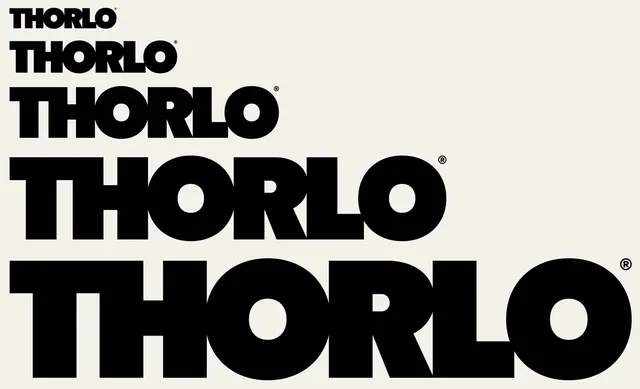 Thorlo Wordmark Variations
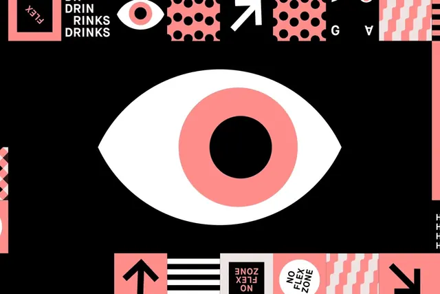 Abstract Eye Identity System
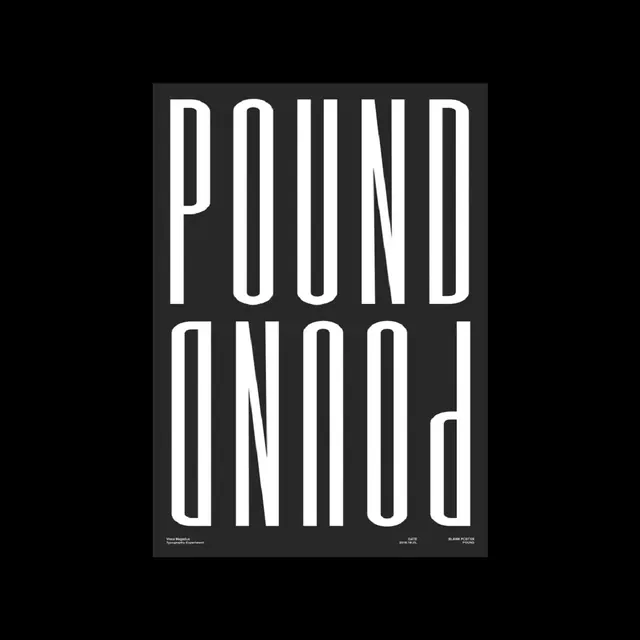 Pound Wordmark Poster
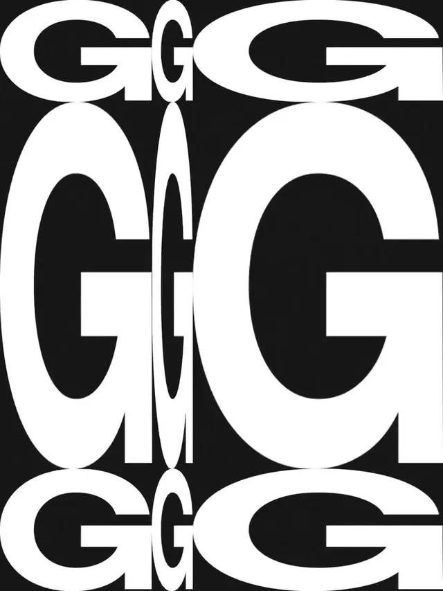 Geometric Letterform Pattern
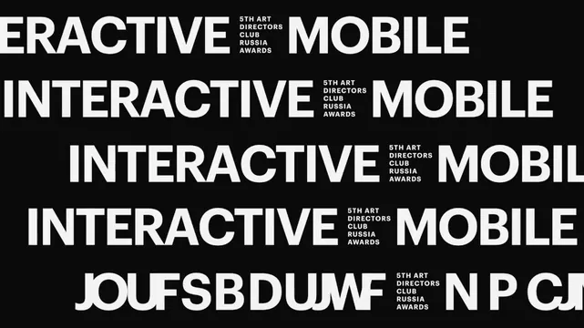 Interactive Mobile Typography Layout
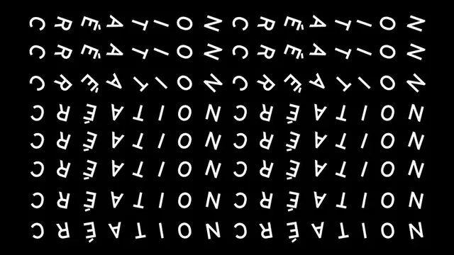 Mirrored Typography Graphic
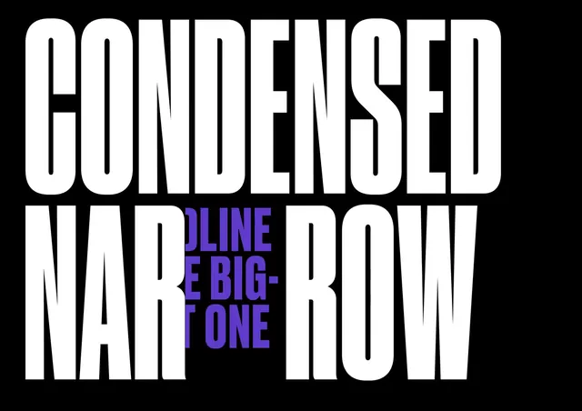 Condensed Narrow Type Specimen
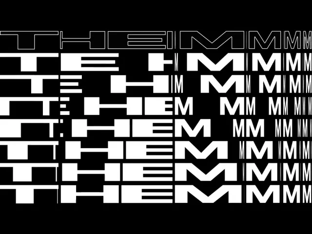 Typography Grid Study
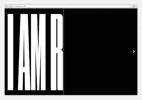 Condensed Wordmark Design
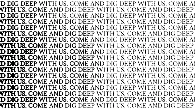 Repetitive Text Pattern
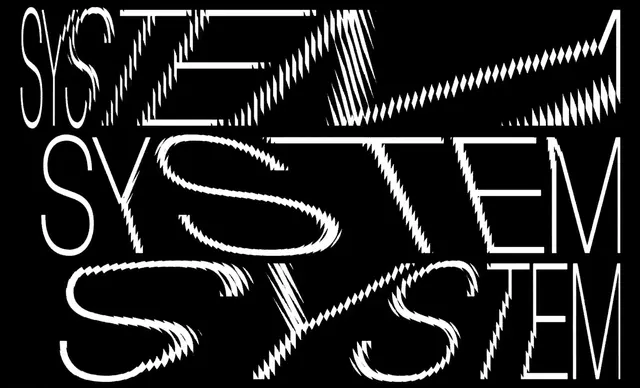 System Wordmark Study
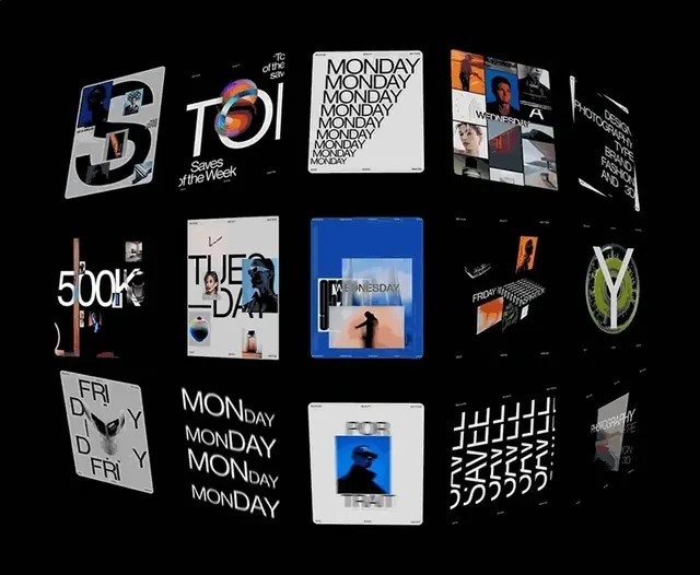 Modern Typography and Branding Identity Collection
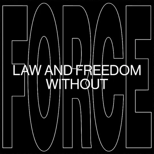 Law and Freedom Without Wordmark
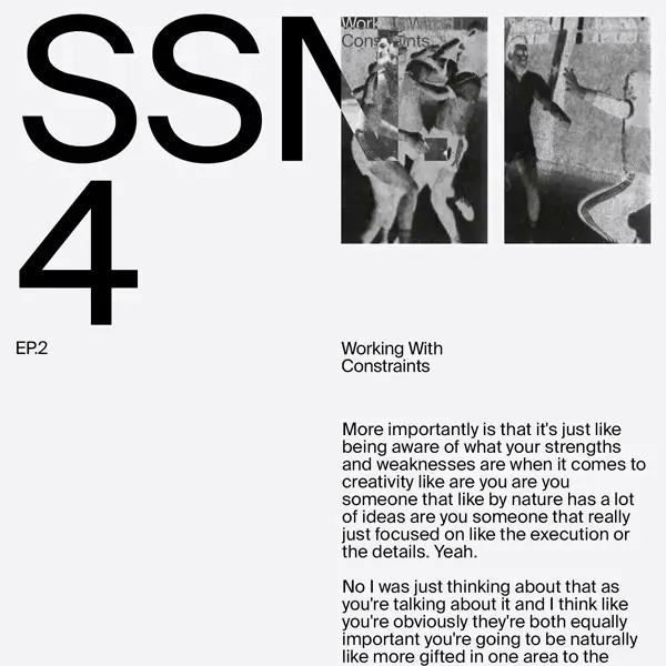 Working With Constraints Editorial Layout
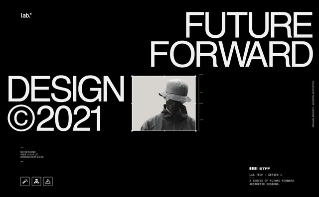 Future Forward Design Reference
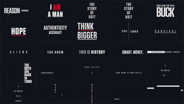 Typography and Layout Design Reference
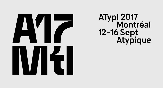 ATypI 2017 Montréal Identity
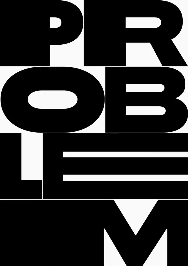 Problem Solver Wordmark
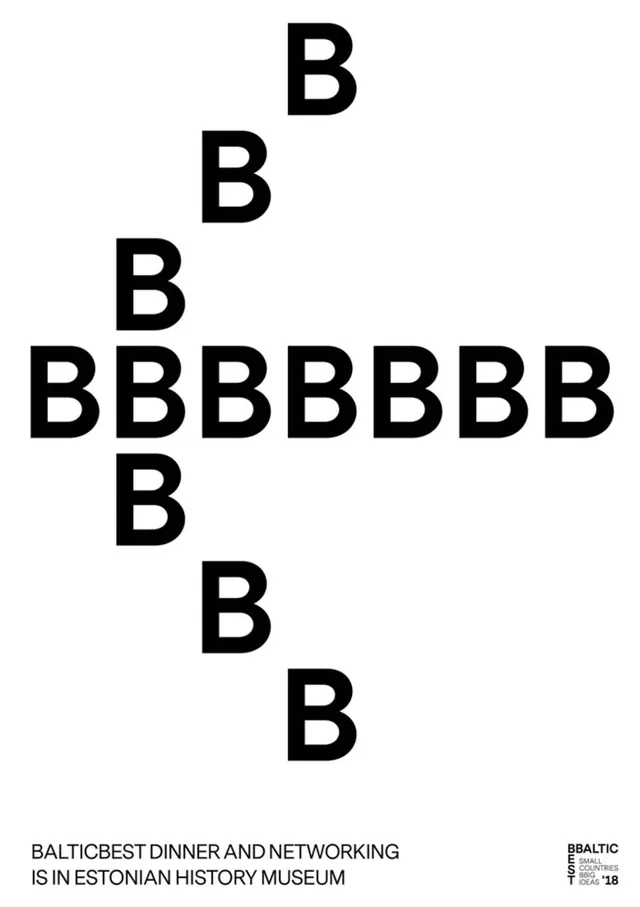 Baltic State Dinner and Networking Poster
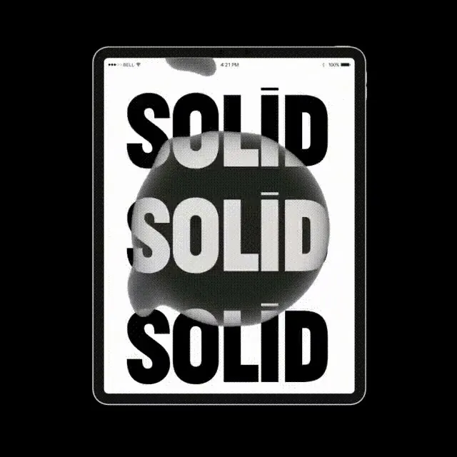 Solid Wordmark Composition