Marken Zeichen Typography Study
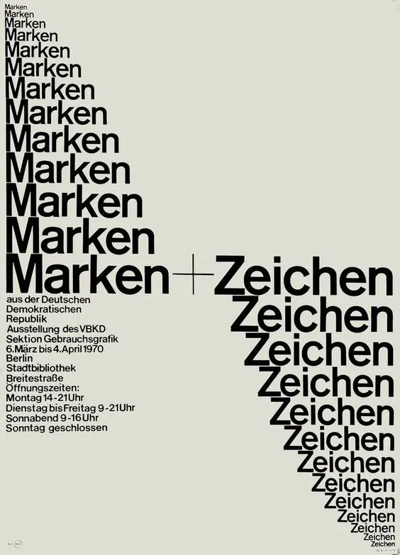
A typographic layout featuring the repeated words 'Marken' and 'Zeichen' in various weights and sizes, arranged in a structured, grid-like composition.
Summary
A typographic layout featuring the repeated words 'Marken' and 'Zeichen' in various weights and sizes, arranged in a structured, grid-like composition.
Visual description
The design features a vertical stack of the word 'Marken' in varying bold weights on the left, contrasted with a horizontal and vertical arrangement of 'Zeichen' on the right. A small block of fine-print text sits in the lower-left corner, creating a high-contrast visual hierarchy.
Key takeaway
The design demonstrates how varying font weights and spatial arrangement can create a dynamic yet structured typographic identity.
Reuse notes
This layout can be used as a template for typographic posters, brand identity studies, or editorial headers.
More like this
 Typography and Layout Design Reference
 Vertical Typography Layout
 Typography and Layout Design Reference
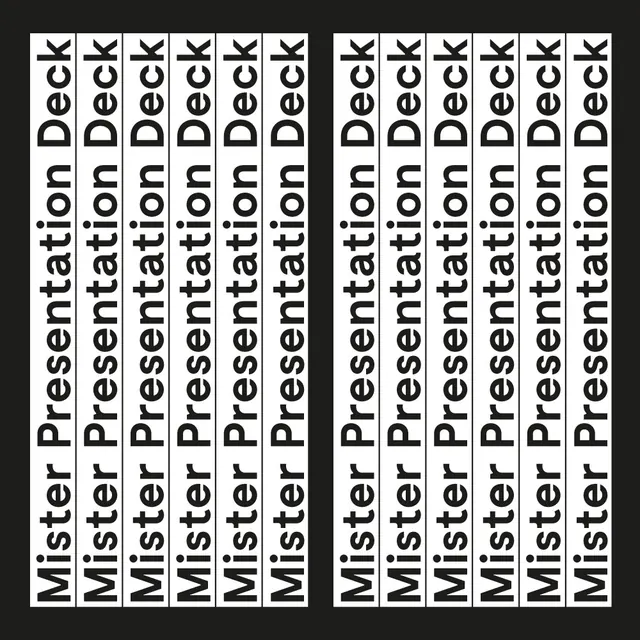 Mister Presentation Deck Typography Layout
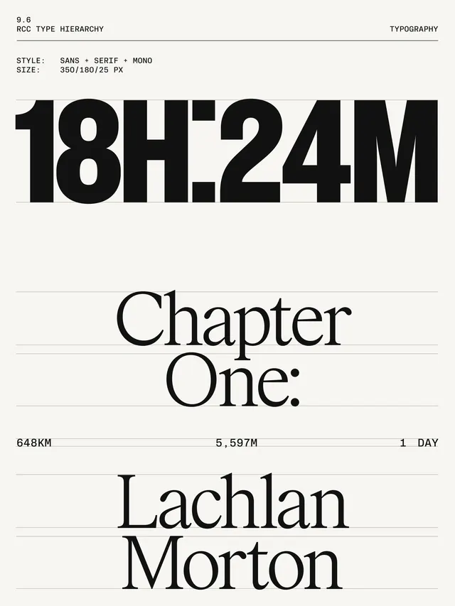 Chapter One Editorial Layout
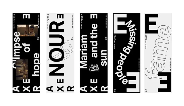 Typography and Graphic Design Reference Board
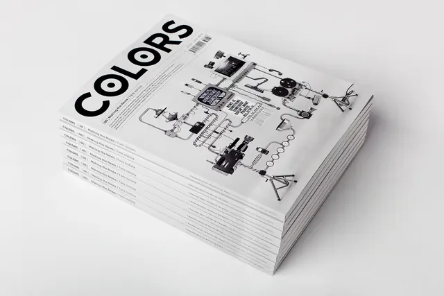 COLORS Editorial Mockup
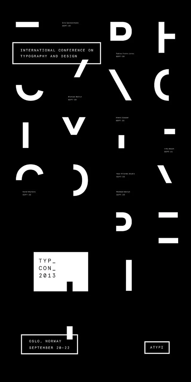 Swiss Style Typography Layout
 Typography and Layout Design Reference
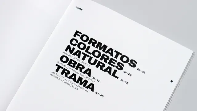 Typography Layout Design
 Typography and Price List Layout
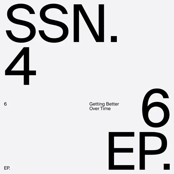 SSN.4 6EP Typography Layout
 Grid-Based Graphic Design Reference
 Rich Black 1080 Flat Wordmark
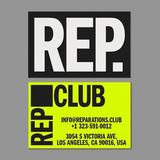 REP. CLUB Identity Design
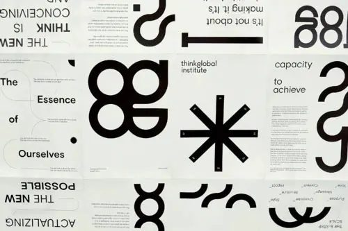 Abstract Geometric Typography Collage
 Plantme Wordmark Identity System
 Typography-focused Editorial Layout
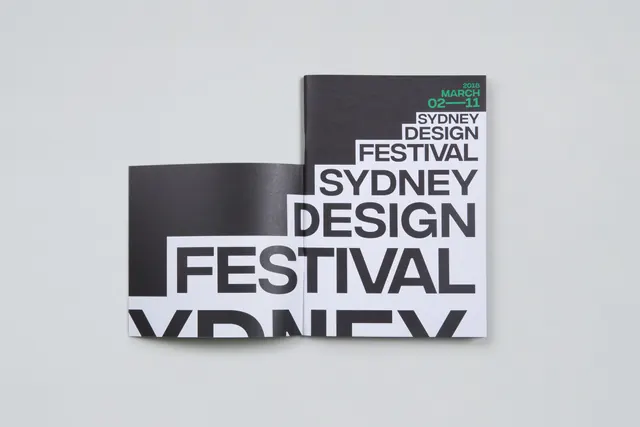 Sydney Design Festival Wordmark
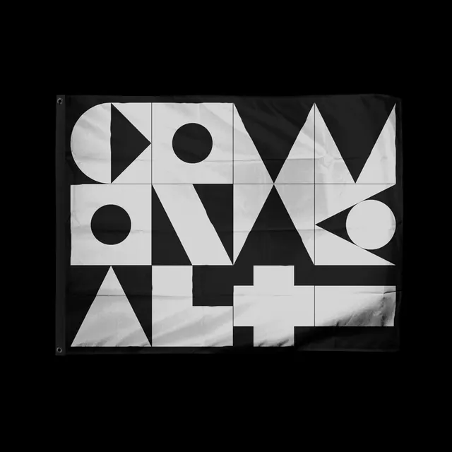 Geometric Typography Composition
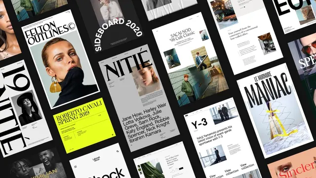 Editorial and Branding Design Grid
 Josef Brockmann Muller Identity
 Seneca Lake Typography Layout
 Experimental Typography Poster