Sydney Design Festival Wordmark
A bold, typographic identity for the Sydney Design Festival featuring stacked, high-contrast black and white text blocks.
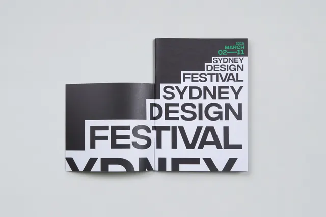
Summary
A bold, typographic identity for the Sydney Design Festival featuring stacked, high-contrast black and white text blocks.
Visual description
The design features a stacked arrangement of text blocks in black and white. The words 'SYDNEY DESIGN FESTIVAL' are repeated and layered, creating a dynamic, architectural composition of heavy sans-serif type.
Key takeaway
The design uses high-contrast typography and geometric stacking to create a powerful, authoritative visual identity.
Reuse notes
This style can be adapted for event posters, social media assets, and large-scale environmental signage.
ColorMonochrome, High Contrast
TypeSans Serif, All Caps, Oversized, Condensed
MoodBold, Professional, Technical
Palette
#D3D6DB
#45444A
More like this
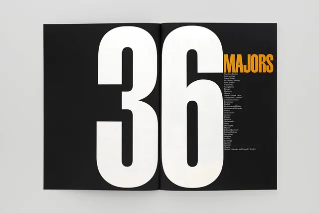 36 MAJORS Typography Design
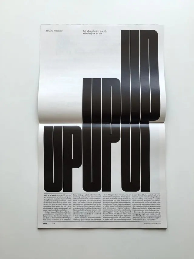 Typography and Layout Design Reference
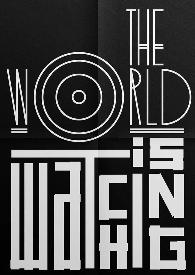 The World Is Watching Typography Design
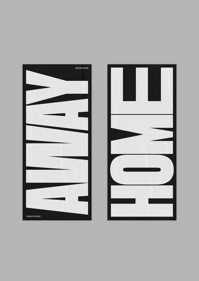 Away Home Typography Layout
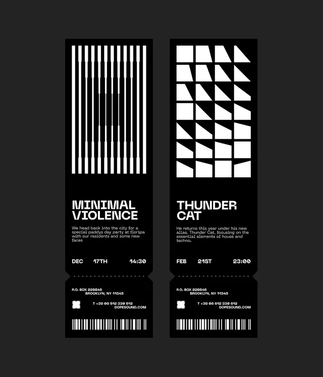 Minimal Violence and Thunder Cat Identity
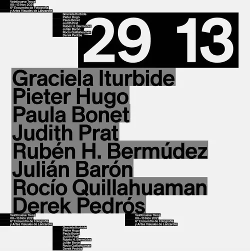 Typography-Driven Poster Design
 Typography and Image Grid Layout
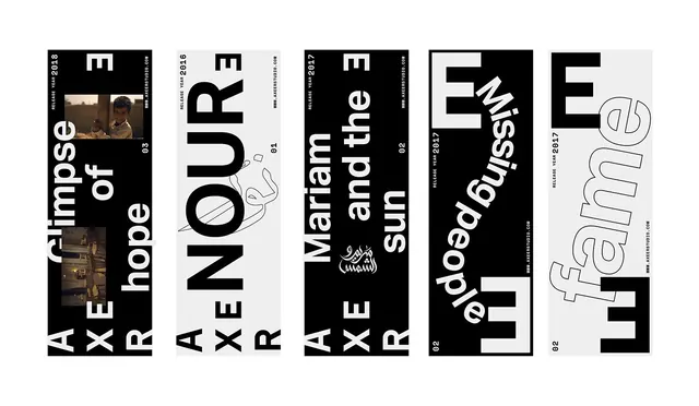 Typography and Graphic Design Reference Board
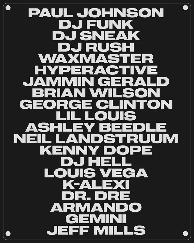 Typography List Design
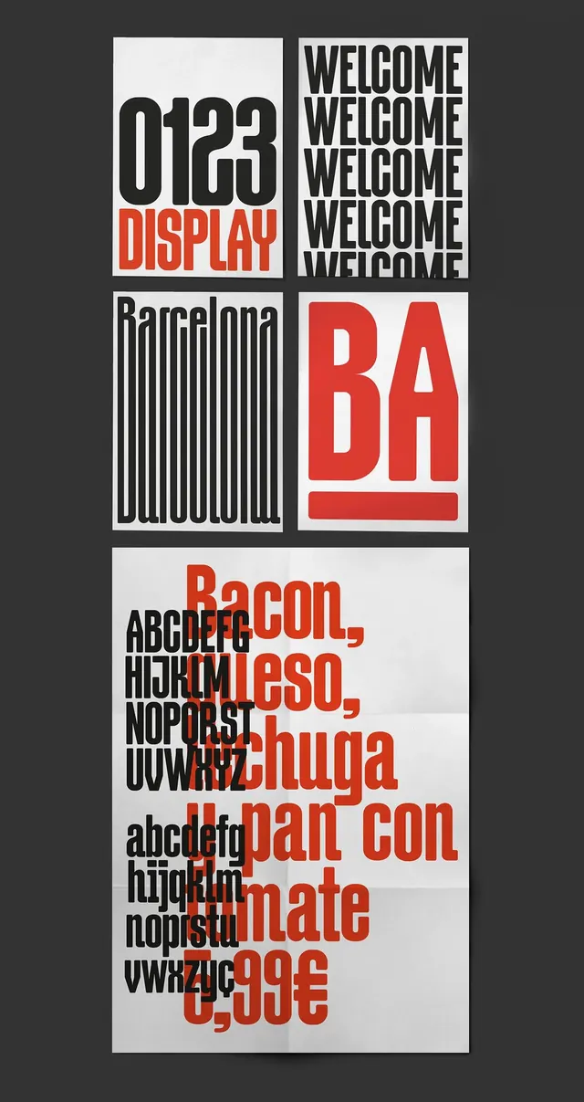 Swiss Typography and Grid Layout Study
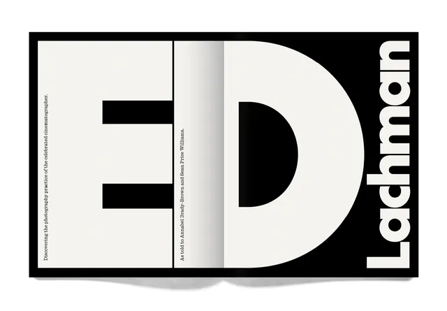 ED Lachman Identity Design
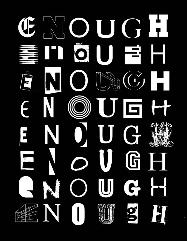 Enough Wordmark Variations
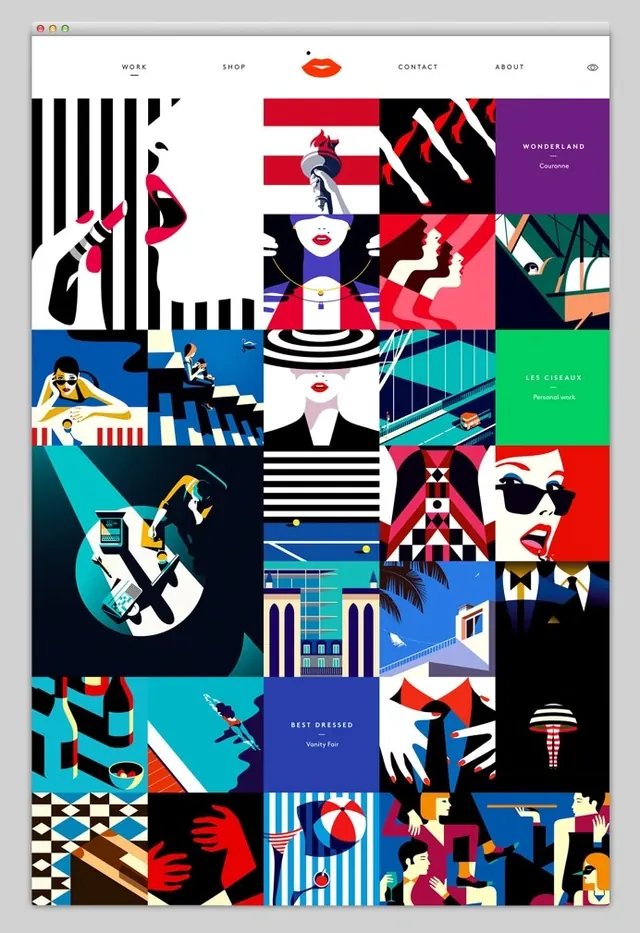 Graphic Design Style Reference Board
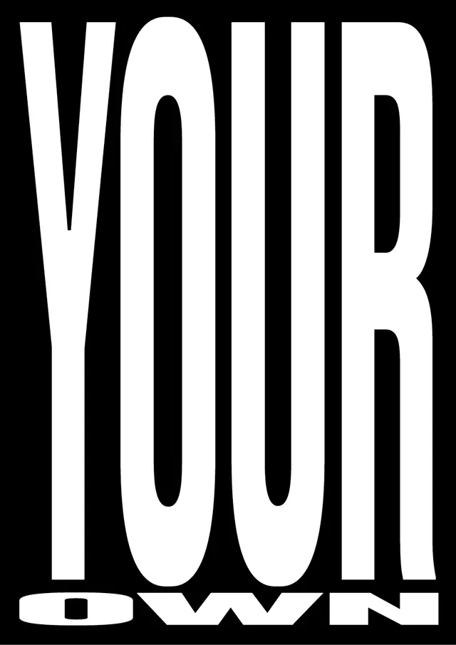 YOUR OWN Wordmark
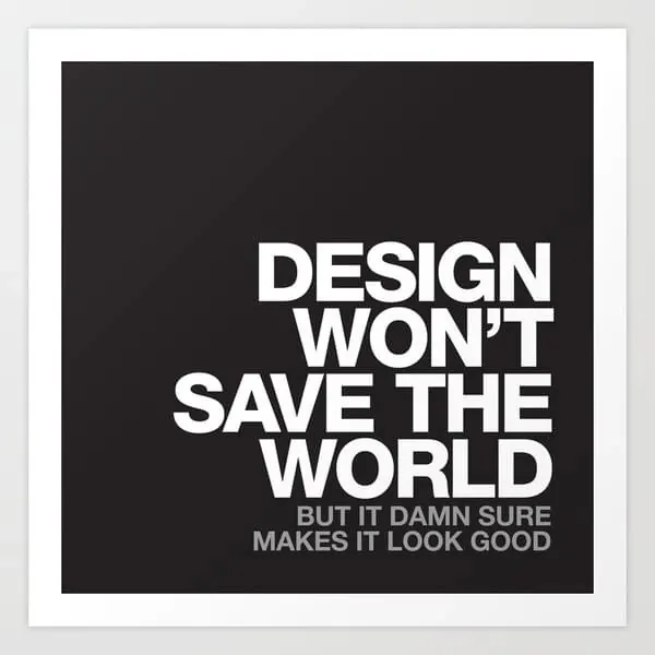 Design Won't Save The World Typography Poster
 DIA STUDIO Invitation Vinyl Mockup
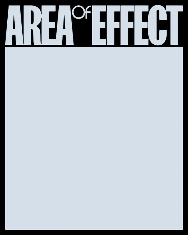 Area of Effect Wordmark
 MAPP MTL Event Poster Design
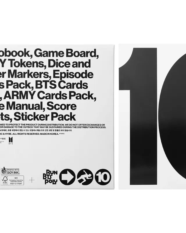 Board Game Component List Layout
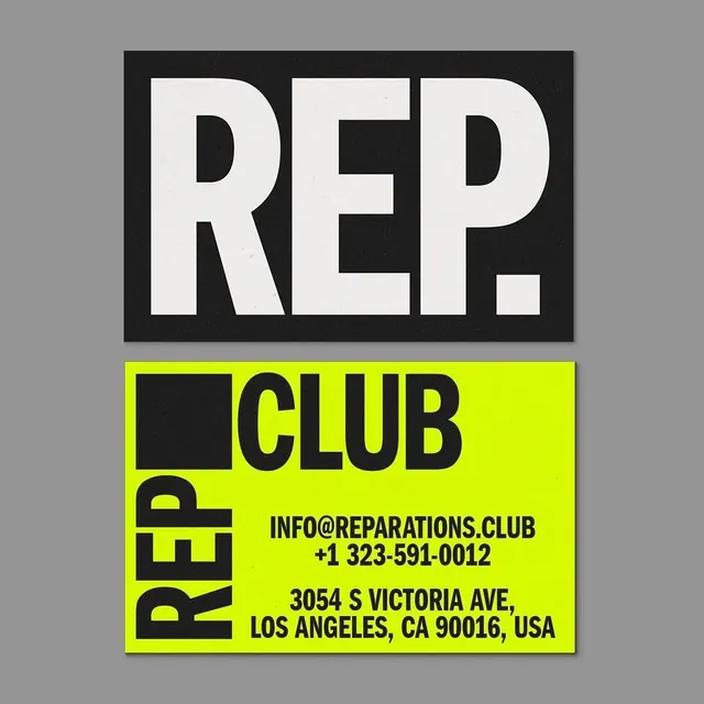 REP. CLUB Identity Design
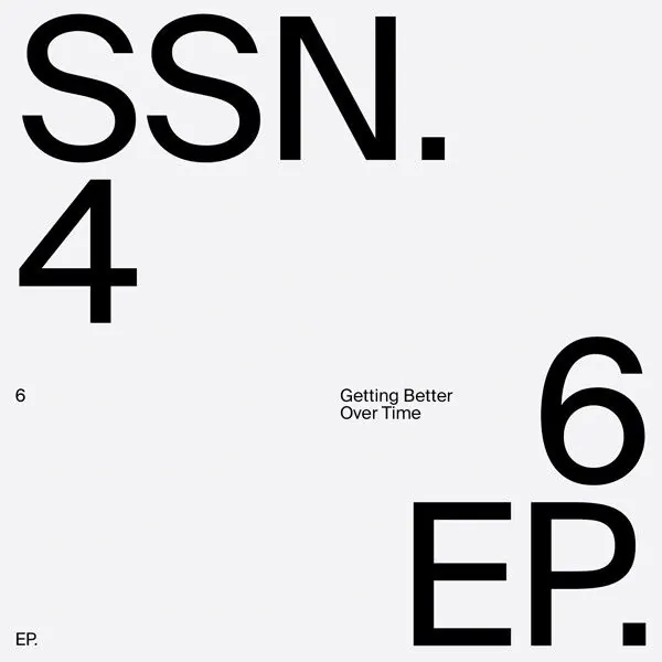 SSN.4 6EP Typography Layout
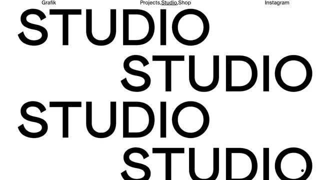 Studio Wordmark Identity System
 Abstract Geometric Typography Collage
 Nike Air Not Shoe Identity System