Design Won't Save The World Typography Poster
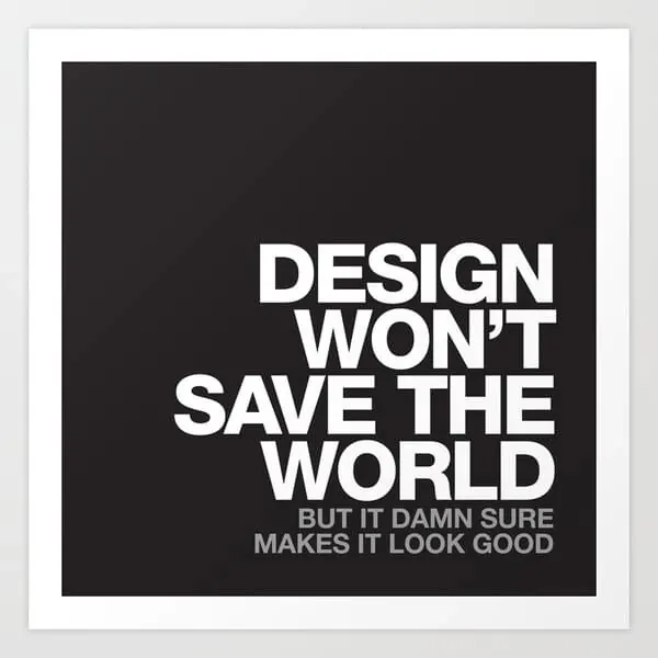
A high-contrast typographic poster featuring a bold statement about the limitations of design, presented in a minimalist, dark-mode aesthetic.
Summary
A high-contrast typographic poster featuring a bold statement about the limitations of design, presented in a minimalist, dark-mode aesthetic.
Visual description
The image features large, white sans-serif text on a solid black background. The primary message 'DESIGN WON'T SAVE THE WORLD' is stacked in a heavy, bold weight, while a smaller sub-caption at the bottom reads 'BUT IT DAMN SURE MAKES IT LOOK GOOD'.
Key takeaway
The design emphasizes the power of bold typography and high-contrast layout to deliver a strong, provocative message.
Reuse notes
This layout can be adapted for social media quotes, agency branding, or interior office decor.
ColorDark, High Contrast, Monochrome
TypeSans Serif, Oversized, All Caps, Display
MoodBold, Professional, Technical
Palette
#262225
#F0F0F0
More like this
 Bold Typography Layout
 Abstract Numerical Typography
 Typography and Graphic Design Reference Board
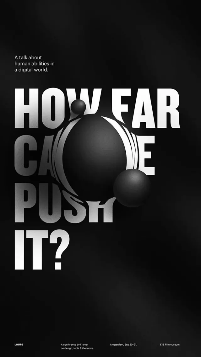 How Far Can You Push It? Typography Poster
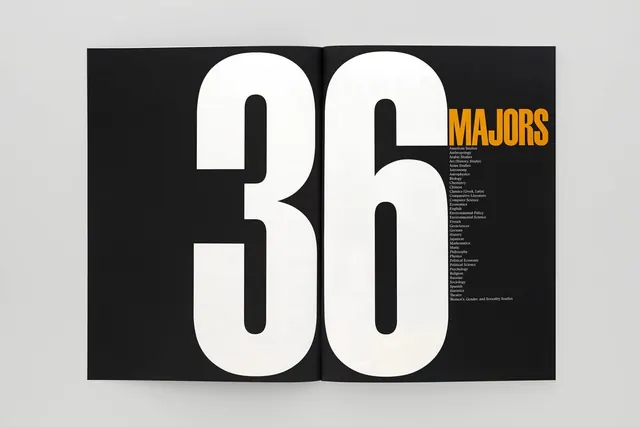 36 MAJORS Typography Design
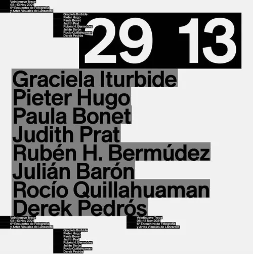 Typography-Driven Poster Design
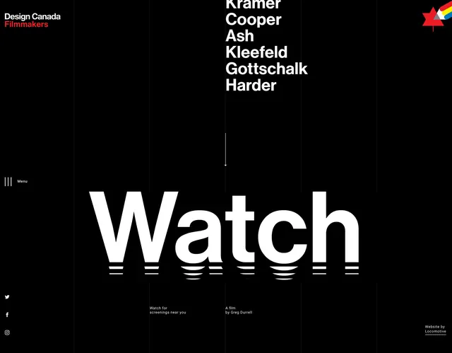 Watch Editorial Layout
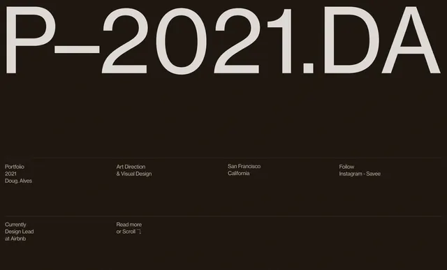 P-2021.DA Typography Layout
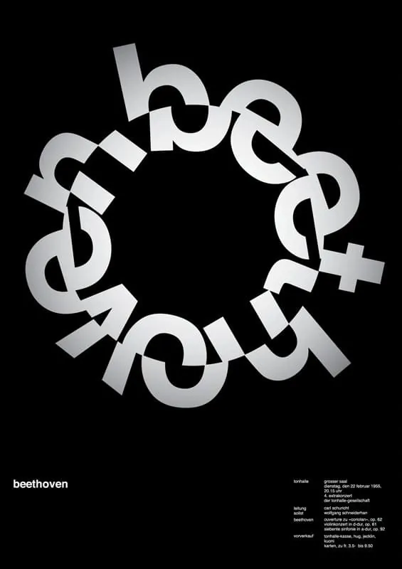 Beethoven Circular Wordmark
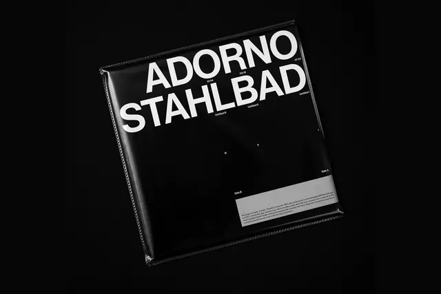 Adorno Stahlbad Mockup
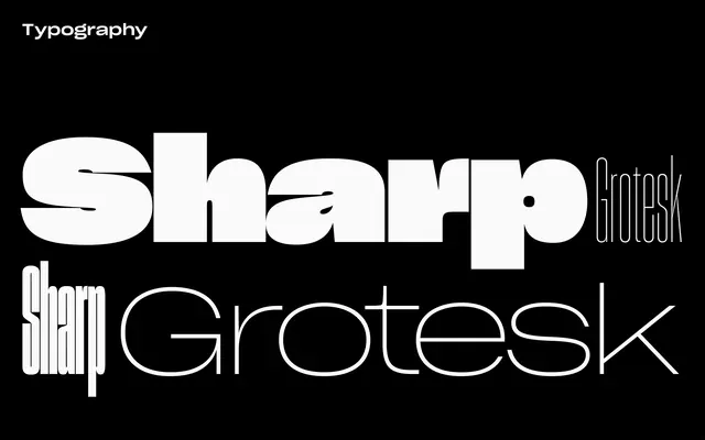 Sharp Grotesk Type Specimen
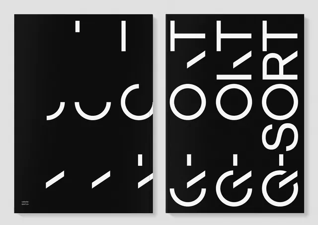 Abstract Typography Composition
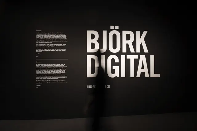 Björk Digital Wordmark and Layout
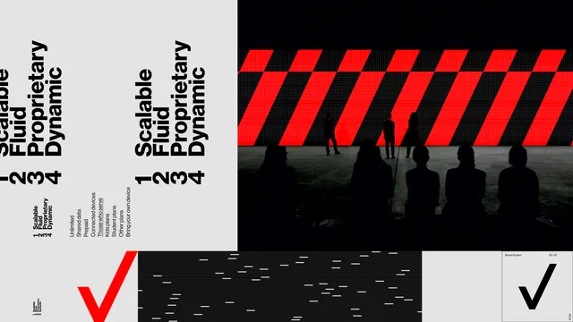 Graphic Design Reference Board
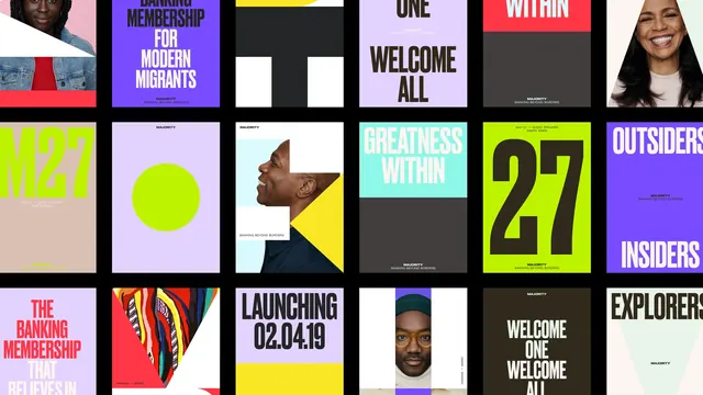 Grid-Based Graphic Design Reference
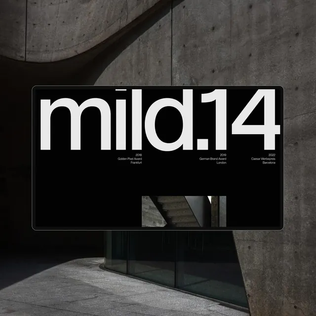 mild14 Wordmark Mockup
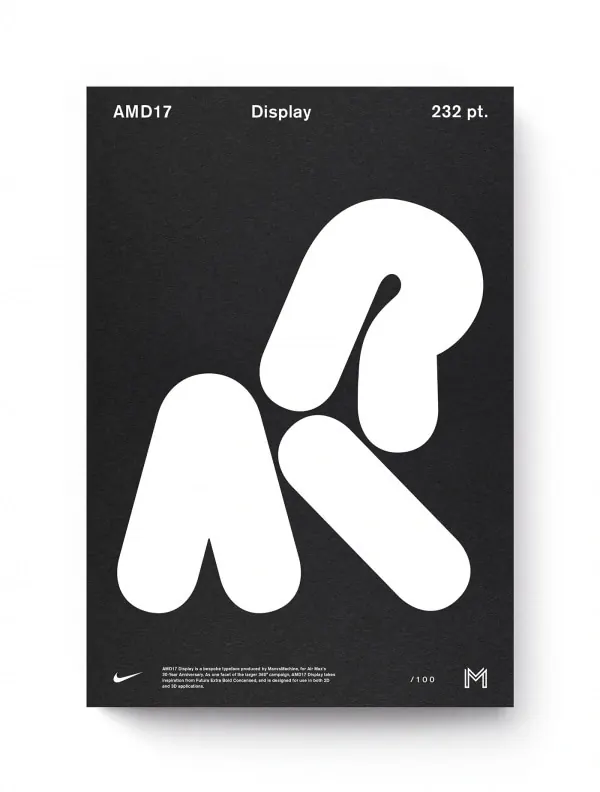 AMD Display Advertisement
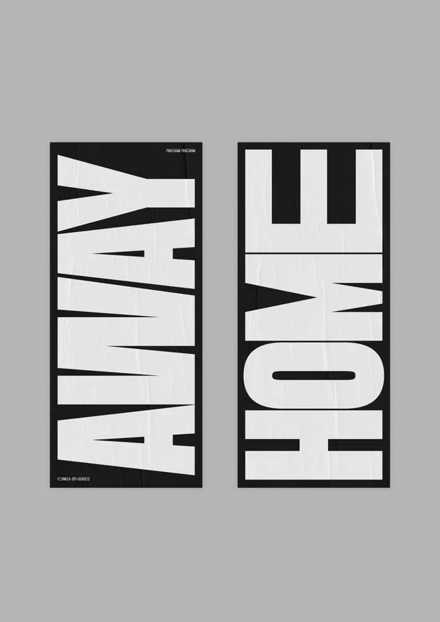 Away Home Typography Layout
 Typography Wordmark Composition
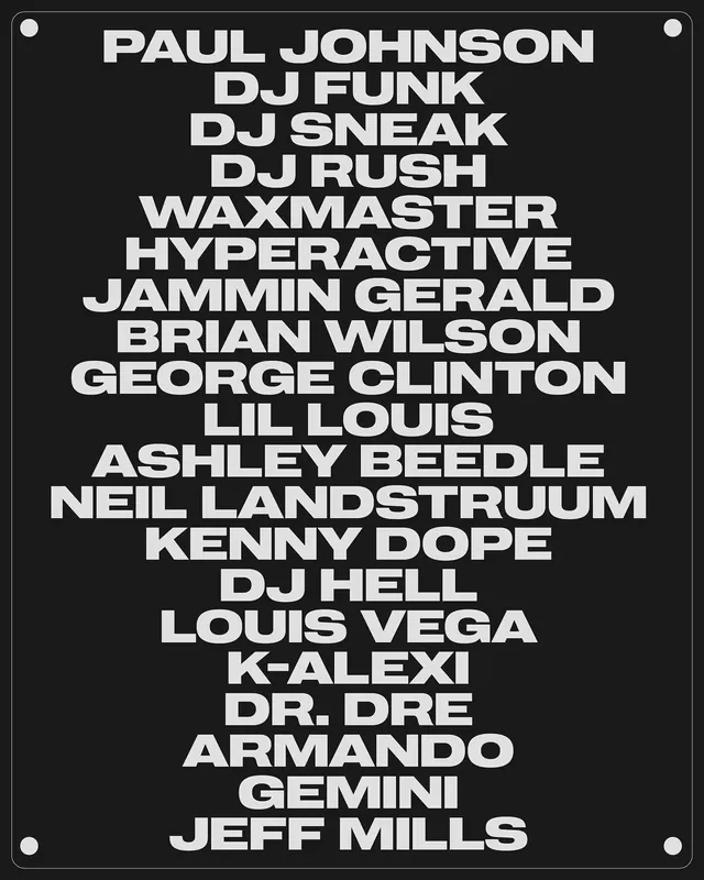 Typography List Design
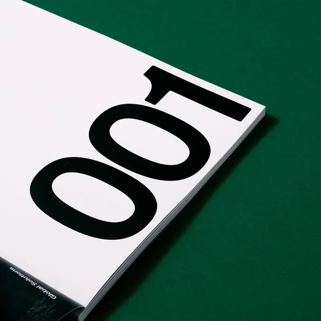 O01 Typography Mockup
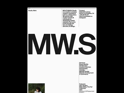 MW.S Identity System
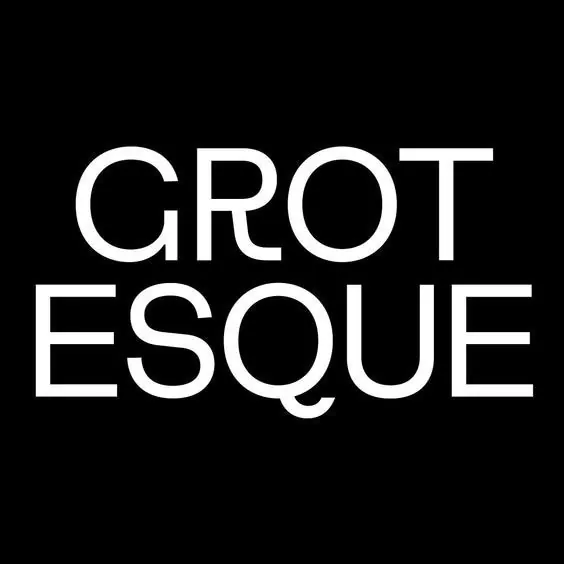 Grotesque Wordmark
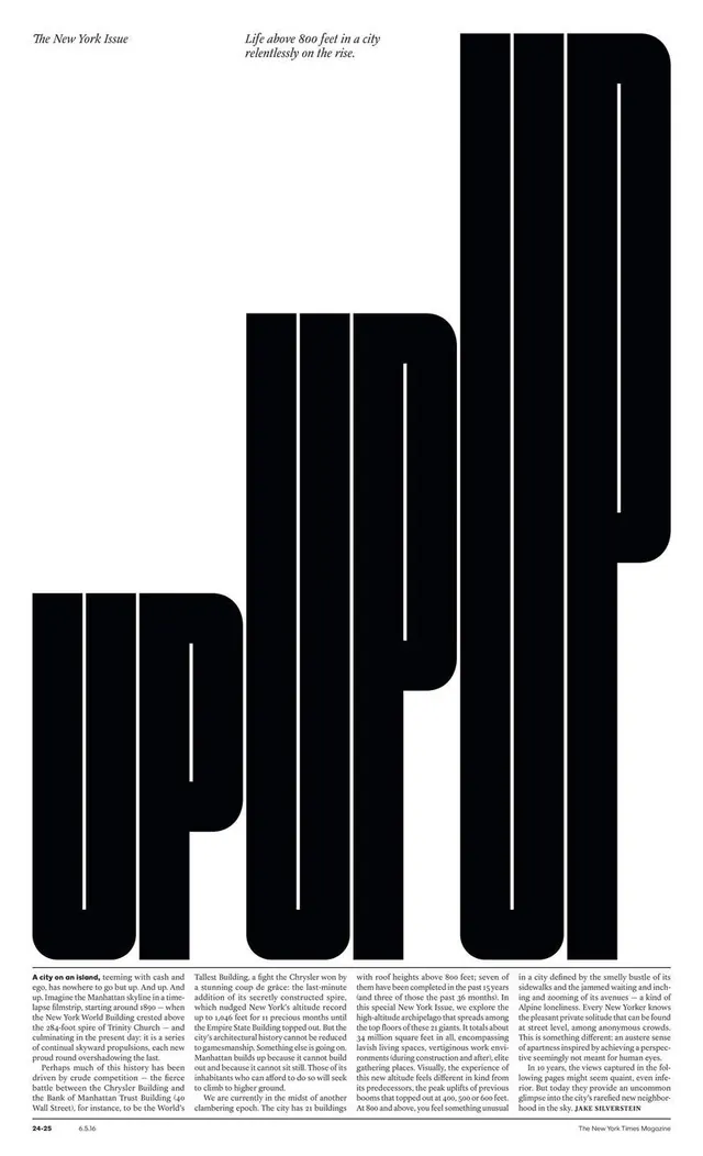 Typography and Layout Design Reference