Josef Brockmann Muller Identity
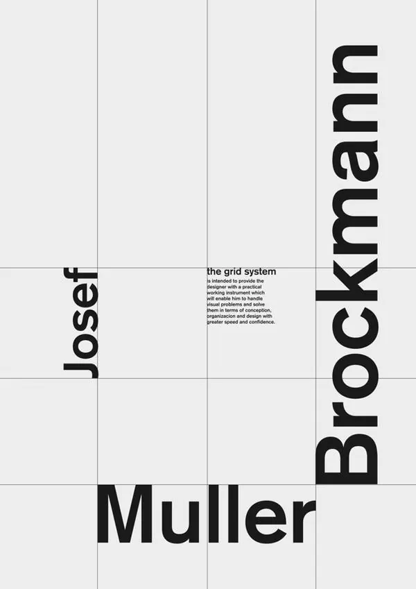
A minimalist, grid-based typographic layout featuring a large-scale wordmark and a small block of descriptive text.
Summary
A minimalist, grid-based typographic layout featuring a large-scale wordmark and a small block of descriptive text.
Visual description
The design uses a strict grid system with large, bold sans-serif text oriented both horizontally and vertically. A high-contrast black and white color palette defines the layout, with a small block of justified text centered in a white field.
Key takeaway
The design demonstrates how extreme scale and geometric orientation can create a powerful, structured brand identity.
Reuse notes
This layout can be adapted for high-end editorial headers, portfolio covers, or modular brand guidelines.
StyleMinimal, Swiss, Boxed, Geometric, Monochrome
ColorMonochrome, High Contrast
TypeSans Serif, Oversized, Condensed
MoodProfessional, Bold, Technical, Premium
Tagsgrid, typography, layout, black and white, modular
Palette
#EBEBEB
#1F1F1F
More like this
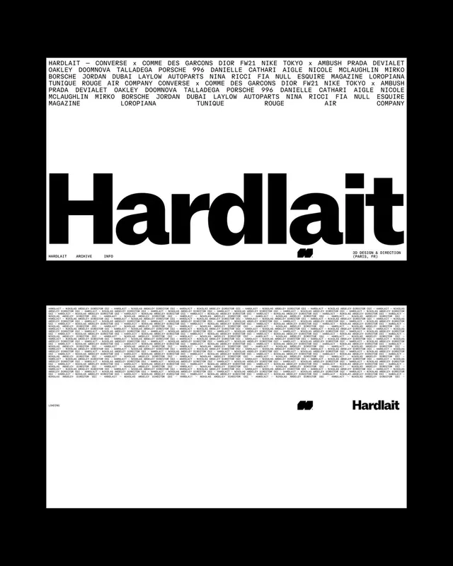 Hardlait Identity System
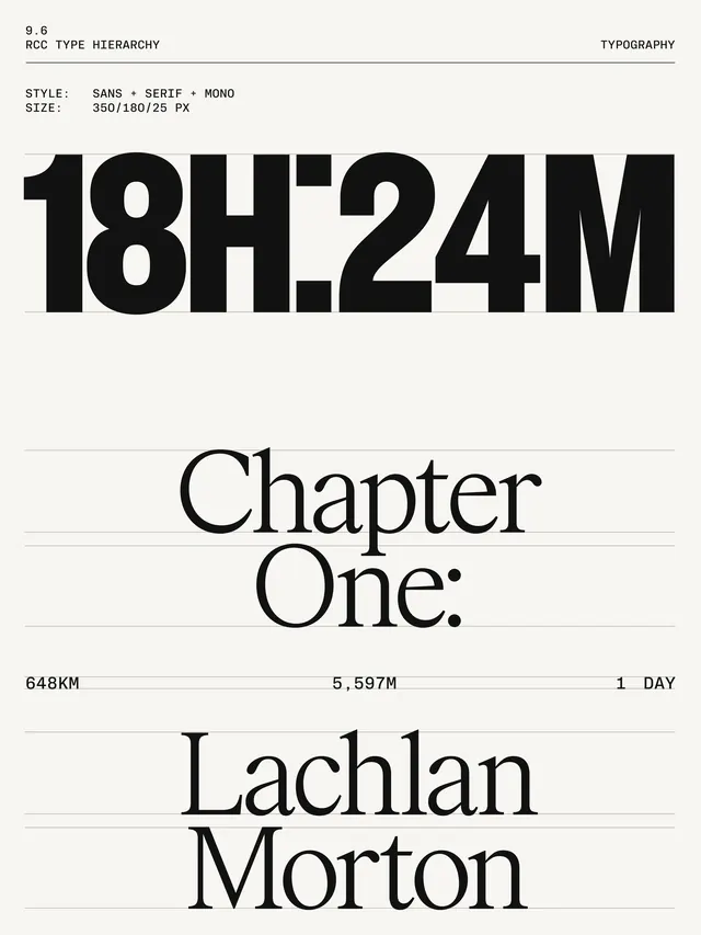 Chapter One Editorial Layout
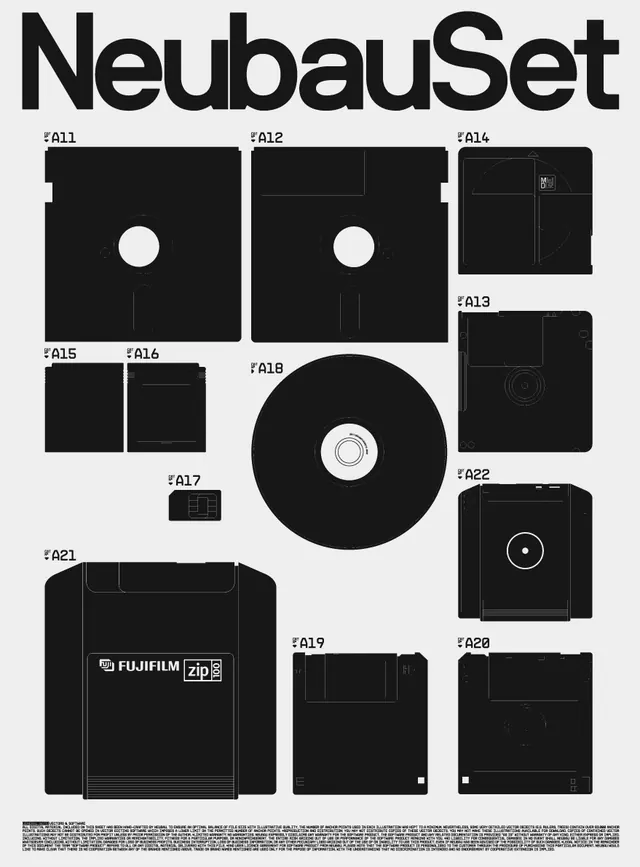 NeubauSet Identity System
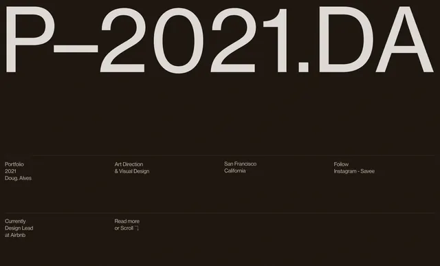 P-2021.DA Typography Layout
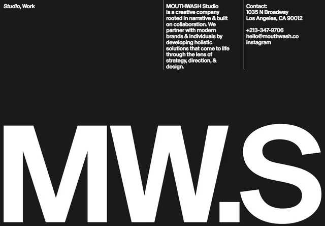 Studio MWS Identity Design
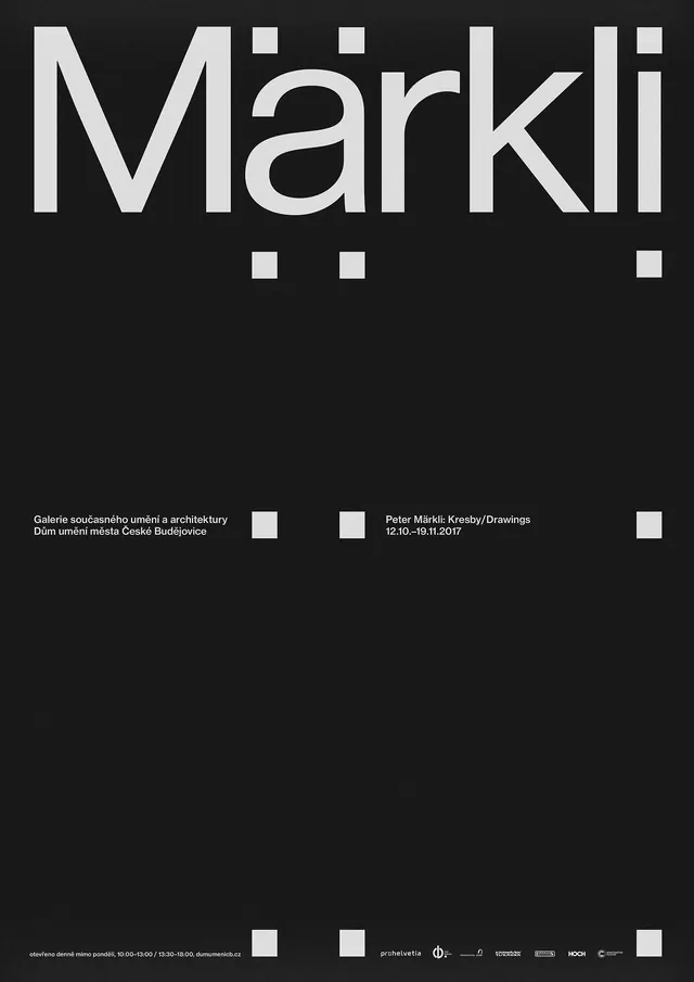 Märkli Wordmark and Layout
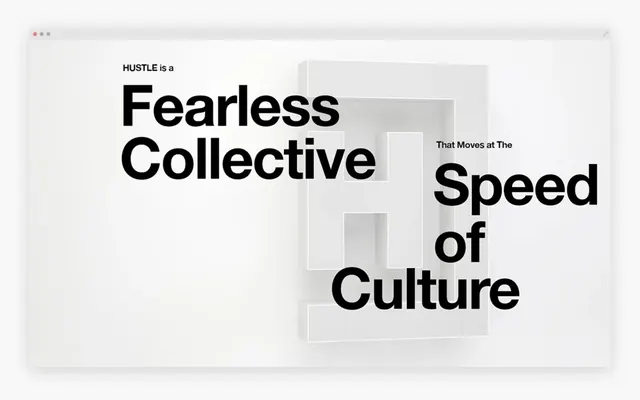 Fearless Collective Typography Layout
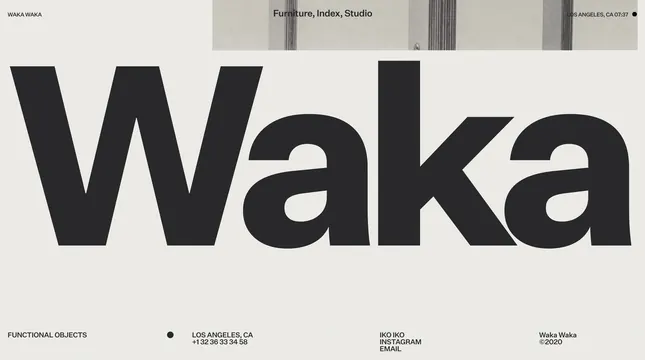 Waka Wordmark and Identity System
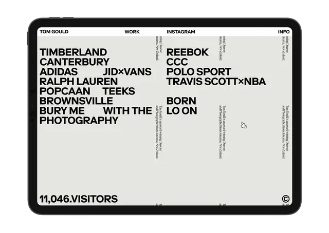 Typography-based Portfolio Layout
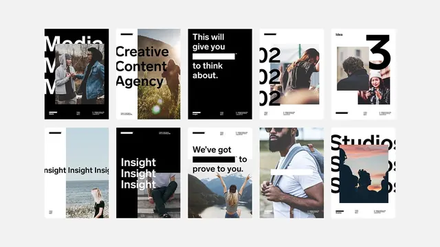 Editorial Typography and Layout Grid
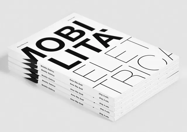 Stacked Typography Mockup
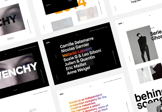 Typography and Layout Design Reference
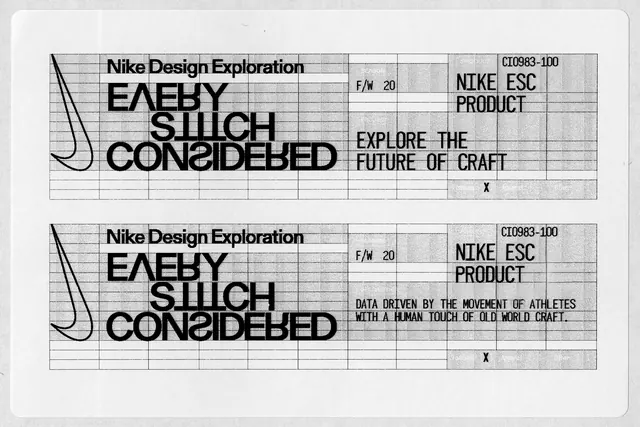 Nike Design Exploration: Early Silicon Considered
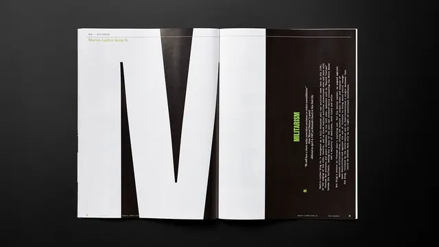 Minimalist Typography Layout
 Typography and Layout Design Reference
 Typography List Design
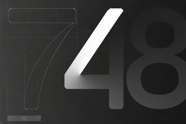 Abstract Numerical Typography
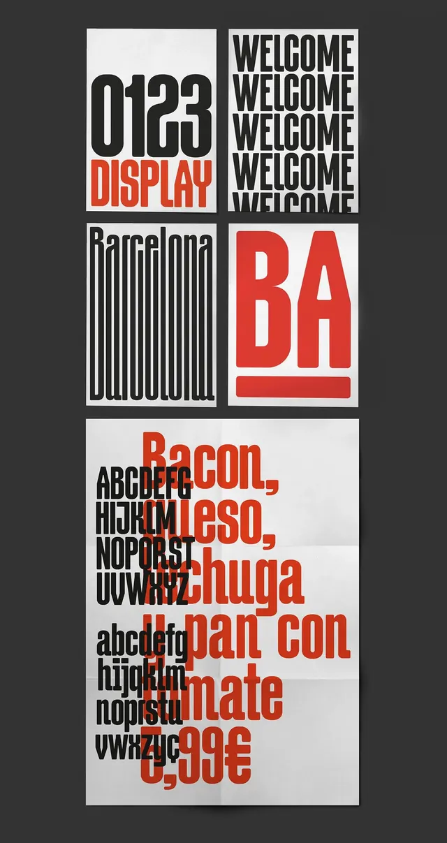 Swiss Typography and Grid Layout Study
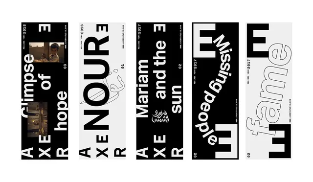 Typography and Graphic Design Reference Board
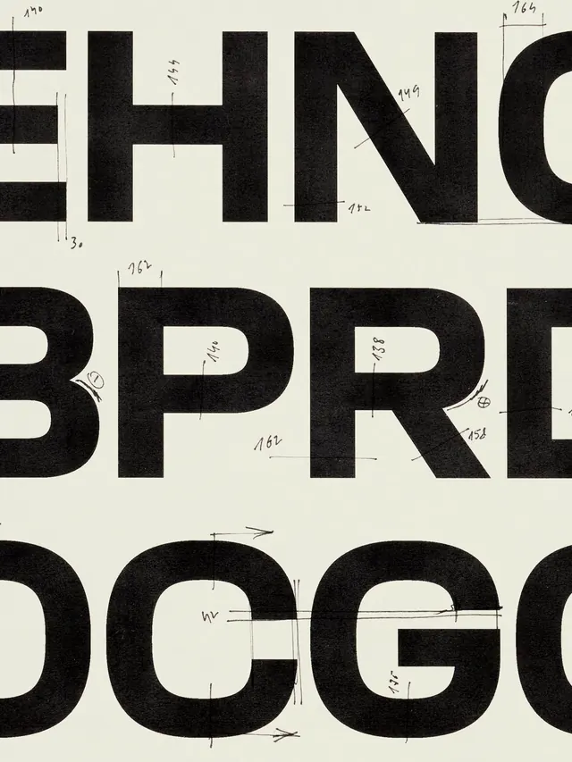 Bold Typographic Grid Layout
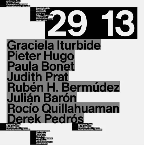 Typography-Driven Poster Design
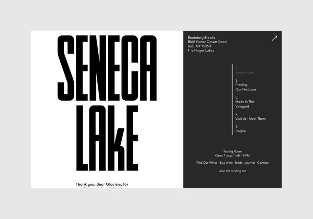 Seneca Lake Typography Layout
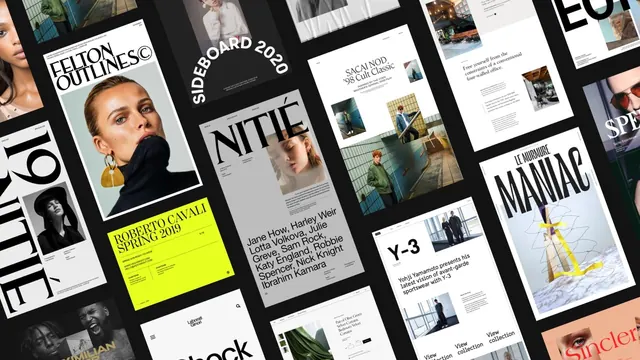 Editorial and Branding Design Grid
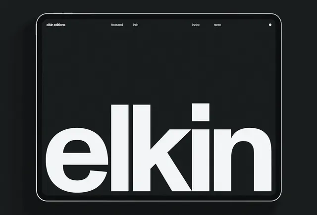 elkin Wordmark Design