São Paulo Typography Design
A high-contrast, minimalist typographic layout featuring the words 'São Paulo' in a bold, oversized sans-serif font with a unique circular graphic element.

Summary
A high-contrast, minimalist typographic layout featuring the words 'São Paulo' in a bold, oversized sans-serif font with a unique circular graphic element.
Visual description
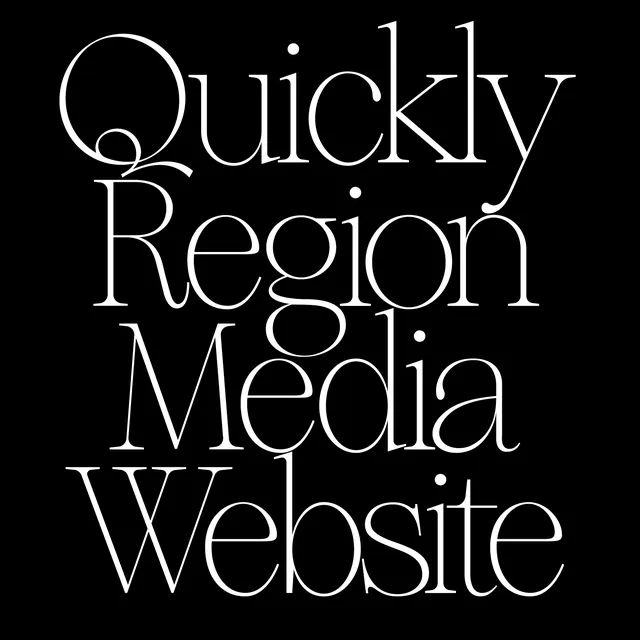
The design features large, white sans-serif text against a solid black background. The word 'São Paulo' is stacked, with a distinctive white circle intersecting the final 'o' of 'Paulo'.
Key takeaway
The design demonstrates how bold typography and simple geometric shapes can create a powerful, sophisticated visual identity.
Reuse notes
This style can be adapted for high-impact posters, branding, or editorial layouts requiring a strong typographic focus.
StyleMinimal, Swiss, Monochrome, Geometric
ColorHigh Contrast, Monochrome
TypeSans Serif, Oversized, Display
MoodBold, Professional, Elegant
Palette
#F5F5F5
#050505
More like this
 Letters in Art Typography Design
 Typography and Logo Composition
 Abstract Typographic Composition
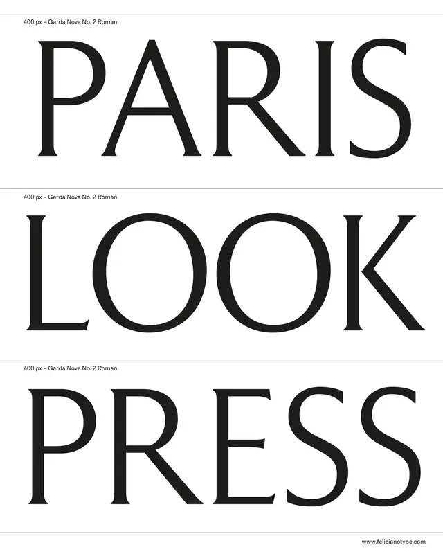 Paris Look Press Typography Layout
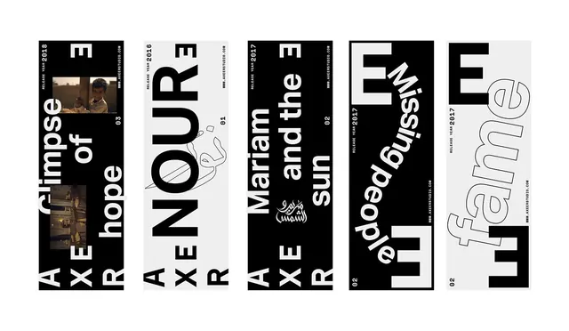 Typography and Graphic Design Reference Board
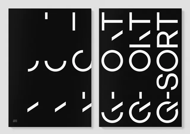 Abstract Typography Composition
 Design Won't Save The World Typography Poster
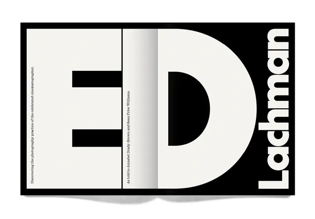 ED Lachman Identity Design
 Abstract Geometric Composition
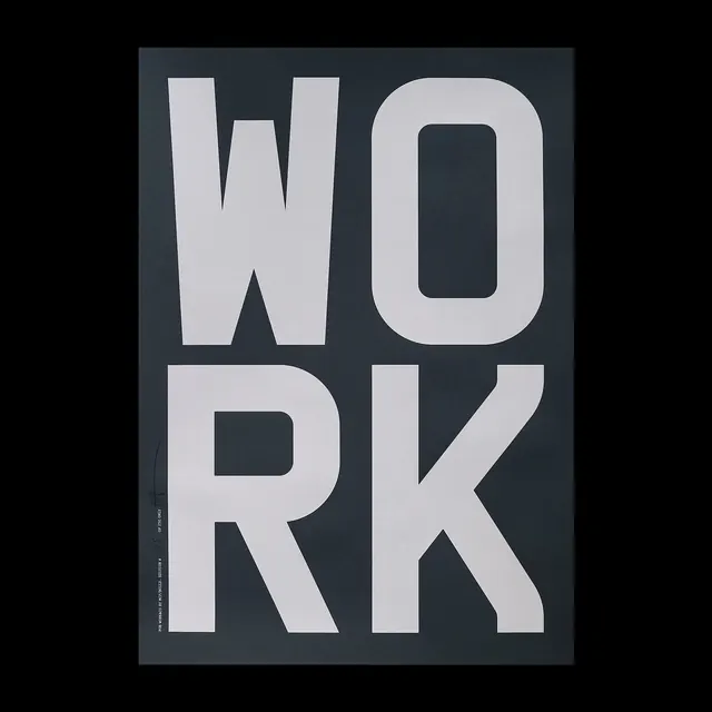 WORK Wordmark Design
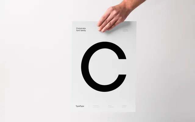 Minimalist Typography Poster
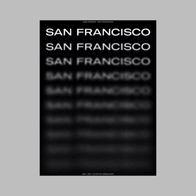 San Francisco Typography Poster
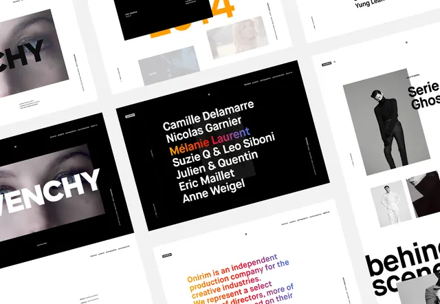 Typography and Layout Design Reference
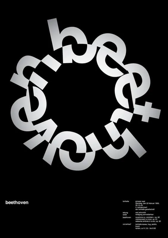 Beethoven Circular Wordmark
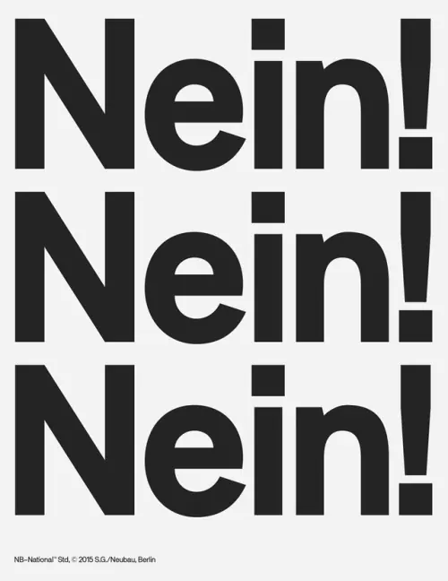 Nein! Wordmark Repetition
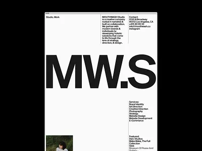 MW.S Identity System
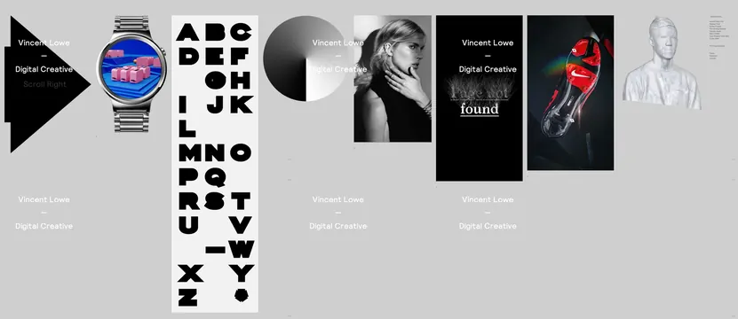 Typography and Branding Showcase
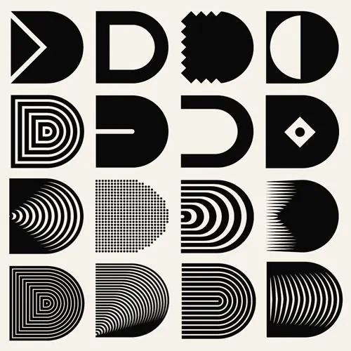 Geometric Letterform Exploration
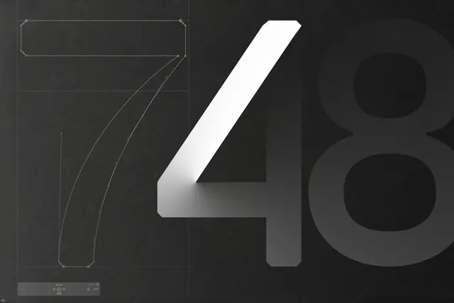 Abstract Numerical Typography
 Totally for 3 Years Typography Design
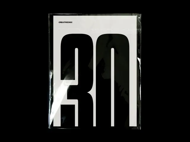 Abstract Typography Poster
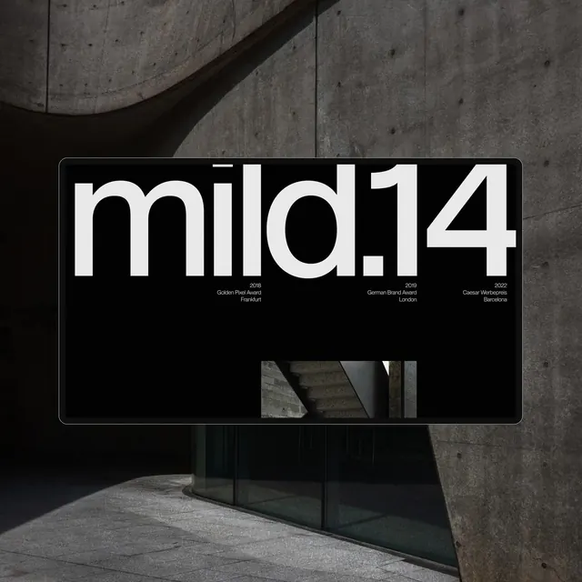 mild14 Wordmark Mockup
 Typography Stack Wordmark
 Typography Layout Design