Nein! Wordmark Repetition
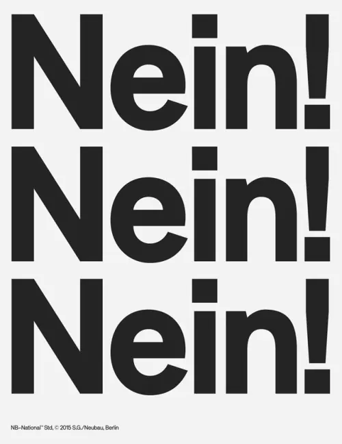
A high-contrast, monochrome typographic design featuring the word 'Nein!' repeated three times in a stacked, bold layout.
Summary
A high-contrast, monochrome typographic design featuring the word 'Nein!' repeated three times in a stacked, bold layout.
Visual description
The image displays the word 'Nein!' in a heavy, black sans-serif font against a white background. The word is repeated vertically three times, with the exclamation point and the 'N' creating a strong vertical rhythm.
Key takeaway
The design uses bold repetition and high contrast to create a powerful, immediate visual impact.
Reuse notes
This style can be adapted for protest posters, bold editorial headers, or minimalist branding.
ColorMonochrome, High Contrast
TypeSans Serif, Display, Oversized
MoodBold, Energetic, Professional
Palette
#F2F2F2
#262626
More like this
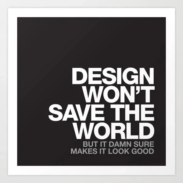 Design Won't Save The World Typography Poster
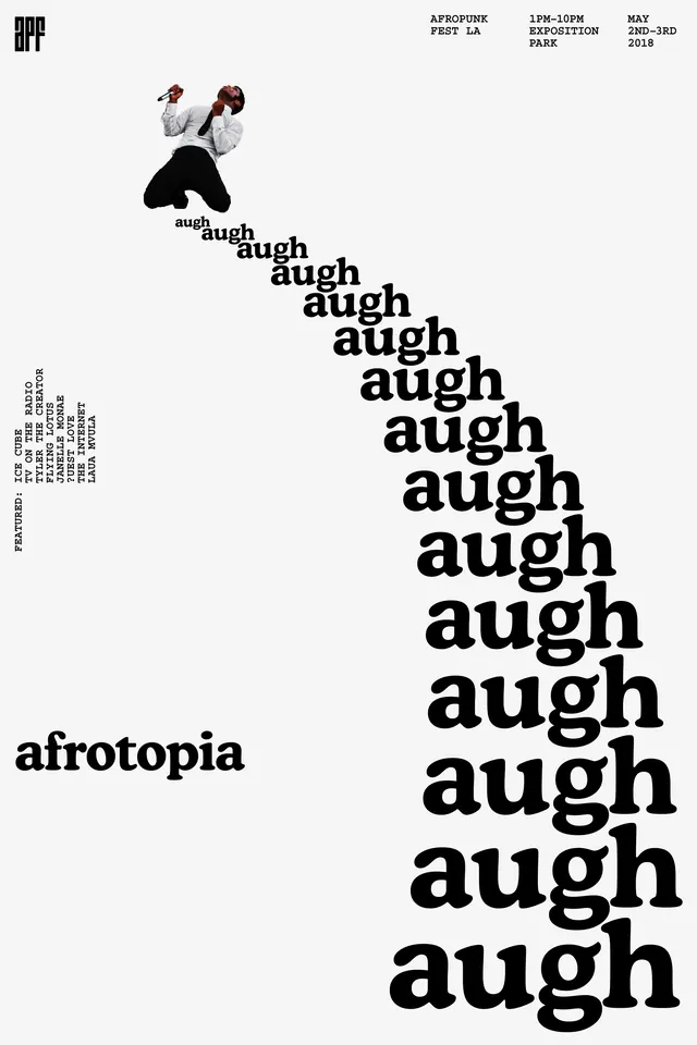 Afrotopia Typography and Illustration Design
 Abstract Typographic Composition
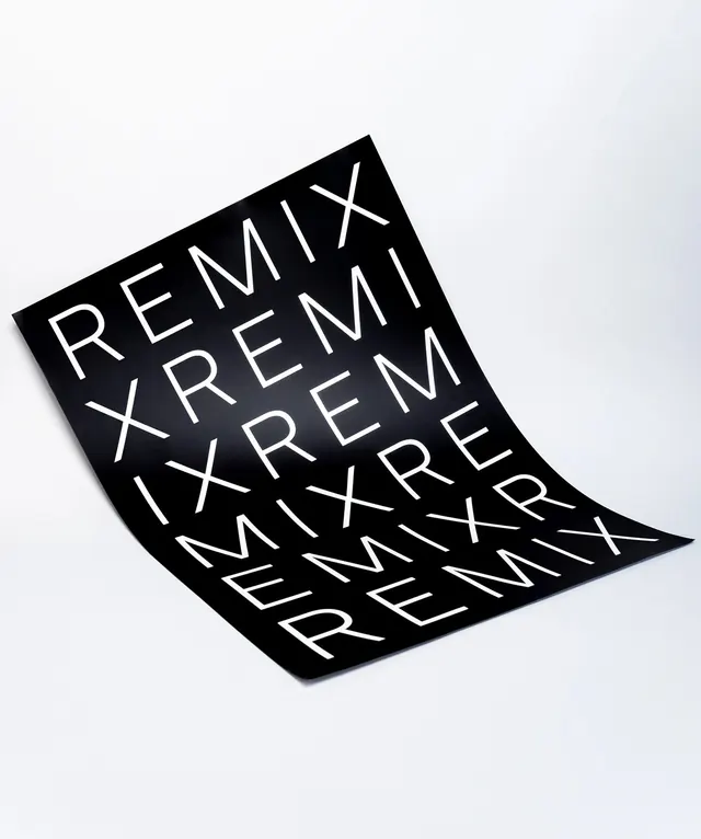 REMIX Wordmark Pattern
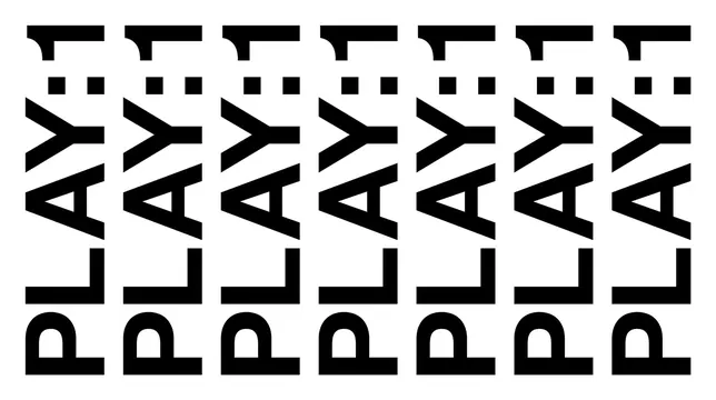 PLAY1 Wordmark Pattern
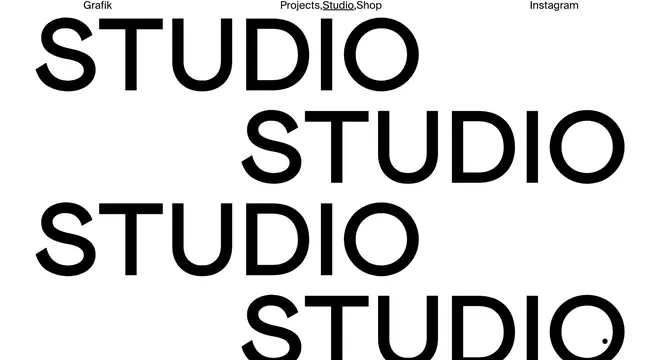 Studio Wordmark Identity System
 HOT AIR Wordmark Design
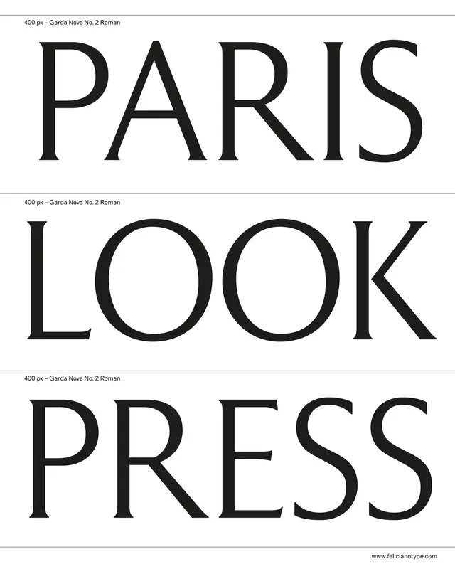 Paris Look Press Typography Layout
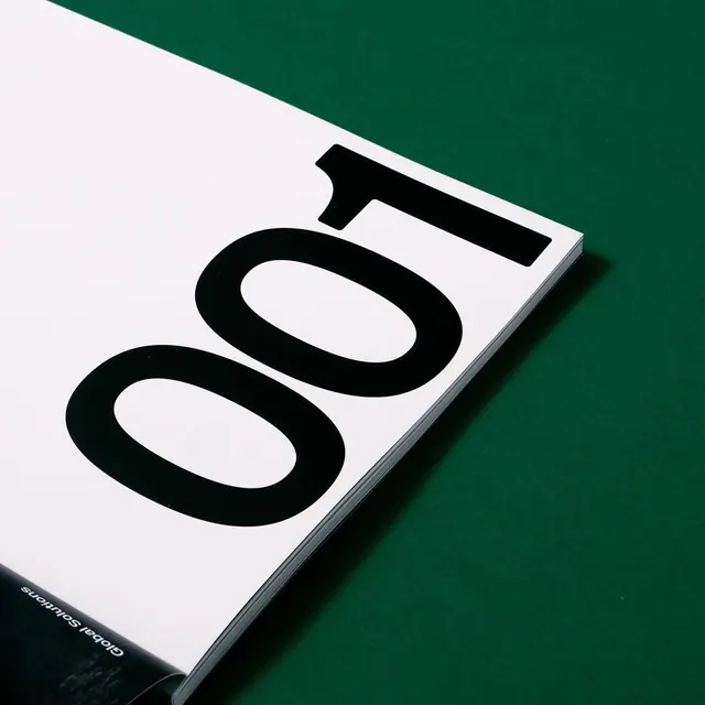 O01 Typography Mockup
 Alphabet and Number Type Specimen
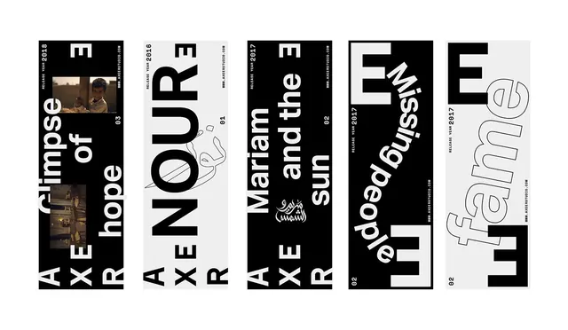 Typography and Graphic Design Reference Board
 Typography and Image Grid Layout
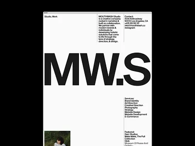 MW.S Identity System
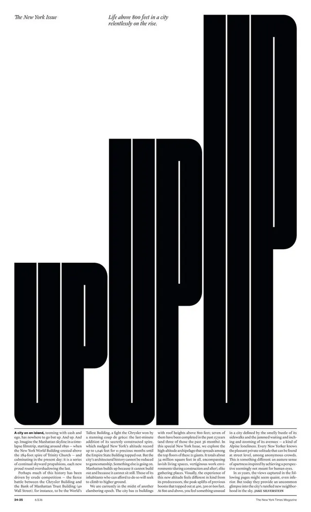 Typography and Layout Design Reference
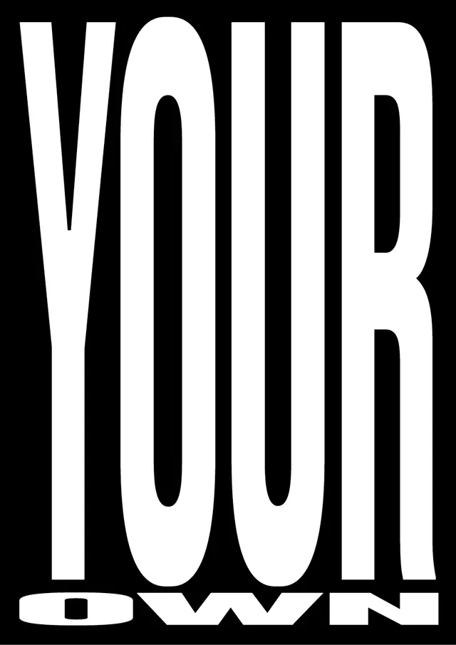 YOUR OWN Wordmark
 Typography Collage - Nobody Knows Why
 Typography Pattern - NOISE and VOICE
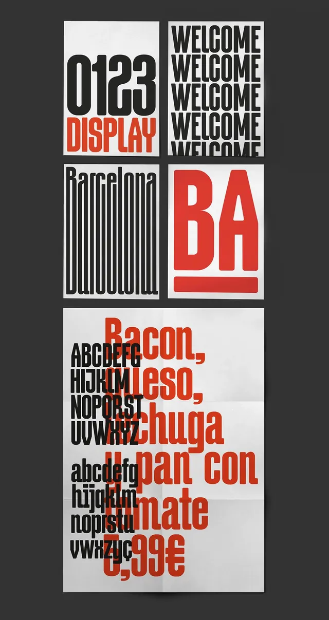 Swiss Typography and Grid Layout Study
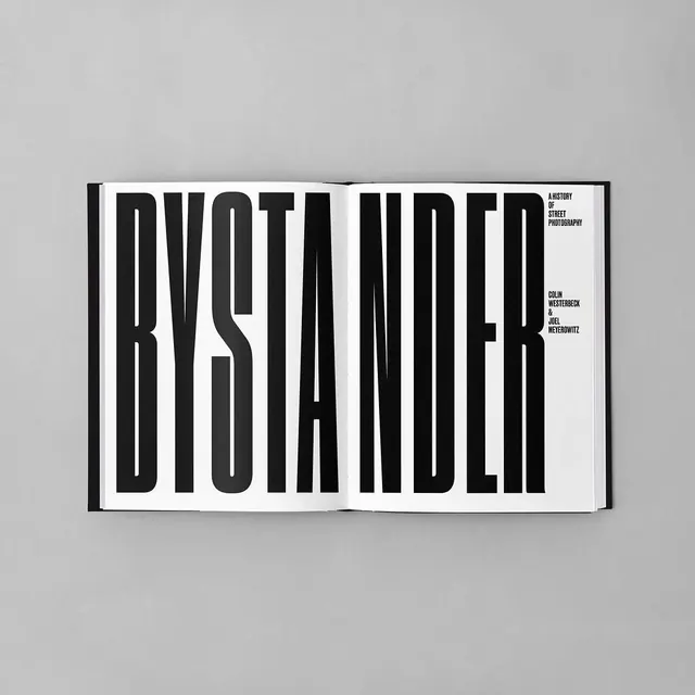 BYSTANDER Wordmark Design
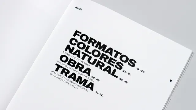 Typography Layout Design
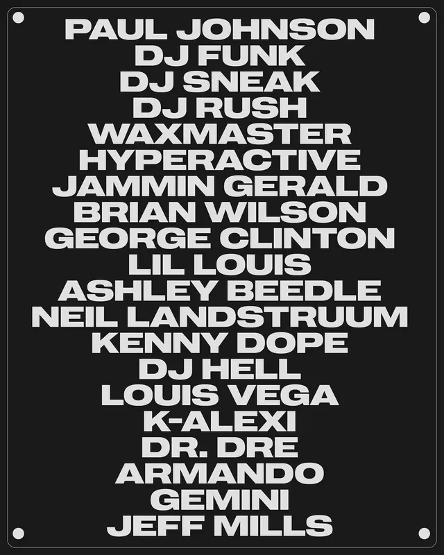 Typography List Design
 Japanese Calligraphy Typography Design
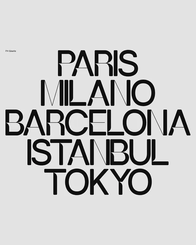 Typography Collage of Global Cities
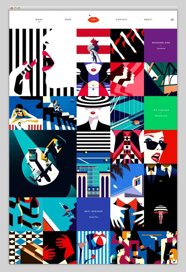 Graphic Design Style Reference Board