Lightyear Divider Section
A minimal section transition built from descending steel-grey stepped bars that lead the eye from a pale top into a near-black section below.

Summary
A full-bleed divider that hands off between two sections using a short staircase of grey horizontal bars descending into a dark band.
Visual description
The top two-thirds is a flat pale aqua field. Toward the bottom-left, three stacked horizontal bars step down from left to right in progressively darker steel greys, each shorter and lower than the last, forming a rough staircase. They resolve into a solid near-black band that fills the bottom of the frame edge to edge. No text, icons, or imagery appear; the whole effect is purely color and shape transitioning the page from light to dark.
Key takeaway
Using a few offset, progressively darker bars to physically "walk" the viewer from a light section into a dark one, a transition that reads as deliberate rather than an abrupt color cut. Pure geometry doing the work of a divider with zero copy.
Reuse notes
Reach for this when two adjacent sections clash in background tone and you want a graphic, on-brand handoff instead of a hard edge. Best when the brand already uses a stepped or angular motif. Carries no information, so place it only between content blocks, never as a standalone hero.
More like this
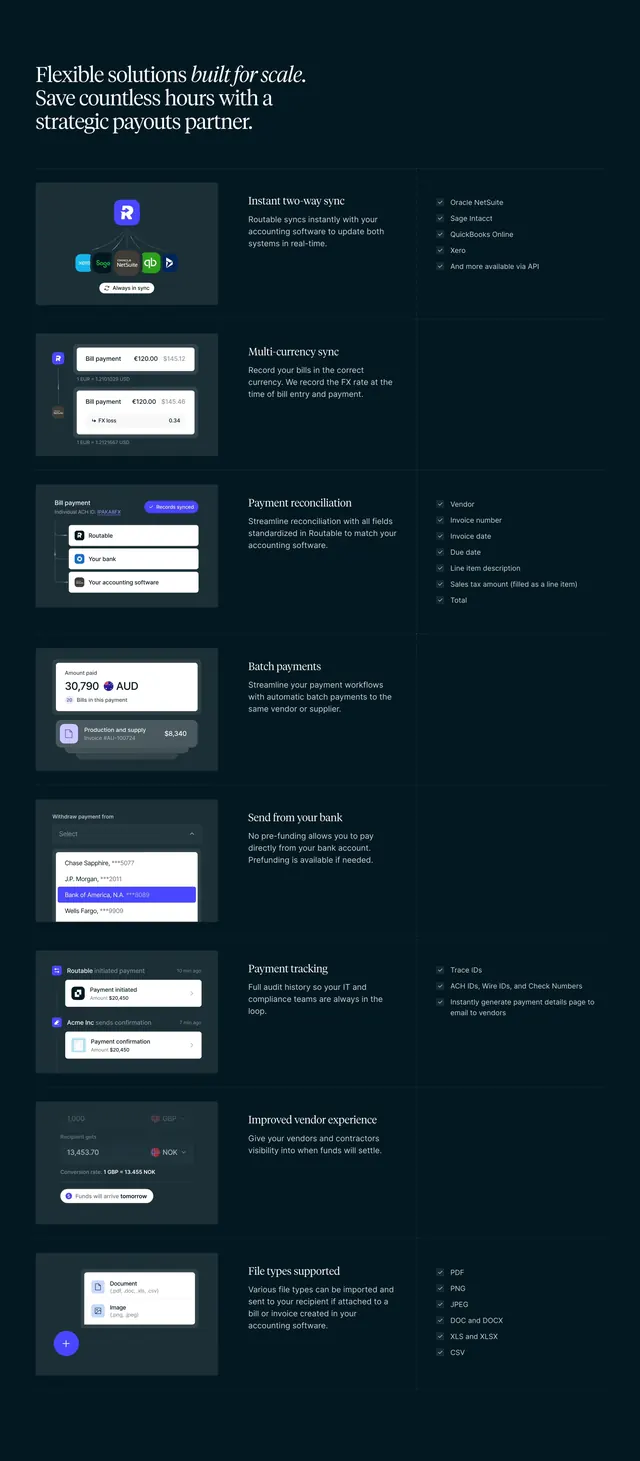 Routable built-for-scale feature list
 RevenueBase GTM teams value proposition
 Hiro halftone dot gradient divider
 Standard Fleet real-time visibility feature carousel
 The Grid supplier matching feature banner
 RevenueBase blueprint client logo grid
 Sketch design without distractions grid
 Lightyear Mission Statement Section
 Vooma platform feature split
 Noxus light hero with agent workflow card
 Antimetal top navigation bar
 Plain halftone dot-gradient divider
 Plain scalloped halftone edge divider
 Timescale Ship safer benefits section
 Canopy OS LoanLab beta feature
 Harmonic zig-zag section divider
 Sketch collaboration bento feature grid
 Routable CSV payments feature section
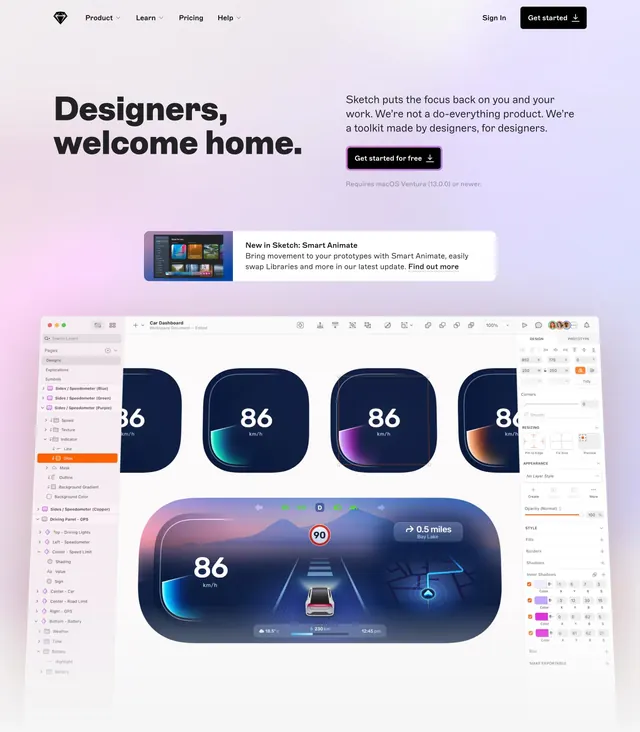 Sketch designers welcome home hero
 Canopy Features Section
 Canopy developer docs CTA band
 Canopy Connect dark docs CTA
 Laravel Cloud bento features with config mockups
 Reevo founders grid with geometric frames