Canopy Features Section
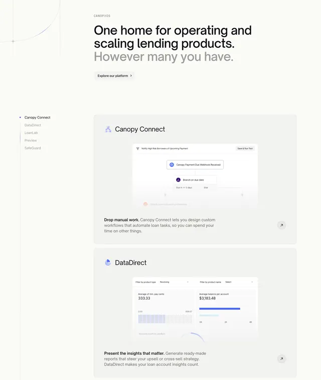
Light feature section with a sticky left nav of product modules and large stacked cards on the right showing product UI screenshots.
Summary
A light features section that anchors a sticky list of product modules on the left while large feature cards scroll on the right, each showing a real product screenshot. The defining structure is the sidebar-nav-plus-stacked-cards pairing.
Visual description
A grey "CANOPYOS" eyebrow tops a two-tone headline, "One home for operating and scaling lending products." in black with "However many you have." in light grey, followed by a small light "Explore our platform" pill with an arrow. A faint thin curve decorates the top-left corner. Below, a left column lists module names as a vertical nav (Canopy Connect highlighted with a dot, then DataDirect, LoanLab, Preview, SafeGuard in grey). The right side stacks large light rounded cards: a "Canopy Connect" card with a workflow-automation UI screenshot and a bold-lead-in caption ("Drop manual work."), and a "DataDirect" card with an analytics dashboard screenshot (filters, average balance figures, a bar chart) and its own caption. Each card has a small circular arrow button in its corner.
Key takeaway
The sticky module list that doubles as section navigation while the matching feature cards scroll past, tying name to screenshot. The bold-lead-in sentence opening each caption ("Drop manual work.") for a quick scannable hook before the explanation.
Reuse notes
Best for a multi-module platform where each product needs its own screenshot and short pitch. Requires genuine, legible product UI to fill the large cards. The sticky nav pattern shines on long scrolls but needs a sensible mobile fallback where the sidebar collapses.
More like this
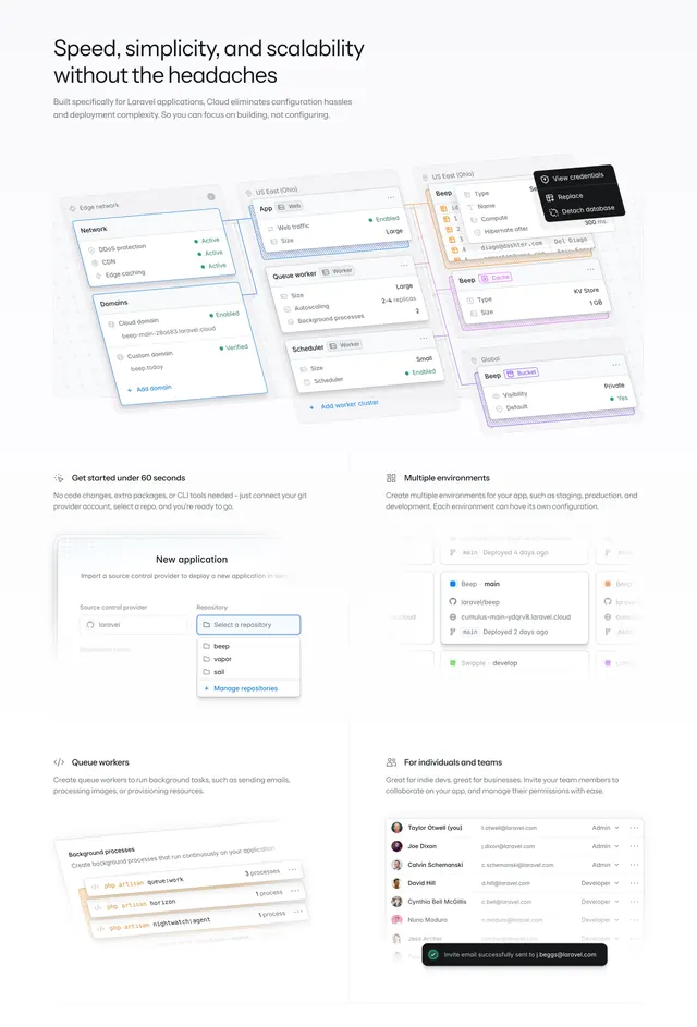 Laravel Cloud bento features with config mockups
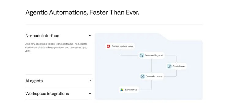 Noxus features with accordion and flow diagram
 Sierra consumer banking tabbed feature
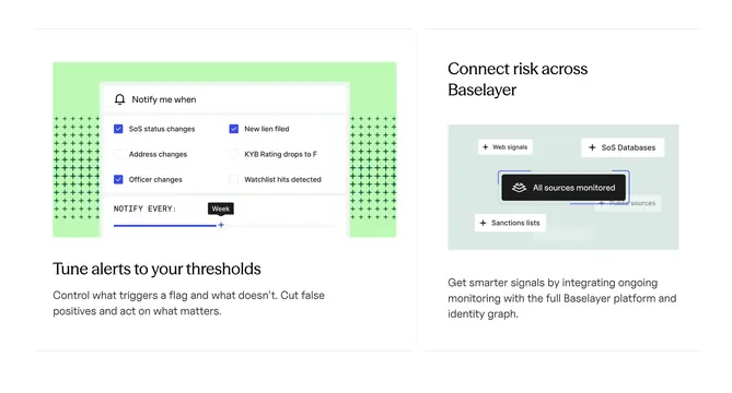 Baselayer risk alert tuning cards
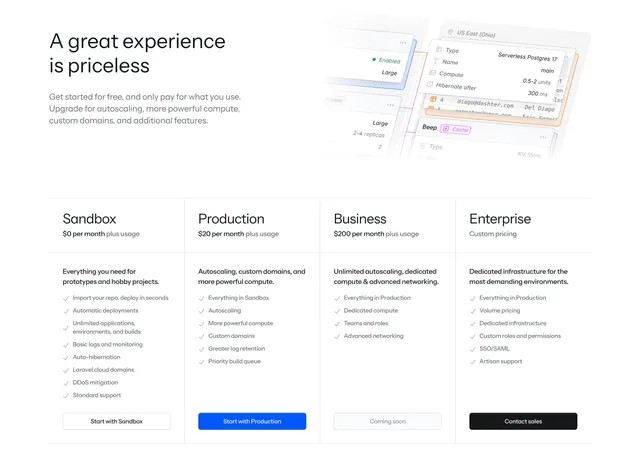 Laravel Cloud four-tier pricing with mockup header
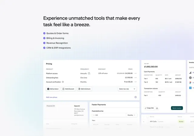 Sequence product capabilities UI collage
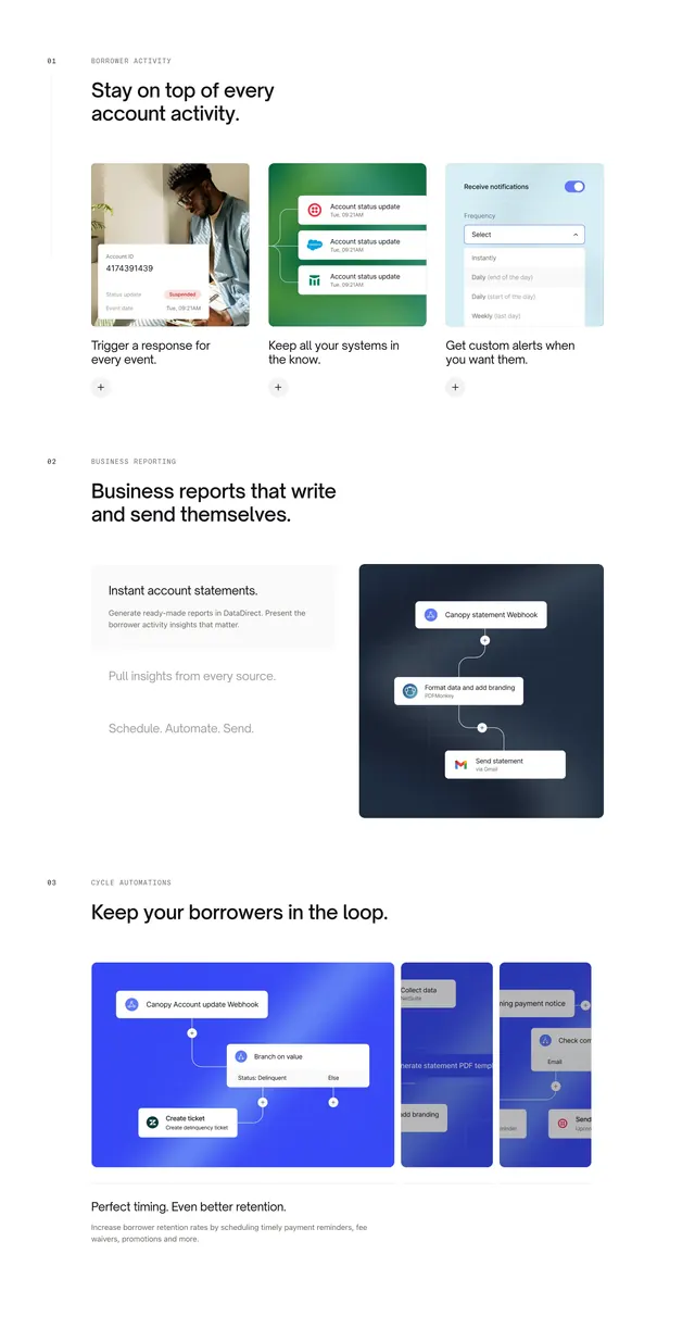 Canopy Connect numbered feature sections
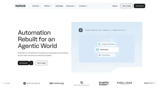 Noxus light hero with agent workflow card
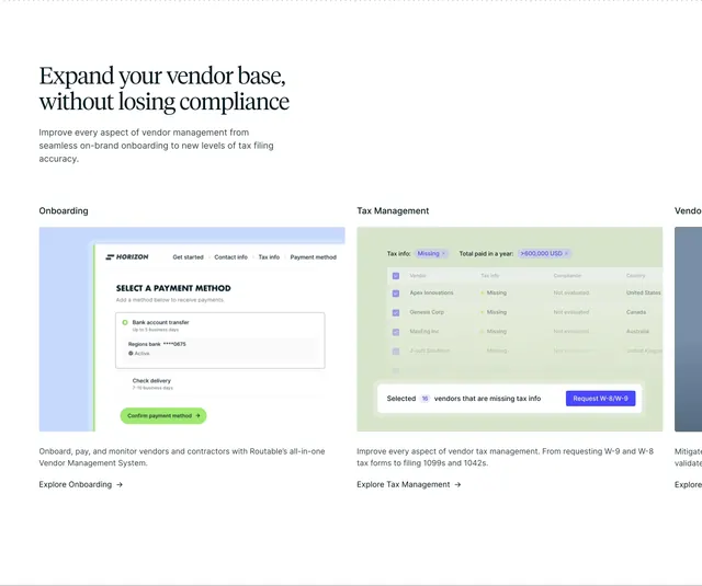 Routable vendor management features
 Standard Fleet real-time visibility feature carousel
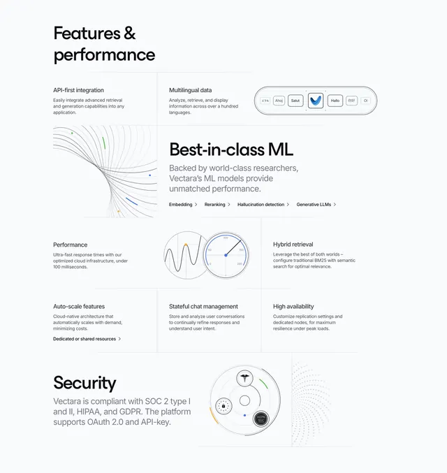 Vectara Features Section
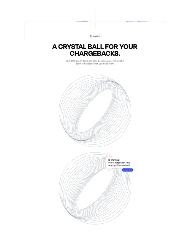 Chargeflow insights wireframe spheres hero
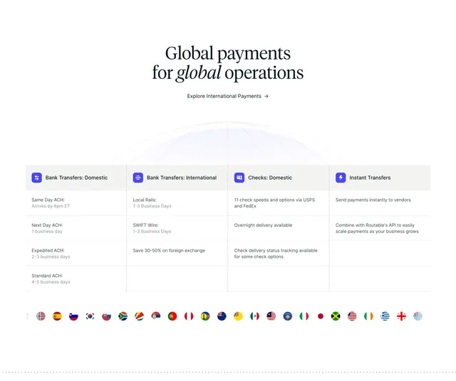 Routable global payments grid
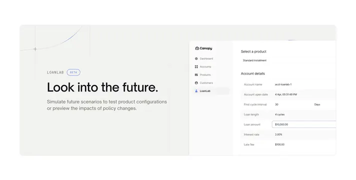 Canopy OS LoanLab beta feature
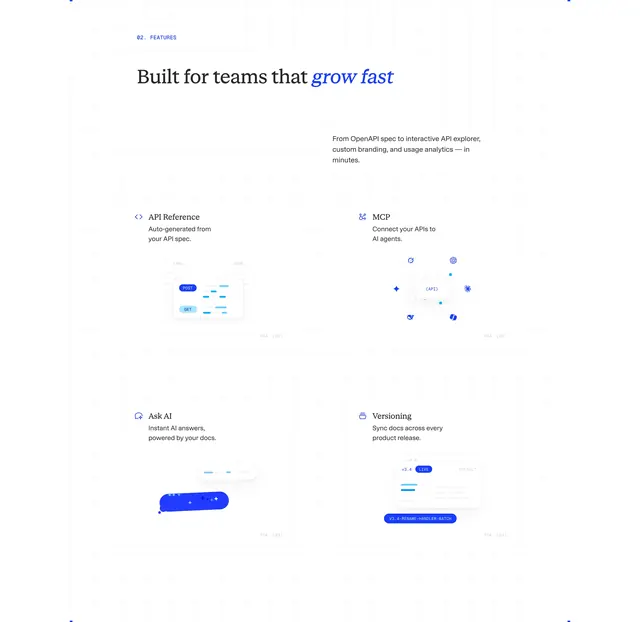 ReadMe four-feature blueprint grid
 Parloa customer relationship split feature
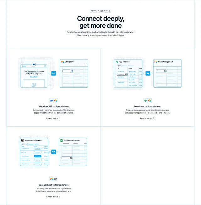 Whalesync popular use cases with sync diagrams
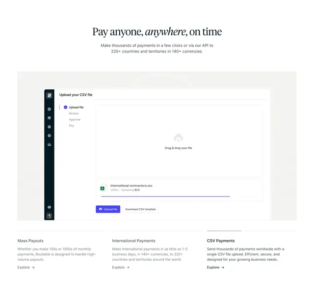 Routable CSV payments feature section
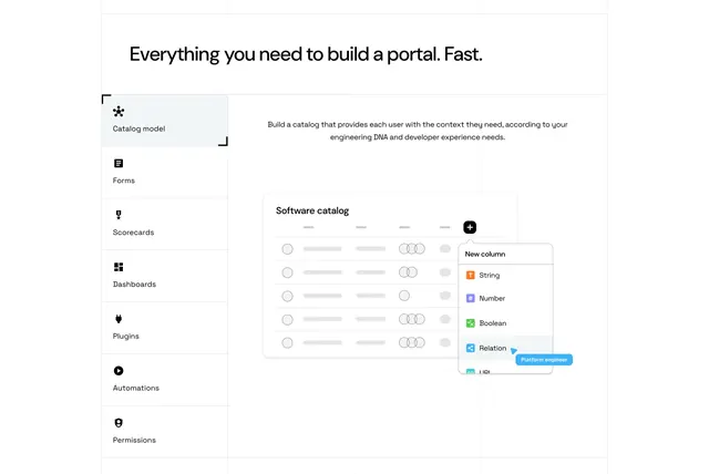 Port tabbed feature section with vertical menu and catalog mockup
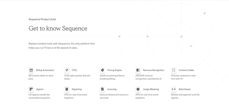 Sequence product suite icon grid with radar graphic
 Antimetal top navigation bar
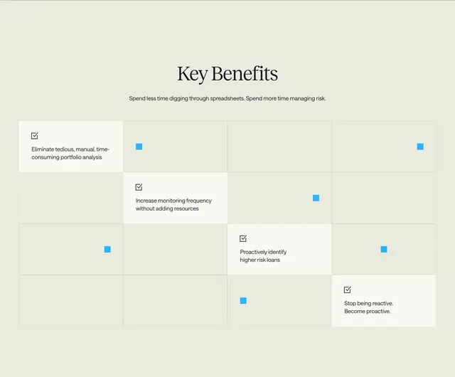 Lumos key benefits diagonal grid
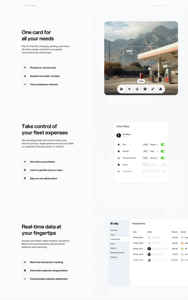 Rally stacked split feature sections with UI mockups
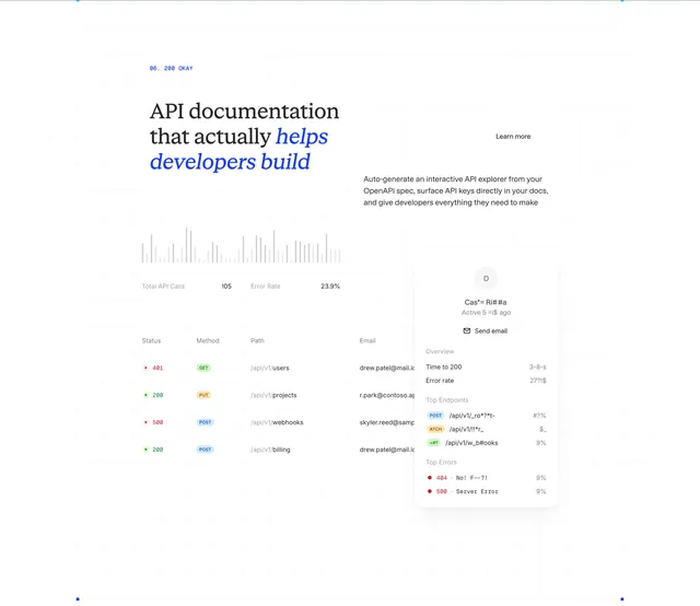 ReadMe API docs analytics bento feature