Jasper Features Section
Split feature section with a tabbed accordion list on the left and a live product screenshot on the right, set on a lavender dotted panel.
Summary
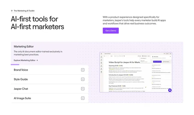
A feature-detail block where a left-hand list of expandable feature tabs (Brand Voice, Style Guide, Jasper Chat, AI Image Suite) drives a large product screenshot on the right, all seated on a soft lavender dotted panel. The interactive list-to-preview pairing is the point.
Visual description
A split header runs an oversized two-line black headline "AI-first tools for AI-first marketers" on the left against an intro paragraph and a filled violet "Get a Demo" button on the right, under a small "The Marketing AI Toolkit" eyebrow. Below sits a wide rounded panel with a pale lavender fill and a faint dot texture. Its left half opens with a "Marketing Editor" title, a short description, and an "Explore Marketing Editor" link, with a violet progress underline marking the active item; beneath are four stacked rows (Brand Voice, Style Guide, Jasper Chat, AI Image Suite) each with a chevron toggle. The right half shows a detailed Jasper editor screenshot with a document, toolbar, and a Style Guide panel flagging grammar violations.
Key takeaway
Wiring a vertical list of feature tabs to a single large preview lets one section showcase several capabilities without stacking many screenshots. The violet progress underline on the active row signals an auto-advancing or selectable sequence. The dotted lavender panel softly contains both halves and gives the screenshot a branded frame.
Reuse notes
Use when several related features each deserve a real product view but you want to conserve vertical space. Needs genuinely legible, high-quality screenshots to carry the right half. The tinted panel ties it to a brand color; swap the fill to match your palette, and keep the active-state cue obvious so users know the list is interactive.
More like this
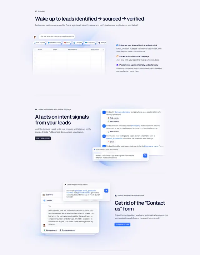 Godmode Features Section
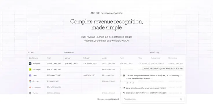 Sequence ASC 606 revenue table with AI agent overlay
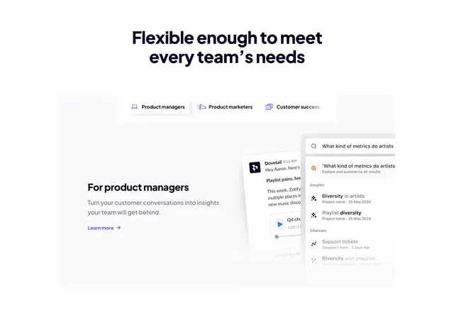 Dovetail audience-tabbed feature with floating search UI
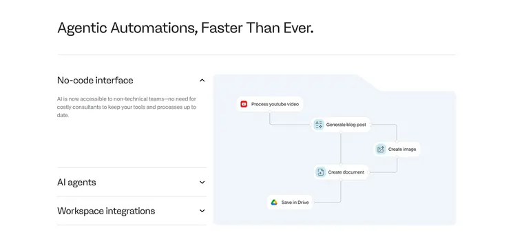 Noxus features with accordion and flow diagram
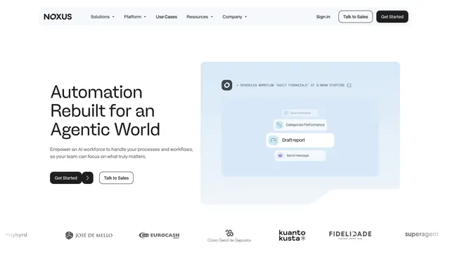 Noxus light hero with agent workflow card
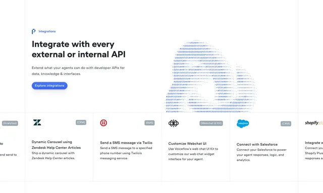 Voiceflow Integrations Section
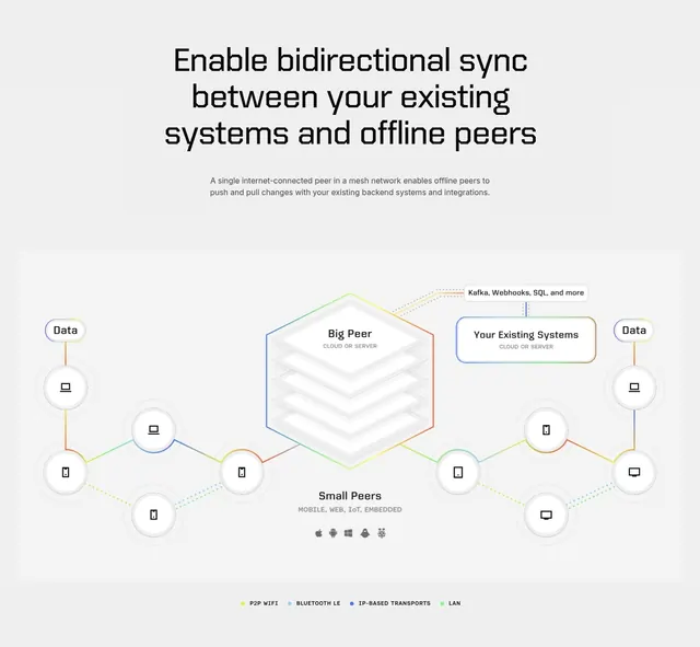 Ditto bidirectional sync architecture diagram
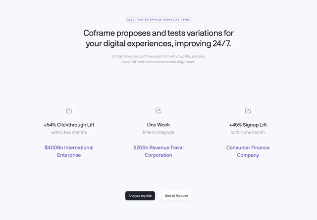 Coframe stat-driven value proposition with 3-column grid
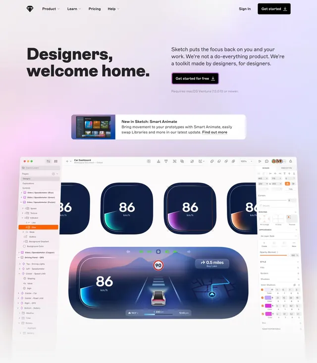 Sketch designers welcome home hero
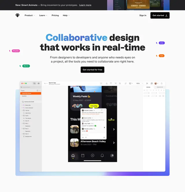 Sketch real-time collaboration hero
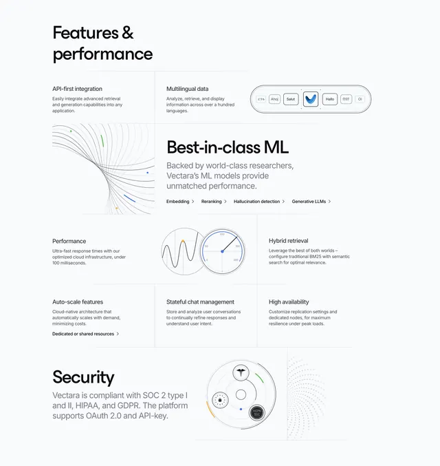 Vectara Features Section
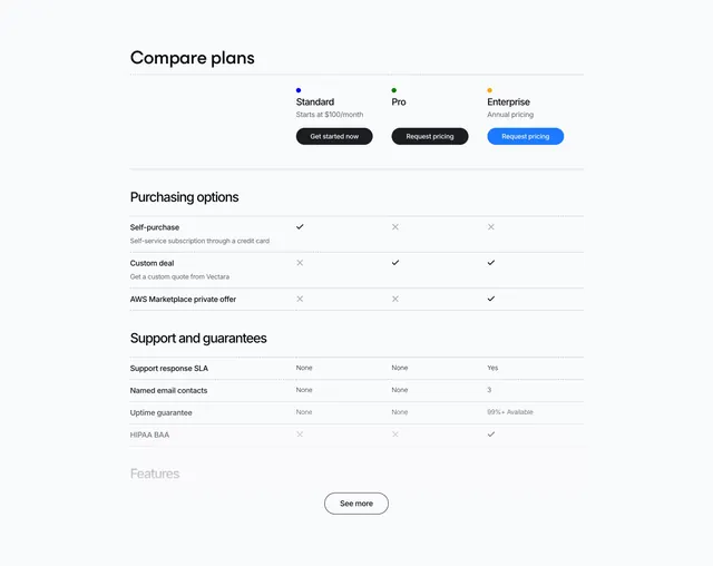 Vectara Pricing Table Section
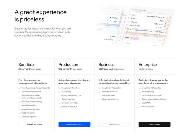 Laravel Cloud four-tier pricing with mockup header
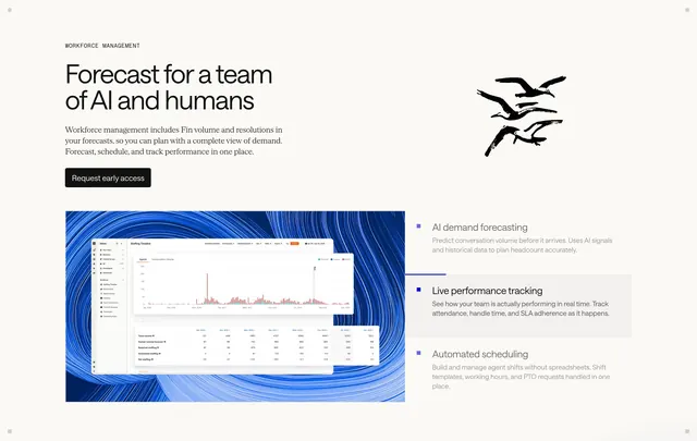 Intercom workforce management feature
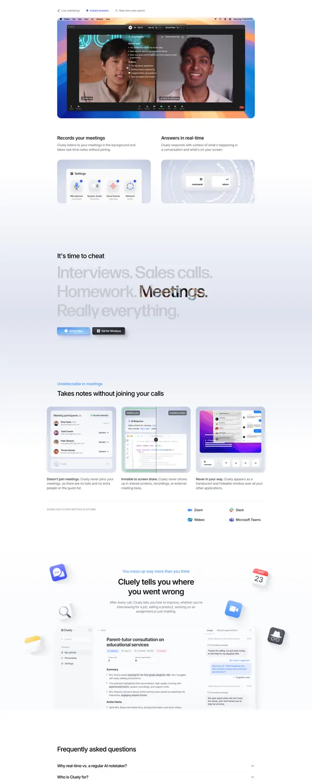 Cluely landing page
 Vectara CTA Section
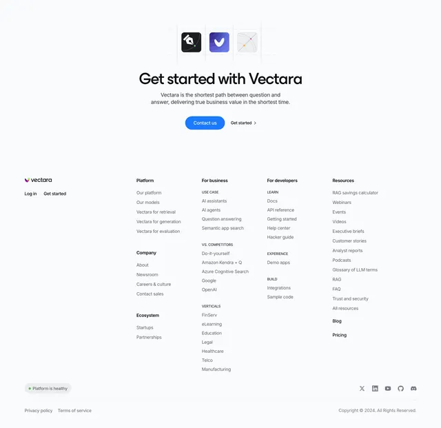 Vectara Footer Section
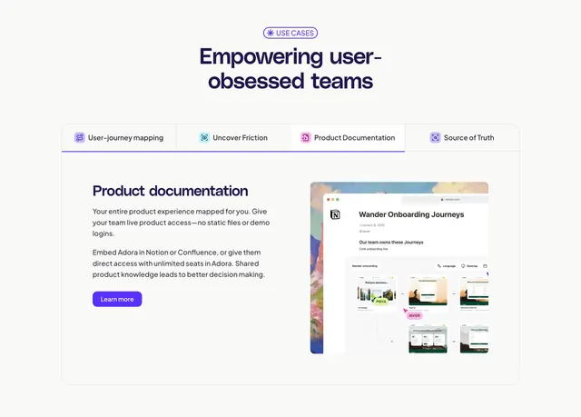 Adora tabbed feature detail with Notion mockup
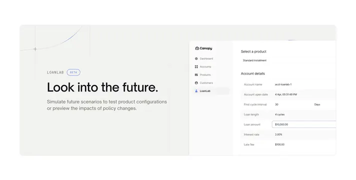 Canopy OS LoanLab beta feature
 Exante AI contract-intelligence hero
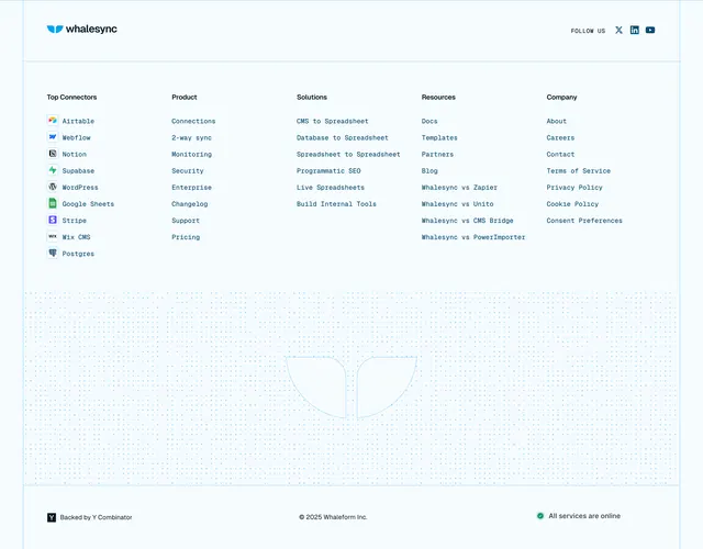 Whalesync technical footer with whale watermark
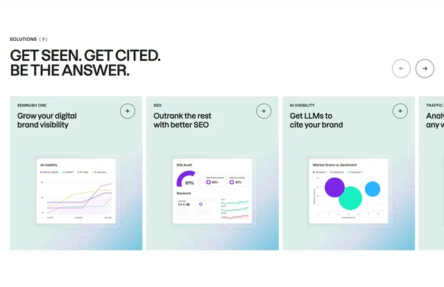 Semrush solutions product carousel
 Orshot Hero Section
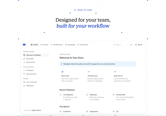 ReadMe team workflow docs hub preview