DevRev Features Section (Audience Cards on Blue)
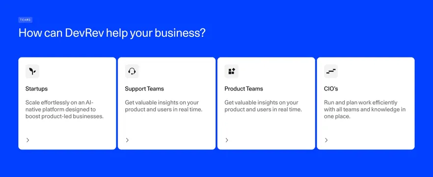
Bold cobalt-blue features section with a white headline and four white audience cards, each with a small icon, title, short copy, and a chevron link.
Summary
A high-saturation cobalt-blue features section presenting four equal white cards, each segmented by audience (Startups, Support Teams, Product Teams, CIO's), with a small icon, title, short copy, and a chevron link. The flat blue field behind crisp white cards is what makes it pop.
Visual description
A solid bright cobalt-blue background fills the section. Top left, a small "TEAMS" pill label sits above a large white headline ("How can DevRev help your business?"). Below, four equal white rounded cards run in a single row. Each card has a light-grey rounded icon tile at the top left holding a simple black glyph, then a black title (Startups, Support Teams, Product Teams, CIO's), two or three lines of grey body copy, and a small black chevron arrow in the lower left signaling a link. The cards share equal height with generous internal padding.
Key takeaway
A single saturated brand color as a full-bleed background makes plain white cards feel energetic and on-brand with zero extra decoration. Segmenting features by audience persona rather than by feature lets visitors self-select, and the consistent icon-tile plus chevron pattern keeps four cards perfectly uniform.
Reuse notes
Great for a "who it's for" or solutions-by-persona block when you have a strong brand color to commit to. The intensity depends on that color being genuinely vivid; a muted background would make it look flat. Easy to extend or shrink the card count. Works in light mode and reads well against neighboring white sections.
More like this
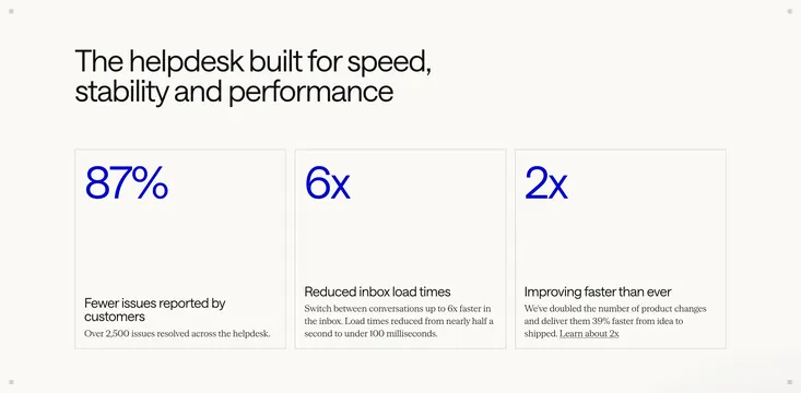 Intercom helpdesk performance stats
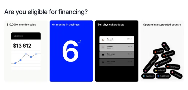 Wayflyer financing eligibility four-card grid
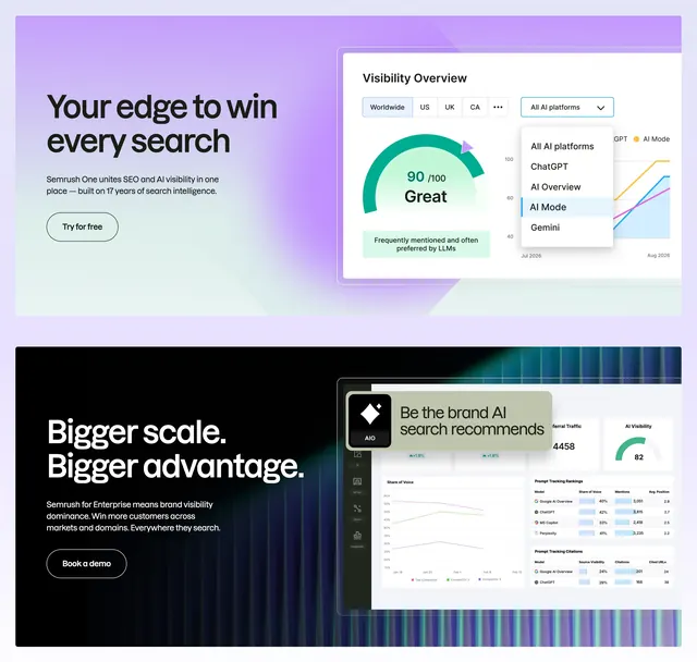 Semrush AI search dual feature
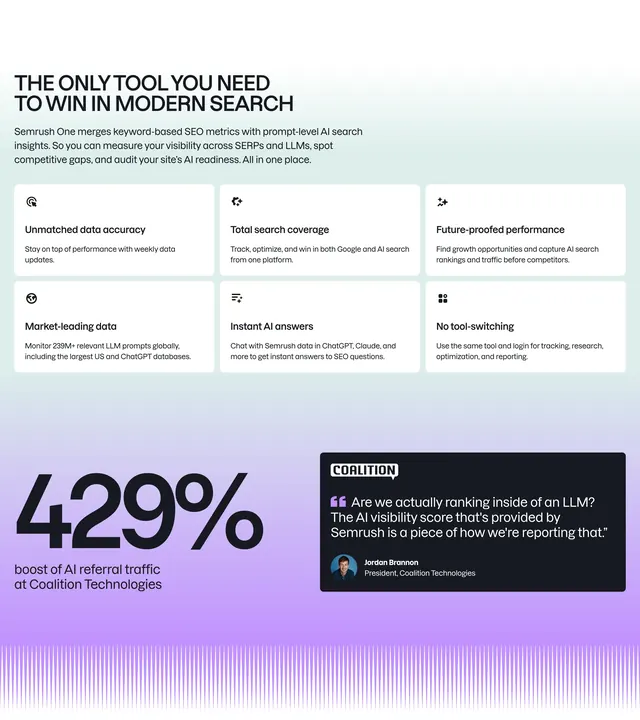 Semrush One value proposition grid
 Response Footer Section
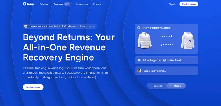 Loop Hero Section
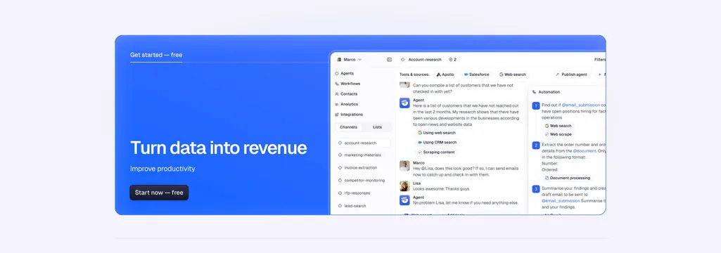 Godmode CTA Section
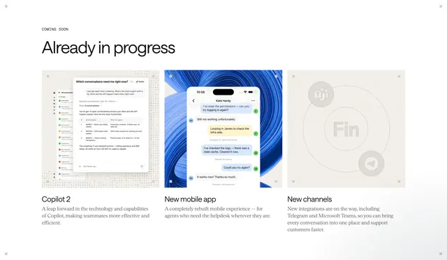 Intercom coming soon roadmap grid
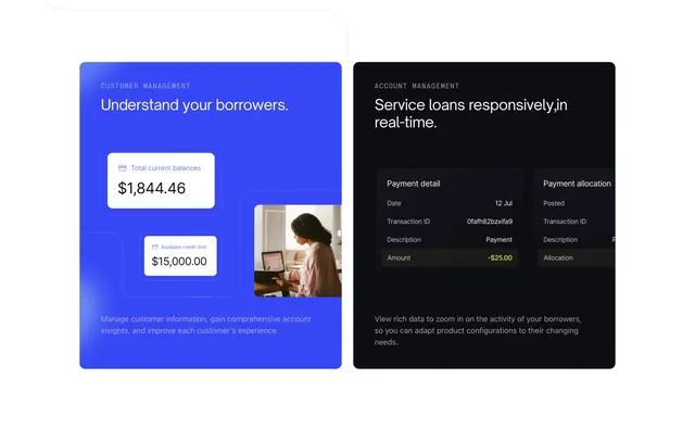 Canopy OS dual feature cards
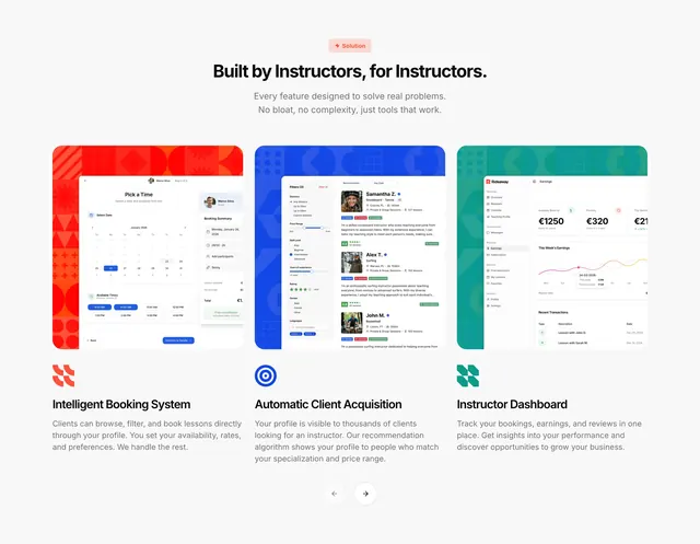 Rideaway instructor feature showcase
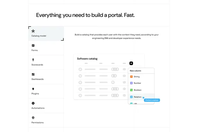 Port tabbed feature section with vertical menu and catalog mockup
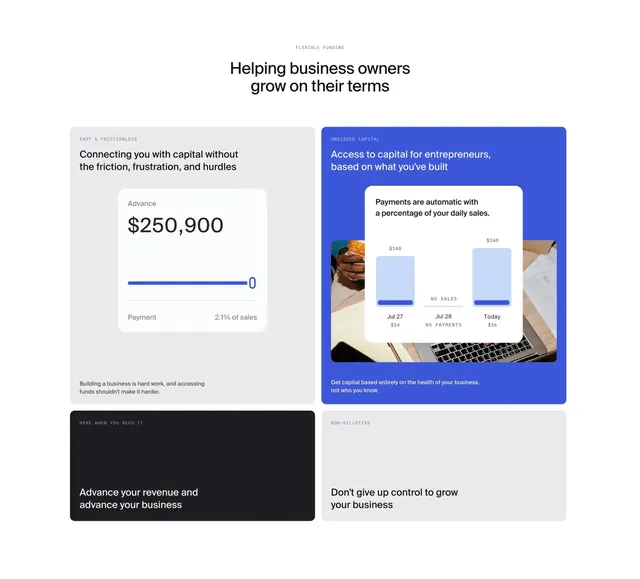 Pipe flexible funding bento grid
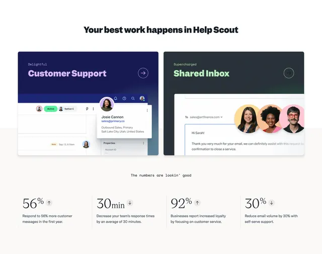 Help Scout feature cards with stats row
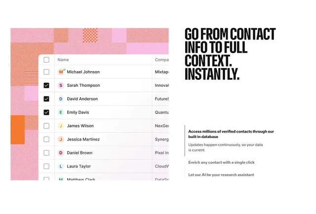 Reevo contact enrichment list feature
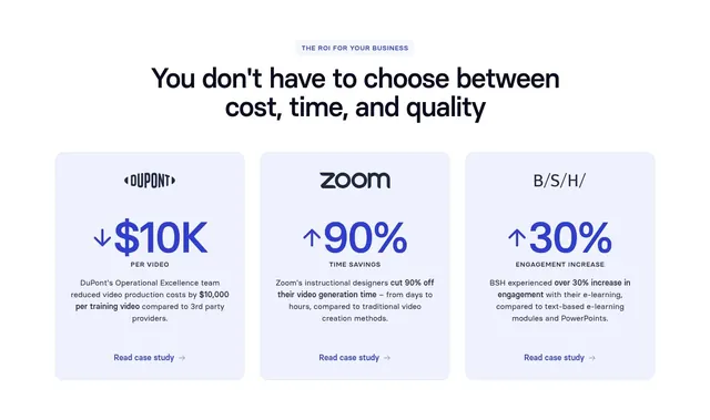 Synthesia Value Proposition Section (ROI stats)
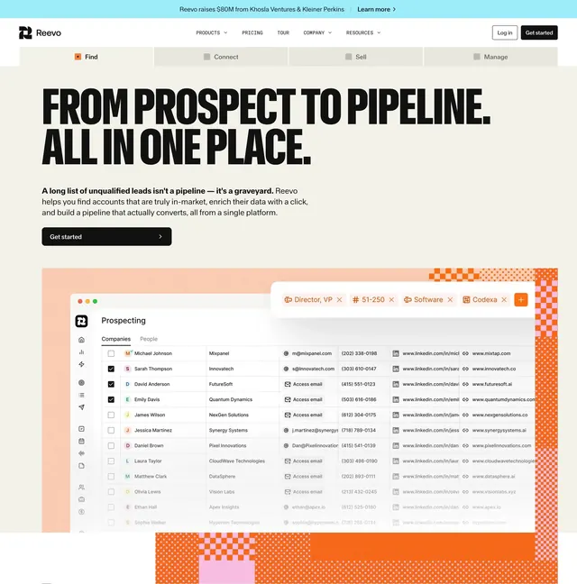 Reevo prospect to pipeline hero
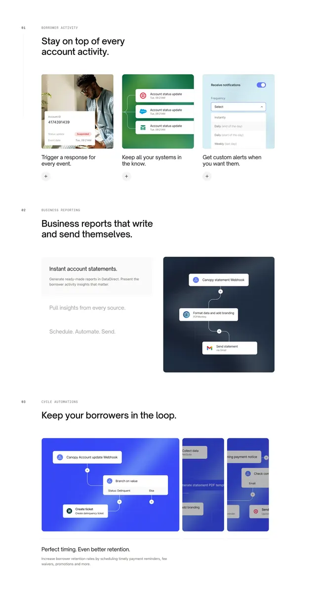 Canopy Connect numbered feature sections
 Attio blue dream CRM CTA card
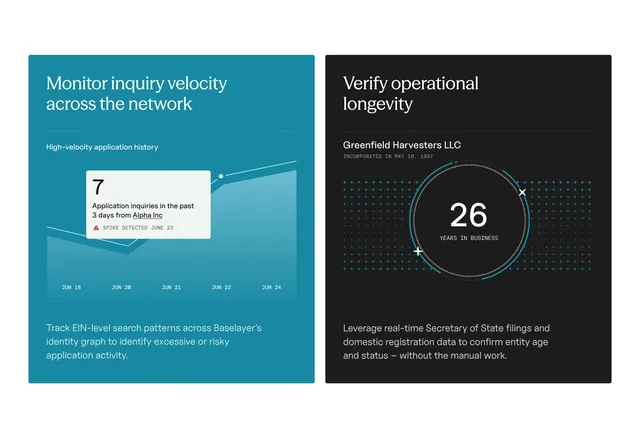 Baselayer inquiry velocity and longevity cards
 Wayflyer financing gradient CTA banner
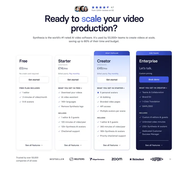 Synthesia Pricing Section
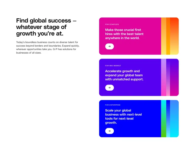 Globalization Partners solution page section business sizes
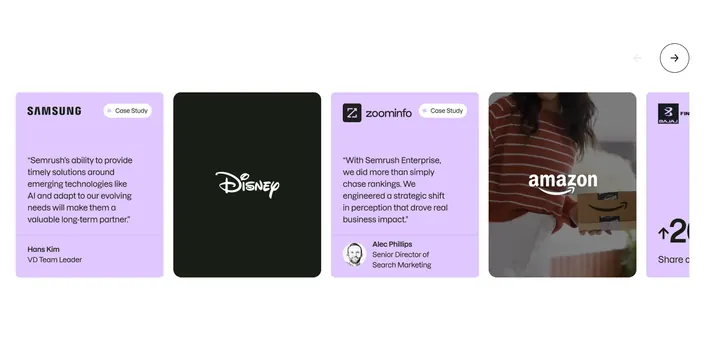 Semrush mixed testimonial carousel
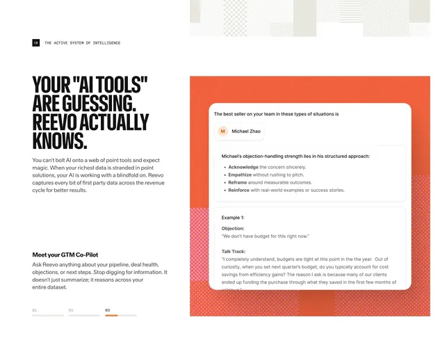 Reevo GTM co-pilot objection handling card