Cowlendar Features Section
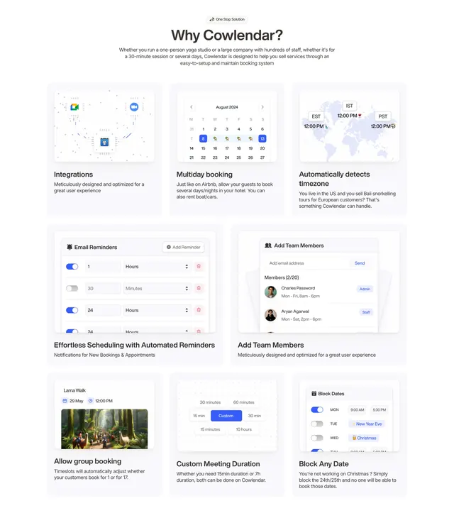
Light bento-style features grid where eight cards pair a heading and copy with a small product UI mockup of each capability.
Summary
A light bento-grid features section where a centered badge and heading sit above eight cards, each combining a short benefit heading, a line of copy, and a small mock UI illustrating that specific feature. Each card carrying its own miniature product UI is the defining device.
Visual description
Light grey background. Centered top: a small "One Stop Solution" pill badge, a dark heading "Why Cowlendar?", and a three-line grey supporting paragraph. Below, a bento grid of light rounded cards in uneven sizes. The top row of three cards shows: an integrations diagram with floating app logos and connector lines; an "August 2024" calendar widget with selected dates and emoji markers; and a world map with three timezone clocks (EST, IST, PST). A middle row of two wider cards shows an email-reminders UI with blue toggle rows and dropdowns, and an "Add Team Members" panel with an email input, send button, and member avatars. A bottom row of three cards shows a group-booking card with a forest photo, a custom meeting-duration selector with time pills, and a "Block Dates" panel with day toggles and holiday tags. Each card has its mockup on top and a bold heading plus grey description below.
Key takeaway
Giving every feature card its own purpose-built mini UI rather than generic icons, so the grid demonstrates the product capability by capability. The varied bento sizing keeps eight cards from feeling like a monotonous matrix.
Reuse notes
Strong for feature-rich consumer SaaS and app-store products that need to show many capabilities at once. Each mockup must be custom and legible, which is production-heavy. Light, friendly palette with a blue accent. The bento sizing requires planning which features deserve the larger cells.
More like this
 Cowlendar CTA Section
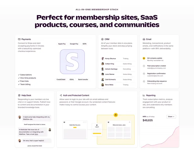 Outseta all-in-one membership feature bento
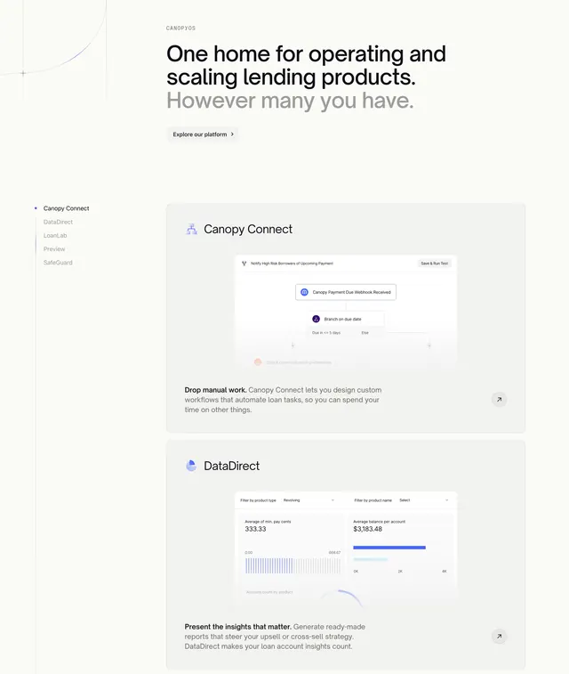 Canopy Features Section
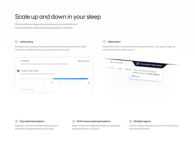 Laravel Cloud autoscaling feature split
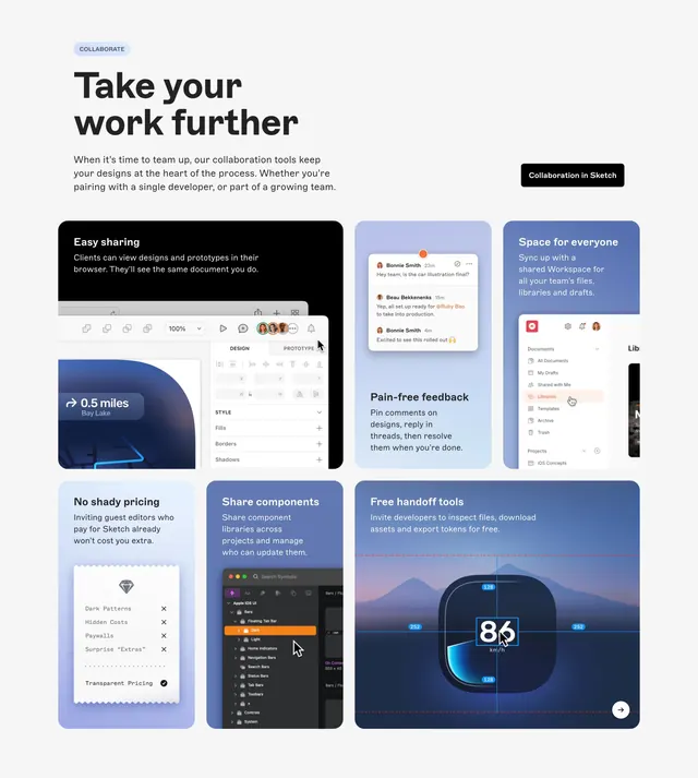 Sketch collaboration bento feature grid
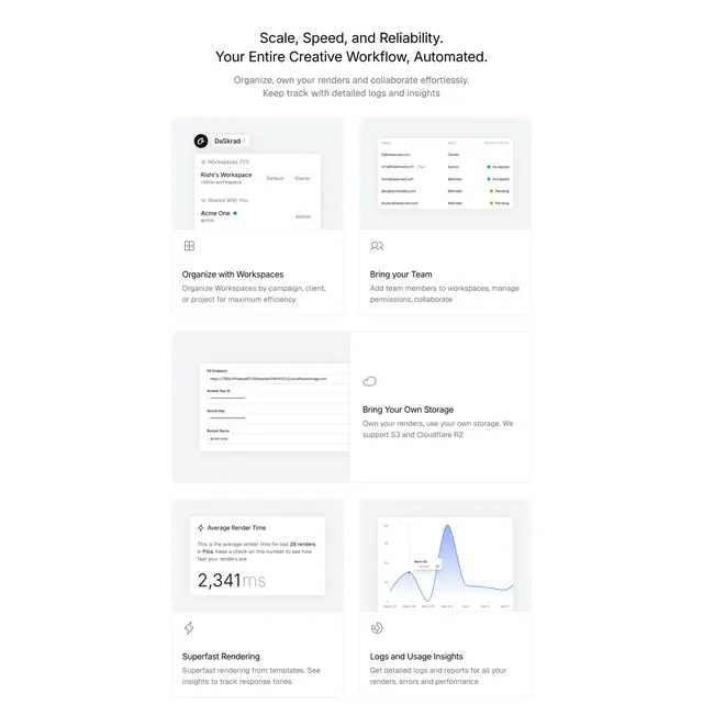 Orshot Features Section
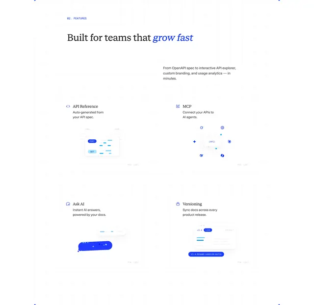 ReadMe four-feature blueprint grid
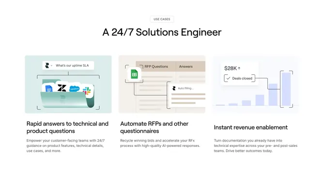 Realm three-column use-case features
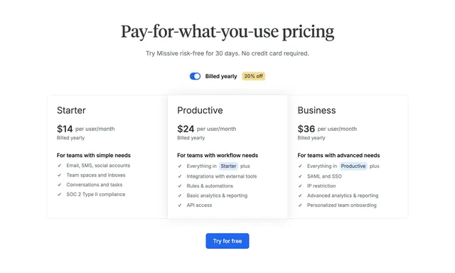 Missive light three-tier pricing with serif headline and yearly toggle
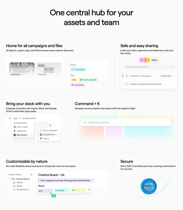 Focal bento features grid with UI mockups
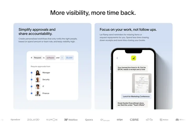 Ramp approvals and follow-ups dual cards
 Monica Hero Section
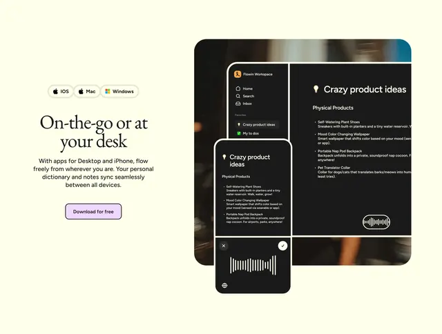 Flow cross-platform availability feature section
 Cap "Crafted for simplicity" feature row
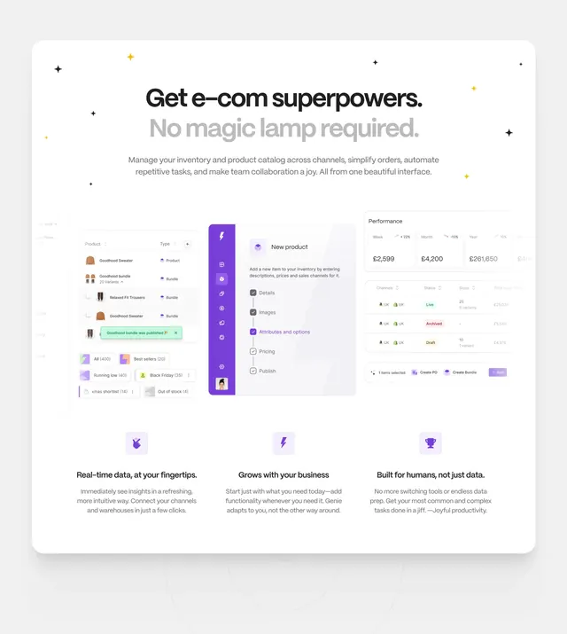 Genie e-commerce features with UI collage
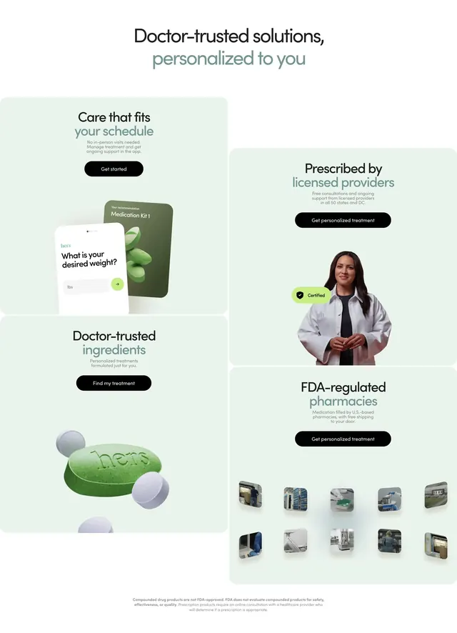 Hers doctor-trusted bento benefits grid
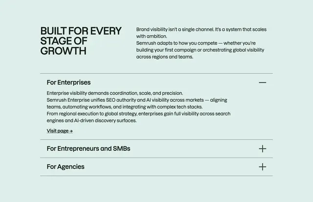 Semrush growth-stage accordion
 Cowlendar FAQs Section
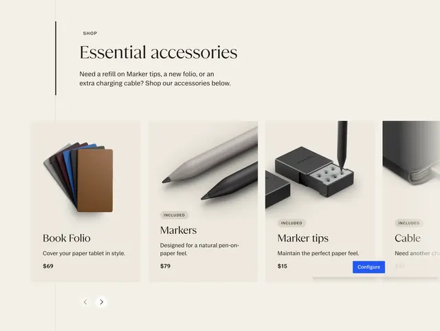 reMarkable essential accessories carousel
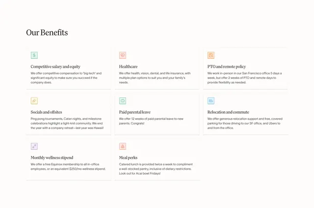 Conversion careers benefits grid
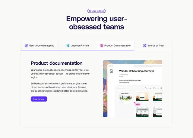 Adora tabbed feature detail with Notion mockup
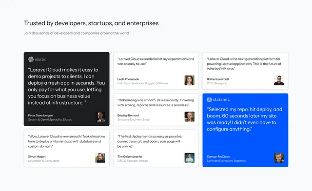 Laravel Cloud bento testimonial grid
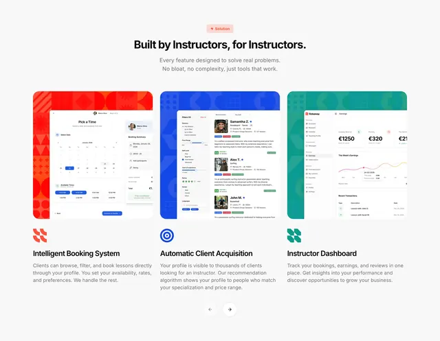 Rideaway instructor feature showcase
 Merchlink purple card footer