Google Fitbit design palette study
A structured color palette grid showing the complete color system for Google Fitbit, progressing from dark navy through light blue to warm tones.

Summary
A structured color palette grid showing the complete color system for Google Fitbit, progressing from dark navy through light blue to warm tones.
Visual description
The image shows a structured color palette grid showing the complete color system for google fitbit, progressing from dark navy through light blue to warm tones. with a clear focus on composition and visual hierarchy. Colors are rendered in cool, gradient, light tones, creating a professional aesthetic.
Key takeaway
The primary design principle demonstrated here is the use of technical design coupled with professional, technical visual presentation, making it suitable as a reference for similar design challenges.
Reuse notes
This asset works well in design systems focused on professional, technical communications. Consider pairing with similar cool, gradient, light palettes for coherent visual language.
More like this
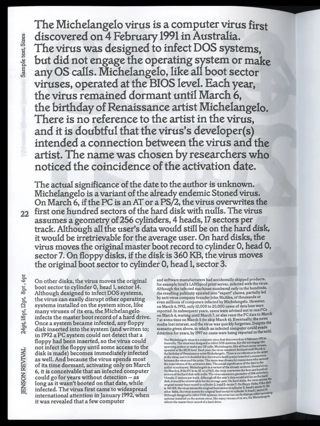 Jenson Revival type specimen and documentation (slide 7)
 Typography specimen Matter typeface
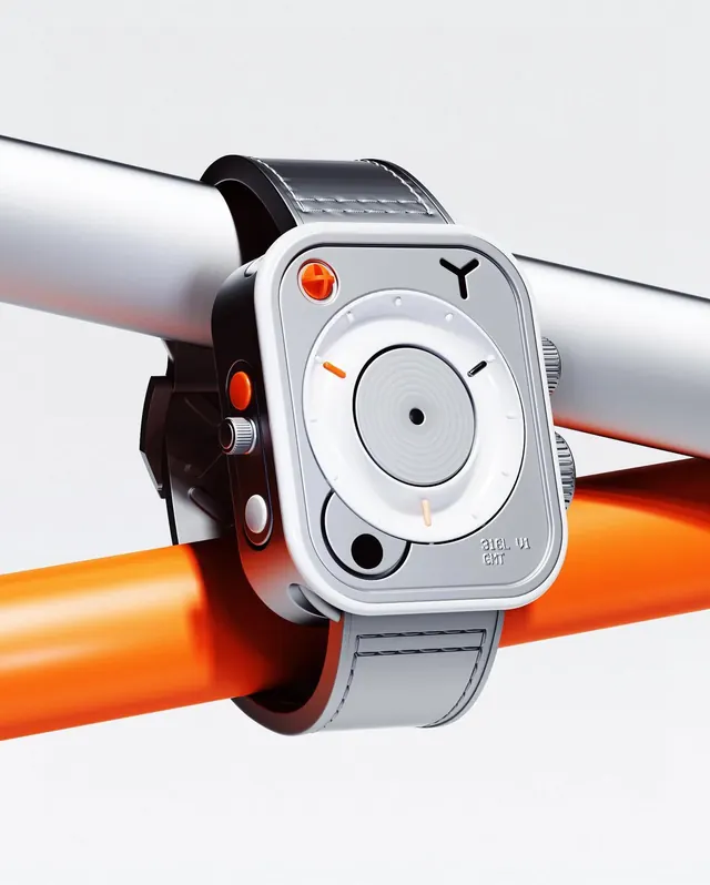 Futuristic Watch-Like Device Render
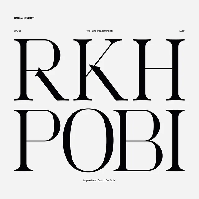 Hardal Studio RKH POBI type specimen
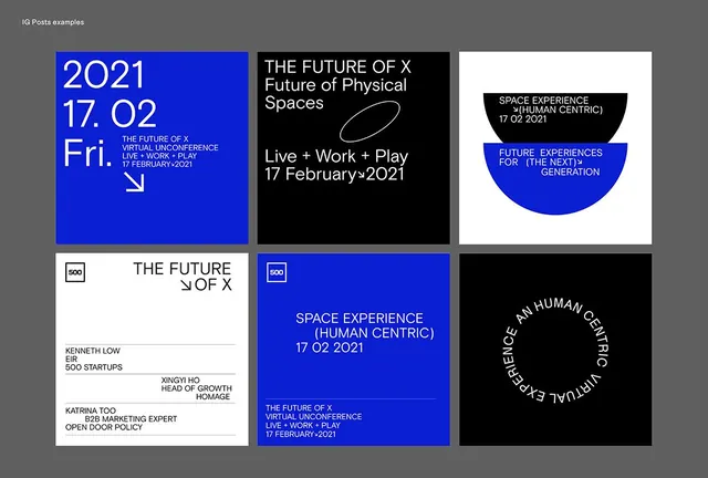 The Future of X conference poster grid
 Base44 app UI and testimonial motion piece (slide 2)
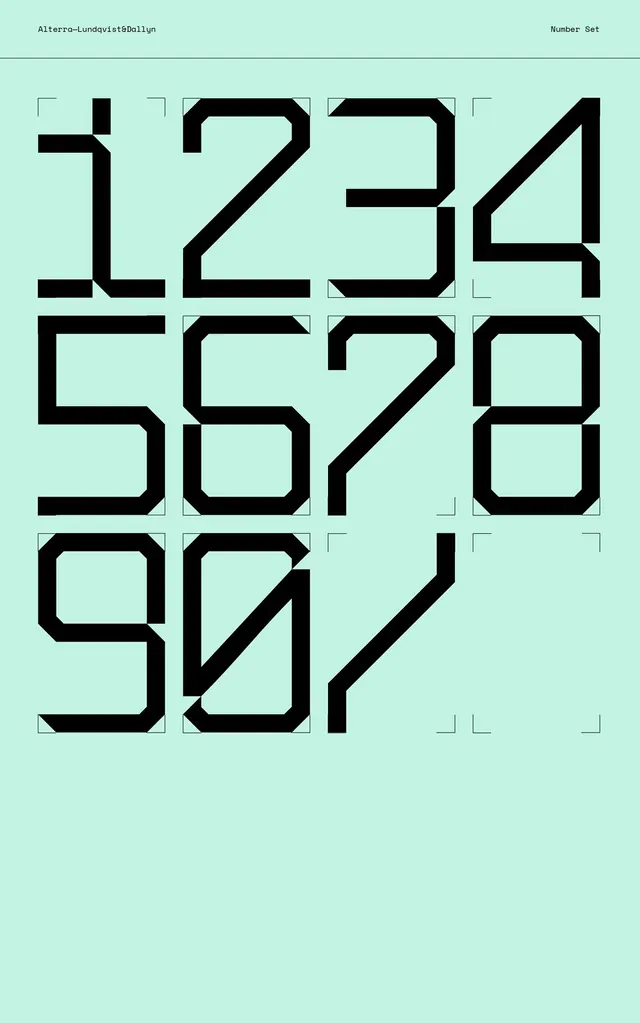 Geometric numerals type specimen with corner accents
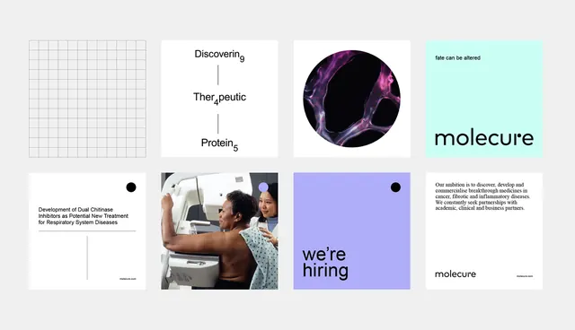 Scientific branding grid with purple and teal accents
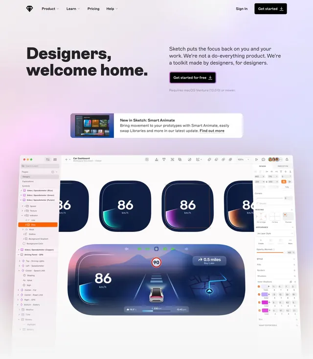 Sketch designers welcome home hero
 Brand identity system showcase
 Technical diagram with structured hierarchy
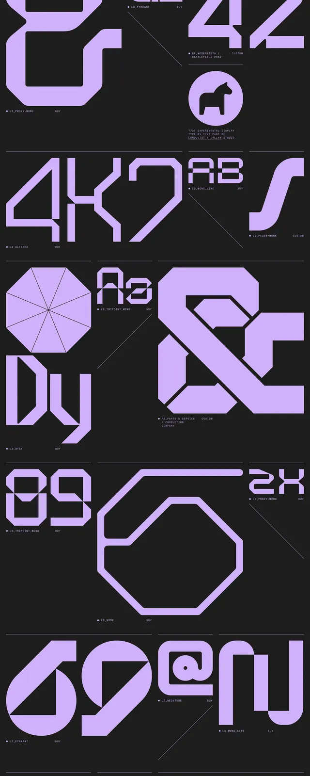 Modular lavender type specimen sheet
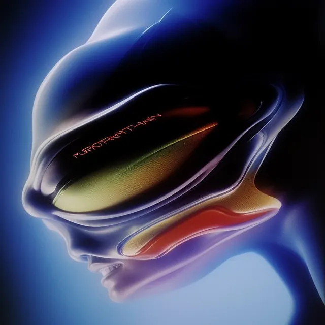 Murorhythm sci-fi visor head render
 Grove AI PRM integration hub hero
 Digital interface design mockup
 Abstract Blue Data Visualization
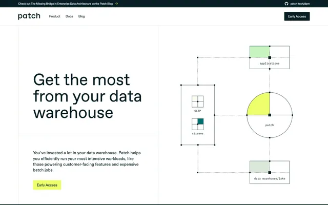 Patch data warehouse hero
 IBM simulation 3D motion graphics carousel (slide 2)
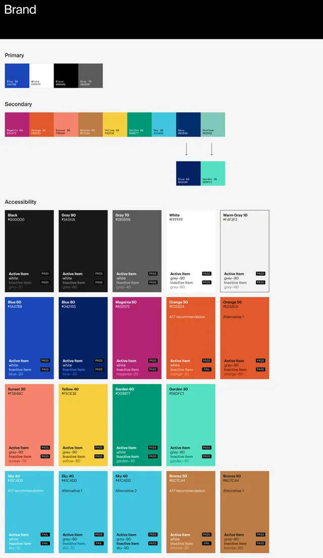 Getty 2020 brand color palette specification
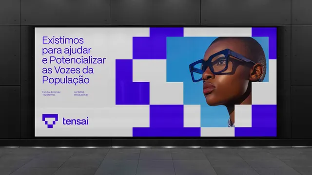 Social advocacy poster with deep purple geometric grid and portrait
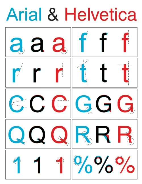 Arial & Helvetica Type Specimen
 Blue geometric grid typography overlay
 Electric blue abstract type specimen
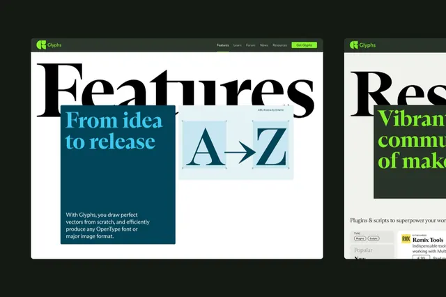 Corporate-clean minimal abstract graphic