Brand identity system showcase
Comprehensive visual demonstration of a brand's identity system including color, typography, and application patterns.

Summary
A systematic showcase of a comprehensive brand identity, demonstrating color palette, typography, and component applications across different contexts.
Visual description
Grid-based layout showcasing brand elements in modular format. Components are organized systematically to show consistency and variation. The presentation uses the brand's own palette and typography to demonstrate application.
Key takeaway
Systematic presentation of brand identity through modular organization and consistent application. This approach shows how design systems maintain coherence across variations.
Reuse notes
Perfect for brand guideline documentation, design system portfolios, and brand identity case studies. The systematic grid layout makes it ideal for showing component libraries and design patterns.
More like this
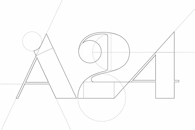 A24 logo construction diagram
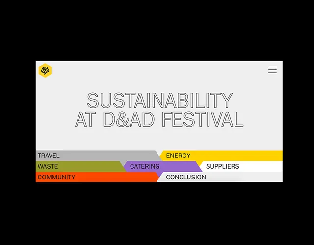 Segmented rainbow-bar sustainability infographic
 Minimalist Architectural Design Composition
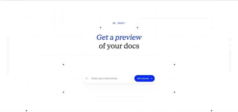 ReadMe docs preview email CTA
 Code editor UI with soft gradient and music player overlay
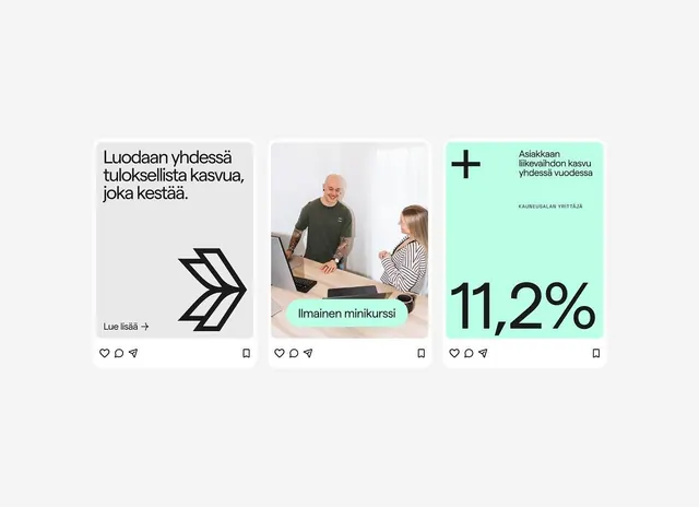 Three Finnish social cards with teal accents
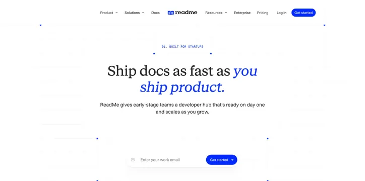 ReadMe startup ship docs hero
 Runlayer AI risks four-column callouts
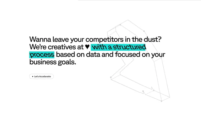 Riotters bold statement with cyan highlight
 Raycash fintech brand identity and motion design (slide 2)
 REFORMR Pilates studio brand identity carousel (slide 9)
 Pastel stacked shapes composition
 Typography specimen Matter typeface
 Jimo flow editor bento features
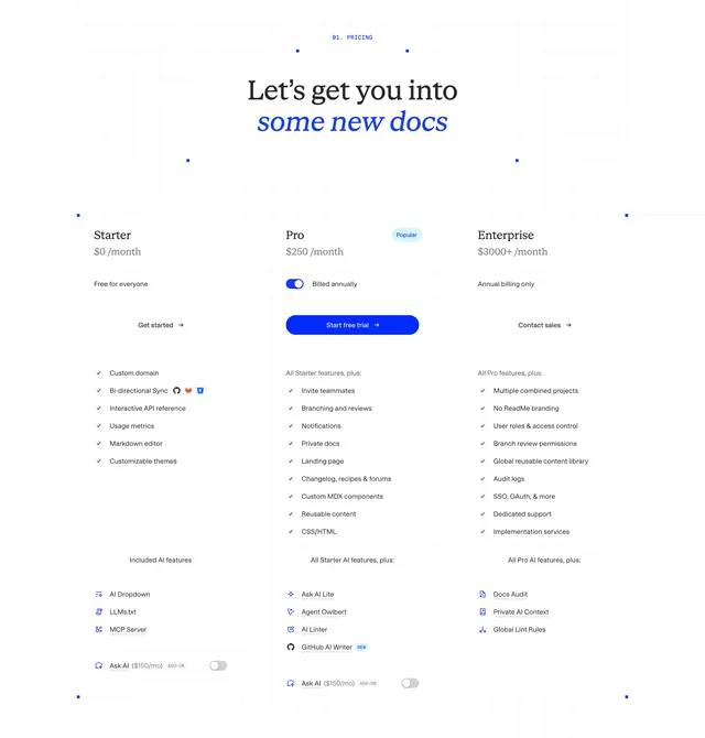 ReadMe three-tier pricing table
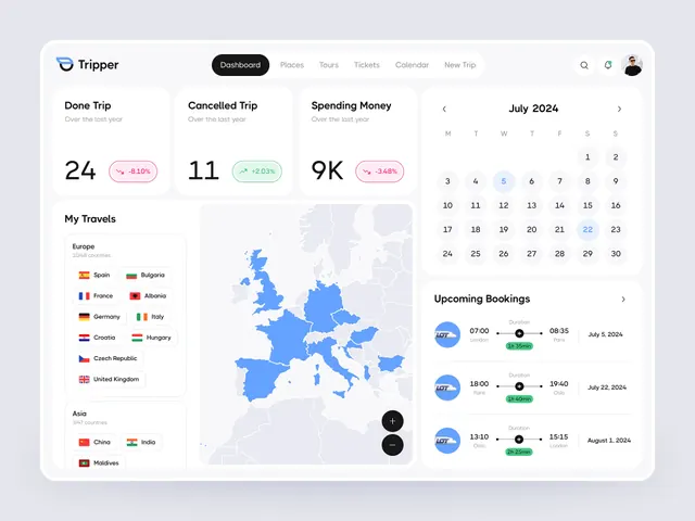 Travel app dashboard with map and bookings
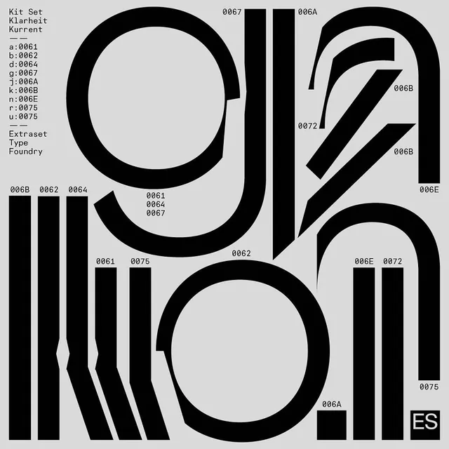 Kit Set Klarheit Kurrent specimen
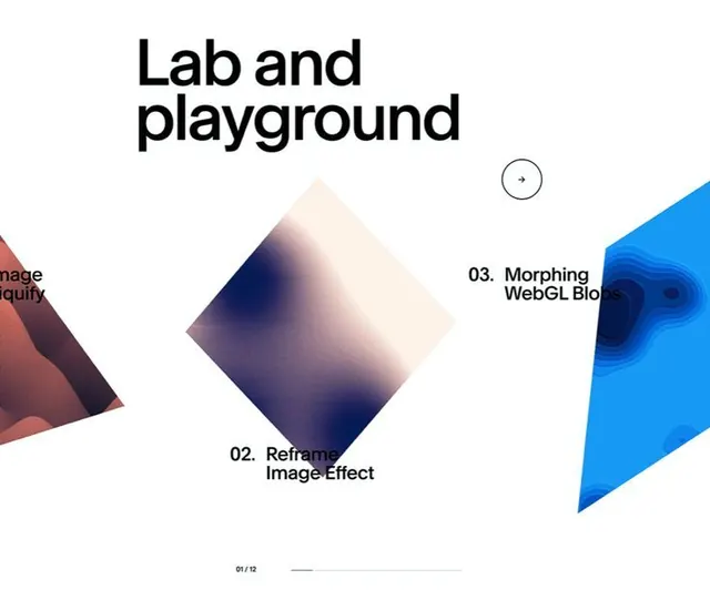 Lab and Playground generative gradient experiments
 Minimalist brushed-metal analog clock
 Granola AI notepad brand rebrand case study (slide 10)
 Three-panel startup hero cards with halftone portraits
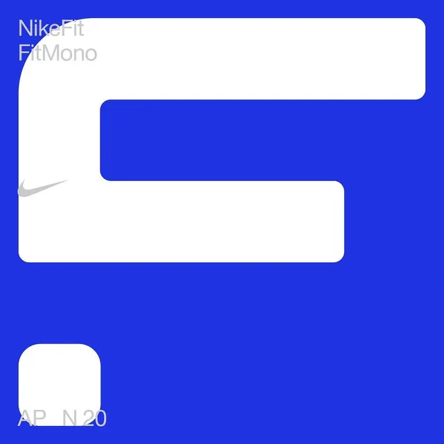 NikeFit blue typography study
 Jenson Revival type specimen and documentation (slide 7)
 Gravity careers CTA with wireframe