Monochrome geometric typography study
Minimal graphic design using only black and light gray, emphasizing typography and geometric arrangement with high contrast.

Summary
Clean monochromatic composition using only two values: light gray (#D1D1D1) and near-black (#292929). Typography and geometry create visual rhythm without any color complexity.
Visual description
The 1102×828px landscape design is purely black-and-white, relying on type treatment and geometric arrangement for visual interest. The two-tone palette suggests typography-forward design with clean, modern sans-serif type and geometric spacing creating the composition's structure.
Key takeaway
The elegance of true black-and-white design: constraint becomes clarity. When stripped of color, typography and spacing must carry all the communicative and aesthetic weight.
Reuse notes
Excellent reference for monochrome branding systems, print design, or high-contrast accessibility work. The minimal palette works well for contemporary, luxury, or technical brands that need to communicate sophistication. Strong foundation for systematic design approaches where restraint reinforces quality.
More like this
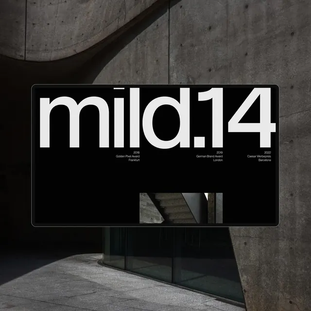 mild14 Wordmark Mockup
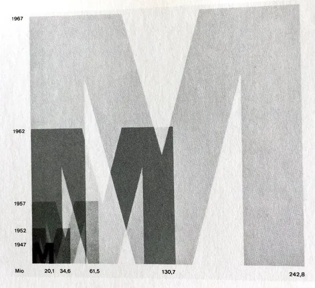 Abstract Geometric Data Visualization
 Minimalist typographic poster split composition
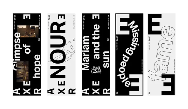 Typography and Graphic Design Reference Board
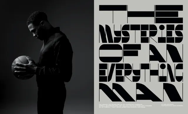 Split monochrome with bold geometric type
 Bold split-background typography
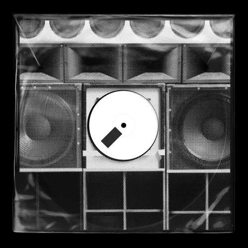 Geometric Grid and Circle Composition
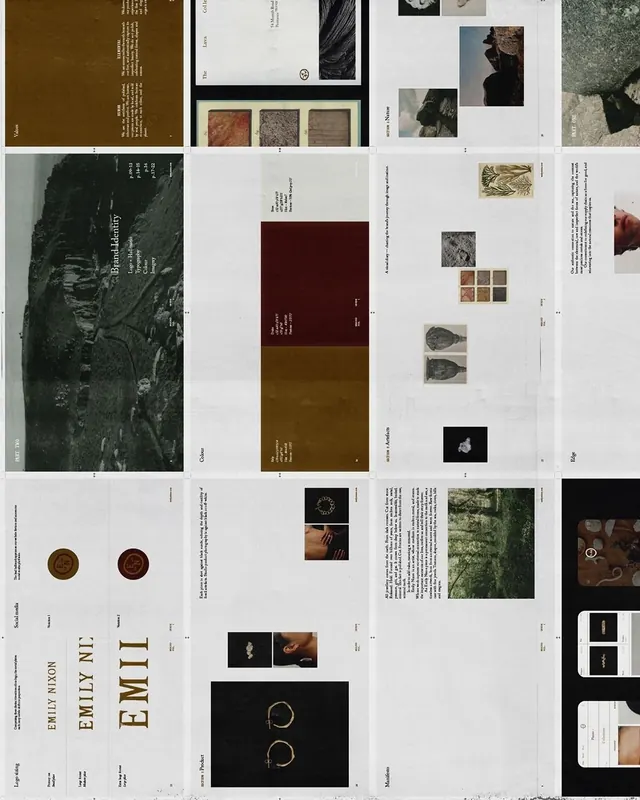 Editorial and Identity Layout Collection
 Minimalist UI and Portrait Design Reference
 Geometric Circle Grid Pattern
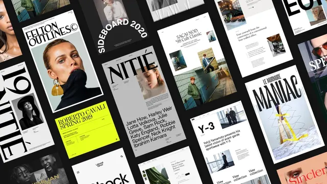 Editorial and Branding Design Grid
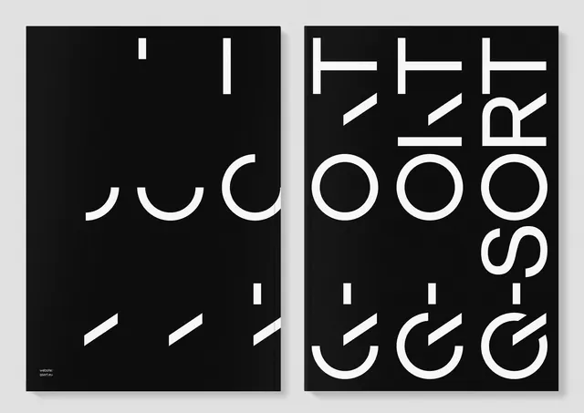 Abstract Typography Composition
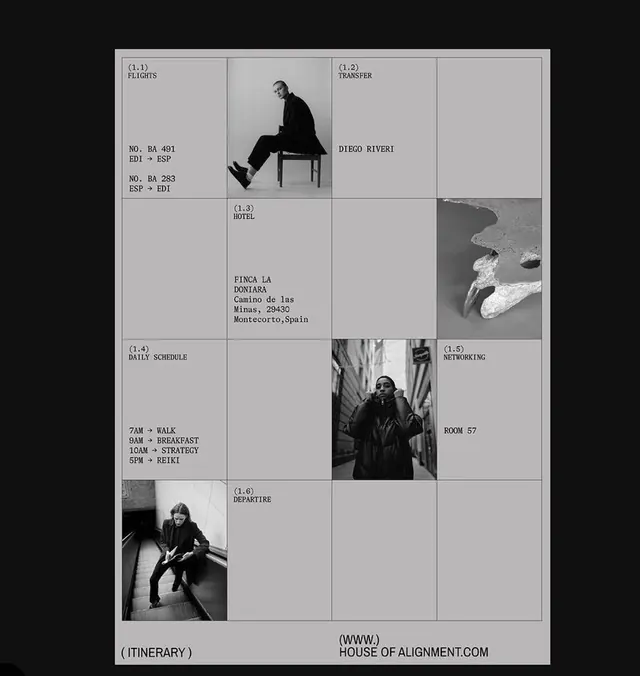 Editorial grid with monochrome photography
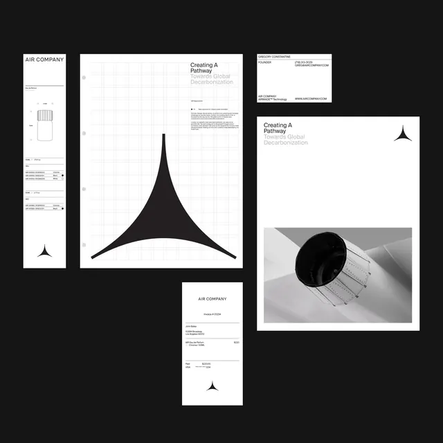 Air Company Brand Identity System
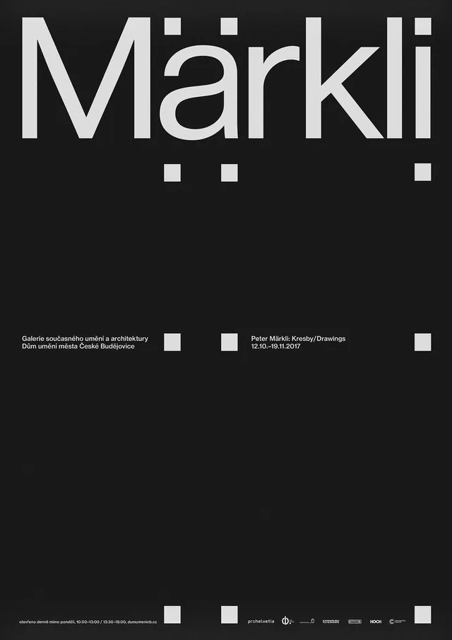 Märkli Wordmark and Layout
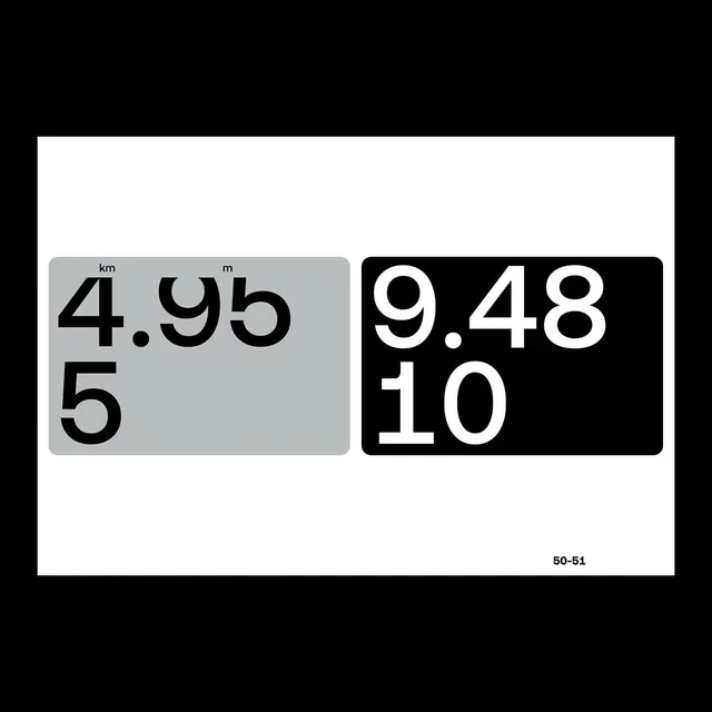 Numeric Type Specimen
 Mixed Media Design Reference Board
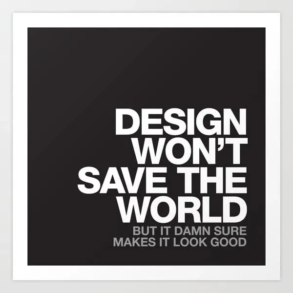 Design Won't Save The World Typography Poster
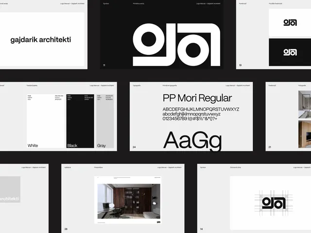 gajdarik architekti Brand Identity Presentation
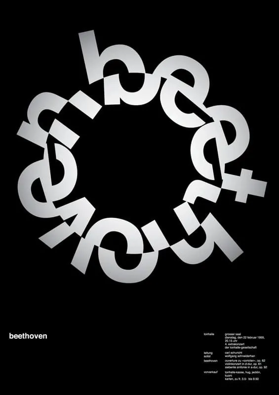 Beethoven Circular Wordmark
 Geometric 3D Faceted Pattern
 Minimalist Botanical Branding Mockup
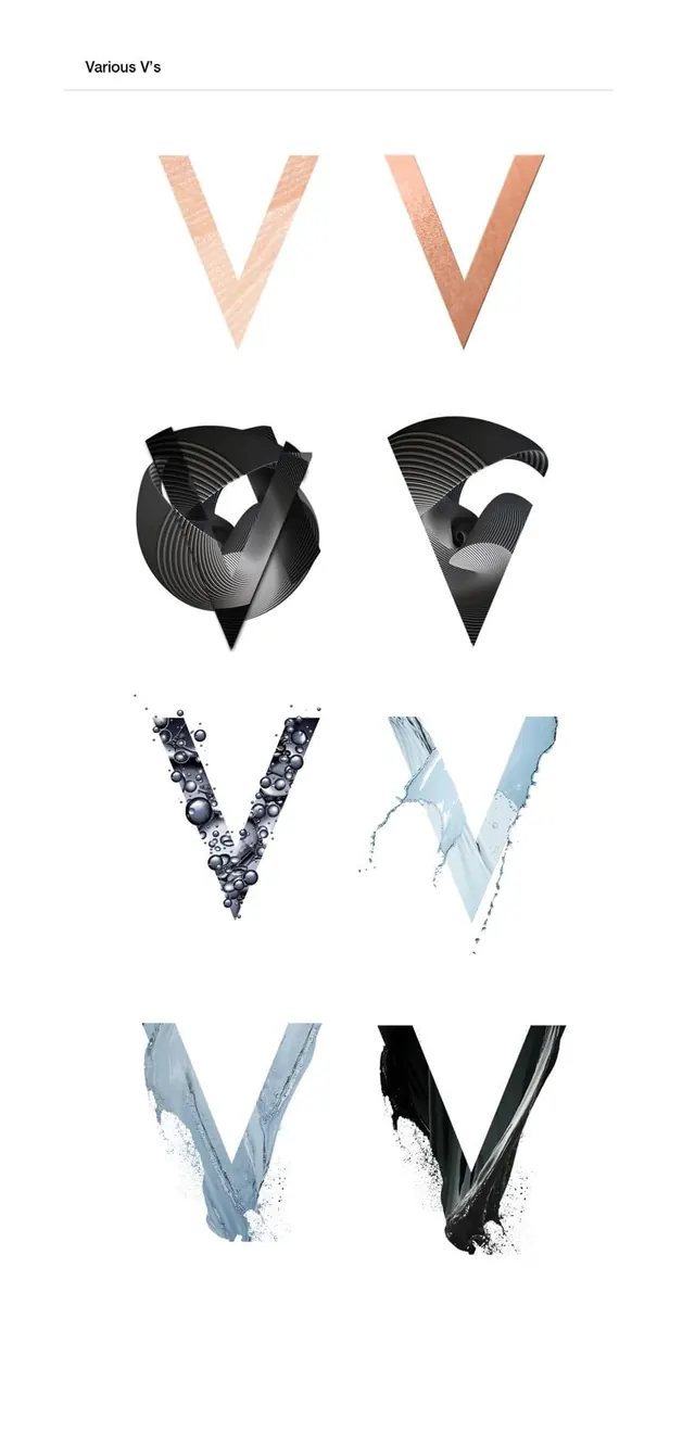 Abstract Letterform Identity System
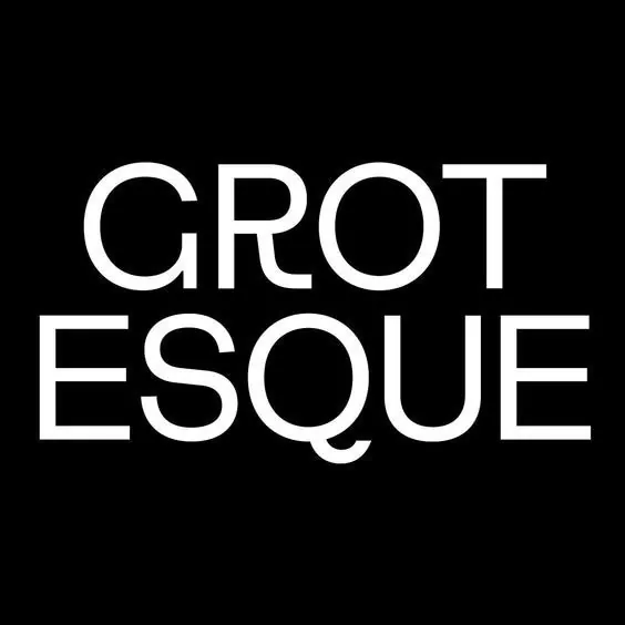 Grotesque Wordmark