Typography and Layout Identity System
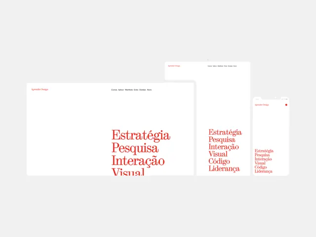
A clean, minimalist identity system showcasing a vertical typographic hierarchy and layout structure across three different card formats.
Summary
A clean, minimalist identity system showcasing a vertical typographic hierarchy and layout structure across three different card formats.
Visual description
Three white rectangular cards overlapping each other, featuring red sans-serif text. The largest card displays a vertical list of Portuguese words, while smaller cards show variations in scale and density.
Key takeaway
The design demonstrates how consistent typography and generous white space can create a sophisticated, organized brand identity.
Reuse notes
Use this layout structure for clean corporate presentations or minimalist brand guidelines.
StyleMinimal, Swiss, Corporate Clean, Light Mode
ColorLight, High Contrast
TypeSans Serif, Oversized, All Caps
MoodProfessional, Elegant, Calm
Tagstypography, layout, grid, minimalism, branding
Palette
#F5F5F5
#F2514B
More like this
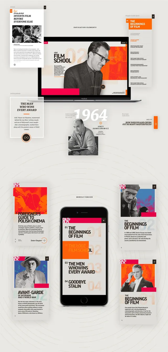 Editorial Layout and UI Design Reference
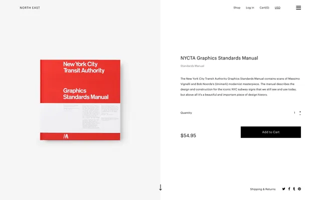 NYCIDA Graphic Standards Manual
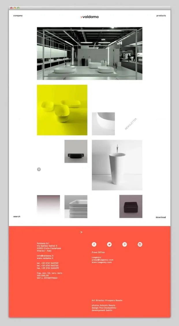 Confluence Identity System
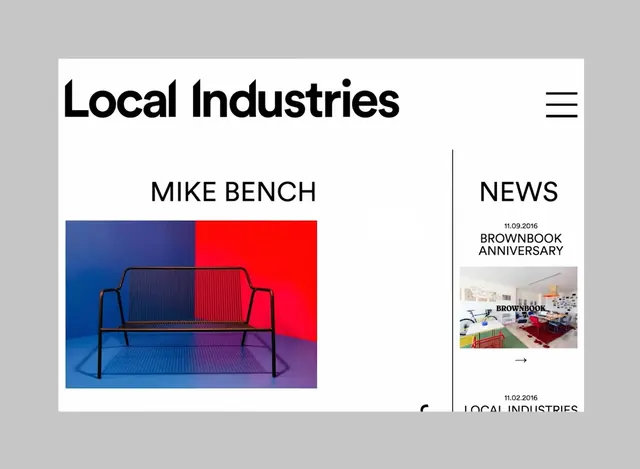 Local Industries Website Layout
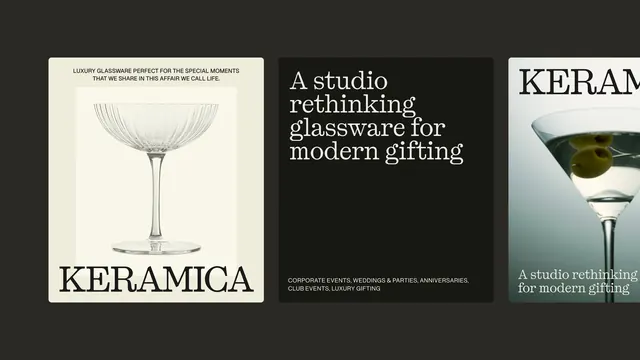 KERAMICA Brand Identity and Product Showcase
 AsafH. Wordmark Mockup
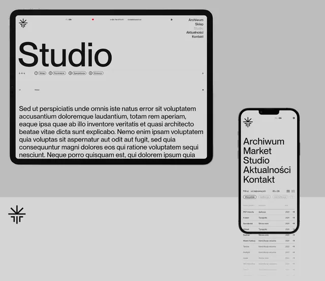 Studio Identity System
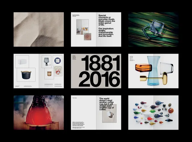 Brand Identity and Visual System Overview
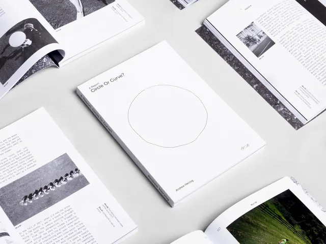 Minimalist Editorial Layout Design
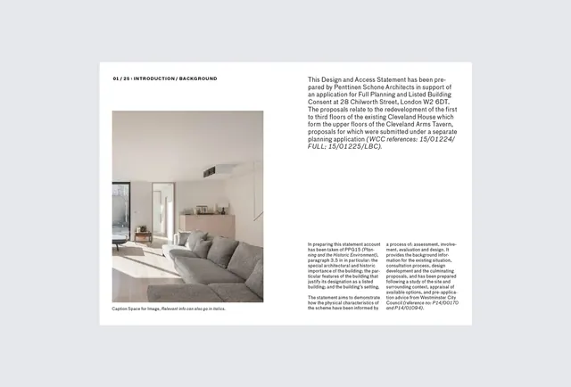 Minimalist Interior Design Editorial Spread
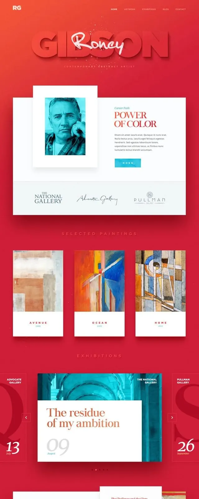 Art & Design Editorial Layout
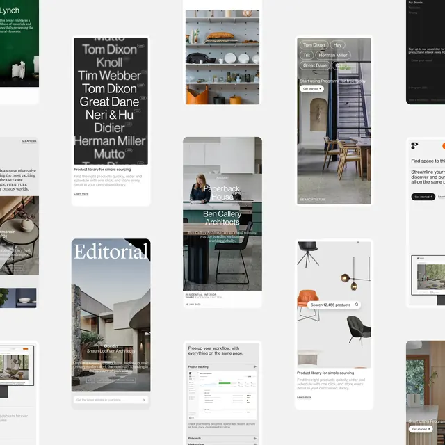 Editorial and Layout Design Collection
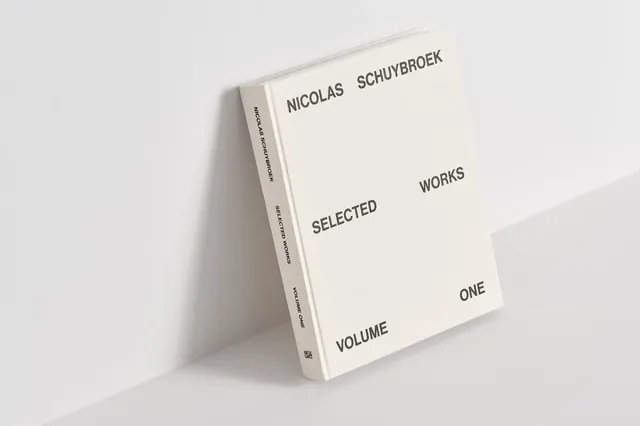 Minimalist Editorial Book Mockup
 Graphic Design Portfolio Layout
 Shell Chair Poster
 Visual News Editorial Layout
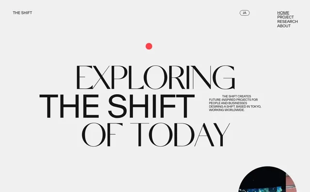 Exploring the Shift of Today Typography Design
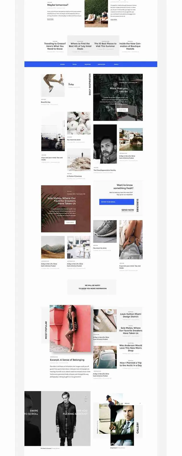 Design Portfolio Layout
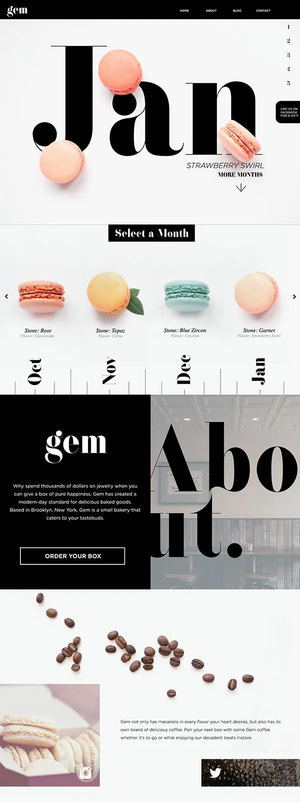 Modern Editorial Identity System
 Minimalist Geometric Layout
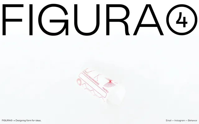 FIGURA Branding and Packaging Mockup
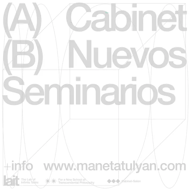 Manetatulyan Typography Layout
 Ligne Editorial Layout
 SPACE10 Identity Spread