NYCIDA Graphic Standards Manual
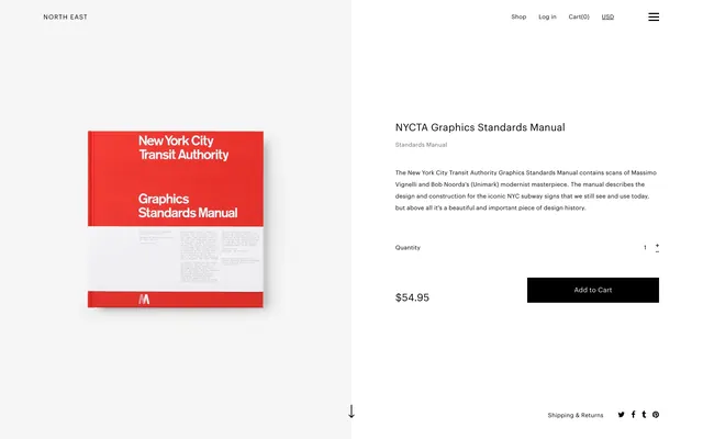
A clean, minimalist layout showcasing a publication cover and its corresponding interior page details.
Summary
A clean, minimalist layout showcasing a publication cover and its corresponding interior page details.
Visual description
The design features a red and white book cover on the left and a clean white page on the right with black text. It utilizes a strict grid system with ample white space and a small red logo element.
Key takeaway
The layout demonstrates how to balance bold primary colors with generous white space for a sophisticated, professional look.
Reuse notes
Use this grid structure and high-contrast color blocking for corporate brand guidelines or portfolio layouts.
StyleMinimal, Swiss, Corporate Clean, Light Mode
ColorHigh Contrast, Light
TypeSans Serif, All Caps
MoodProfessional, Elegant, Trustworthy
Tagslayout, grid, publication, branding, manual
Palette
#F5F5F5
#E83933
#0F0F0F
More like this
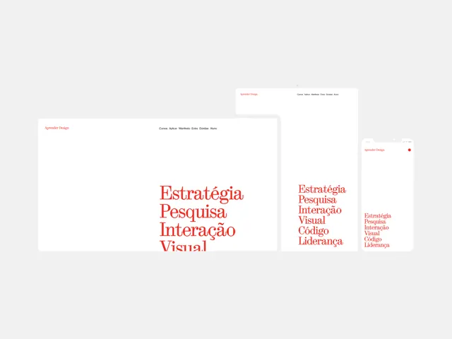 Typography and Layout Identity System
 Editorial Layout and UI Design Reference
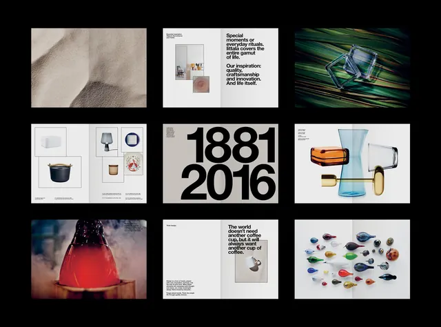 Brand Identity and Visual System Overview
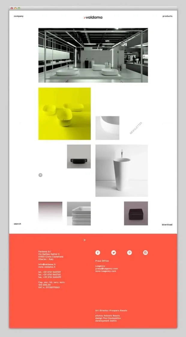
 Local Industries Website Layout
 Confluence Identity System
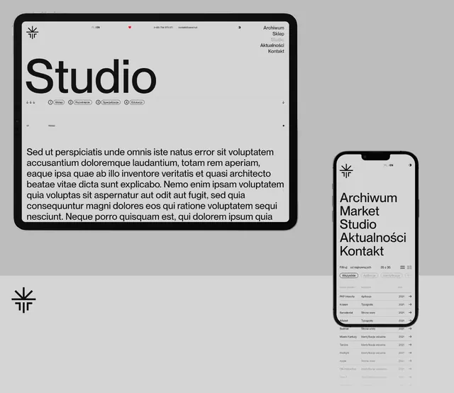 Studio Identity System
 Web Interface Design Layout
 KERAMICA Brand Identity and Product Showcase
 Graphic Design Portfolio Layout
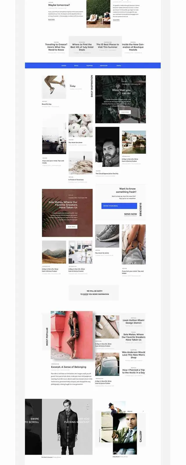 Design Portfolio Layout
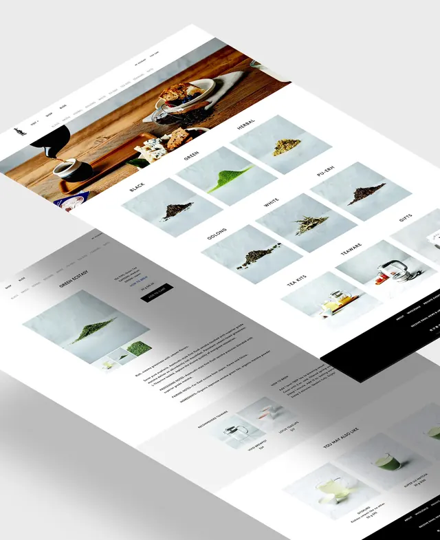 Corporate Identity Presentation Mockup
 AsafH. Wordmark Mockup
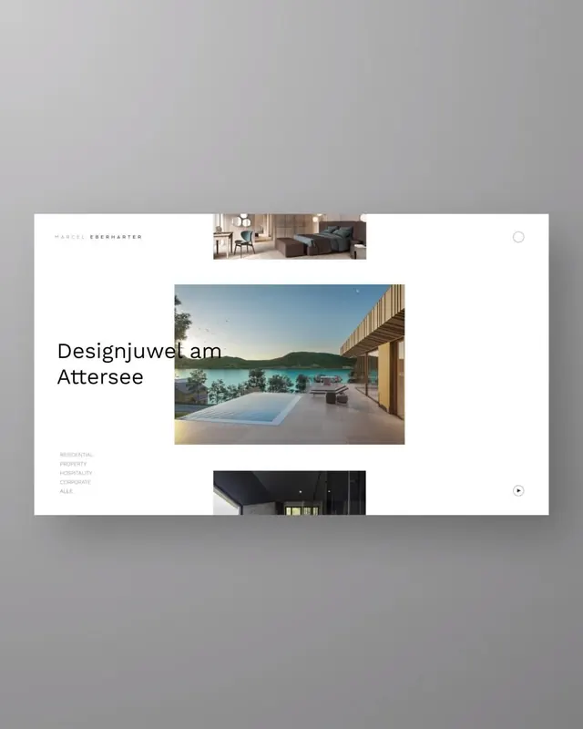 Minimalist architecture portfolio layout
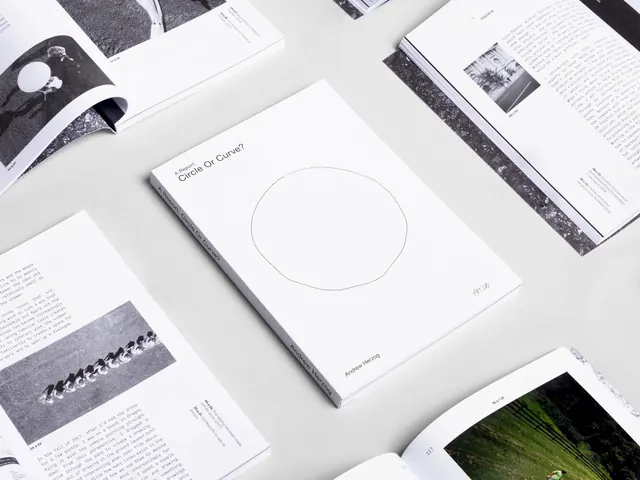 Minimalist Editorial Layout Design
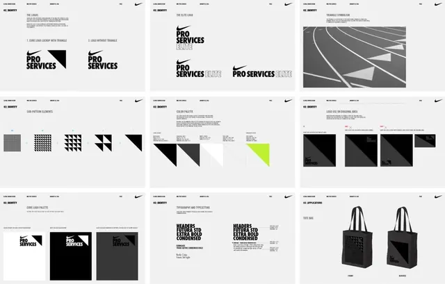 Corporate Identity System and Brand Assets
 Visual News Editorial Layout
 Creative Agency Brand Identity Mockup
 Brand Identity Presentation
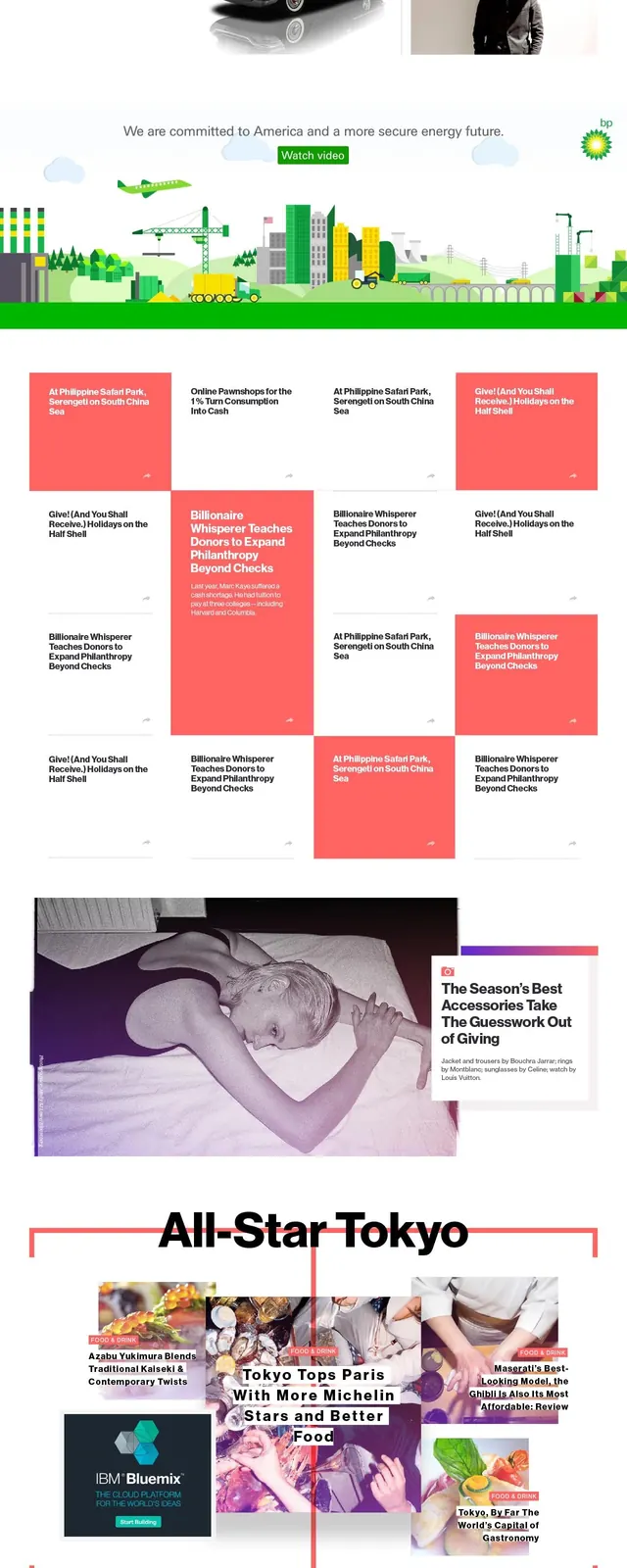 Web Design and UI/UX Portfolio Reference
 Ligne Editorial Layout
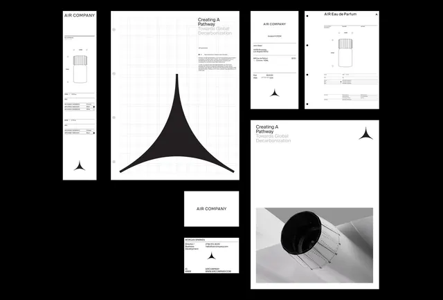 Abstract Geometric Identity System
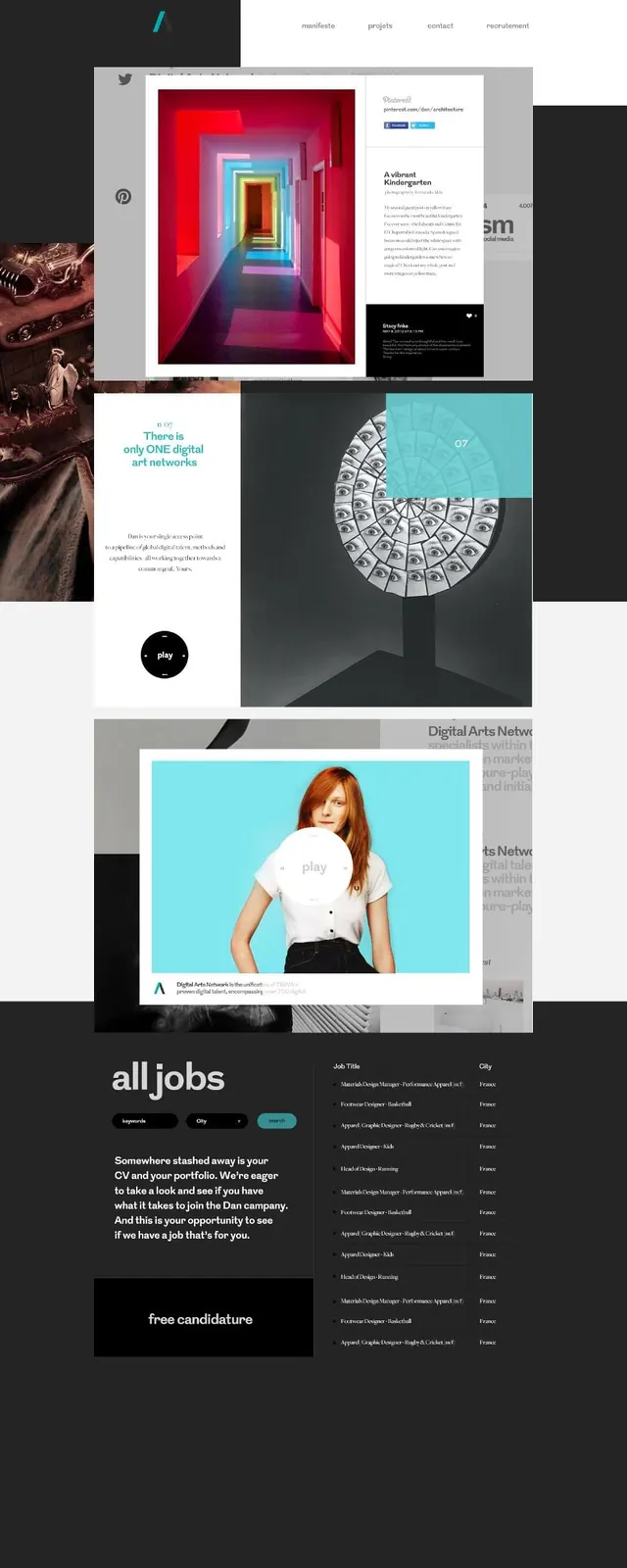 Editorial Layout and UI Design Reference
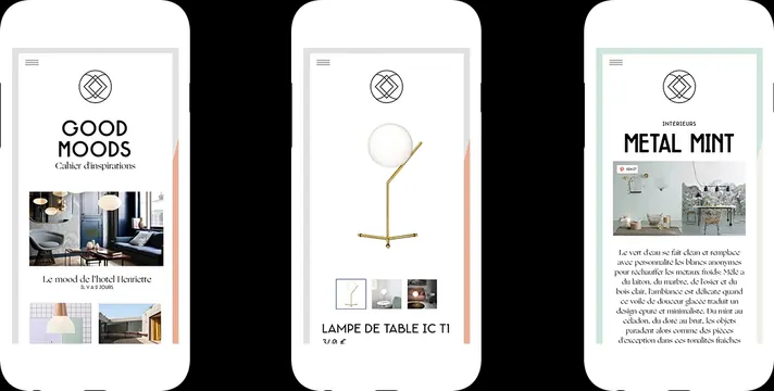 Minimalist Editorial UI Mockups
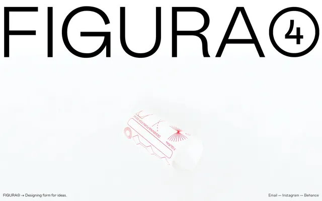 FIGURA Branding and Packaging Mockup