S10 Wordmark Design
A minimalist wordmark featuring the characters 'S10' in a high-contrast, geometric style.

Summary
A minimalist wordmark featuring the characters 'S10' in a high-contrast, geometric style.
Visual description
The design features a bold, solid black 'S' followed by a '1' and a '0' rendered as thin outlines. The characters are set against a neutral gray background.
Key takeaway
The contrast between the heavy weight of the 'S' and the light weight of the '10' creates a sophisticated visual hierarchy.
Reuse notes
This style can be adapted for product branding, tech hardware labeling, or minimalist editorial headers.
StyleMinimal, Geometric, Flat, Monochrome
ColorMonochrome, High Contrast
TypeSans Serif, Display, Oversized
MoodProfessional, Bold, Technical
IndustryConsumer App, Hardware
Tagslettering, typography, geometric, contrast, modern
Palette
#F5F5F5
#292929
More like this
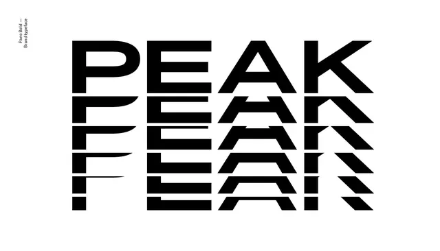 PEAK Wordmark Identity System
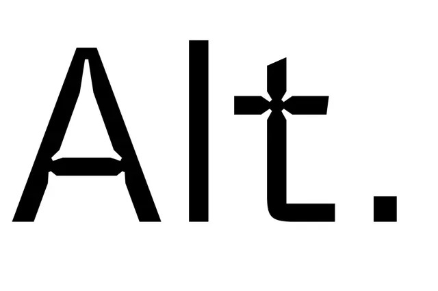 Alt. Wordmark
 5124 Typography Design
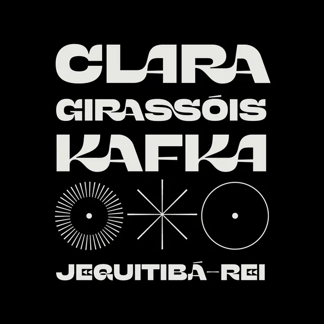 Clara Girassois Kafka Identity
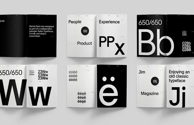 Minimalist Typography and Logo Grid
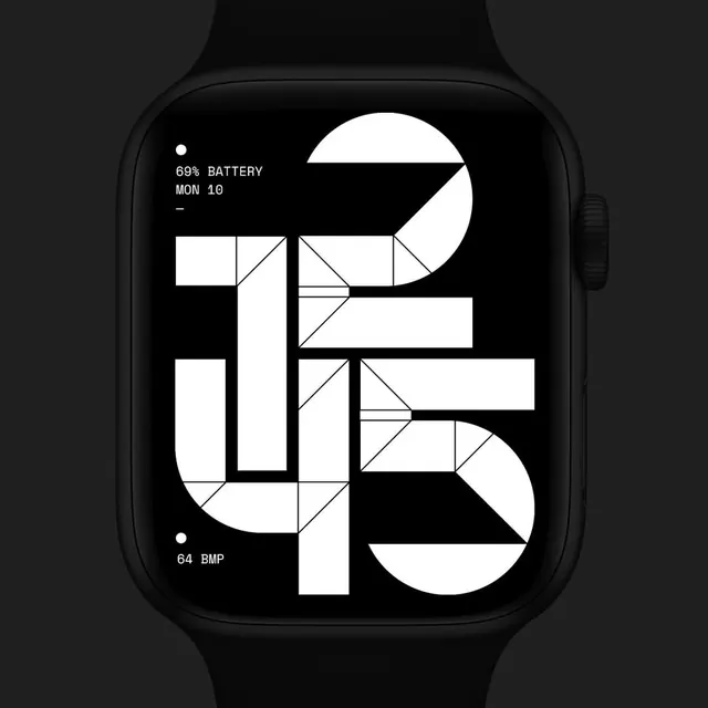 Geometric Watch Face Design
 Technical Dashboard Interface Design
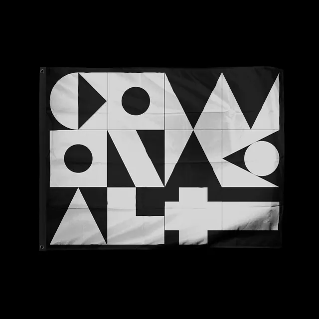 Geometric Typography Composition
 Nike Swoosh and NYHQ0885 Wordmark
 FORMAT Wordmark
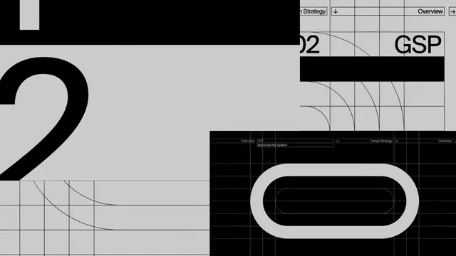 Geometric Typography and Grid System
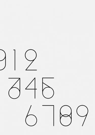 Minimalist Numeric Type Specimen
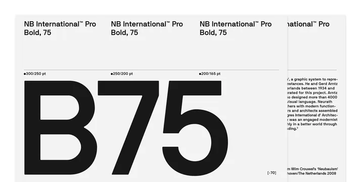 NB International Pro Bold 75 Type Specimen
 VOA Abstract Typography
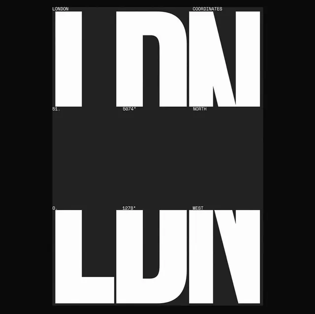 LUNDON Typography Design
 Monochrome Geometric Logo and Pattern Design
 SAMSEN Wordmark
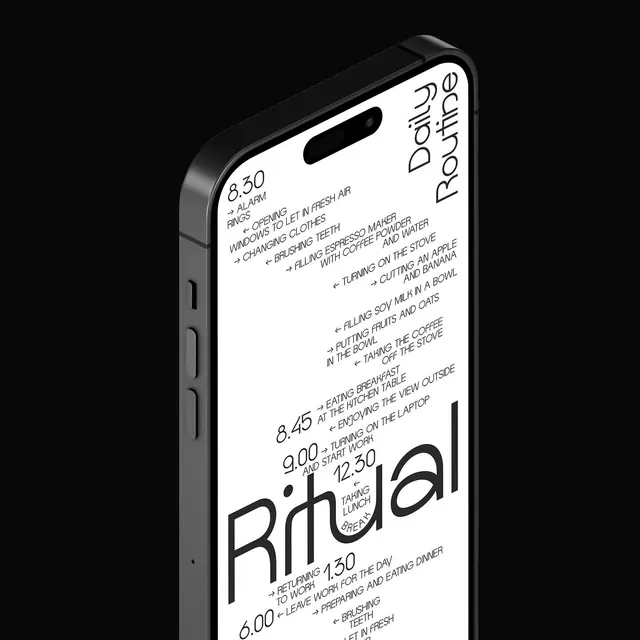 RITUAL Smartphone Mockup
 Moby 7139 Album Cover Design
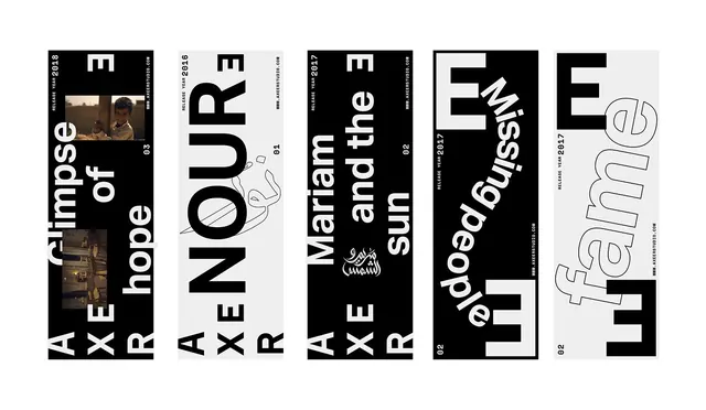 Typography and Graphic Design Reference Board
 Grotesque Wordmark
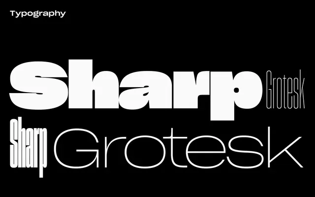 Sharp Grotesk Type Specimen
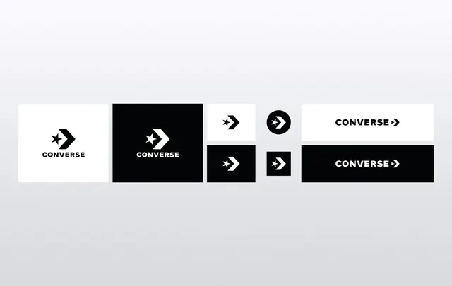 Converse Logo Variations
 HOT AIR Wordmark Design