Converse Logo Variations
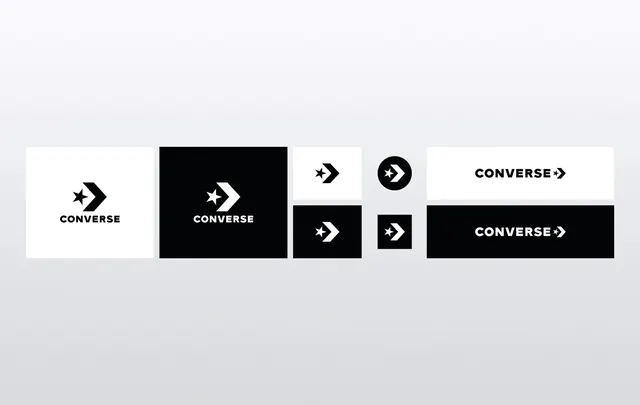
A collection of different logo treatments for the Converse brand, showcasing various layouts, colors, and orientations.
Summary
A collection of different logo treatments for the Converse brand, showcasing various layouts, colors, and orientations.
Visual description
A grid of six Converse logo variations including horizontal and stacked layouts, solid black and white blocks, and different icon placements. The designs explore the relationship between the star chevron symbol and the brand name.
Key takeaway
The brand maintains a strong identity through consistent iconography while experimenting with layout and high-contrast color blocks.
Reuse notes
These variations can be used to demonstrate brand flexibility across different media sizes and backgrounds.
StyleMinimal, Corporate Clean, Monochrome, Boxed, Flat, Geometric
ColorMonochrome, High Contrast
TypeSans Serif, All Caps
MoodProfessional, Bold, Trustworthy
IndustryConsumer App, Marketing, Retail
Palette
#EBEBED
#0A0A0A
More like this
 SAMSEN Wordmark
 Nike Swoosh and NYHQ0885 Wordmark
 VUCKO Logo Presentation
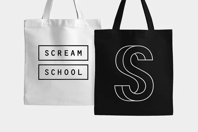 Minimalist Typography Tote Bag Mockup
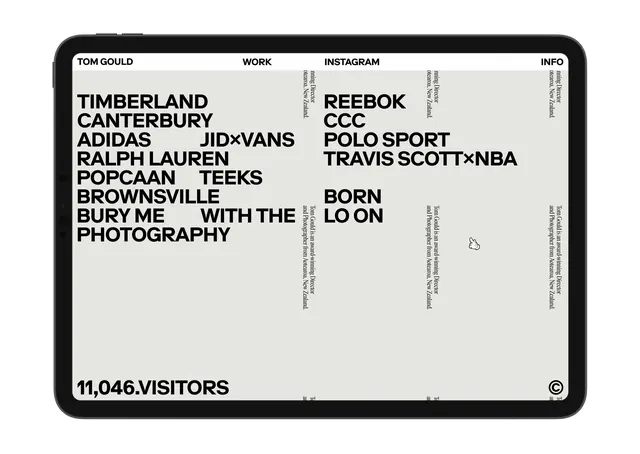 Typography-based Portfolio Layout
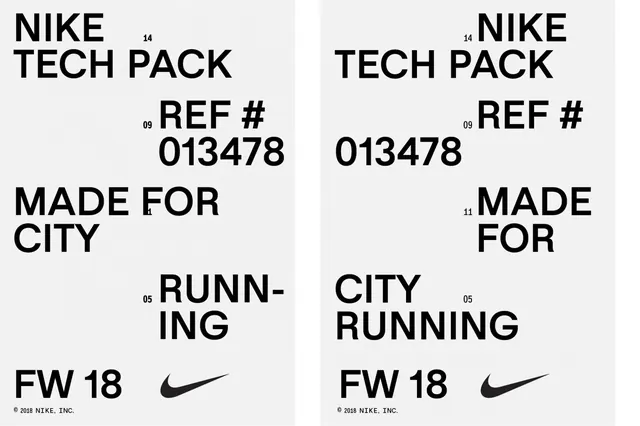 Nike Tech Pack Design Reference
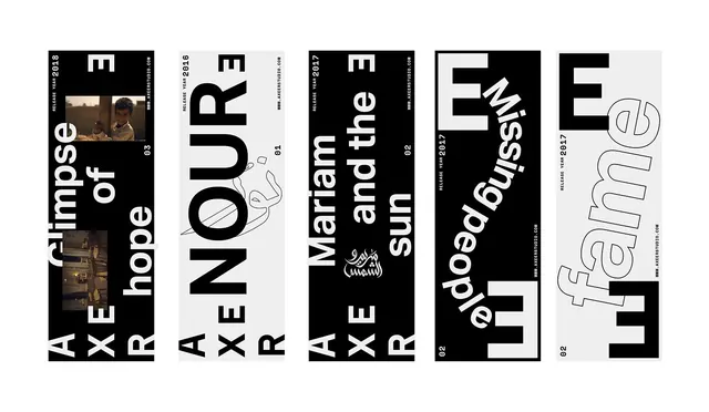 Typography and Graphic Design Reference Board
 Tech Pack Logo
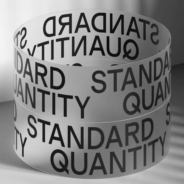 Standard Quantity Typography Wrap
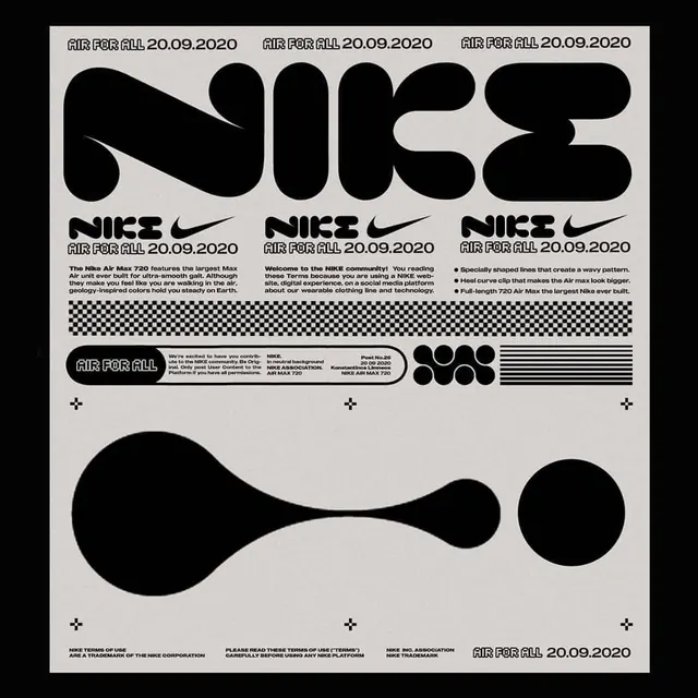 Nike Branding Identity System
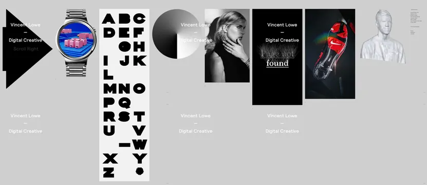 Typography and Branding Showcase
 Hello & Welcome Wordmark
 SINCE DAY ONE Wordmark
 TERMINO Kitchen Identity
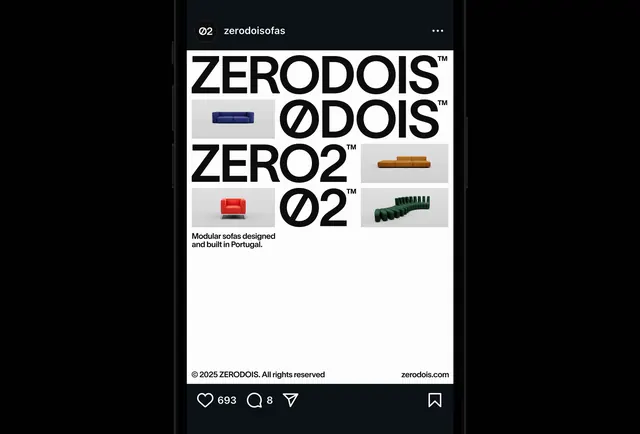 ZERO DOIS Identity System
 Nike and P. Logo Combination
 Nike Swoosh Identity Layout
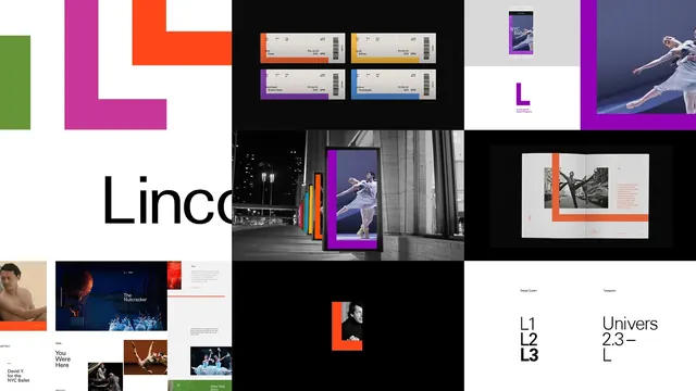 Geometric and Typographic Identity System
 FATLASH Identity System
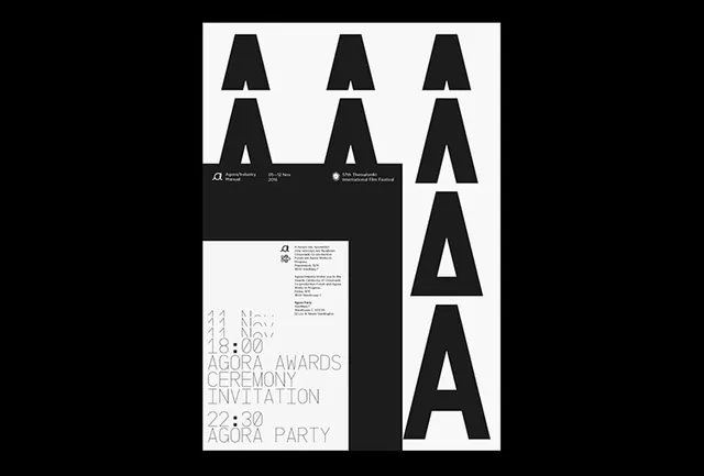 Typography and Layout Identity System
 Swiss Style Typography Layout
 Cylinder Back Chair Design Reference
 Clara Girassois Kafka Identity
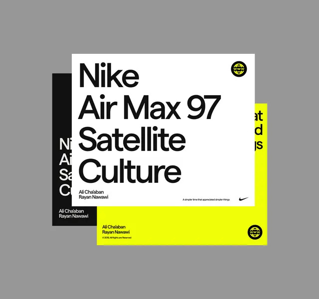 Nike Air Max 97 Satellite Culture Poster