Mobile App UI Comparison
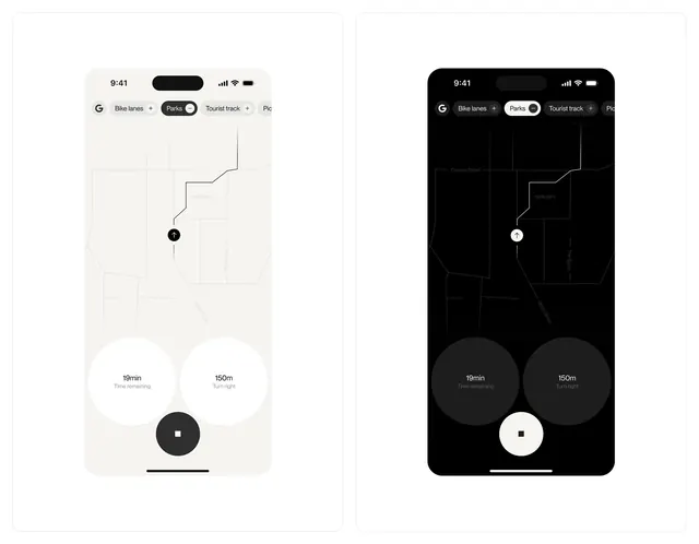
A side-by-side comparison of a mobile application interface in light and dark modes, featuring a data visualization map and circular navigation elements.
Summary
A side-by-side comparison of a mobile application interface in light and dark modes, featuring a data visualization map and circular navigation elements.
Visual description
Two smartphone mockups display a white and black version of the same app interface. The screens feature a central line-art map with nodes and large circular buttons at the bottom.
Key takeaway
The design demonstrates a consistent layout and visual hierarchy across contrasting light and dark themes.
Reuse notes
Can be used as a reference for high-contrast UI design and consistent theme implementation.
StyleMinimal, Dark Mode, Light Mode, Geometric, Flat
ColorMonochrome, High Contrast
TypeSans Serif
MoodProfessional, Technical, Calm
IndustryAnalytics, Data, Productivity, Saas
Tagsui, ux, mobile app, dark mode, light mode, data viz, navigation
Palette
#0A0A0A
#FAFAFA
More like this
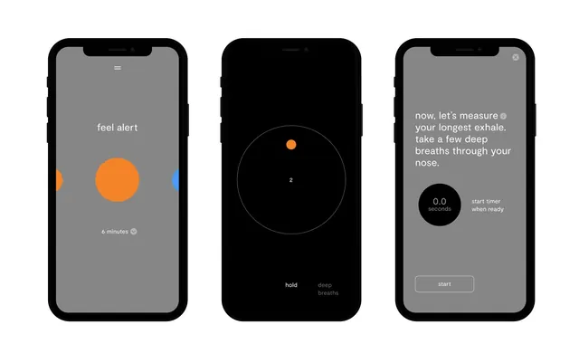 Mobile App Interface Comparison
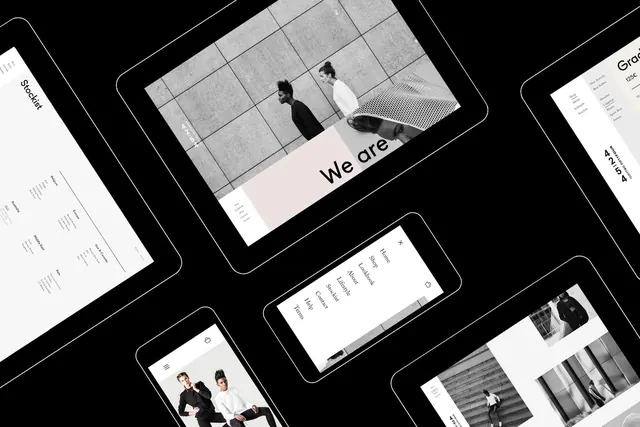 Modern UI/UX Design Mockup Collection
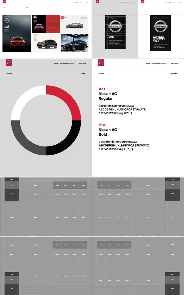 Minimalist Corporate Identity and UI Design Reference
 Circular Arrow Icon
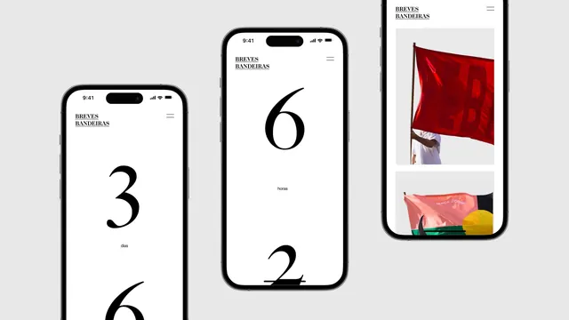 Mobile App UI Mockups
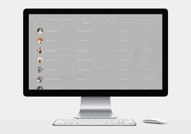 Desktop Dashboard Interface Mockup
 Abstract Geometric Clock Graphic
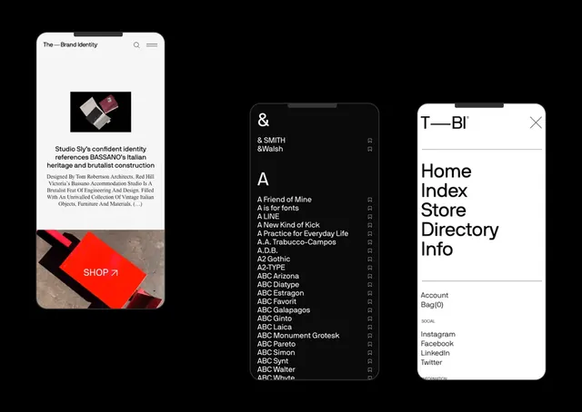 UI Design System Components
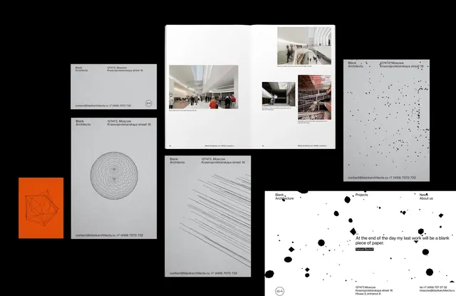 Minimalist Data and Editorial Design Reference
 UI and System Icon Set
 Multi-Asset Brand Identity Showcase
 Minimalist Circular Graphic with Horizontal Line
 Abstract Horizontal Bar Graphic
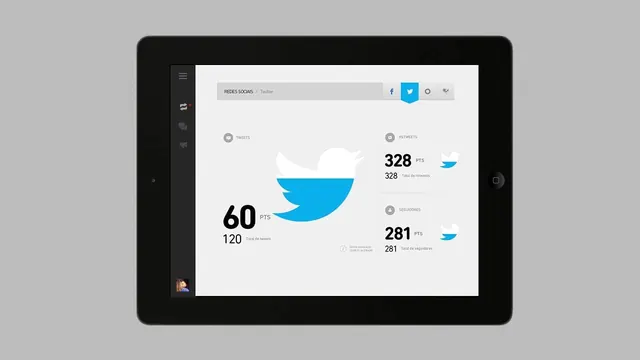 Tablet Dashboard Interface
 Geometric Dot Pattern Identity System
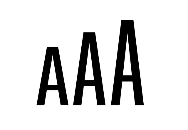 AAA Wordmark Design
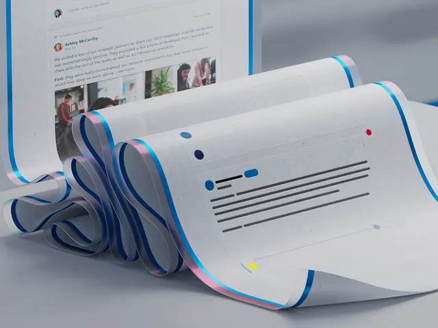 Corporate UI and Dashboard Mockup
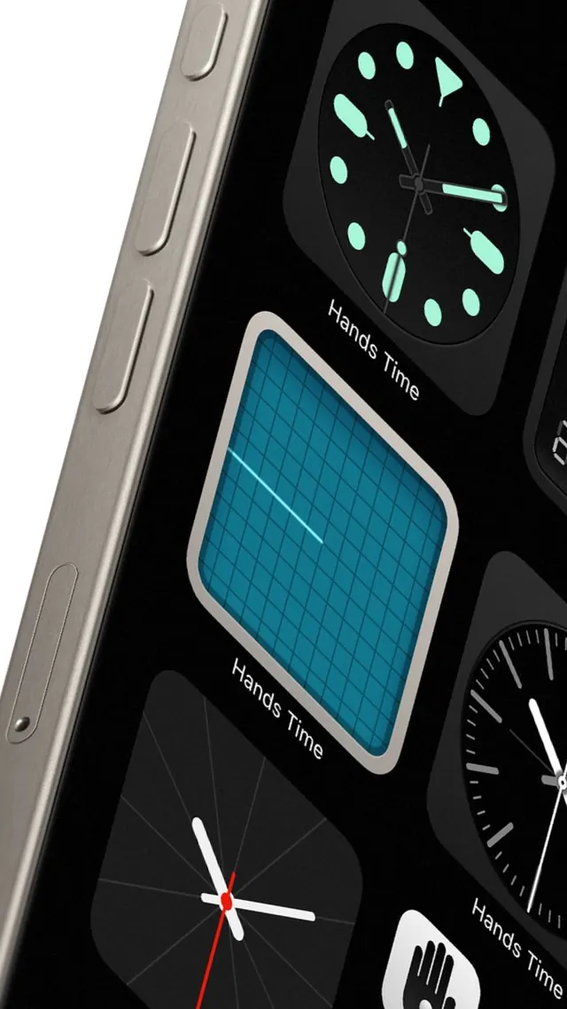 Smartphone UI Design Reference
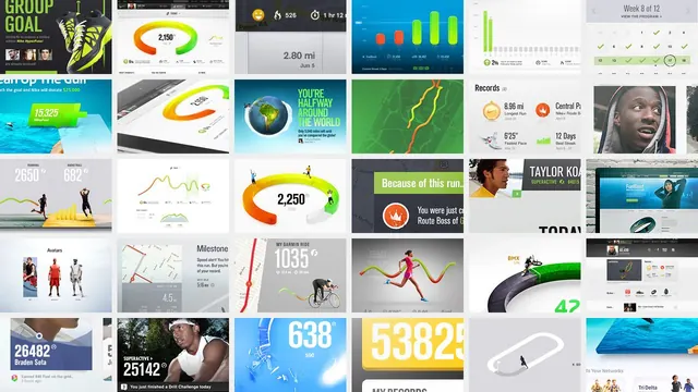 UI and Branding Component Grid
 Mobile App UI Mockup with Geometric Elements
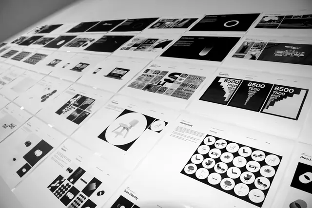 Grid-based Identity System and UI Elements
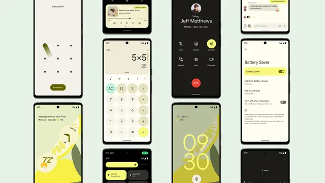 Mobile App UI Design Showcase
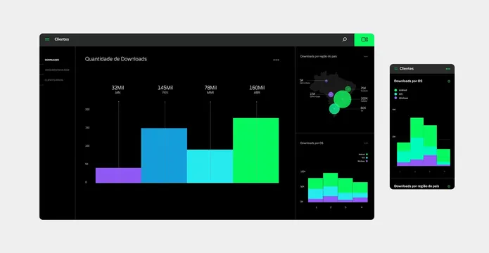 Data Visualization Dashboard
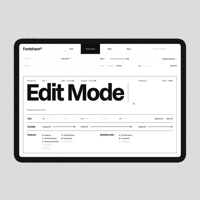 Edit Mode UI Mockup