Valley without/with two-column comparison
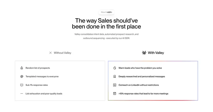
Light two-column "Without vs With" comparison where the negative card is plain bordered and the positive card gets a gradient outline.
Summary
A side-by-side comparison on white that contrasts a plain bordered "Without Valley" card against a "With Valley" card lifted by a soft rainbow gradient border.
Visual description
A small grey "How it works" pill eyebrow sits above a centered two-line black headline and two lines of muted sub-copy. Below, two column headers read "Without Valley" (with an X icon) and "With Valley" (with the brand mark). Each column is a rounded card holding four icon-and-text rows: the left lists negatives (random prospects, templated messages, sub 1% response rates, list exhaustion) in a flat grey-bordered card; the right lists positives (warm leads, personalized messages, unrestricted LinkedIn outreach, >15% response rates) in a card edged with a faint multi-color gradient stroke that warms toward the bottom.
Key takeaway
Using only a gradient border to distinguish the "good" column keeps both cards equally clean while still signaling which side is the win. Pairing each line with a small monoline icon makes the contrast scannable rather than text-heavy.
Reuse notes
A go-to for positioning a product against the status quo or a competitor. The gradient-outline trick reads as premium without color-flooding the card. Keep both lists to the same number of rows so the comparison stays balanced.
More like this
 Kota country benchmarking coverage card
 Seamless alternating feature rows with gradient UI cards
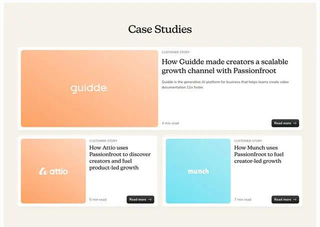 Passionfroot bento case study cards
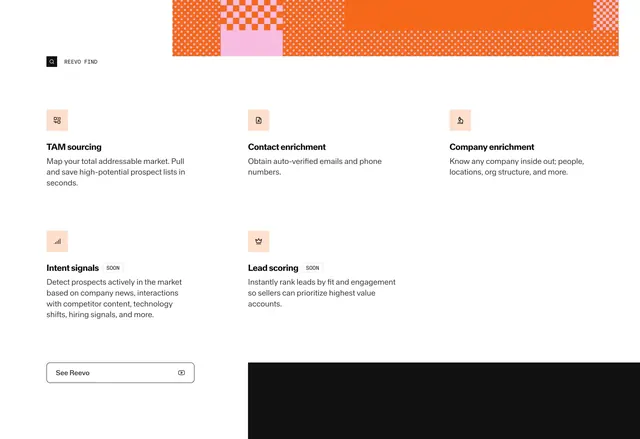 Reevo Find capability grid
 Synthesia Testimonials Section
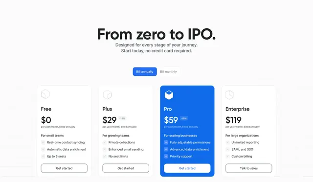 Attio pricing hero with four-column plans
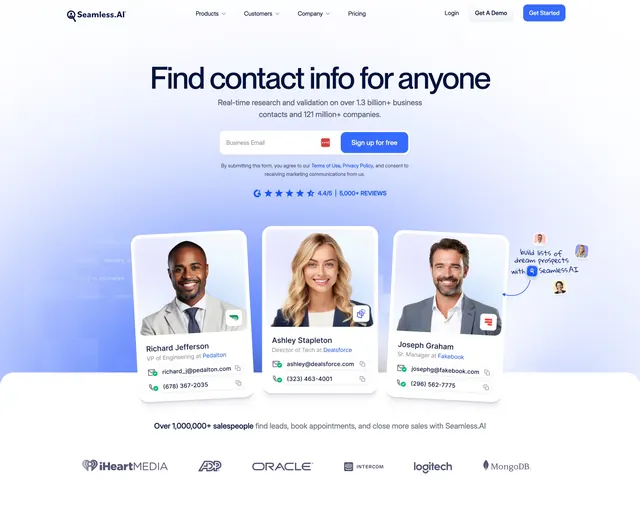 Seamless centered hero with email signup and contact cards
 Futern Hero Section
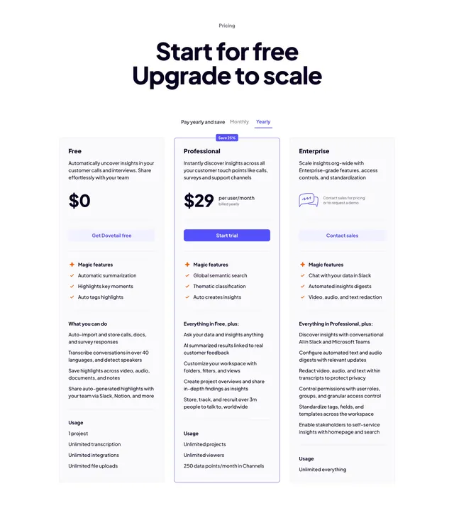 Dovetail three-tier pricing with billing toggle
 Giga light split demo CTA
 Iru focus on what matters CTA
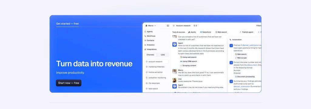 Godmode CTA Section
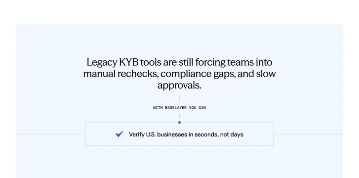 Baselayer problem-to-solution vertical flow
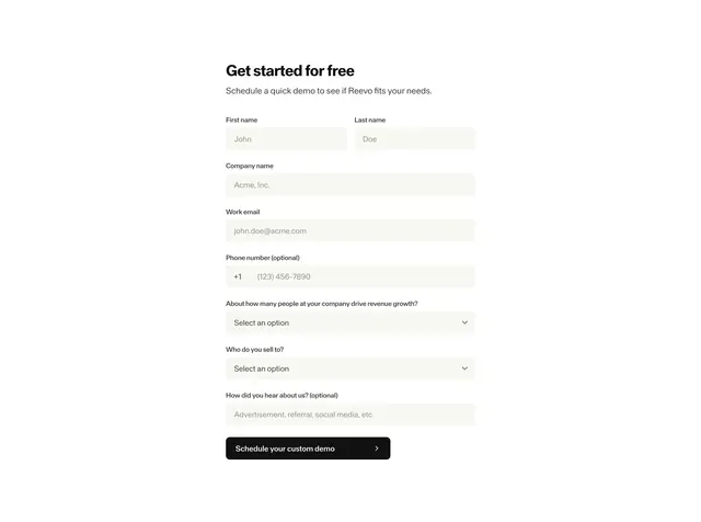 Reevo get started demo form
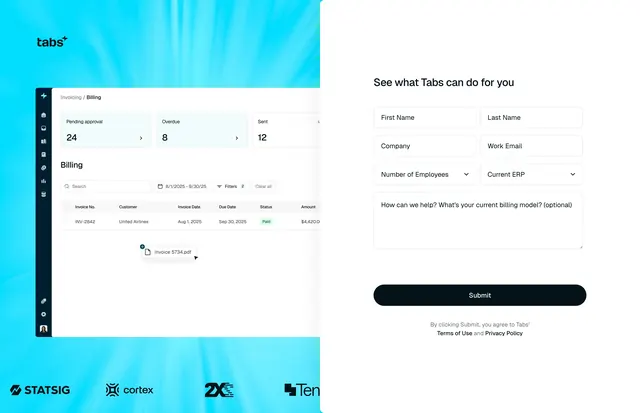 Tabs demo request split form hero
 Valley Hero Section
 Semrush stats and facts hero
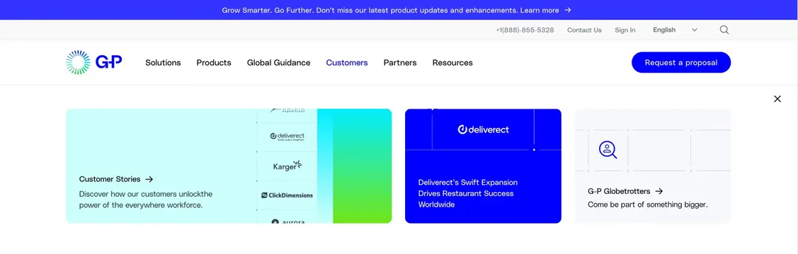 Globalization Partners home Customers mega menu
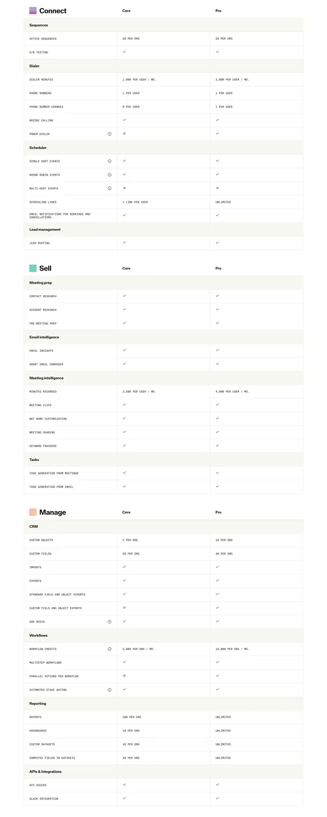 Reevo Core vs Pro comparison table
 Dovetail integrations grid with faded logo tiles
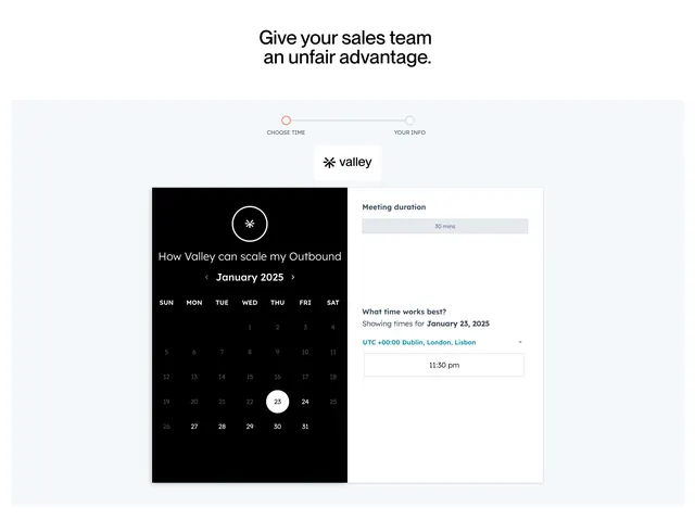 Valley book-a-demo scheduler with split calendar
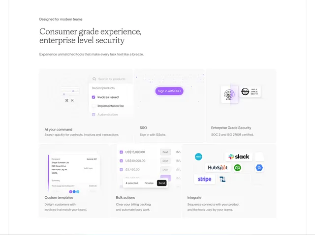 Sequence bento feature grid with UI mockups
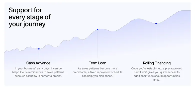 Wayflyer support journey growth curve
 Holocene inventory clarity stats