Raycast dark three-tier pricing with lifted Pro card
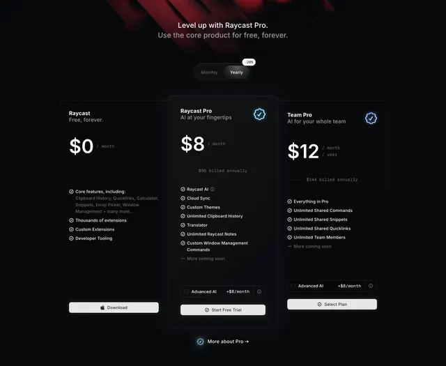
Dark three-column pricing on a red-tinted backdrop, billing toggle with a discount badge, monospace prices, and a lifted, slightly lighter Pro card in the middle.
Summary
A dark three-tier pricing section over a faint red-tinted backdrop, with a Monthly/Yearly toggle carrying a "-20%" badge and a lifted middle Pro card filled a shade lighter than its neighbours. Monospace prices and check-listed features give it a precise, technical feel.
Visual description
A centered two-line heading ("Level up with Raycast Pro." / "Use the core product for free, forever.") sits below a soft red atmospheric blur at the top. A dark pill toggle (Monthly / Yearly active) carries a small "-20%" tag. Three plan columns follow on near-black. Free ($0/month) and Team Pro ($12/month/user) sit in flat outlined cards; the middle Raycast Pro card ($8/month, "$96 billed annually") is lifted slightly above the row and filled a shade lighter than the near-black backdrop, with a glowing cyan verified badge top-right, matched by a glowing periwinkle badge on the Team Pro card. Prices are oversized with monospace "/ month" units. Each card lists checkmark features, the Pro and Team cards include a bordered "Advanced AI +$8/month" add-on toggle row, and CTAs differ per tier (Download with Apple glyph, Start Free Trial, Select Plan). A small "More about Pro" pill sits centered below.
Key takeaway
The recommended card lifted and lightened by one step, plus a glowing verified badge, a restrained way to highlight on dark without color-flooding the column. Monospace price units against a sans body reinforce a developer-tool identity. The inline "Advanced AI +$8/month" toggle row builds an add-on directly into the card instead of hiding it in fine print.
Reuse notes
A strong template for a developer or power-user product priced in clean tiers with optional add-ons. The badge glow and red backdrop only work on a dark theme; on light they would need rethinking. The "-20%" toggle badge implies a real monthly/yearly swap, so make it functional, and keep the per-card CTA wording distinct (download vs. trial vs. contact) the way this does.
More like this
 Linear Asks activation upsell screen
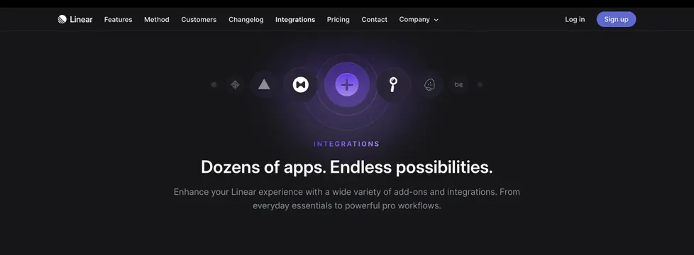 Linear integrations page hero
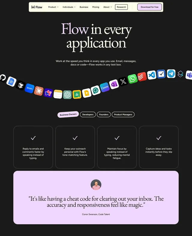 Flow product hero
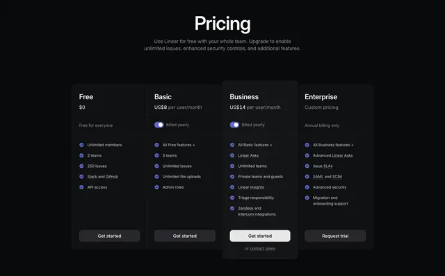 Linear Pricing Section
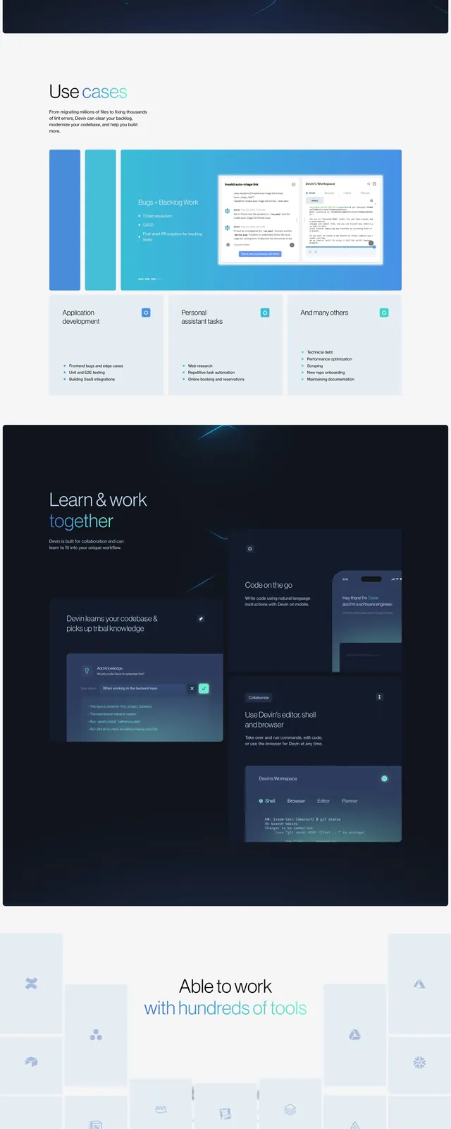 Devin dark SaaS landing page
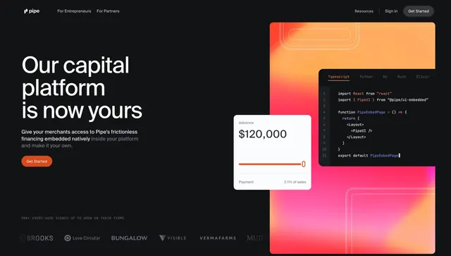 Pipe partners split hero with code
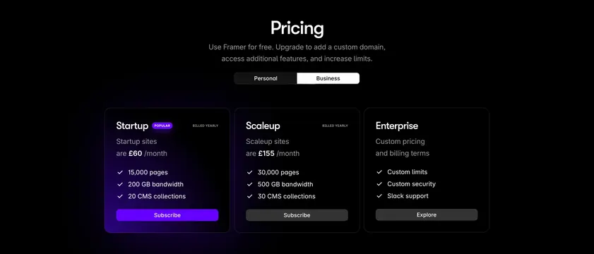 Framer dark three-column pricing with violet glow
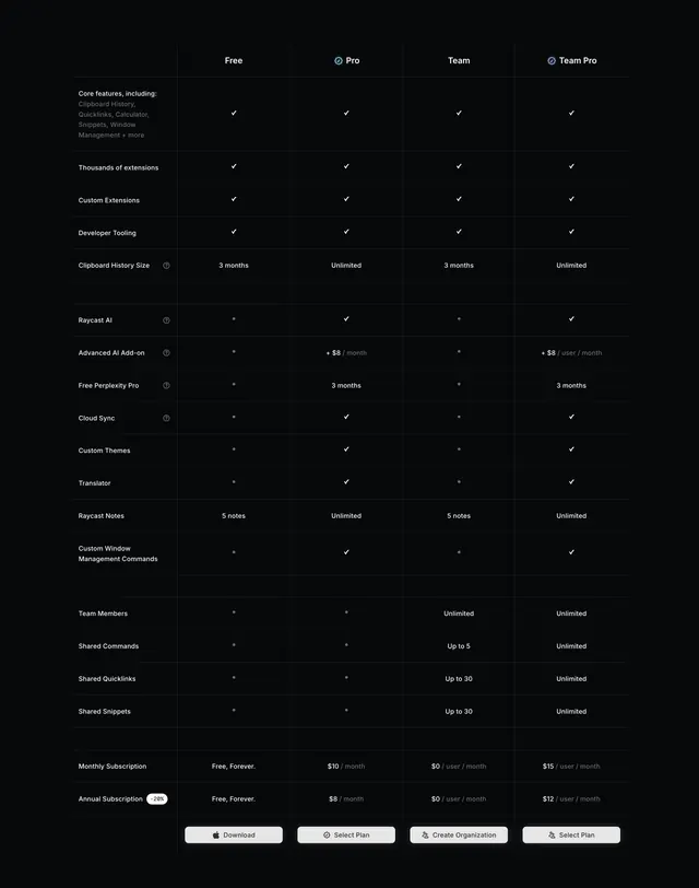 Raycast dark four-plan feature comparison table
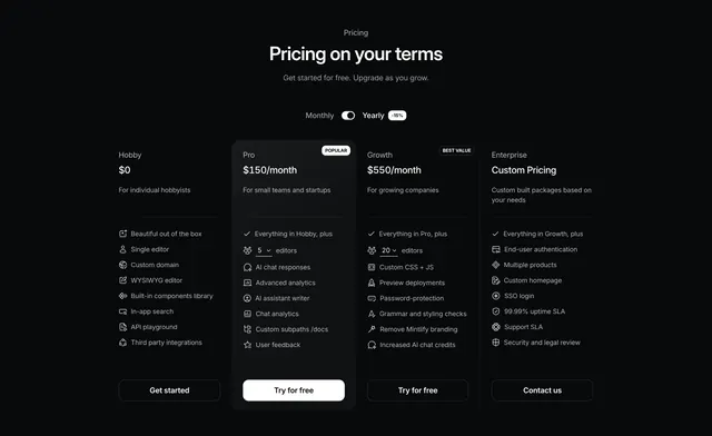 Mintlify dark four-tier pricing with highlighted Pro column
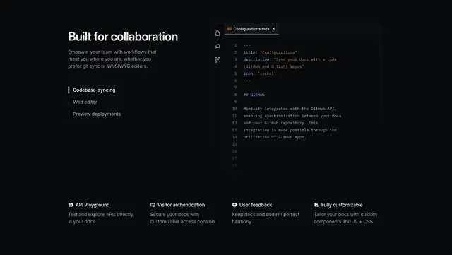 Mintlify collaboration feature with code editor mockup and 4-col row
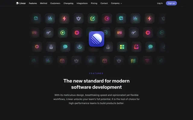 Linear features page hero
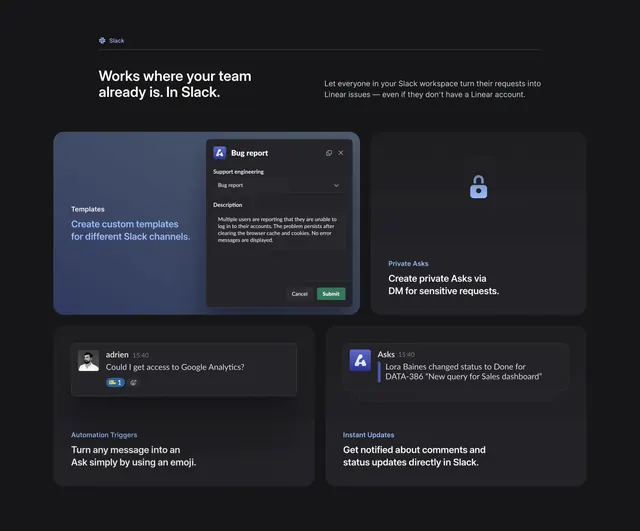 Linear Asks Slack integration features
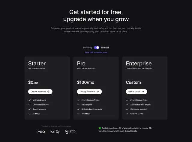 Bucket Pricing Section
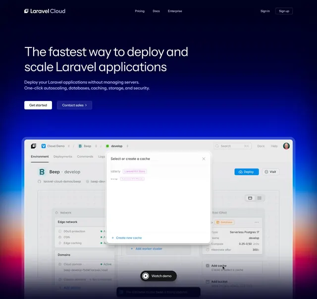 Laravel Cloud dark hero with dashboard
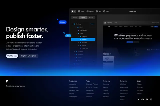 Framer CTA-plus-footer with five link columns
 Linear integrations workflow hero
 Linear homepage hero with app preview
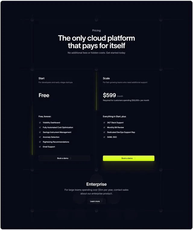 Antimetal dark pricing tiers
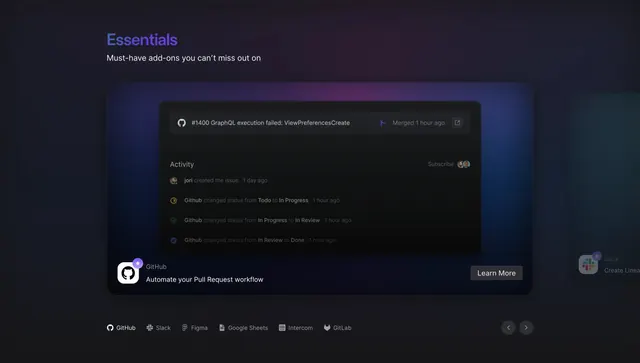 Linear Essentials integrations spotlight
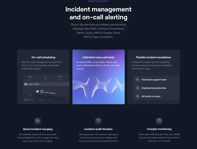 Better Uptime incident management feature grid
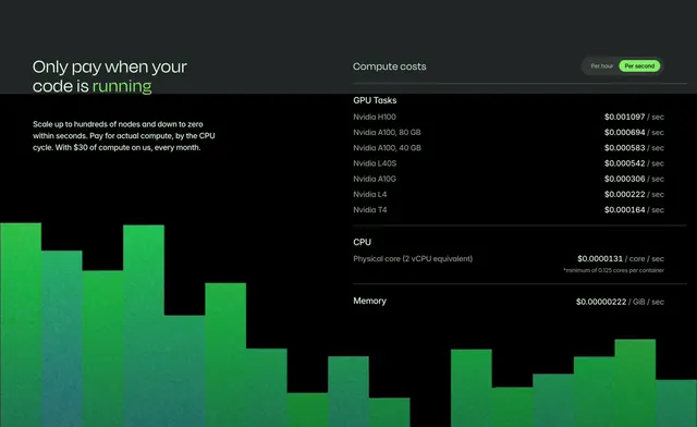 Modal home page compute cost
 Linear Hero Section
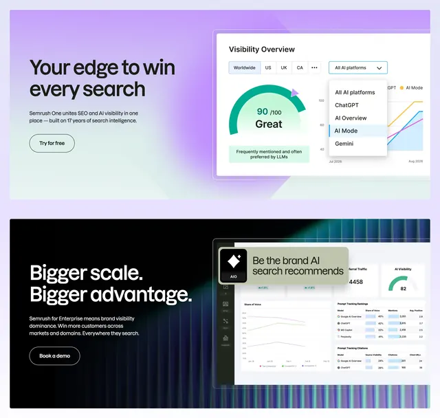 Semrush AI search dual feature
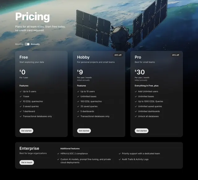 Outerbase three-tier pricing over space imagery