Outseta team-membership feature detail with UI panel
Light feature-detail section pairing a left product screenshot with a right text block, over a three-column supporting point row beneath.
Summary
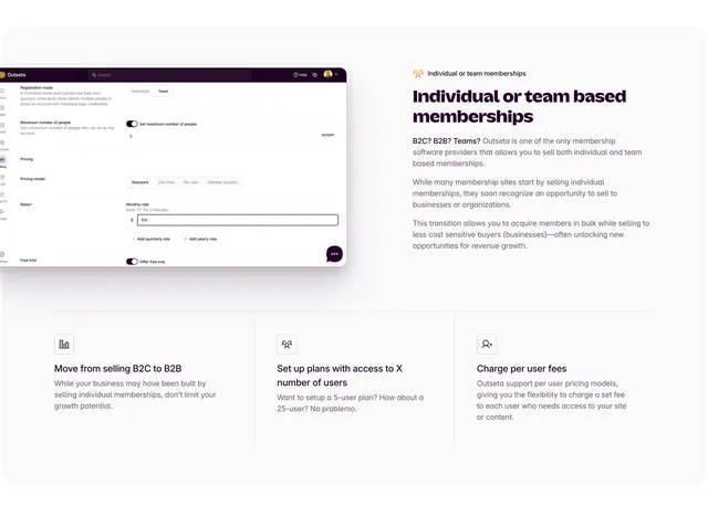
A light feature-detail block that places a product settings screenshot on the left and a descriptive paragraph on the right, then reinforces the point with a three-column row of small supporting benefits underneath. It is a clean split-plus-trio layout for explaining one capability in depth.
Visual description
On the left, a rounded product screenshot shows an Outseta settings panel with a dark top bar, a left icon rail, and form sections for registration mode (Individual/Team toggle), maximum number of people, pricing model (Standard/One time/Per user options), monthly rate, and a free-trial toggle. On the right, an oversized two-line aubergine headline "Individual or team based memberships" sits above several short paragraphs of muted body copy explaining selling to both individuals and organizations. A thin divider separates this from a lower three-column row, each column a small line icon over a bold short title (Move from selling B2C to B2B, Set up plans with access to X number of users, Charge per user fees) and two lines of gray supporting text. Generous white space throughout.
Key takeaway
The two-tier explanation structure: a deep split (screenshot plus narrative) for the headline capability, then a divider into three lightweight supporting points that elaborate without competing for attention. Showing the real settings UI makes an abstract billing feature concrete.
Reuse notes
Good for explaining a single nuanced feature that benefits from both a product view and a few framing sub-points. Needs a legible, well-cropped settings screenshot. The light, generously spaced layout suits a calm B2B SaaS narrative; the three-column row scales down cleanly on smaller screens.
More like this
 Outseta all-in-one membership feature bento
 Reevo like what you saw split demo
 Adora tabbed feature detail with Notion mockup
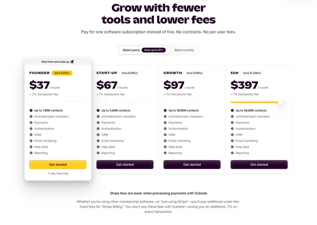 Outseta four-tier pricing with featured plan
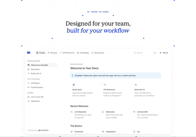 ReadMe team workflow docs hub preview
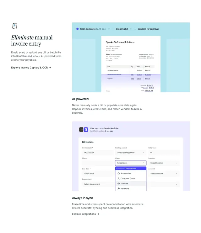 Routable invoice capture and OCR features
 ReadMe customer logo grid
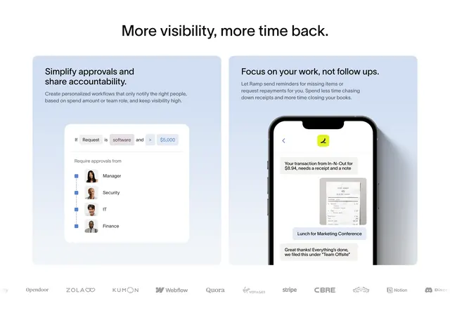 Ramp approvals and follow-ups dual cards
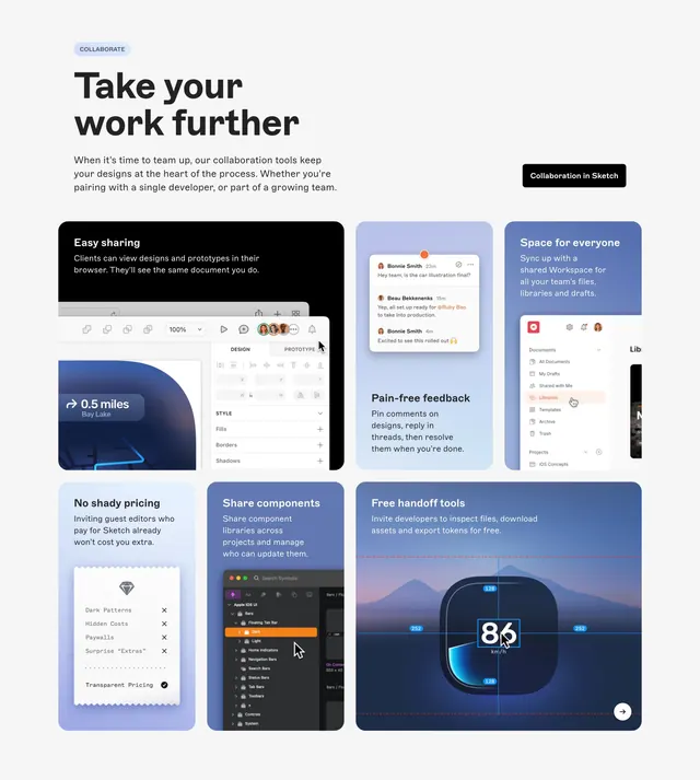 Sketch collaboration bento feature grid
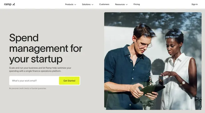 Ramp startup spend management split hero
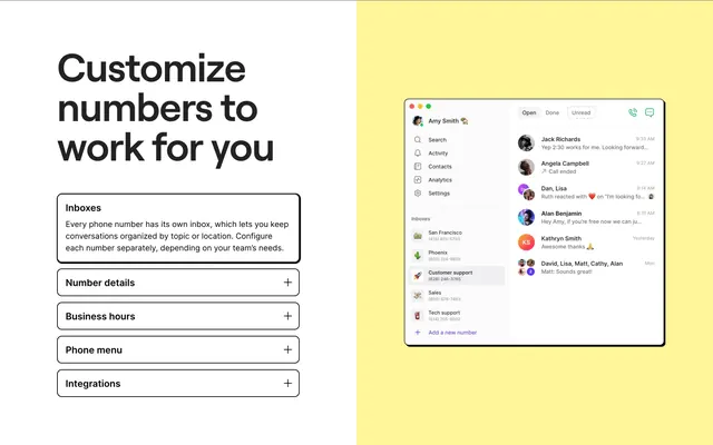 OpenPhone customize numbers split feature
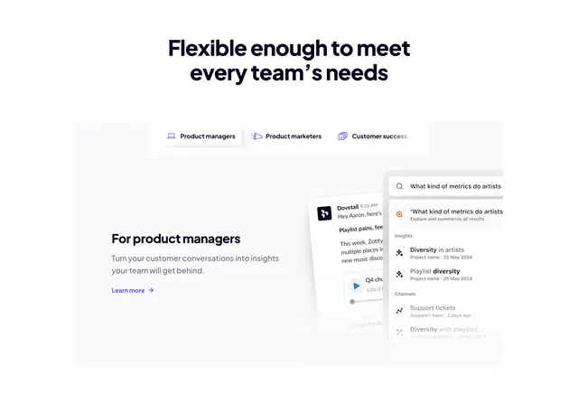 Dovetail audience-tabbed feature with floating search UI
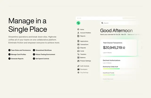 Highnote manage in one place split feature
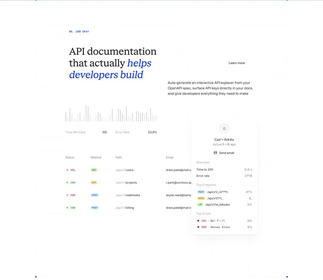 ReadMe API docs analytics bento feature
 Osome accounting split hero
 Globalization Partners security page section certifications
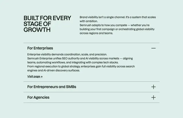 Semrush growth-stage accordion
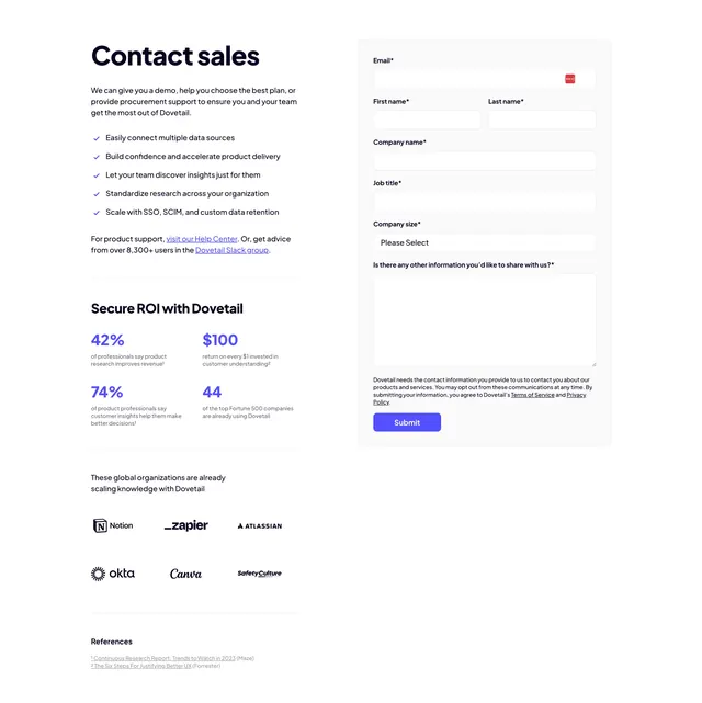 Dovetail contact sales split form
 Furey how we work split CTA with logo collage
 Lumos Lumineers team photo grid
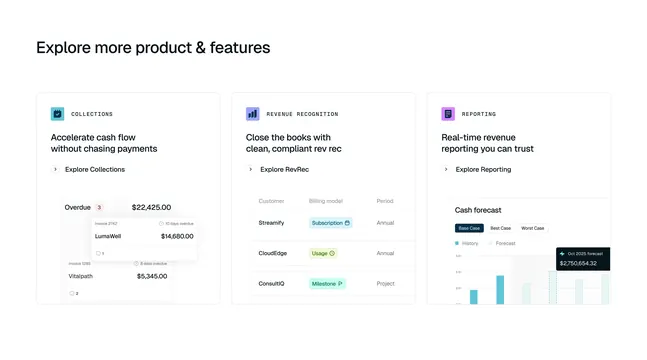 Tabs three-column product feature cards
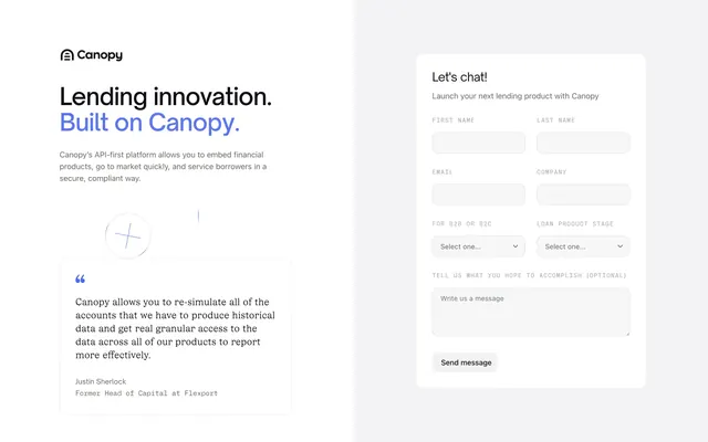 Canopy start page split hero with lead form
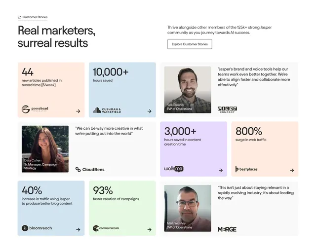 Jasper bento testimonials mixing stats and quotes
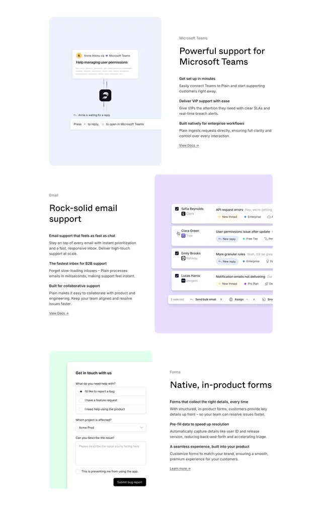 Plain channel integration feature stack