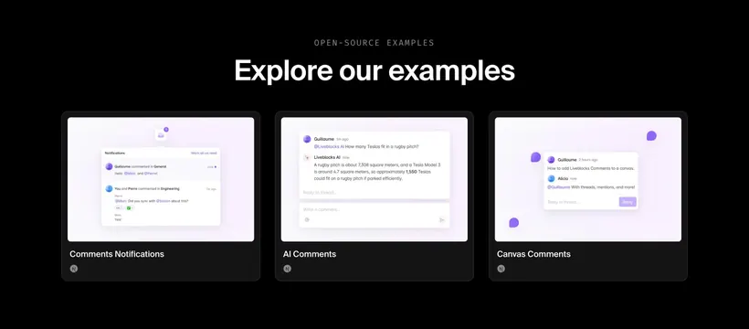
Liveblocks open-source examples grid
Dark three-card gallery showcasing Comments Notifications, AI Comments, and Canvas Comments example UIs.
Summary
Open-source examples row with three purple-accent comment pattern previews in dark framed cards.
Visual description
Black background. Gray OPEN-SOURCE EXAMPLES label and white headline "Explore our examples." Three dark rounded cards with light previews: Notifications modal with bell badge and thread list; AI Comments thread where Liveblocks AI answers a Tesla-on-rugby-pitch question; Canvas Comments with purple pin bubbles and expanded thread on a light canvas. White titles under each card and small circular logos in card corners.
Key takeaway
Showing three distinct comment UX patterns side by side helps developers pick a starting template fast. Keeping previews bright inside dark frames adds focus without a full page mockup.
Reuse notes
Use on docs or examples index pages. Each card needs a distinct interaction story. Purple accent should stay consistent across previews.
More like this
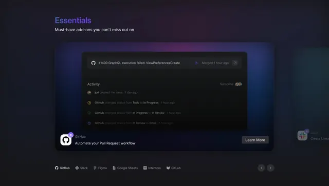 Linear Essentials integrations spotlight
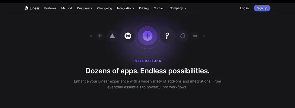 Linear integrations page hero
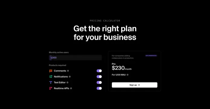 Liveblocks interactive pricing calculator
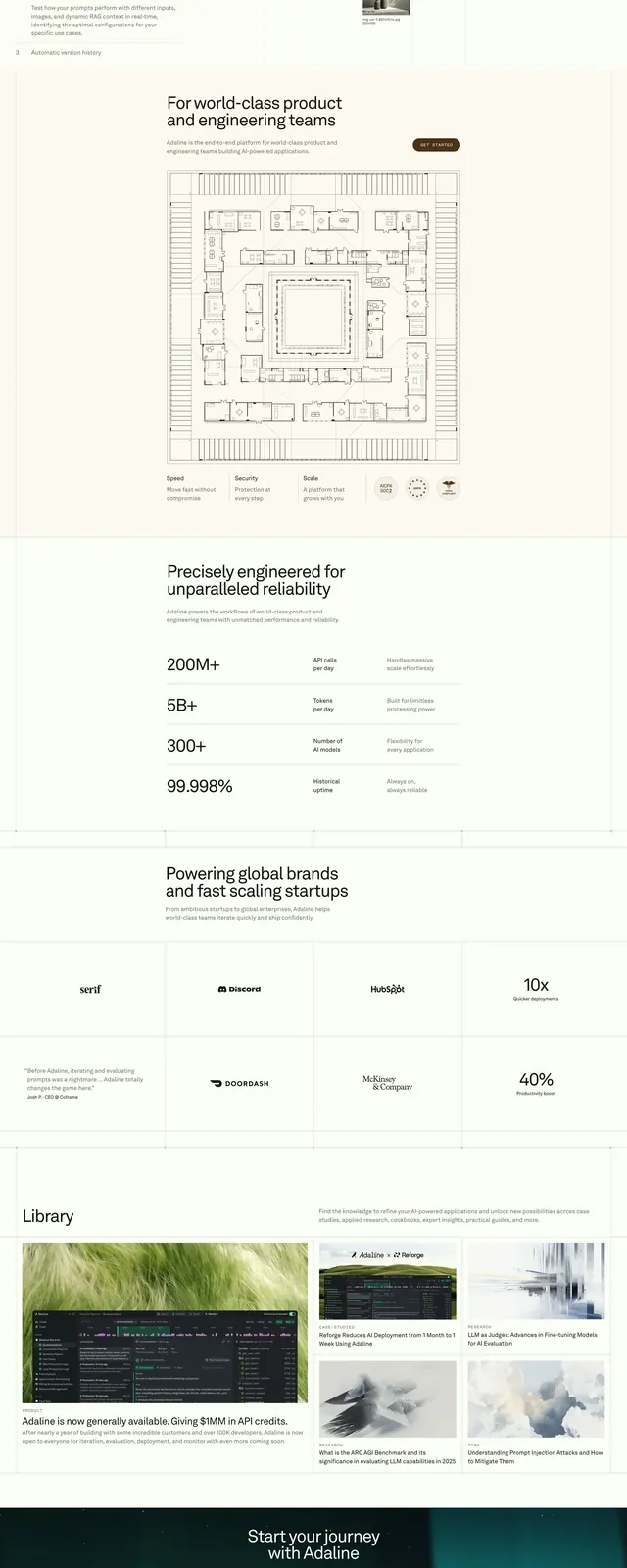 Adaline LLM Platform
 Kinetic ID tablet product spotlight
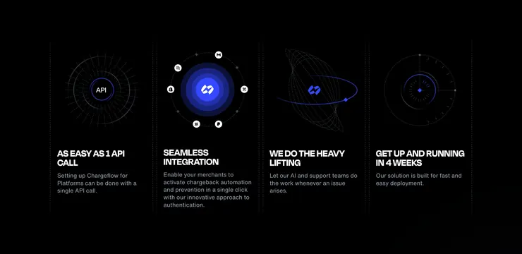 Chargeflow platform four-column features
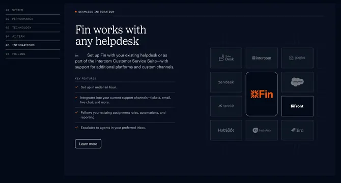 Fin helpdesk integrations chapter
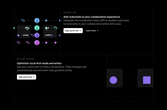 Liveblocks History API and offline benefits
 Chronicle expert templates feature grid
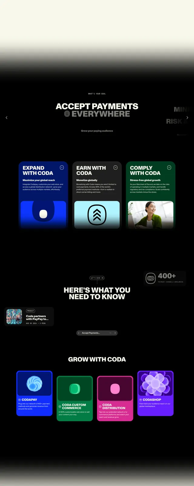 Coda Co homepage hero
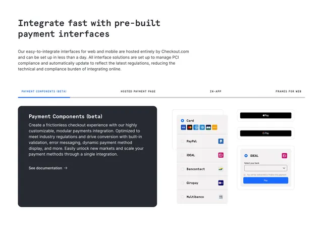 Checkout.com prebuilt interfaces tabbed feature
 Liveblocks all-in-one platform overview
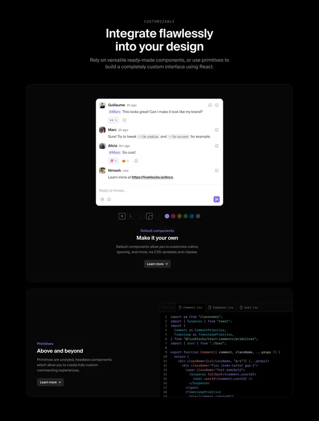 Liveblocks comments customization section
 GitHub Discussions personalization feature
 Chargeflow chargeback savings calculator
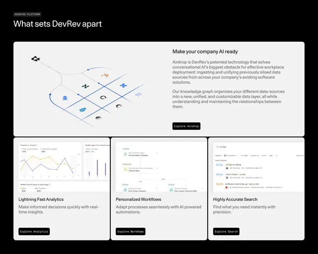 DevRev Features Section
 Linear Asks activation upsell screen
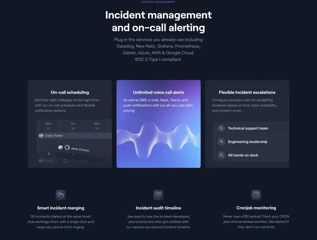 Better Uptime incident management feature grid
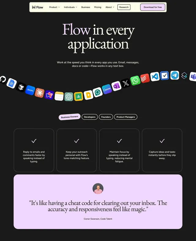 Flow product hero
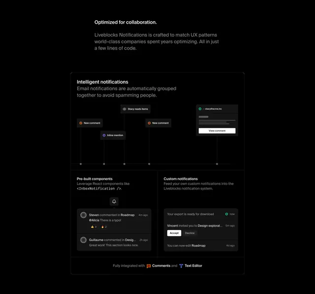 Liveblocks Notifications collaboration features
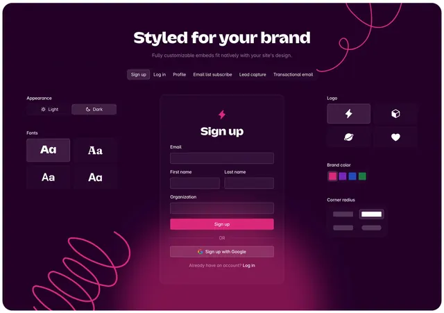 Outseta embed customization feature section
 Better Stack Logtail secure-by-design split
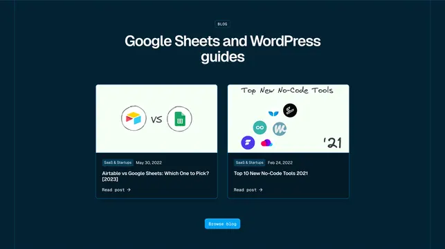 Whalesync blog section with two featured posts
 Better Stack careers split with crystal shards