Jasper integrations split with isometric icon bars
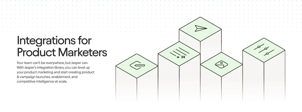
Light split integrations section with a left headline and copy beside a right cluster of staggered 3D isometric bars topped with green line icons over a dot grid.
Summary
A light integrations section that sets a left-aligned headline and paragraph against a right-hand cluster of staggered isometric 3D bars, each capped with a green-faced line icon, over a faint dot grid.
Visual description
On a white background scattered with a subtle blue dot grid in the upper area, the left column carries a two-line oversized dark headline, "Integrations for Product Marketers", followed by a four-line muted paragraph about Jasper's integration library. The right two-thirds shows five tall rectangular bars drawn in isometric perspective at staggered heights, their light grey faces fading toward the bottom and their top faces filled pale green. Each top face holds a thin dark line icon (paperclip-style hook, sliders, image, paper plane, sparkle/star). The bars read like a 3D bar chart of integration categories.
Key takeaway
Turning an integrations pitch into a staggered isometric "bar chart" of icons gives an abstract visual that implies many connected tools without naming any. The pale-green icon faces add a single accent color against an otherwise grey-and-white scene.
Reuse notes
Use when you want to communicate breadth of integrations but cannot or do not want to show specific partner logos. The isometric illustration needs room on the right, so keep copy concise on the left. Pairs with a downstream logo wall if real partners are added later. Works on light.
More like this
 Sierra consumer banking tabbed feature
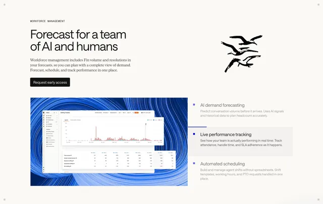 Intercom workforce management feature
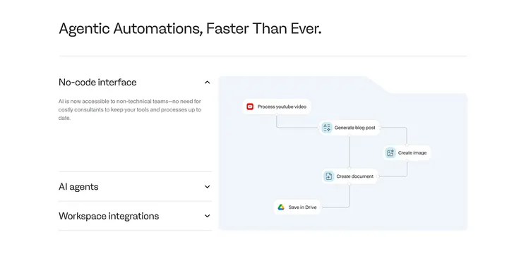 Noxus features with accordion and flow diagram
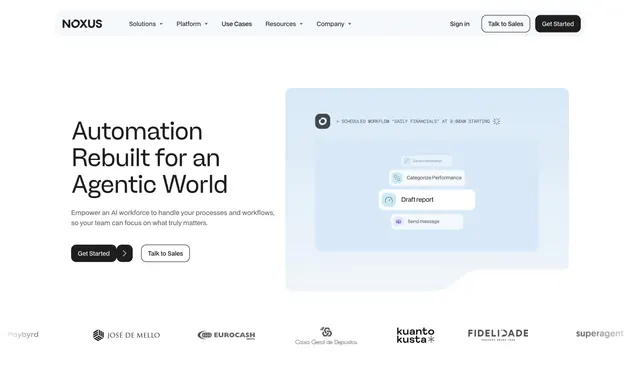 Noxus light hero with agent workflow card
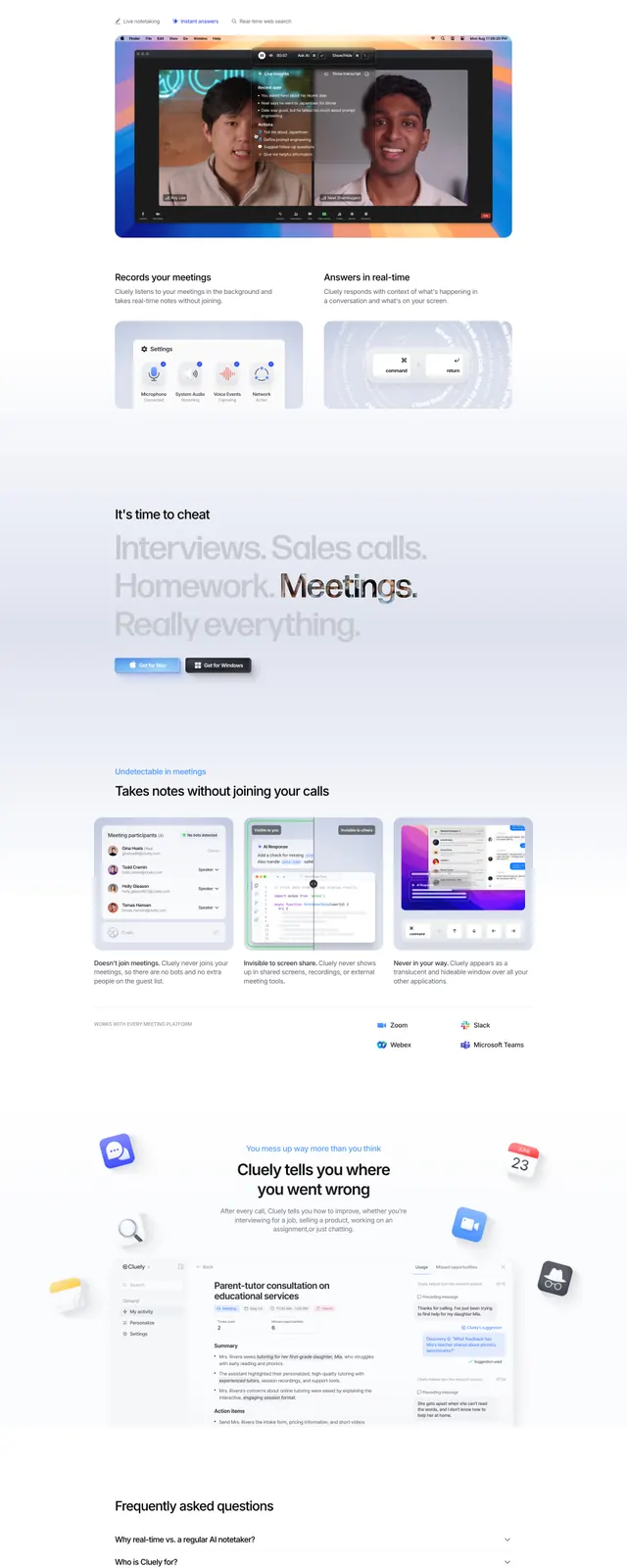 Cluely landing page
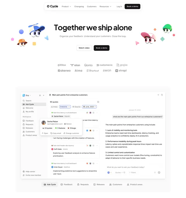 Cycle product hero with Ask UI
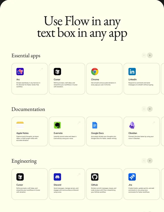 Flow cross-app integration carousel section
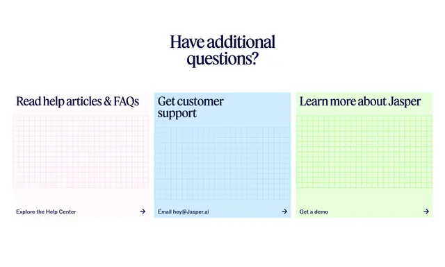 Jasper support questions three-card CTA
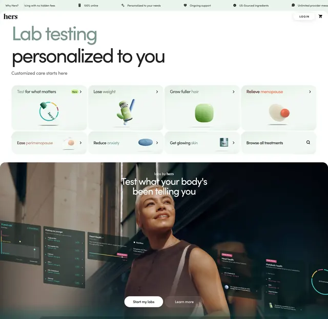 Hers Labs category grid and hero
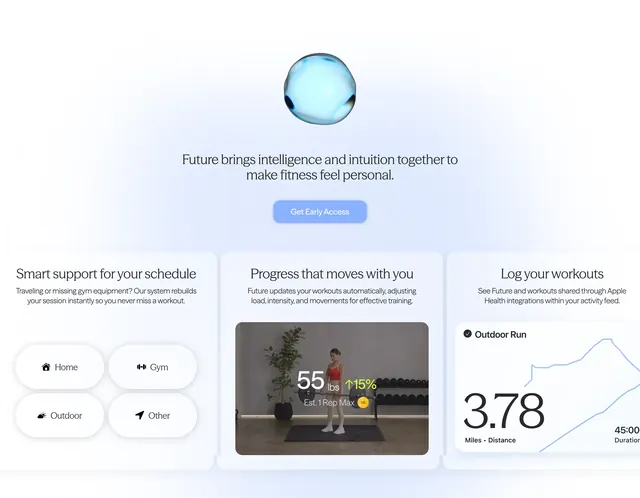 Future fitness intelligence feature trio
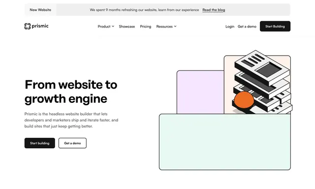 Prismic home hero with isometric stack illustration
 Adept AI homepage hero
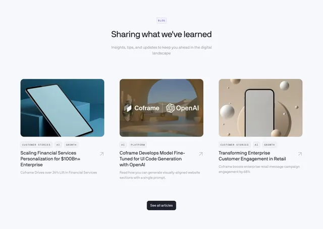 Coframe blog/resources 3-column card grid
 Fellow integrations logo cluster, split layout
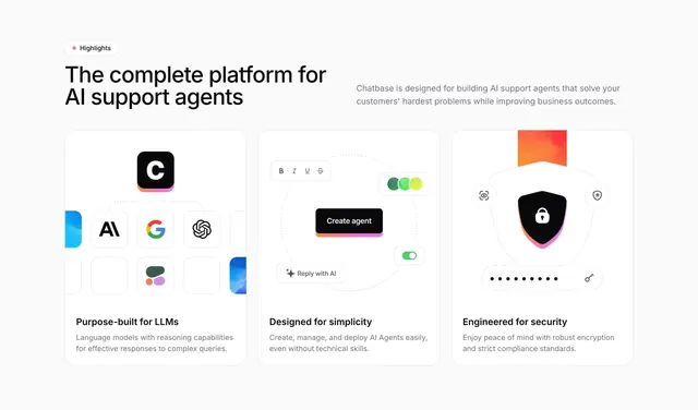 Chatbase three-card feature highlights
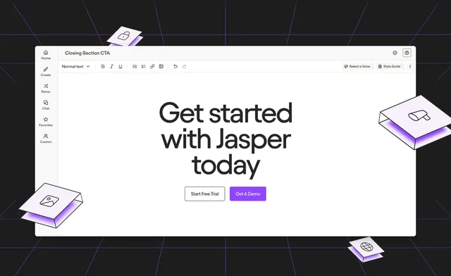 Jasper editor-framed CTA with floating 3D cards
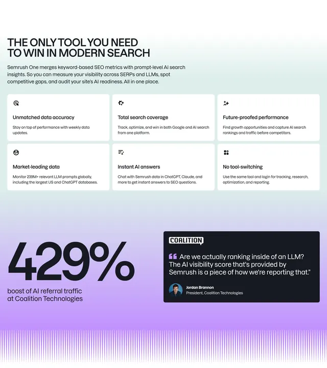 Semrush One value proposition grid
 Orshot Hero Section
 Hers Labs five-step mint bento
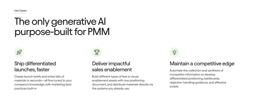 Jasper Features Section
 Inertia centered CTA over dotted ASCII art
 Lindy Integrations Section
 Handhold AI demo agent homepage hero
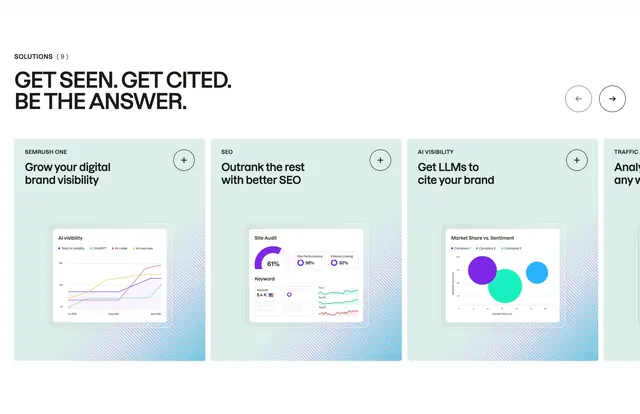 Semrush solutions product carousel