Jasper Features Section
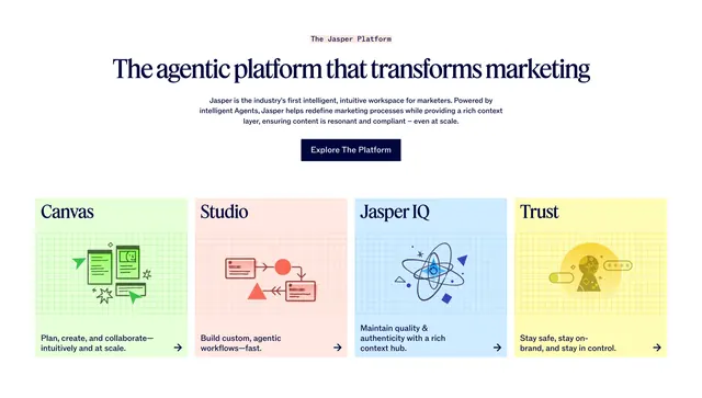
Four colorful illustrated pillar cards (Canvas, Studio, Jasper IQ, Trust) under a centered serif headline and navy CTA.
Summary
A four-pillar feature row where each capability gets its own pastel illustrated card in a different color, sitting under a centered serif headline, intro, and navy button. The block trades minimalism for a colorful, branded set of product pillars.
Visual description
A small monospace-style "The Jasper Platform" eyebrow leads a centered single-line serif headline "The agentic platform that transforms marketing", a short centered intro paragraph, and a filled dark-navy "Explore The Platform" button. Below run four equal cards, each a different pastel fill (green, pink, blue, yellow) with a faint grid texture: Canvas, Studio, Jasper IQ, and Trust. Each card sets its name large in a serif face at the top, a flat black line illustration in the middle (document and arrows, workflow nodes, an atom-like diagram, a shielded figure), and a short two-line description with a right arrow at the bottom.
Key takeaway
Giving each pillar its own pastel color plus a custom line illustration makes four features feel like four distinct products while staying one cohesive row. The serif card titles against flat editorial illustrations read as confident and brand-forward. The centered serif intro with a single dark CTA keeps the colorful grid grounded.
Reuse notes
Reach for this when you want personality and have the budget for custom per-card illustrations; the section leans on that artwork to work. Best for brand or platform-overview pages rather than dense technical specs. Keep the pastel set harmonized and the illustration style consistent across all four cards, or the row loses cohesion.
More like this
 Kajabi AI Creator Hub signup hero
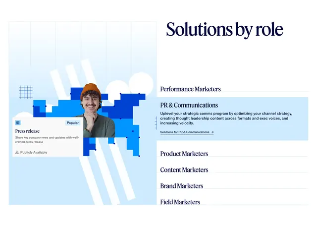 Jasper Solutions by role tabbed feature
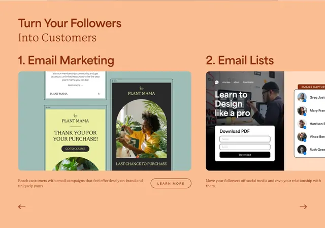 Kajabi followers-to-customers email features
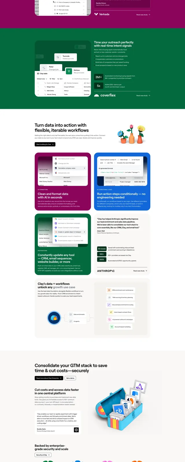 Clay-style illustrated SaaS landing page
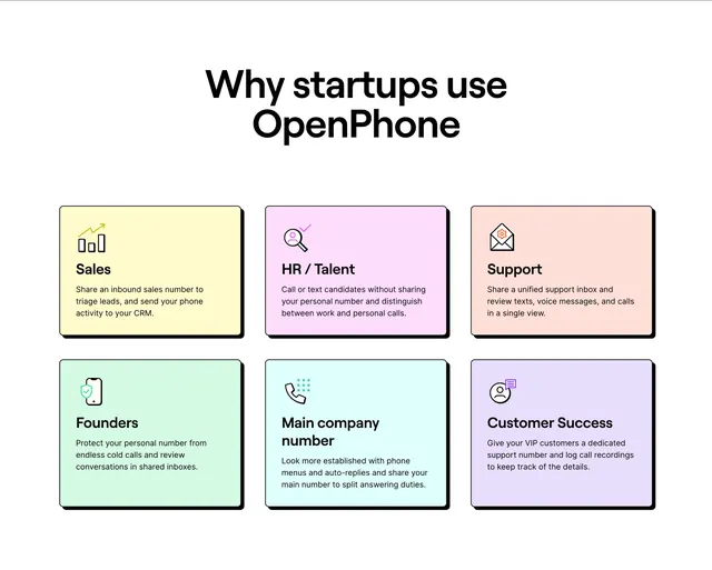 OpenPhone startup use-case benefit grid
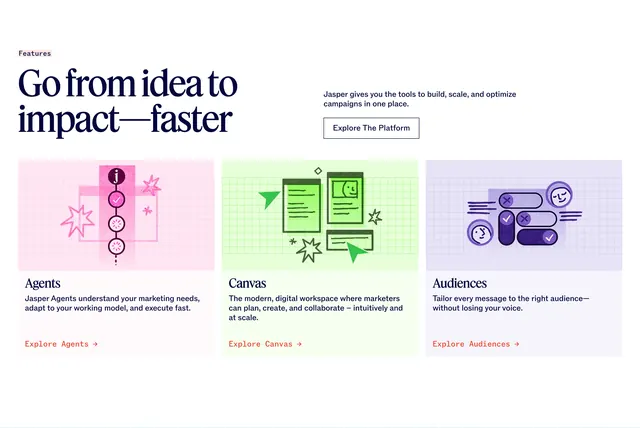 Jasper platform three feature cards
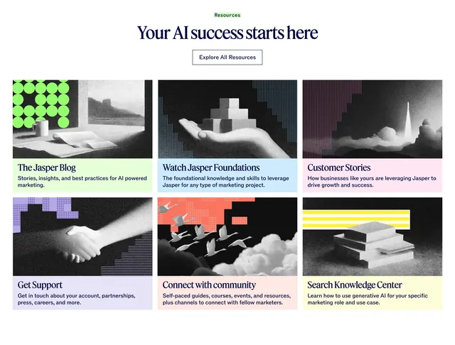 Jasper resources six-card grid
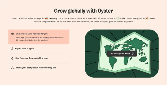 Oyster global hiring benefits with video panel
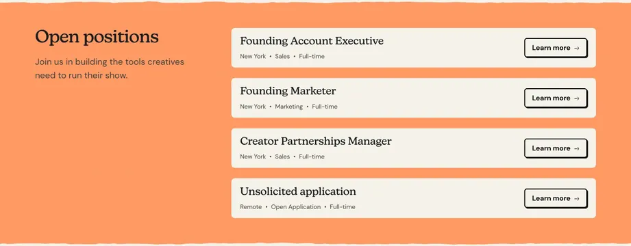 Passionfroot open positions job list
 Oddit staggered benefits marquee ticker
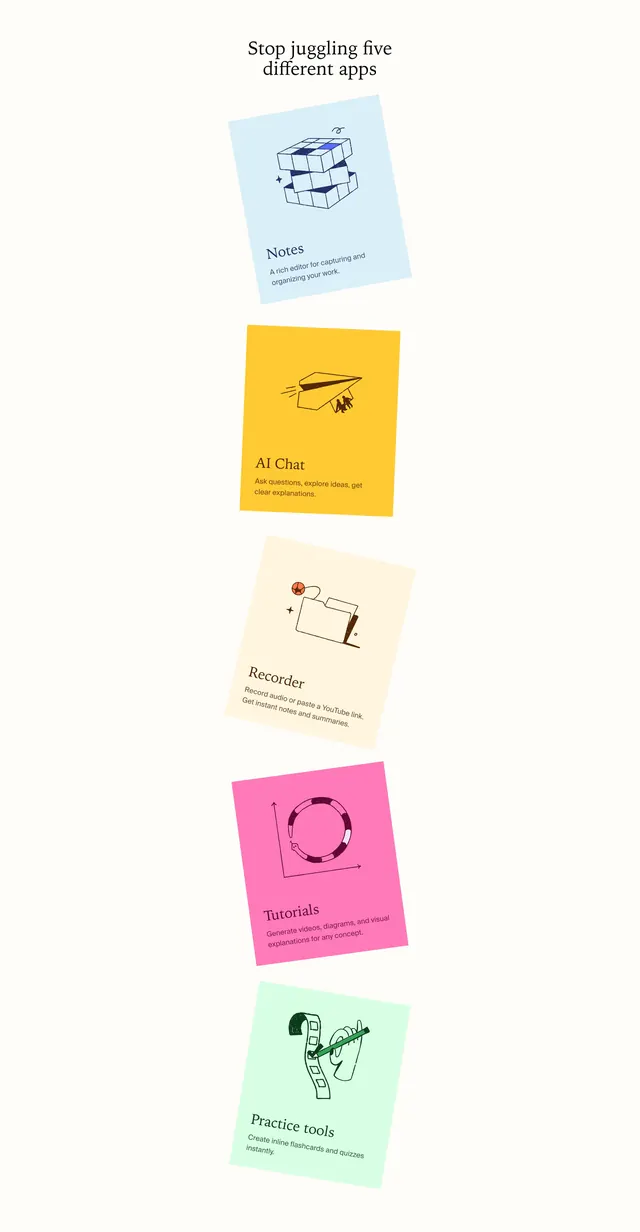 Opennote stacked feature cards
 Vouch AI editing feature split
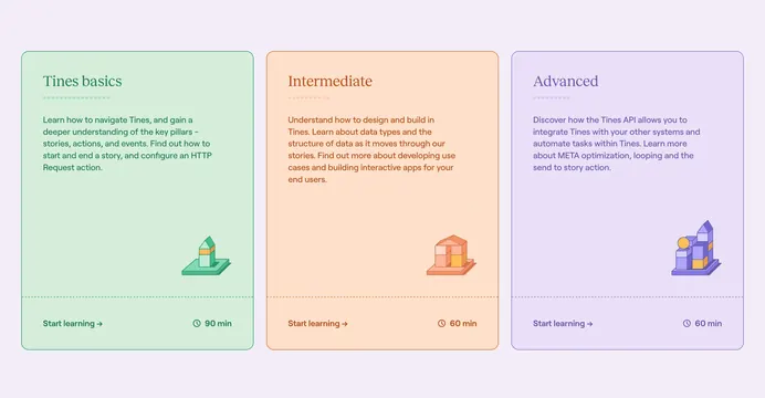 Tines University course level cards
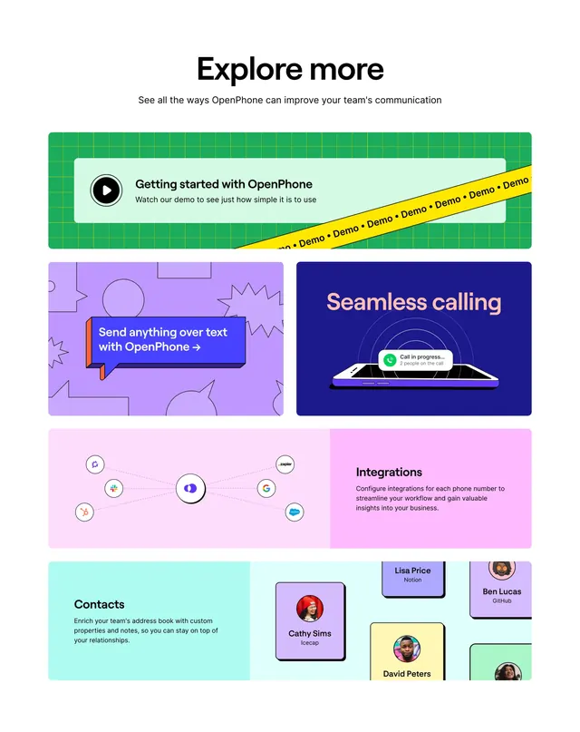 OpenPhone explore-more bento grid
 Jasper CTA Section
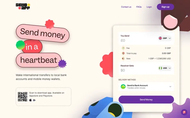 Send App money transfer hero
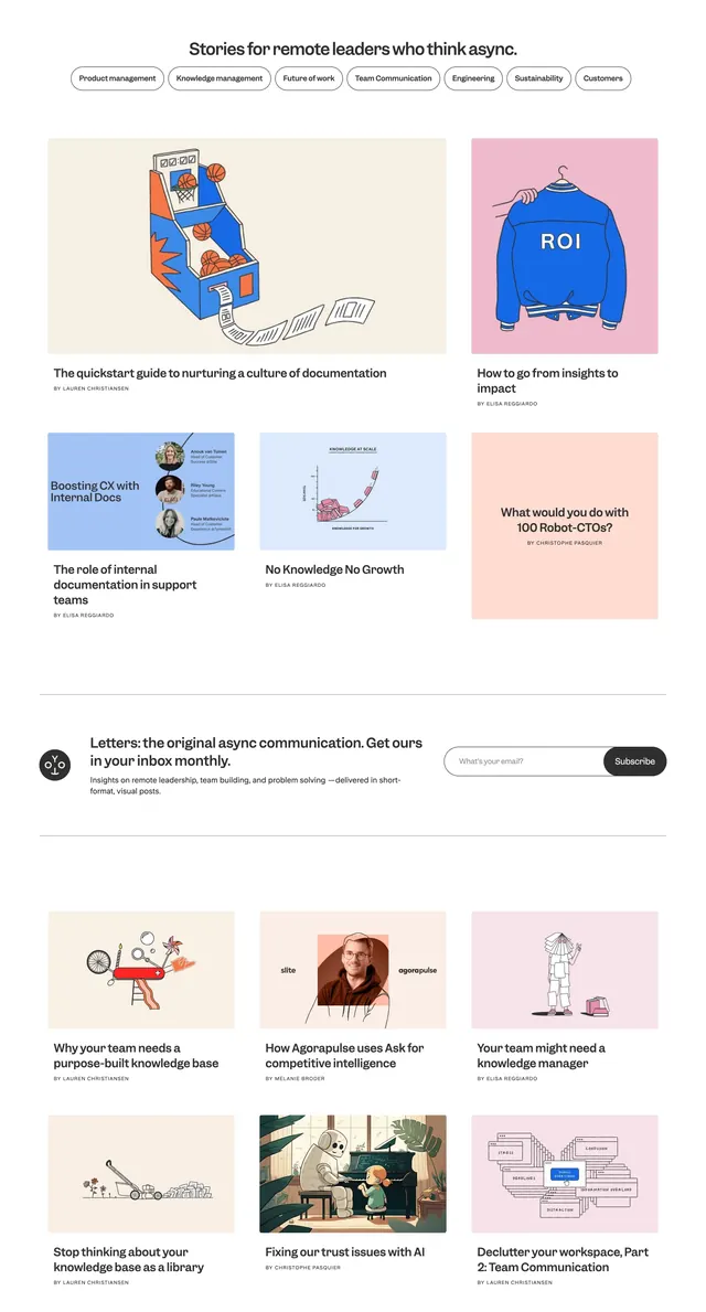 Slite async leaders blog grid
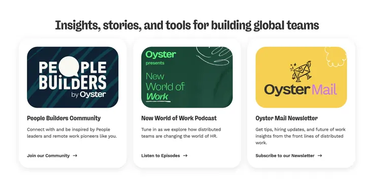 Oyster insights three-card resource grid
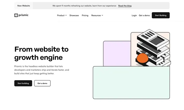 Prismic home hero with isometric stack illustration
 Jasper customer stories bento grid
 Jasper platform value prop with four cards
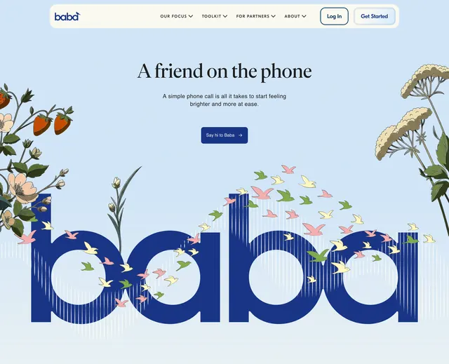 Baba companion phone hero
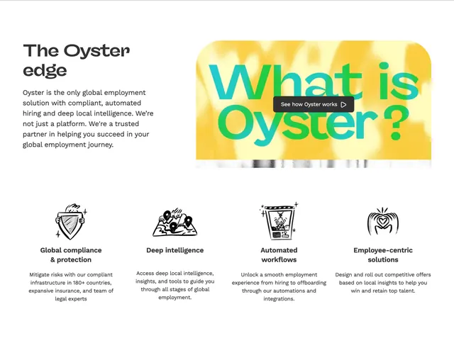 Oyster edge features and video
 Parloa customer relationship split feature