Intercom suite workflow diagram
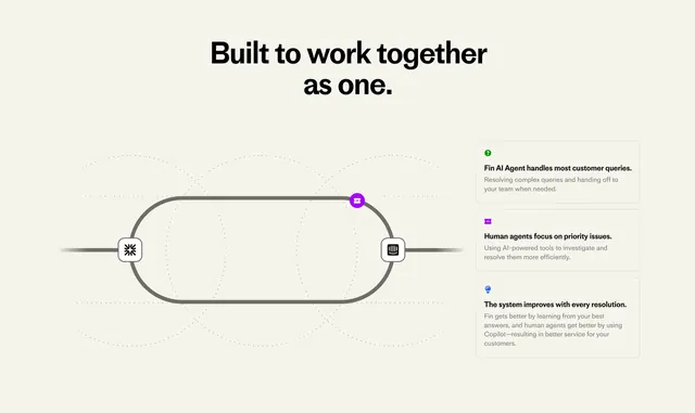
Beige explainer with stadium-track diagram and three boxed steps for Fin, human agents, and continuous improvement.
Summary
How it works section with bold headline, gray stadium loop diagram with Fin and Intercom icons, and three outlined explanation boxes.
Visual description
Light beige background with faint dotted grid. Centered black headline "Built to work together as one." Left: thick dark gray horizontal pill track with white square icons at ends and purple Fin robot icon on upper curve, overlapping dotted circles suggesting motion. Right: three stacked outlined boxes with small colored icons: green question Fin handles queries, purple robot humans on priority issues, blue lightbulb system improves via Fin learning and Copilot.
Key takeaway
Abstract loop diagram plus plain-language boxes explains AI-human workflow without another product screenshot. Dotted grid adds structure on empty beige.
Reuse notes
Mid-page conceptual section on suite pages. Keep to three steps max. Icons must map clearly to product names.
More like this
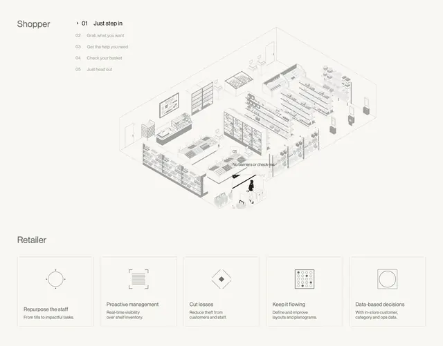 Sensei shopper journey and retailer benefit cards
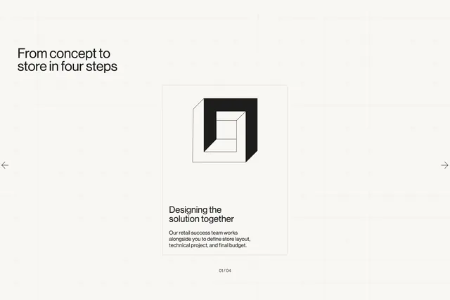 Sensei four-step process carousel card
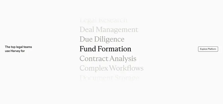 Harvey vertical use-case scroll list
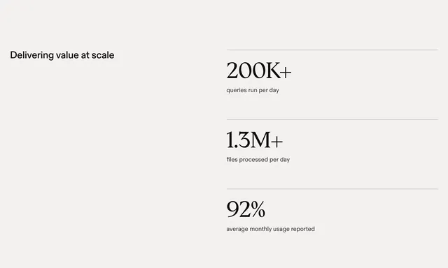 Harvey split stats with serif figures
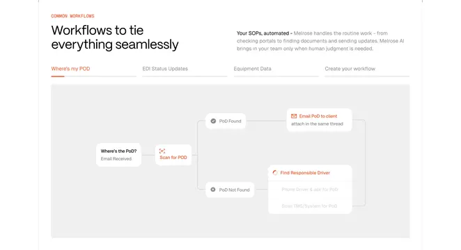 Melrose common workflows diagram
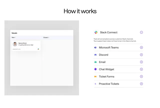 Pylon how it works channel accordion
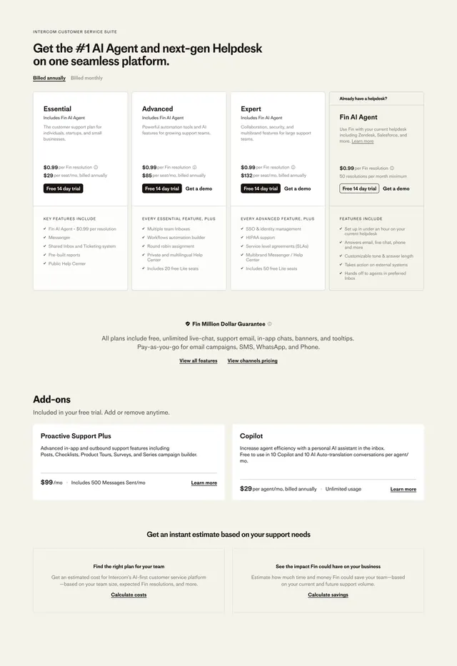 Intercom suite pricing cards
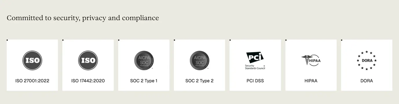 Parloa compliance certification logo cloud
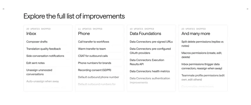 Intercom shipped updates grid
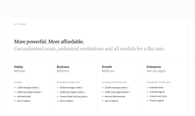 Wist four-tier pricing table
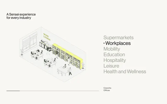 Sensei industry tab list with isometric scene
 Pravah vision mission headline
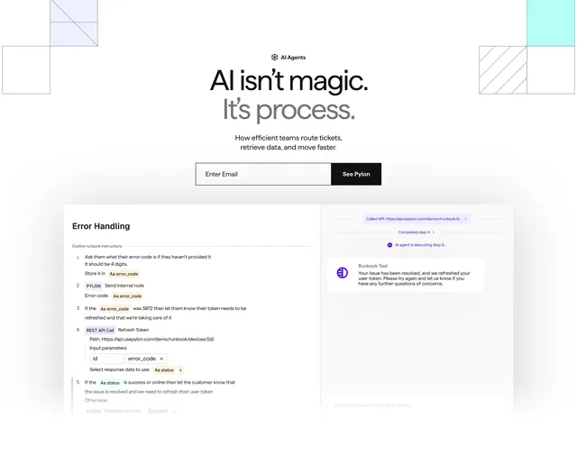 Pylon AI agents process hero
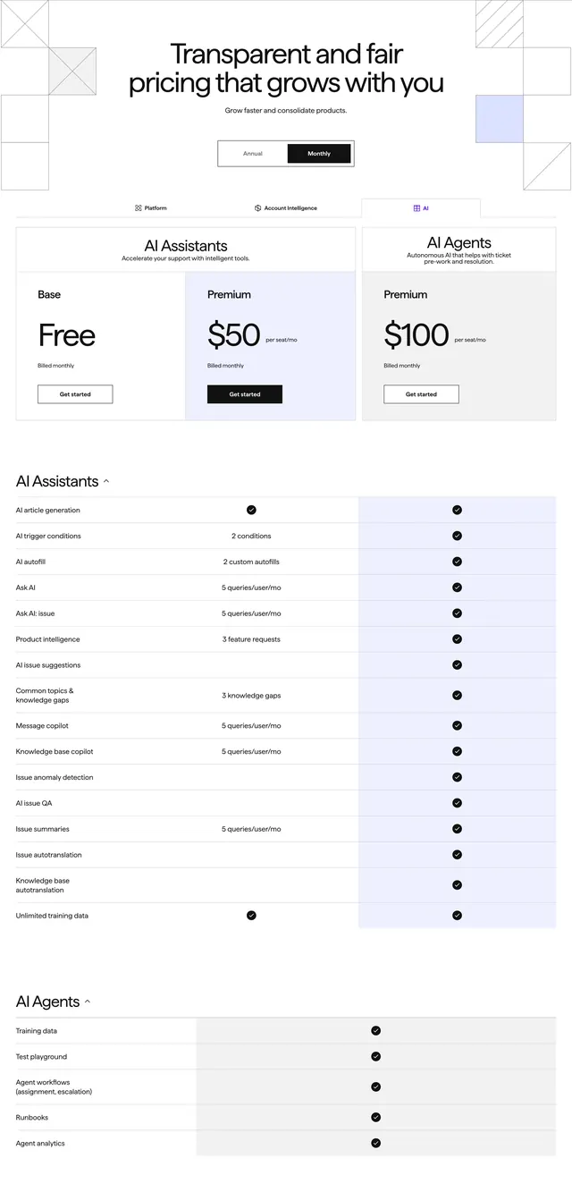 Pylon AI subscription pricing table
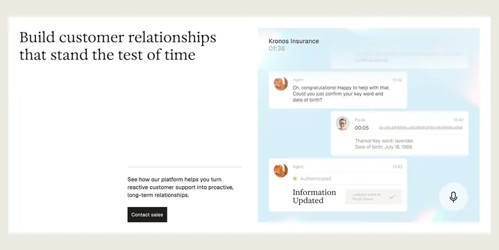 Parloa customer relationship split feature
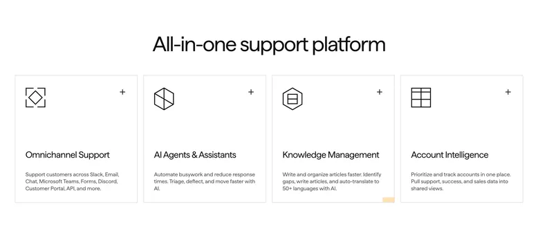 Pylon all-in-one support platform features
 Holocene three-step impact process
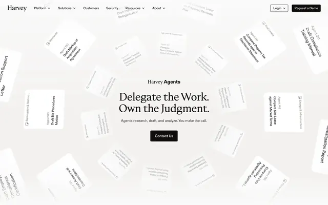 Harvey Agents delegate work hero
 Runlayer security advantages key benefits
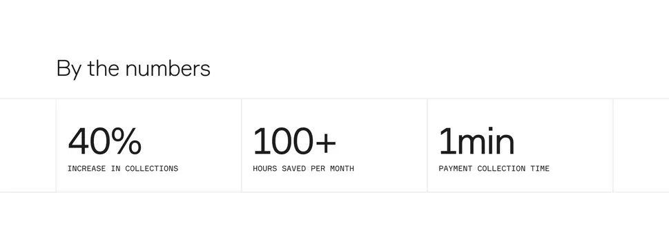 Standard Fleet by-the-numbers stats row
 Google Cloud Team USA footer
 Parloa investor logo cloud with copy
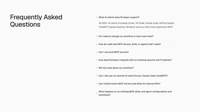 Runlayer support information accordion list
 Attio three-pillar features with wireframe icons