Heva old way vs Heva way comparison
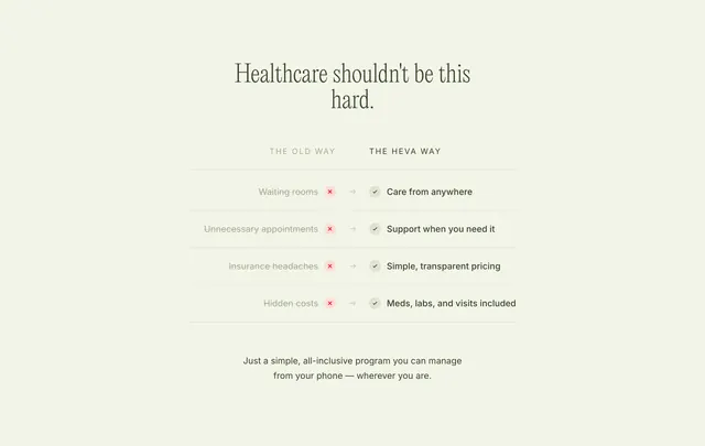
A centered before-and-after comparison table with red X and green check icons mapping legacy healthcare pain points to Heva benefits.
Summary
Four-row comparison under "Healthcare shouldn't be this hard." maps old-way problems to Heva solutions with X/check icons and arrows.
Visual description
Cream background with centered large serif headline. Two column headers: THE OLD WAY (light grey) and THE HEVA WAY (dark). Four rows separated by thin rules. Each row: grey old-way text, red X in soft red circle, grey arrow, green check in soft green circle, bold dark new-way text. Rows cover waiting rooms, unnecessary appointments, insurance headaches, hidden costs. Closing centered sans paragraph about all-inclusive phone-managed care.
Key takeaway
Icon-plus-arrow row pattern makes scan comparison instant without a heavy table chrome. Bolding only the solution side directs attention to outcomes.
Reuse notes
Strong for telehealth or DTC health positioning against legacy systems. Keep to four to six rows max. Muted red/green circles avoid aggressive traffic-light styling.
More like this
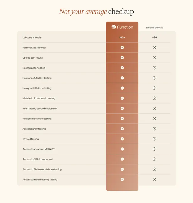 Function vs standard checkup comparison table
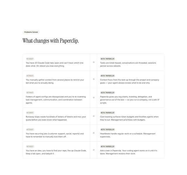 Paperclip without-vs-with comparison table
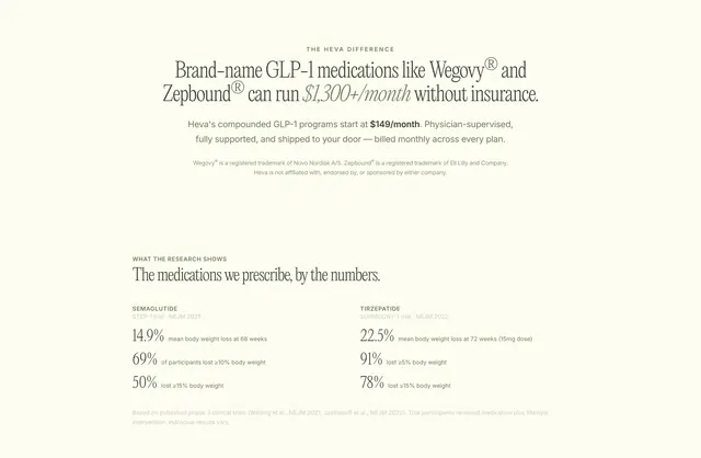 Heva value difference and clinical stats
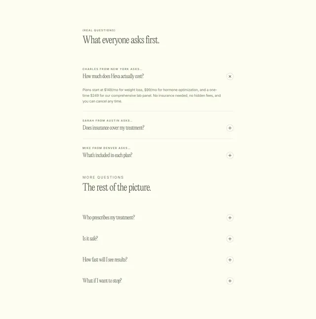 Heva personalized FAQ accordion
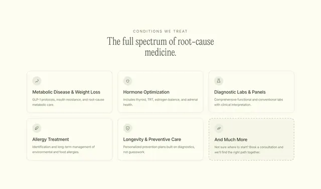 Heva conditions treatment grid
 Heva professional care team grid
 Function longevity health mission CTA
 Function real results testimonial video grid
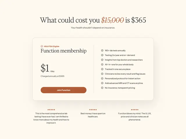 Function membership pricing section
 Function scan locations zip code CTA
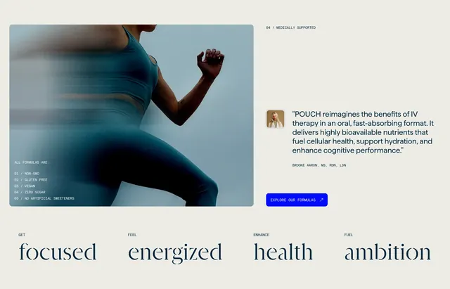 Pouch medical expert testimonial feature
 Function site navigation mega menu
 Sage Hill professional team carousel
 Reflow compliance trust split section
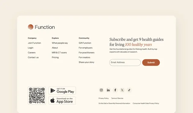 Function footer with newsletter signup
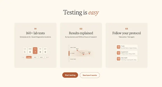 Function how it works three-step section
 Heva health onboarding CTA
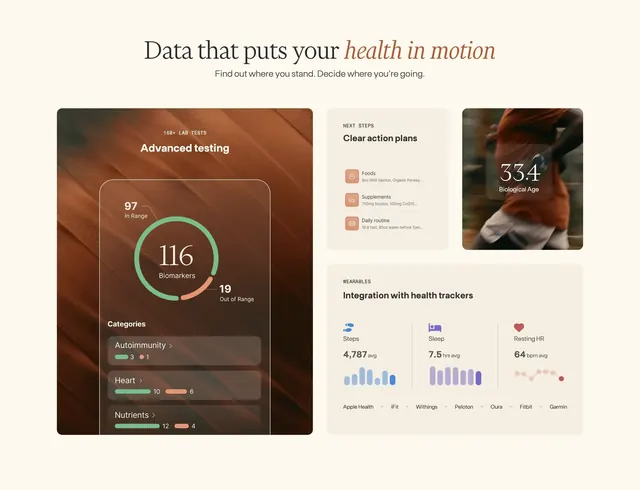 Function comprehensive health data bento grid
 Amigo primary care hero
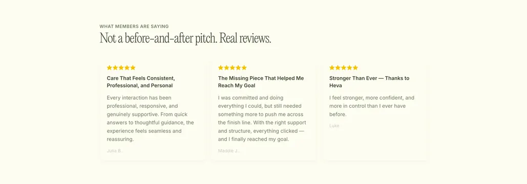 Heva member testimonial cards
 Heva GLP-1 treatment pricing cards
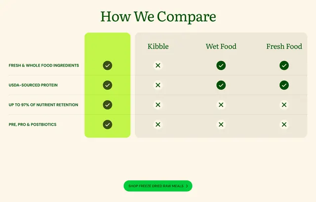 Get Joy freeze-dried comparison matrix
 NGLM executive team grid
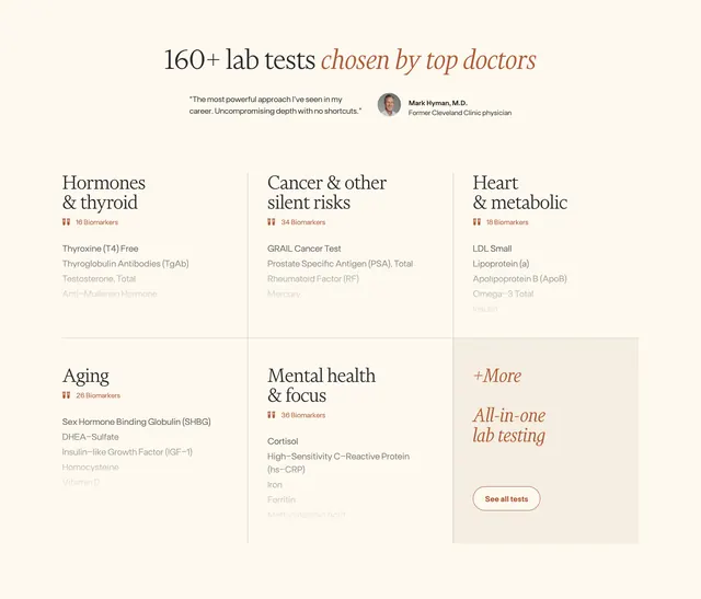 Function available lab tests feature grid