GitHub Packages trusted sources feature
Light split feature section pairing floating package registry cards on the left with a "Trusted sources" headline and copy on the right.

Summary
A light, asymmetric features block that visualizes package trust with three floating registry cards while the right column explains approved, community-sourced installs.
Visual description
White background with a subtle square grid and scattered red, purple, and orange pixel accents. Left side shows three staggered package cards at slight angles: a Docker card for "autoscaler" (v1.0.3, github/ci-autoscaler, 2 stars, 35 downloads) with a padlock badge; an npm card for "primer/css" (v13.4.0, 6.3k downloads) with a globe badge; and a RubyGems card for "rubygems/project" (v6.0.3, 52 downloads) also with a globe badge. Each card shows ecosystem icon, package name in blue, version and commit hash, repo link, and download stats. Right column holds a bold dark heading "Trusted sources" and muted body copy about understanding package contents and using organization-approved packages from the GitHub community.
Key takeaway
Floating, slightly rotated cards make abstract registry data feel tangible without a full UI screenshot. Overlapping trust badges (padlock, globe) on card corners communicate approval at a glance.
Reuse notes
Works for developer platforms explaining supply-chain trust or multi-ecosystem support. Needs real package metadata to stay credible. Light palette pairs well with adjacent dark sections on the same page.
More like this
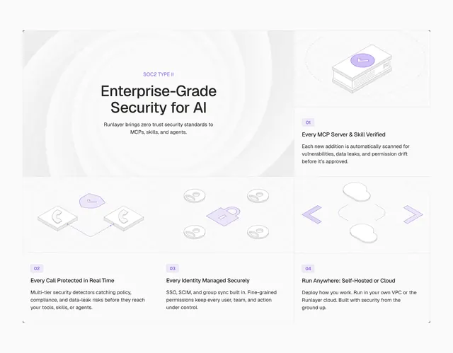 Runlayer security advantages feature grid
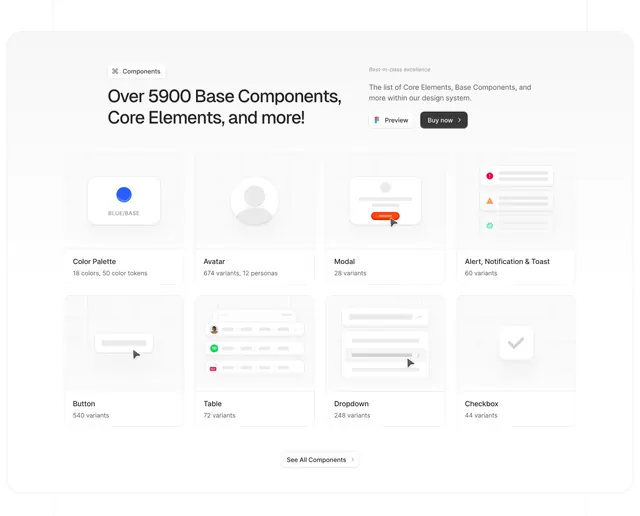 AlignUI components grid showcase
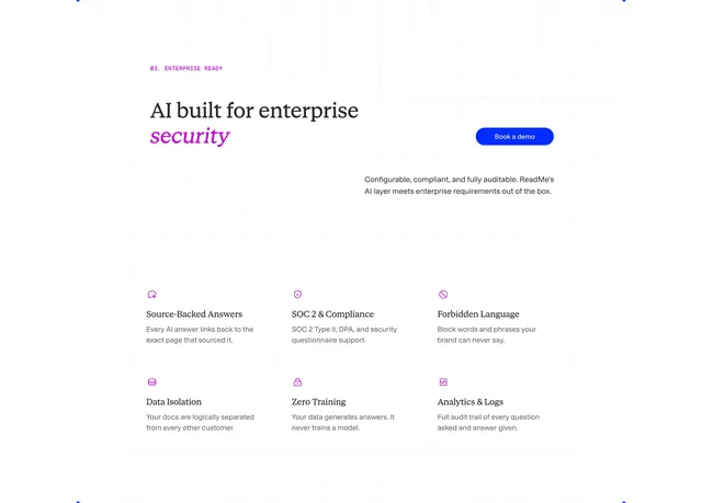 ReadMe enterprise AI security grid
 Xizt home page services
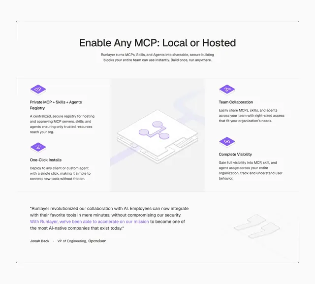 Runlayer MCP capabilities feature grid
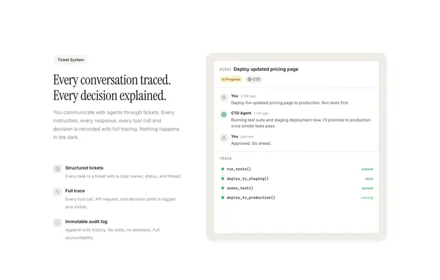 Paperclip agent tracing ticket feature
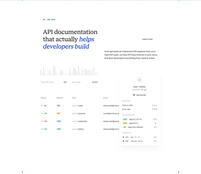 ReadMe API docs analytics bento feature
 ElevenLabs startup grants program feature
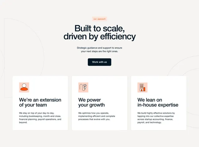 Furey what we do three-pillar approach section
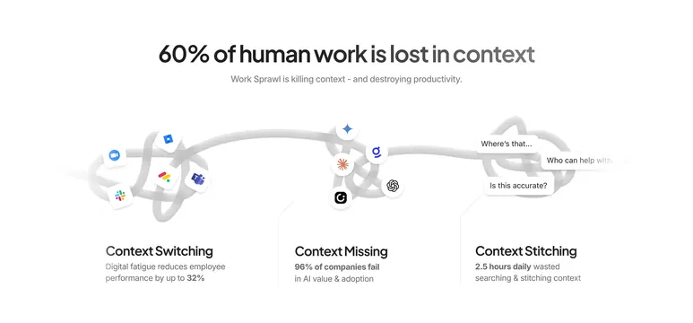 ClickUp work sprawl problem infographic
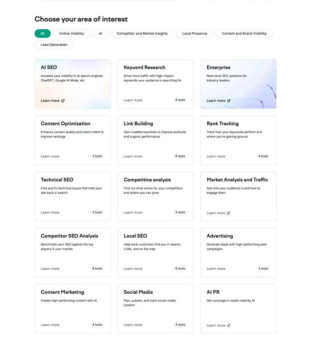 Semrush product interest grid
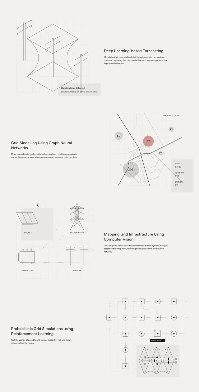 Pravah technology capabilities feature stack
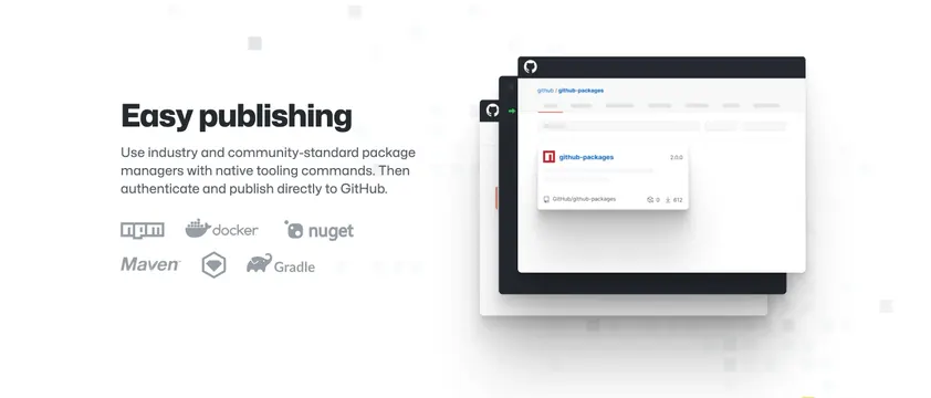 GitHub Packages easy publishing feature
 ReadMe customer stories section header
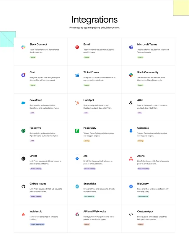 Pylon integrations grid
 Tenor onchain borrowing dashboard
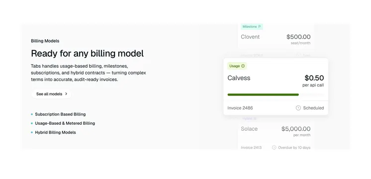 Tabs billing models feature split
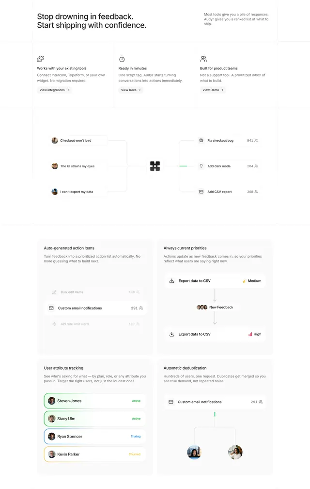 Audyr feedback workflow feature bento
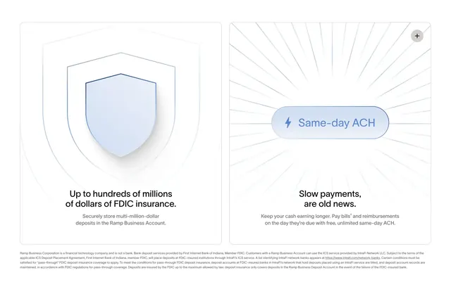 Ramp FDIC and same-day ACH feature pair
 Sensei four-step process carousel card
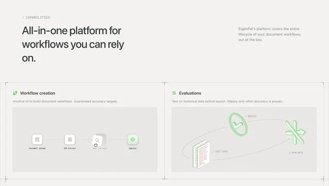 EigenPal capabilities two-card grid
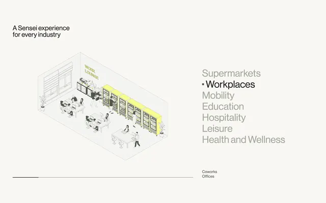 Sensei industry tab list with isometric scene
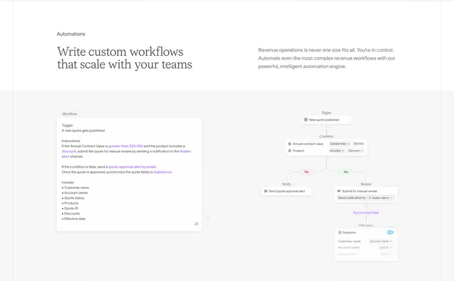 Sequence natural-language workflow builder
 Titan our difference feature list