Drinkdouze Editorial Landing Page
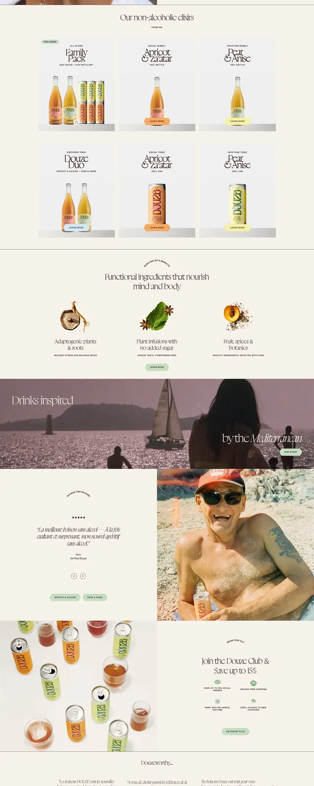
A luxury beverage homepage with oversized serif headlines, full-bleed photography, and cream-toned editorial sections.
Summary
A luxury beverage homepage with oversized serif headlines, full-bleed photography, and cream-toned editorial sections.
Visual description
The page opens with a full-width hero image of cocktails and drinks photographed from above, topped by thin navigation and large italic serif copy. Below, the layout alternates between split image-and-text sections, ingredient feature blocks, testimonial-style content, and product/mix showcases on a soft cream background. The design uses elegant spacing, minimal UI chrome, and centered editorial typography throughout. A warm amber and blush palette reinforces the premium beverage branding.
Key takeaway
This is a strong reference for premium food or drink brands that want an editorial feel with minimal interface clutter. The combination of oversized serif type, soft neutral surfaces, and immersive photography creates a high-end lifestyle presentation.
Reuse notes
Reuse the stacked hero, split storytelling sections, and centered feature grids for a polished brand landing page. The style works best when copy is short and imagery is rich, letting typography and photography carry the narrative.
More like this
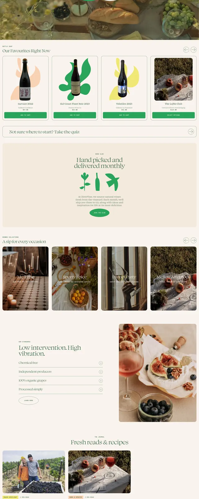 Dirtyvine organic wine storefront
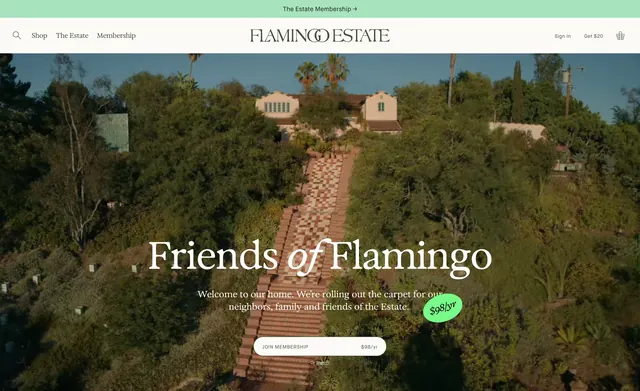 Flamingo Estate Friends of Flamingo hero
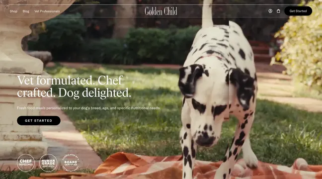 Golden Child garden hero with trust badges
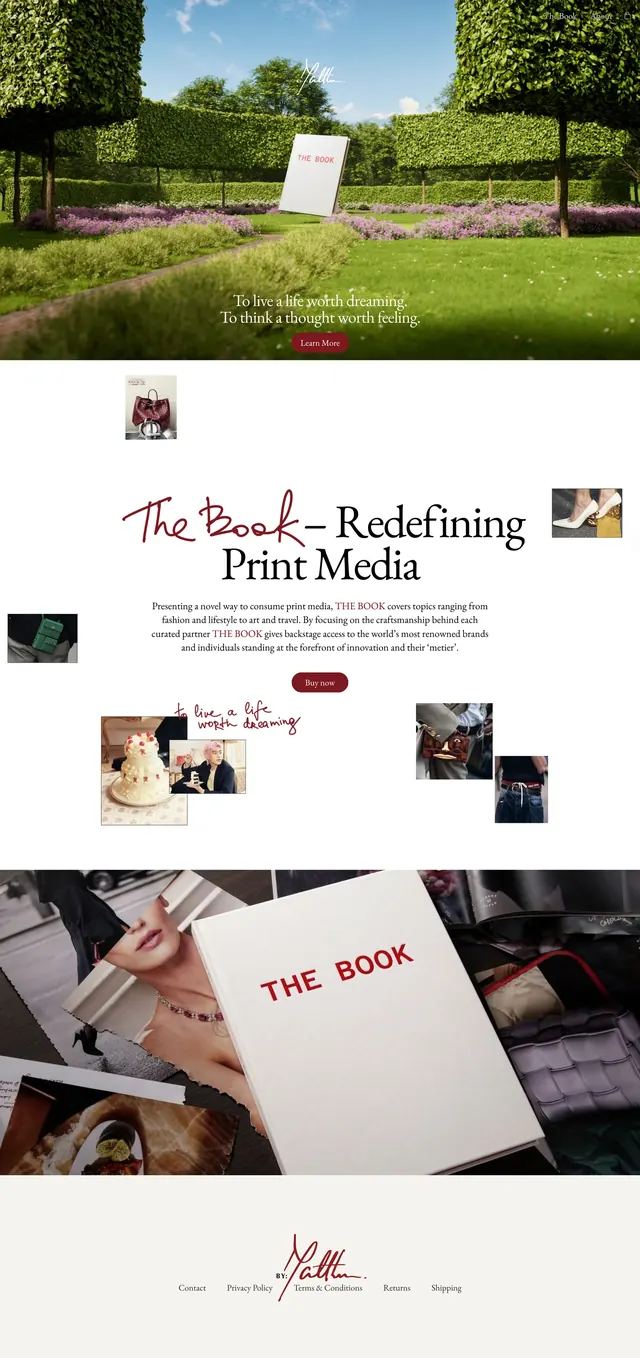 Bymatthew editorial landing page
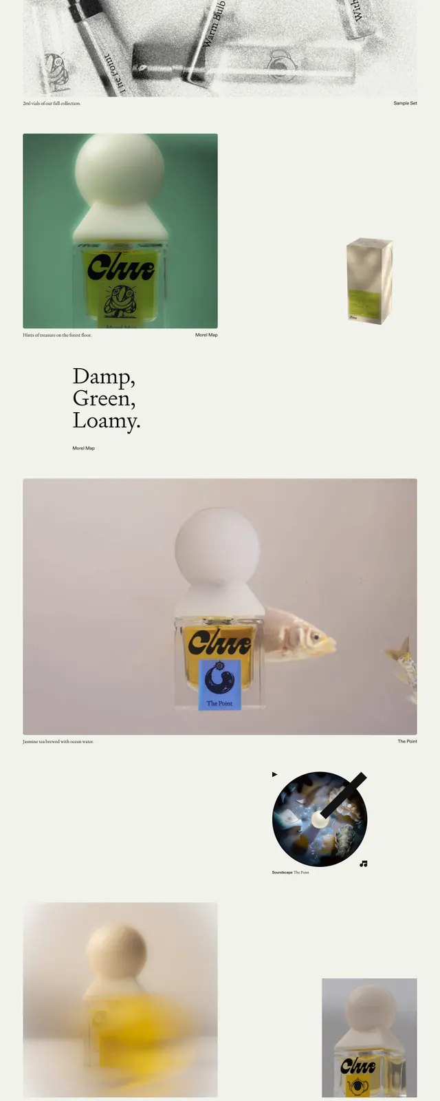 Clue Perfumery Editorial Hero
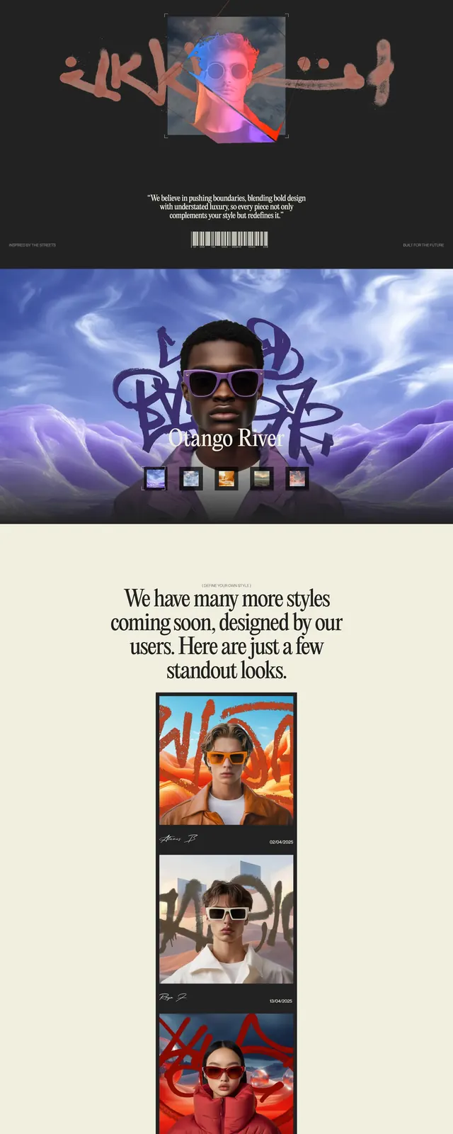 Casa Lunara Eyewear Editorial
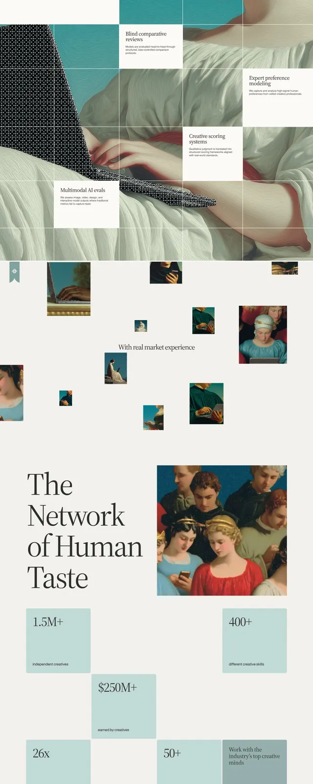 Contralabs editorial hero
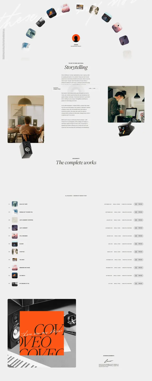 Coveo Music Storytelling Page
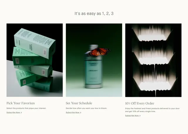 Flamingo Estate subscription process steps
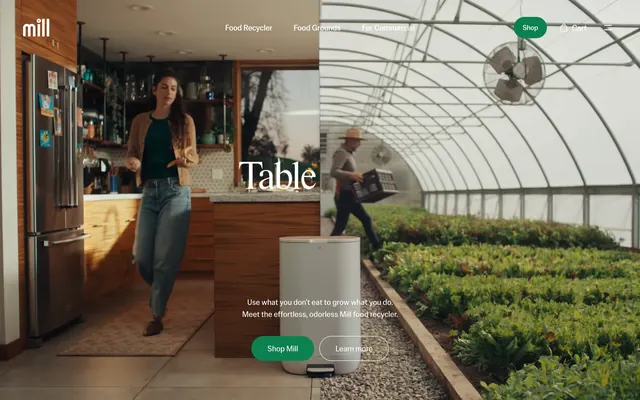 Mill table to farm split hero
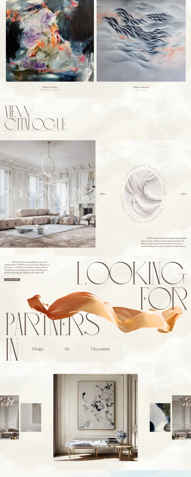 Boyd Art Gallery Hero
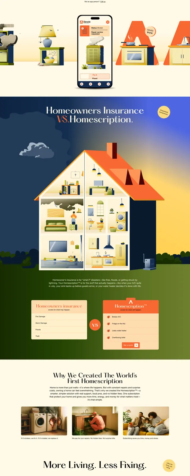 Illustrated Home Maintenance Landing Page
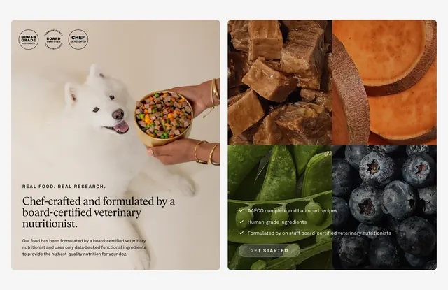 Golden Child ingredients split feature
 Parloa AI agents hero with hex overlay
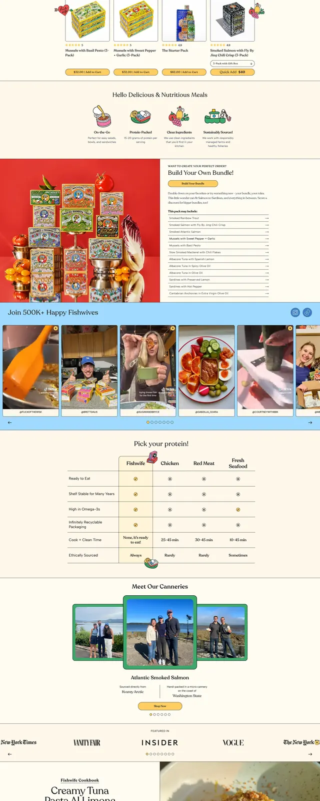 Playful Food Brand Home
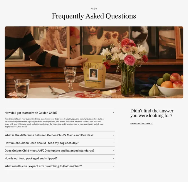 Golden Child FAQ with lifestyle hero image
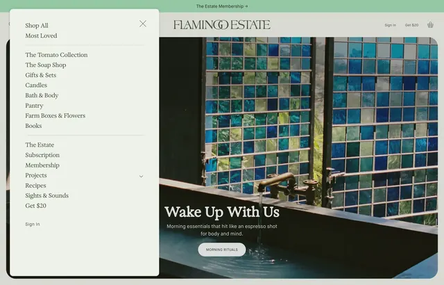 Flamingo Estate product nav drawer
 Isla Porter cabinetry kitchen hero
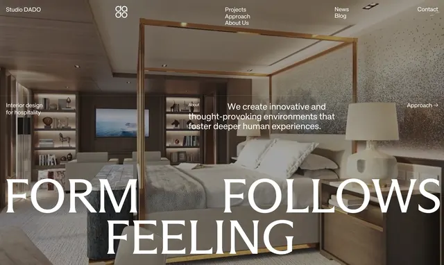 Studio DADO Form Follows Feeling hero
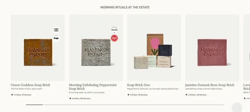 Flamingo Estate soap brick carousel
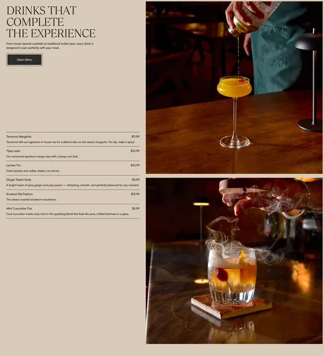 Amrit Palace drink feature
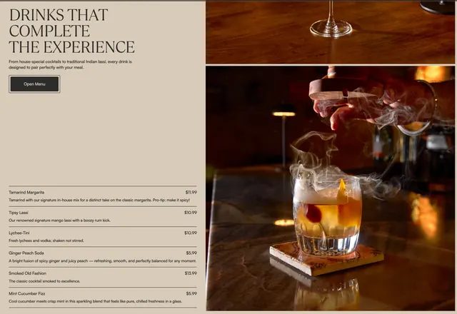 Amrit Palace drink pricing
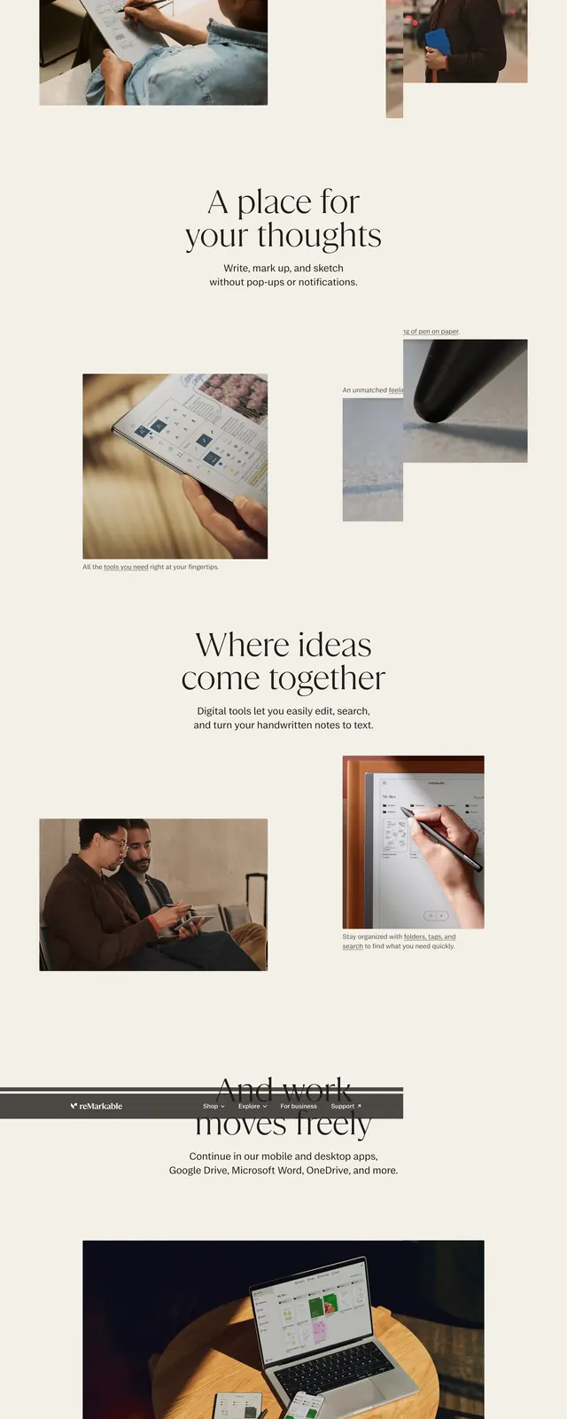 reMarkable paper tablet editorial story
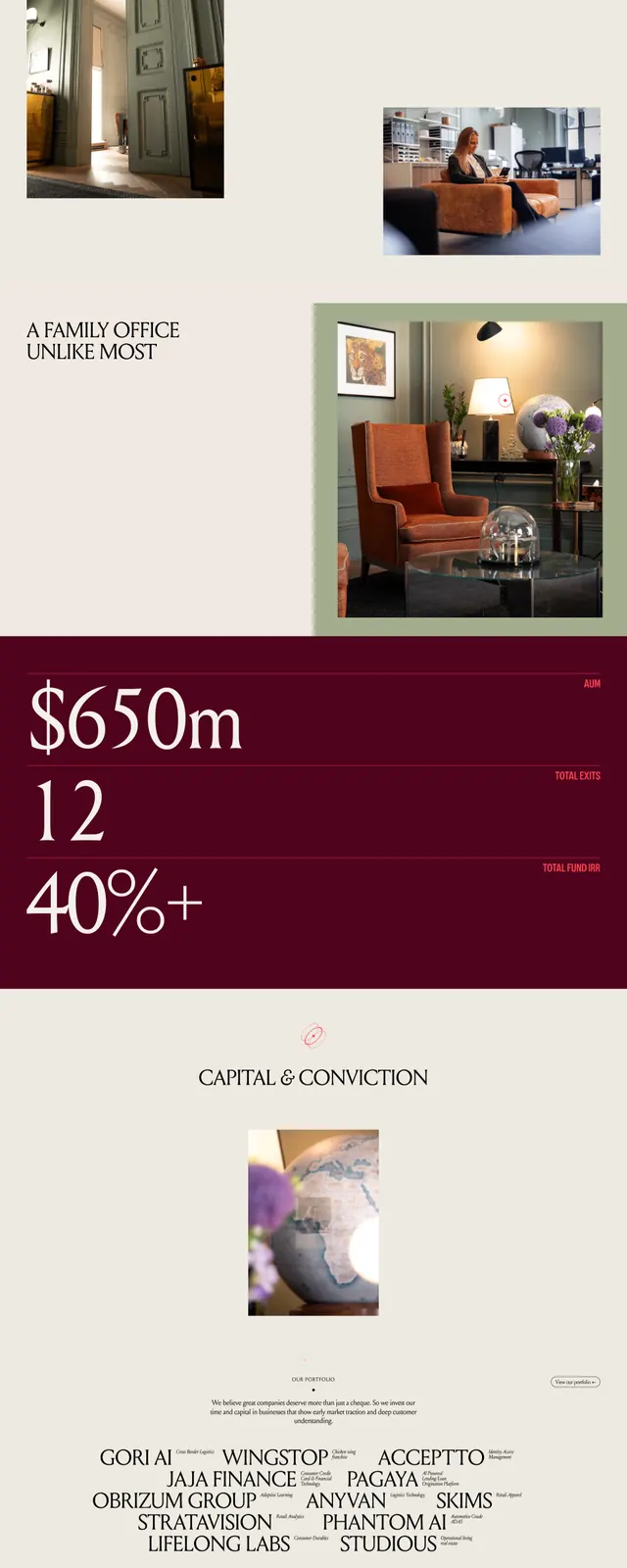 Celeres investment editorial landing page