Design Beyond Barriers
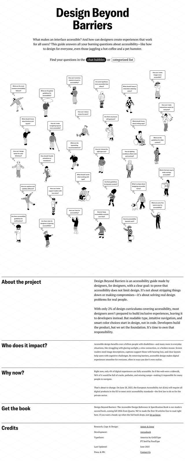
A minimalist accessibility landing page with a playful illustrated hero and long-form editorial sections.
Summary
A minimalist accessibility landing page with a playful illustrated hero and long-form editorial sections.
Visual description
The page uses a white background with a faint diagonal grid texture and a bold centered headline reading "Design Beyond Barriers." Beneath the intro copy, many small hand-drawn characters are scattered across the page, each with a speech bubble containing an accessibility-related question. Lower on the page, the layout shifts into stacked editorial sections with strong horizontal rules, left-aligned section headings, and dense explanatory paragraphs.
Key takeaway
The design combines a clean editorial structure with whimsical illustration to make accessibility content feel approachable and memorable. Its black-and-white palette and spacious typography keep the page serious while the doodle-style visuals add personality.
Reuse notes
Reuse this pattern for advocacy, educational, or mission-driven pages that need both authority and warmth. The speech-bubble question grid is especially effective as a reusable FAQ or topic-navigation hero.
More like this
 Cap 3 Landing Page
 Sketch portfolio grid
 Devouring Details landing page
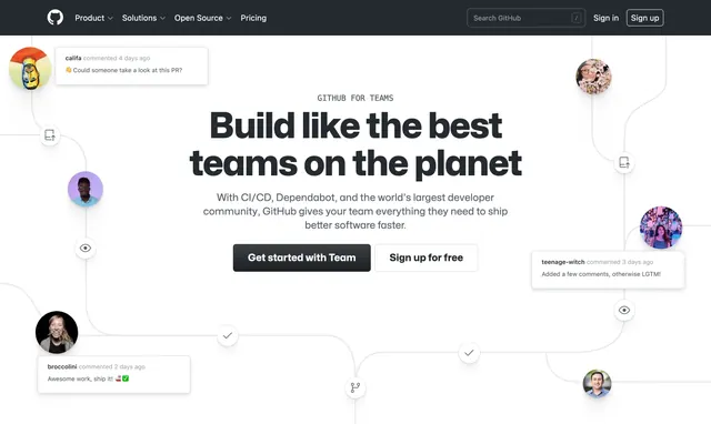 GitHub for Teams collaboration workflow hero
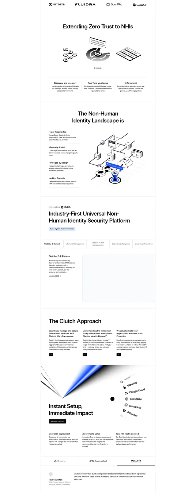 Clutch security hero
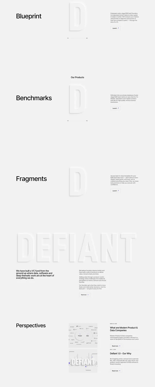 Defiant Minimal Hero
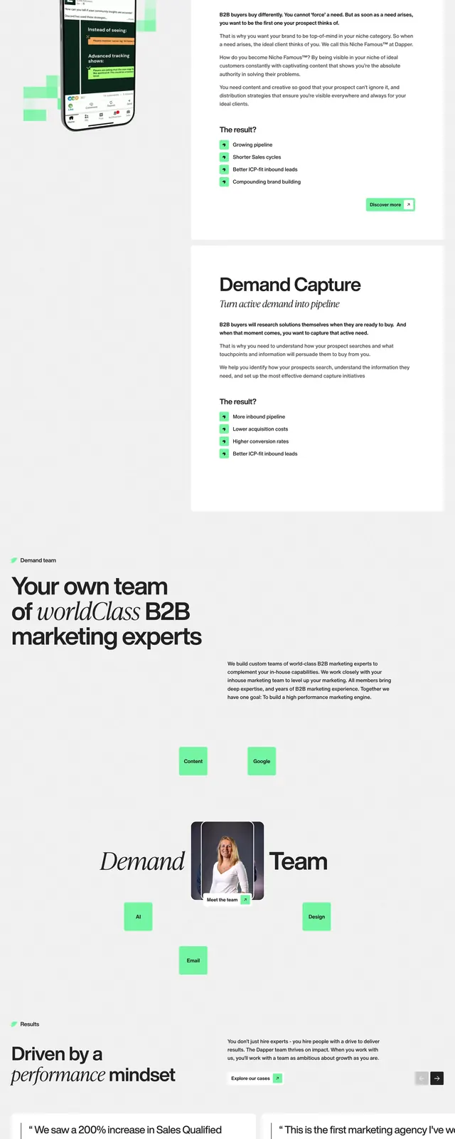 Dapper B2B marketing landing page
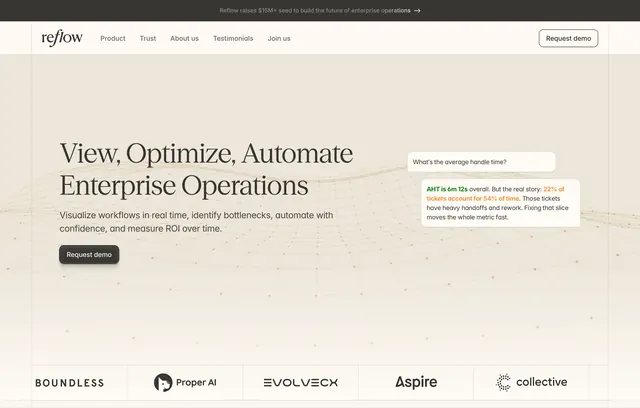 Reflow enterprise operations hero
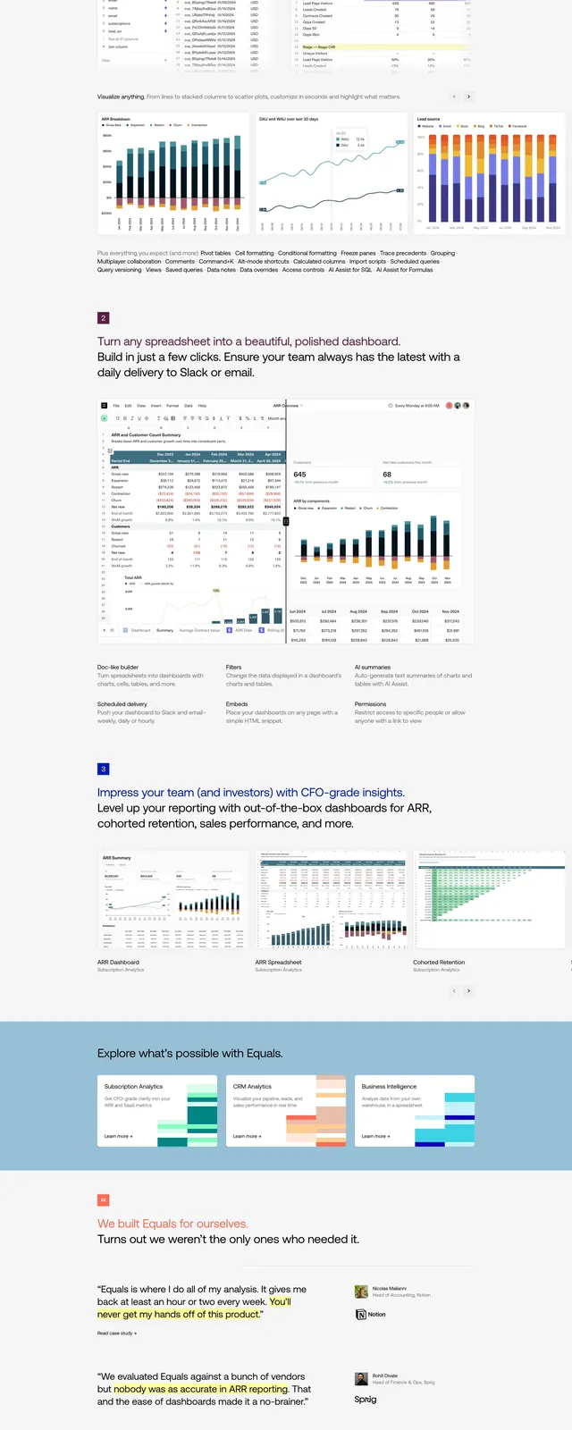 Equals 3 Data Hero
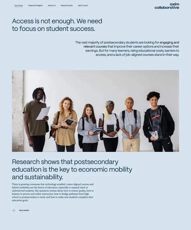 Axim Our Focus page hero
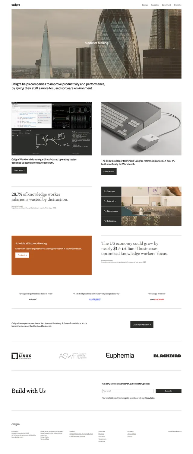 Caligra Corporate Landing Page
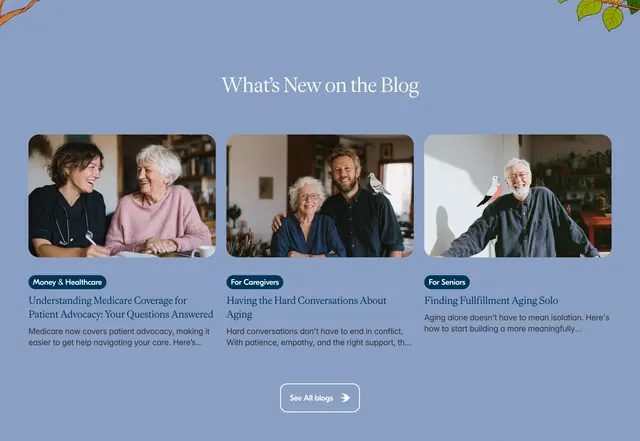 Baba blog preview grid
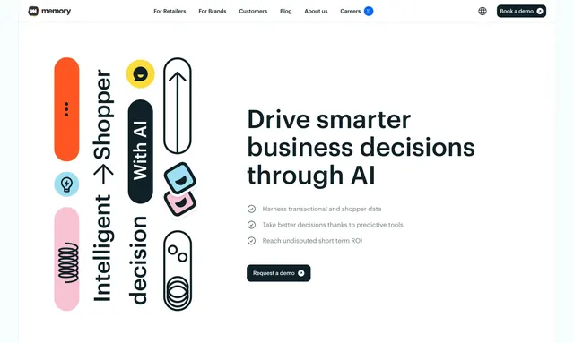 Memory AI retail decisions hero
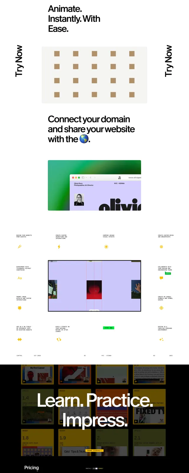 Cntrl 2 Showcase
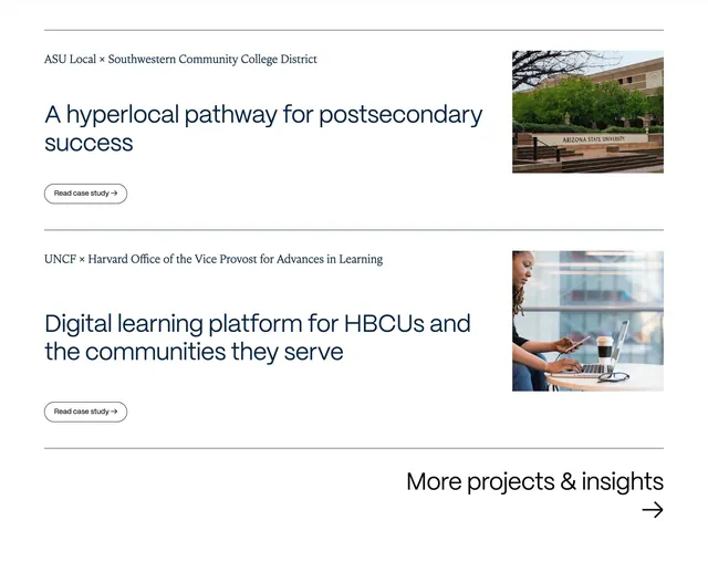 Axim case study list with split rows
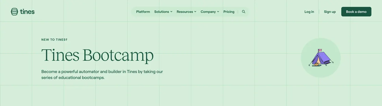 Tines Bootcamp mint hero with tent graphic
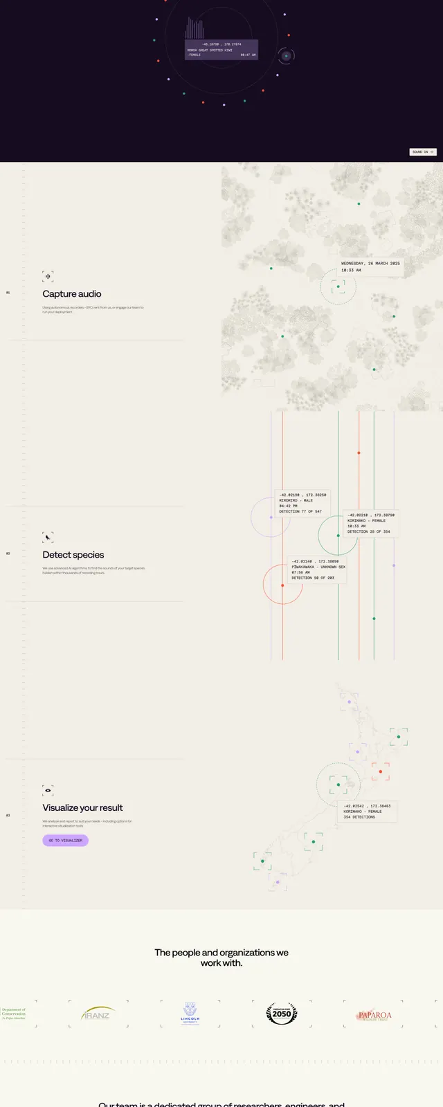 Organic AI research hero
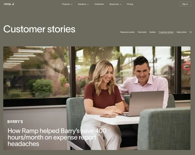 Ramp customer stories page hero
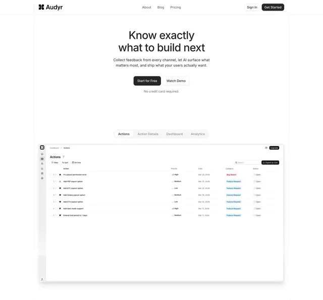 Audyr product hero with tabbed UI preview
 Axisgroup Professional Services Landing Page
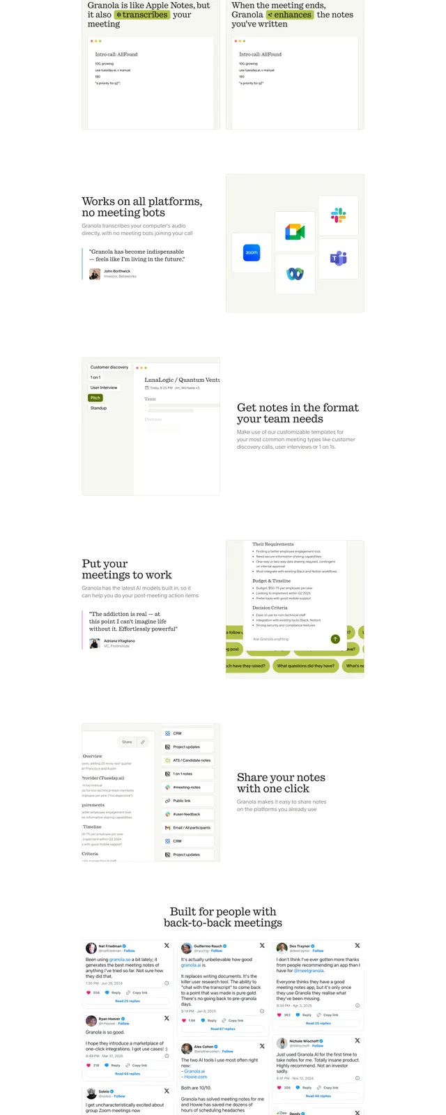 Granola AI Notepad
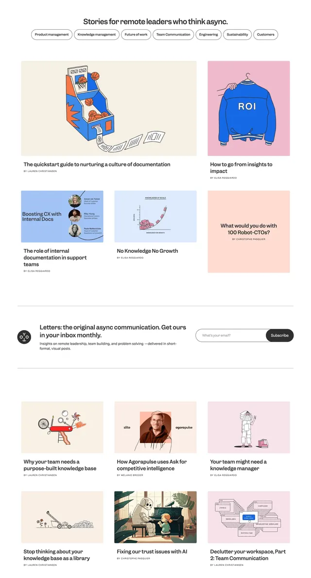 Slite async leaders blog grid
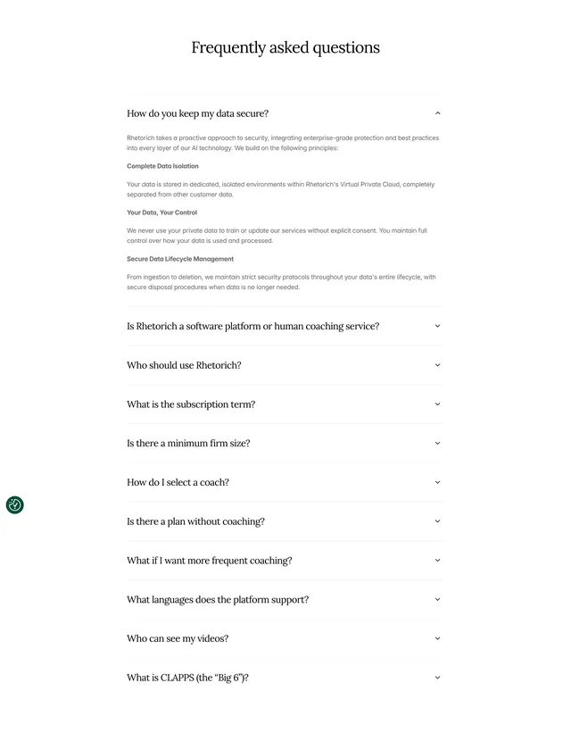 Rhetorich serif FAQ accordion
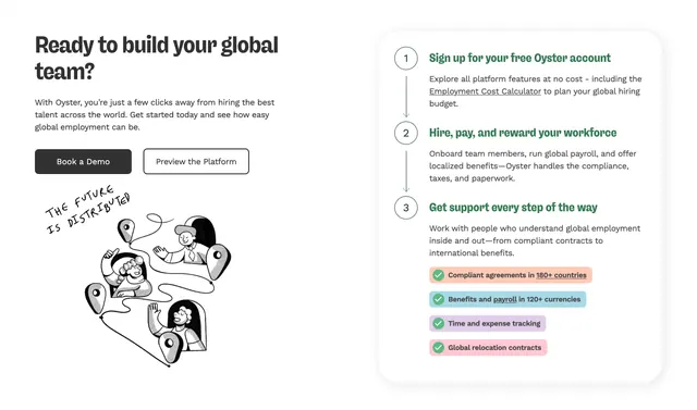 Oyster three-step process with feature pills