Conversion product case grid
Serif case-for headline above 3x2 grid of dot-grid feature cards with workflow, personalization, and pricing UI.

Summary
Six-card grid arguing why teams switch from legacy MAPs, each with a UI vignette on dot-grid panels.
Visual description
White page. Serif The Case for Conversion headline and gray intro on legacy platforms. Six cells in three columns: workflow trigger/enrich/email diagram; 5/7 progress checklist; email wireframe; CRM sync lists; stacked data layer isometric; usage gauge at $500 High Usage with checkout button. Each cell has bold title and short description below the illustration panel.
Key takeaway
Dot-grid trays unify six different UI metaphors into one comparison grid. Pairing workflow diagram with pricing meter covers rational and emotional buyers.
Reuse notes
Competitive replacement landing sections. Illustrations must stay consistent scale.
More like this
 Conversion workflows how-it-works page
 Conversion use cases tabbed feature
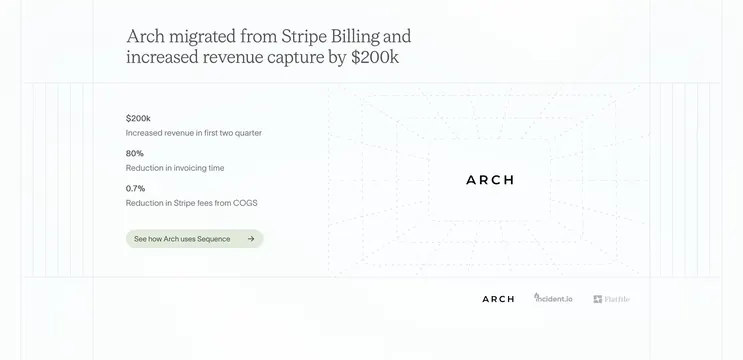 Sequence Arch migration case study highlight
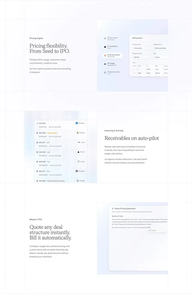 Sequence pricing invoicing CPQ alternating features
 Grove six-benefit icon grid
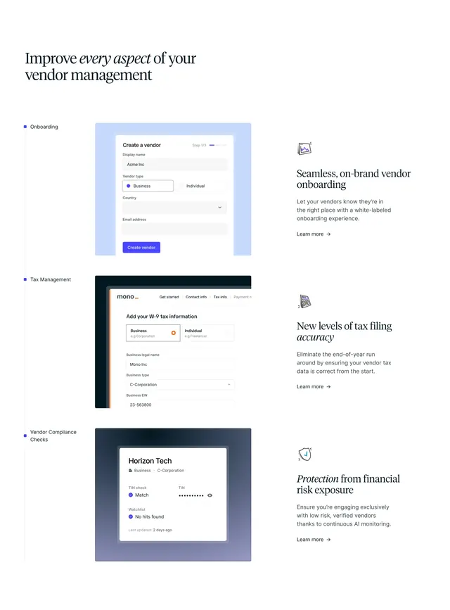 Routable vendor features timeline
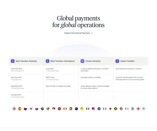 Routable global payments grid
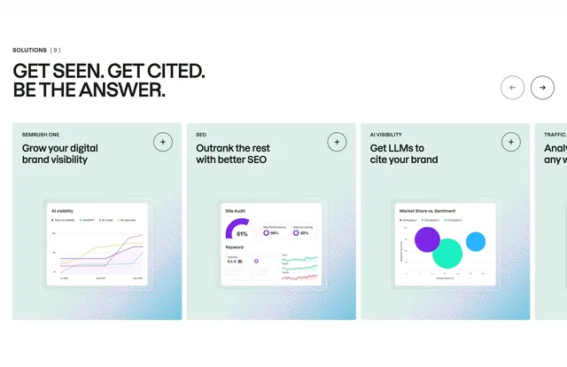 Semrush solutions product carousel
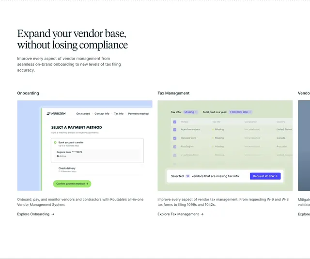 Routable vendor management features
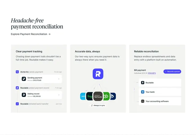 Routable payment reconciliation features
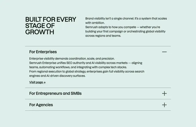 Semrush growth-stage accordion
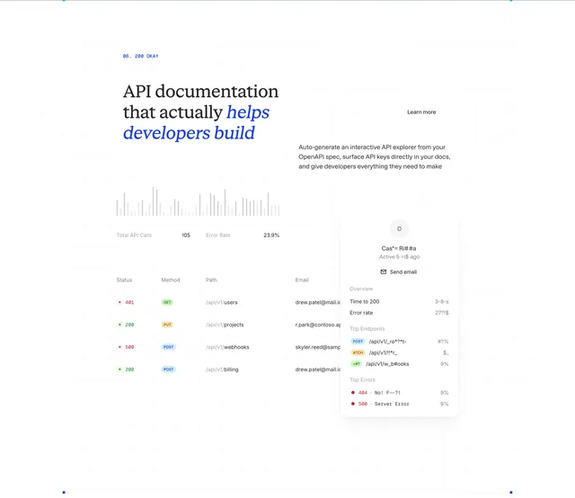 ReadMe API docs analytics bento feature
 Conversion audience segmentation hero
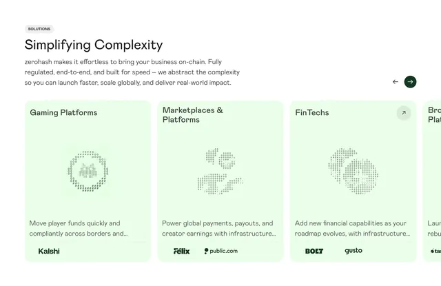 Zerohash solutions horizontal carousel
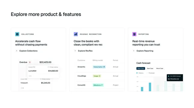 Tabs three-column product feature cards
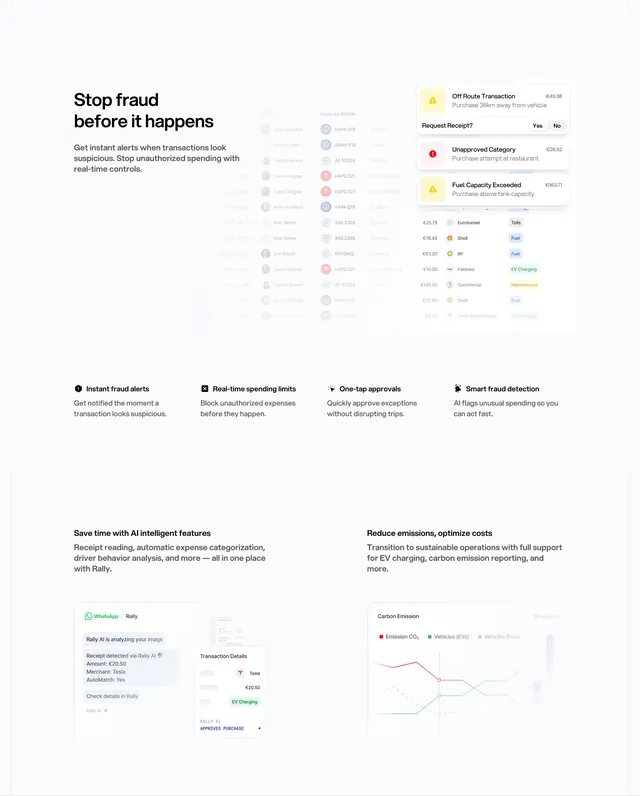 Rally fraud alerts and AI feature stack
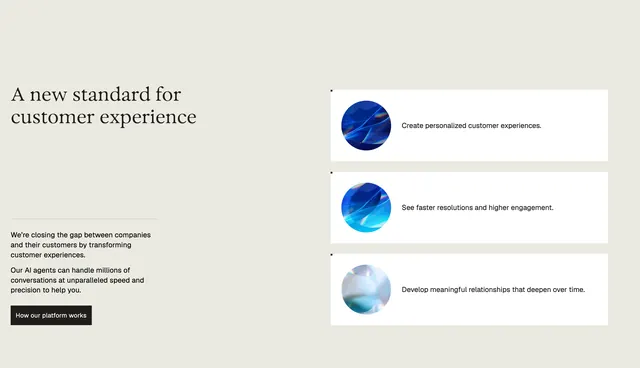 Parloa customer experience split feature
 Routable tabbed AP feature walkthrough
 Sequence enterprise security certification badges
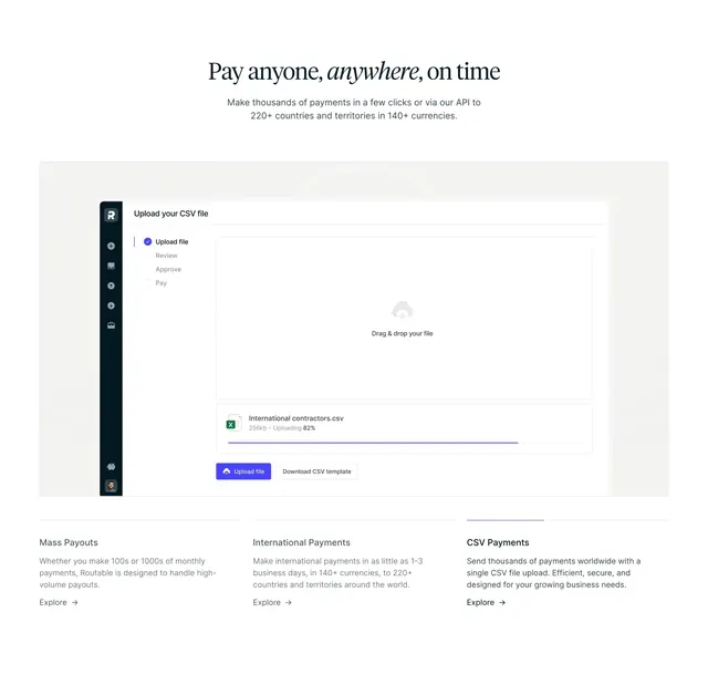 Routable CSV payments feature section
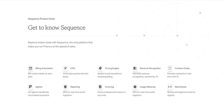 Sequence product suite icon grid with radar graphic
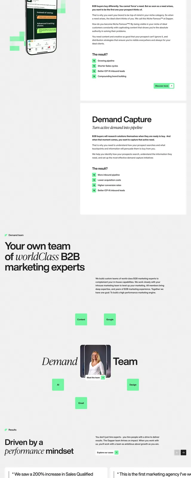 Dapper B2B marketing landing page
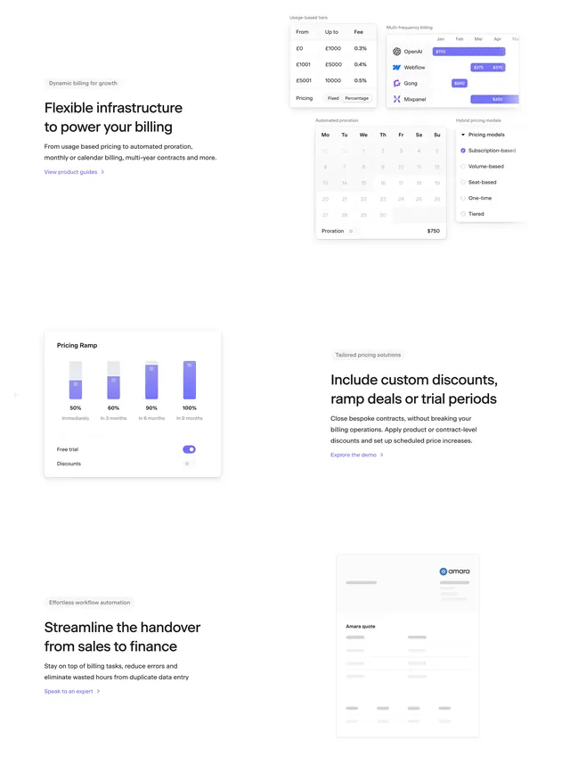 Sequence billing infrastructure alternating features
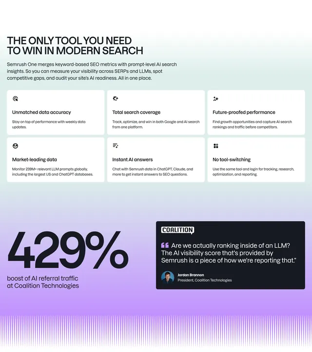 Semrush One value proposition grid