Off Grid OG card
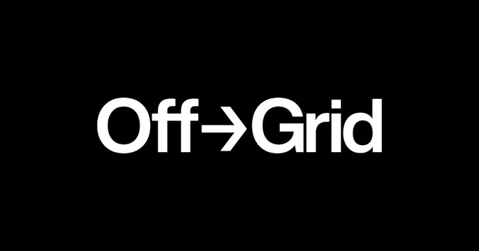
Minimal black card with the wordmark Off, an arrow, then Grid set centered in clean white sans-serif.
Summary
A pure black card with the logotype "Off [arrow] Grid" centered in white, the two words joined by a rightward arrow glyph. The defining move is the minimal white wordmark with an arrow standing in for a connector on solid black.
Visual description
Solid black background, nothing else in the field. Centered horizontally and vertically is the brand name set in a clean geometric white sans-serif: the word "Off", a thin horizontal arrow pointing right, then "Grid", all on one line at a comfortable but not edge-filling size. Letterforms are even-weight and modern; the arrow reads as part of the lockup rather than decoration. Maximum white-on-black contrast, generous negative space all around.
Key takeaway
Swapping a hyphen or space in a two-word name for a directional arrow turns a plain wordmark into a small piece of meaning and motion. Centering it small on a black field with lots of air feels confident and gallery-clean.
Reuse notes
A reliable, restrained choice for a studio or technical brand whose logotype can carry the card alone. The arrow trick works when the name implies movement or transition. Pure black-on-white-type reads crisply at any size; pair with a descriptive page title since there is no tagline.
More like this
 Unshift OG card
 Interactive Svg Animations OG card
 LaunchDarkly OG card
 Outkast Studio OG card
 Hellohello OG card
 Axiom OG card
 BB Agency Company Deck
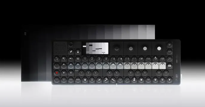 Teenage Engineering OG card
 Closing wordmark page
 Frame OG card
 Section divider 05 Motion
 Julia Johnson OG card
 Magma OG card
 Raycast OG card
 Wand OG card
 Shelve OG card
 KPR brand book cover
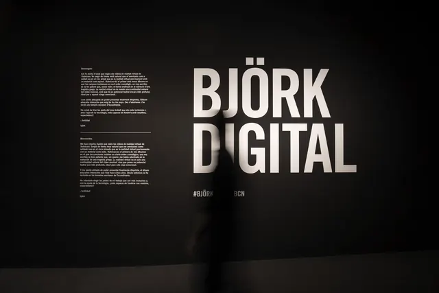 Björk Digital Wordmark and Layout
 Graphite OG card
 Ryan Miyoshi OG card
 Rogo OG card
 Mocha OG card
 Snippet Explorer OG card
 Global Markets divider