Spotify 2018 Wrapped animated explainer video
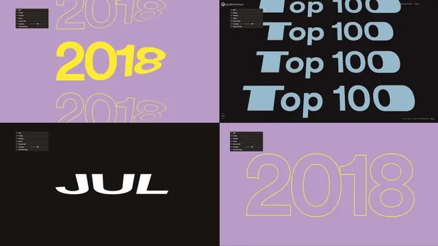
Motion design animation from Spotify's year-in-review campaign showcasing data visualization through animated transitions.
Summary
Motion design animation from Spotify's year-in-review campaign showcasing data visualization through animated transitions.
Visual description
A still from an animated music streaming campaign. Features bold gradients and colorful geometric transitions typical of Spotify's brand motion design. The animation style uses vibrant colors with smooth transitions between scenes.
Key takeaway
Playful, gradient-based motion design elevates data storytelling. Simple geometric transitions and vibrant color palette create engaging, shareable marketing content.
Reuse notes
Great reference for SaaS or consumer app promotional videos. Playful motion and gradient design works well for year-end reviews, achievements, or milestone announcements.
More like this
 Raycash fintech brand identity and motion design (slide 6)
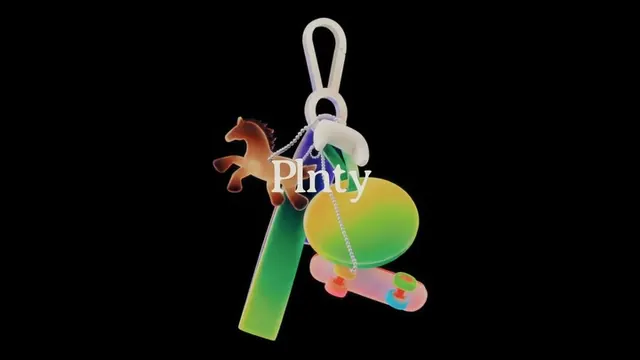 Plenty app UI motions and 3D interface elements (slide 1)
 Google Stadia gradient ribbon mark
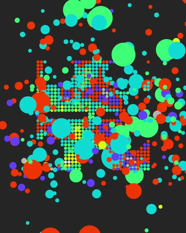 Colorful animated circle formation visualization
 MhdLabss YouTube intro motion reel
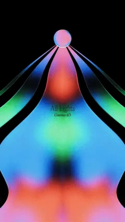 Abstract Gradient Identity
 Google Next 2026 animated typography field
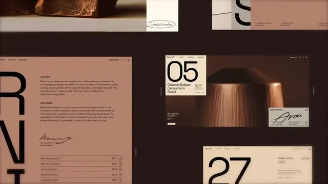 Daniel Muallem WIX motion studio showreel
 Renault Twingo product and visual exploration campaign (slide 6)
 Circular Wordmark Logo
 Alegria Colorful Motion Graphics
 Dynamic Motion Graphics Composition
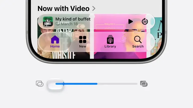 Mobile interface with video content and gradient navigation
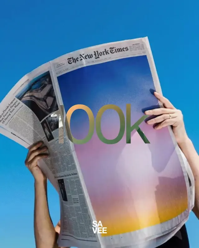 Newspaper spread replaced with rainbow gradient and oversized numeral type
 Turning Tides Festival billboard
 Brooklyn Wordmark Logo
 Apple Creator Studio launch video frame
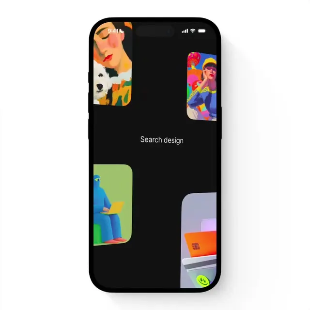 Search Design UI Mockup
 Lune & Wild packaging identity (slide 4)
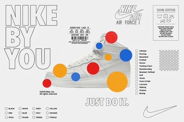 Nike By You product configurator explainer
 Vibrant Neon Purple Gradient Motion Piece
 Beya product animation series with kinetic typography (slide 1)
 JUST DO IT soccer athlete poster
 DAWN kinetic 3D typography