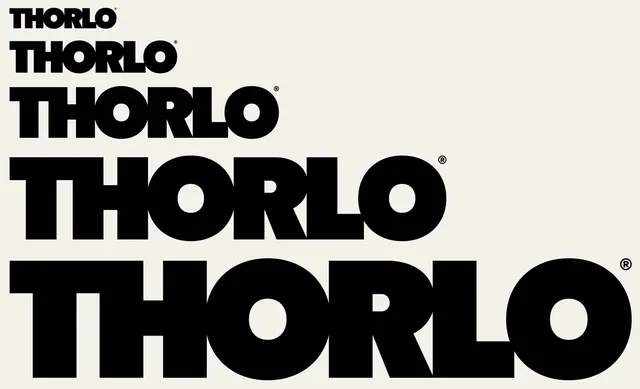
Thorlo Wordmark Variations
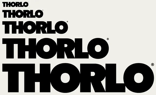
A series of typographic explorations for the word 'THORLO' featuring different weights, scales, and stylistic treatments.
Summary
A series of typographic explorations for the word 'THORLO' featuring different weights, scales, and stylistic treatments.
Visual description
A vertical stack of the word 'THORLO' in various bold sans-serif weights. The designs range from thin and condensed to extremely heavy, blocky letterforms.
Key takeaway
Demonstrates how varying stroke weight and scale can create a cohesive visual identity system.
Reuse notes
Use as a reference for establishing brand hierarchy through typographic weight.
TypeSans Serif, All Caps, Oversized, Condensed
Palette
#050505
#EBEBEB
More like this
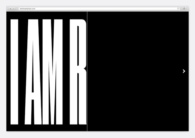 Bold Condensed Wordmark Design
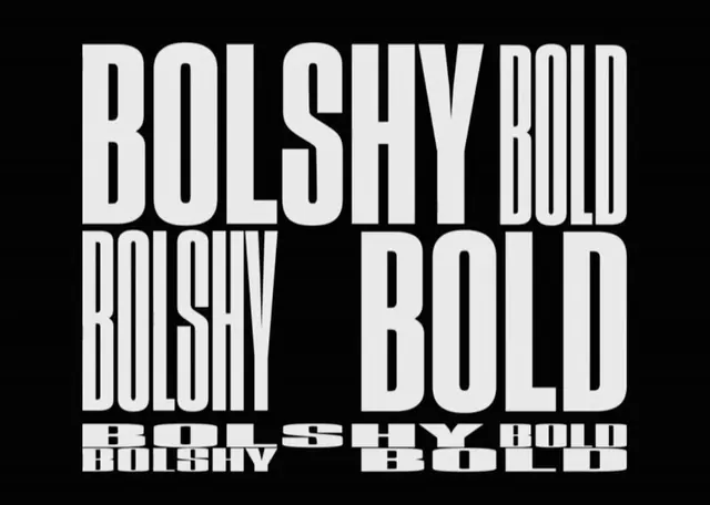 Bolshy Bold Typography Study
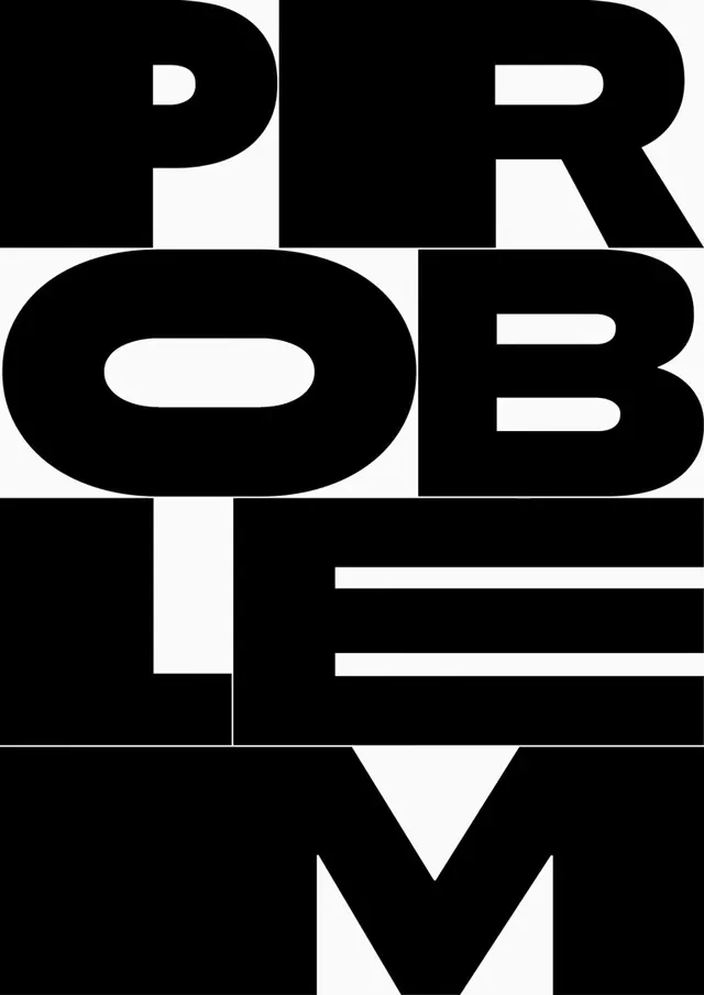 PROBLEM TYPE Wordmark
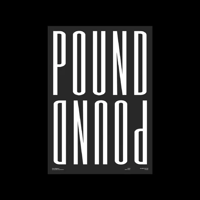 Pound Wordmark Poster
 NUM Wordmark
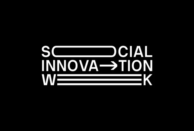 Social Innovation Wordmark
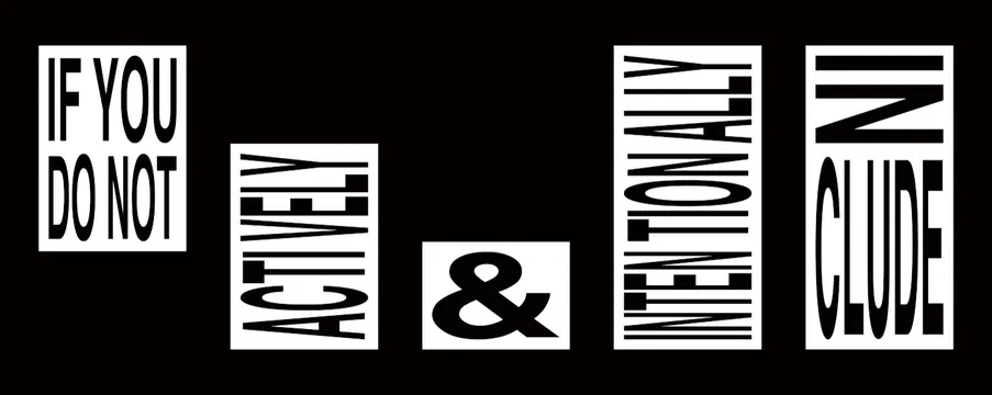 Typography Layout Composition
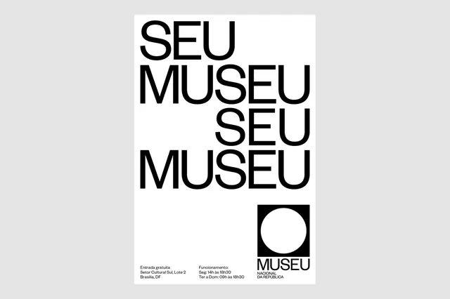 SEU MUSEU Identity
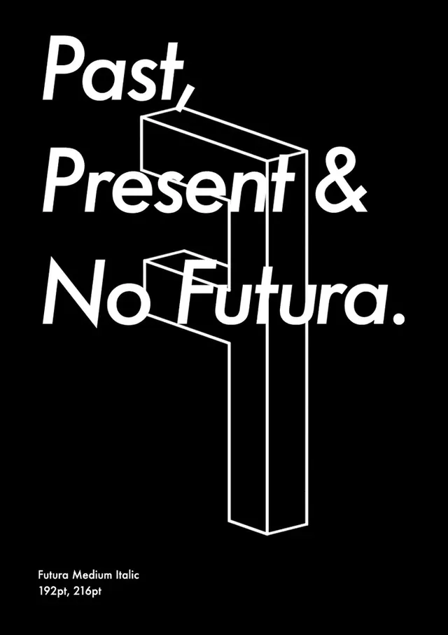 Past, Present & No Futura Typography Layout
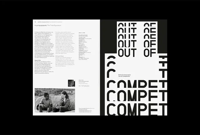 Typography and Layout Composition
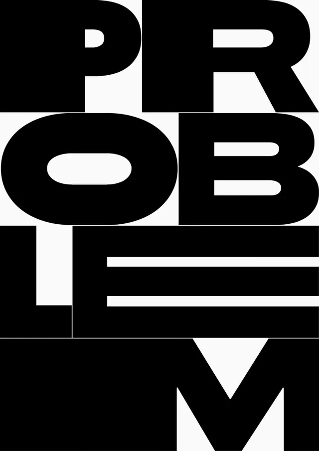 Problem Solver Wordmark
 Abstract Typographic Distortion
 GOT DOWN Wordmark
 Thorlo Wordmark Variations
 Auto Grotesk A & B Type Specimen
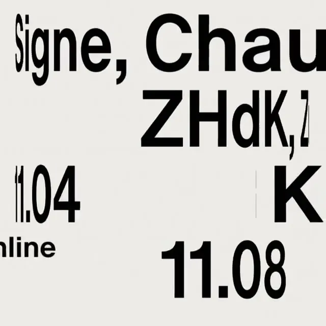 Typography Collage
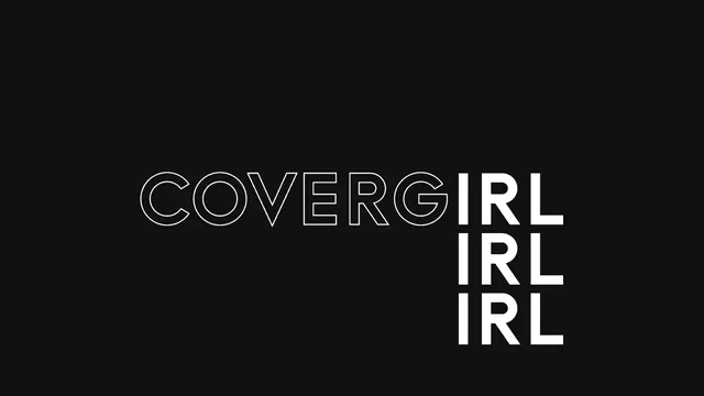 COVERGIRL Wordmark
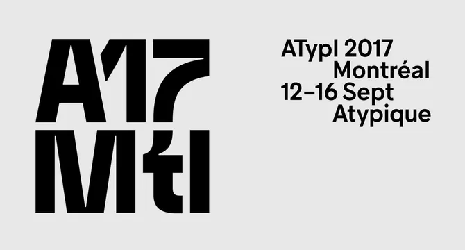 ATypI 2017 Montréal Identity
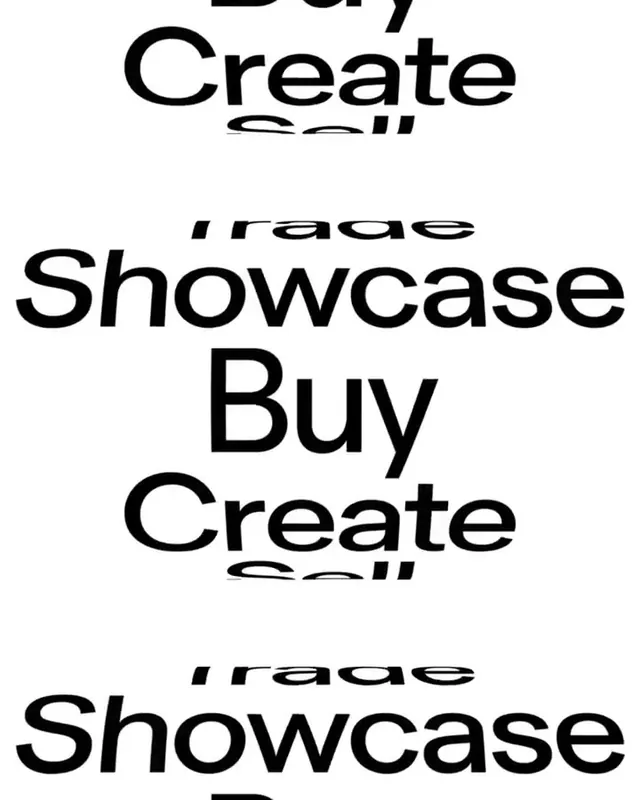 Typography Layout Study
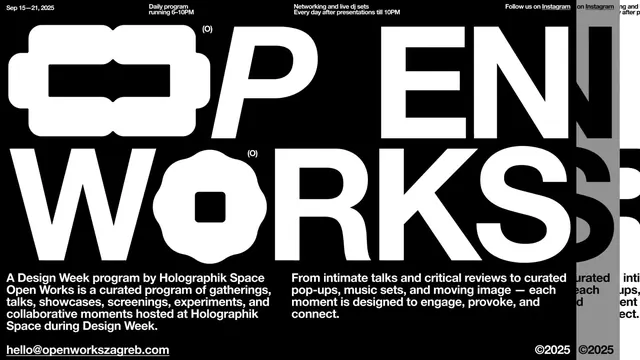 Open Works Typography Layout
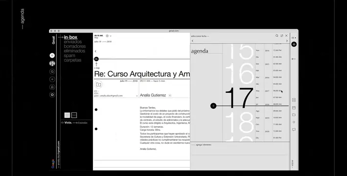 Editorial Layout Design Reference
 Typography Layout Composition
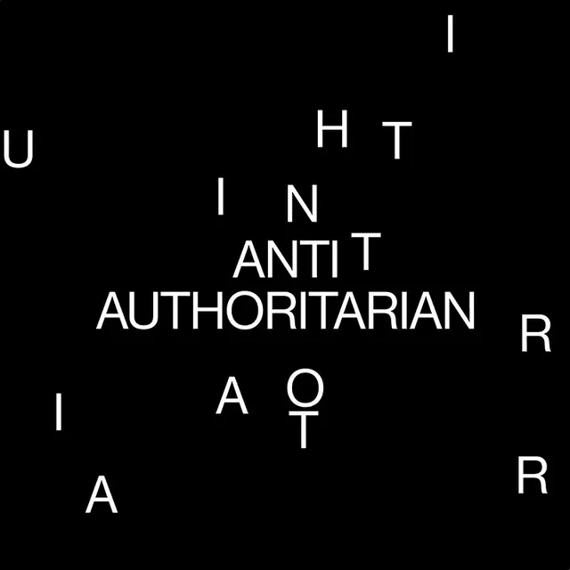 Anti-Authoritarian Typography Layout
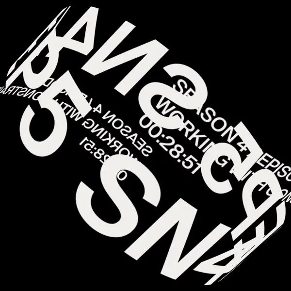 Abstract Typographic Collage