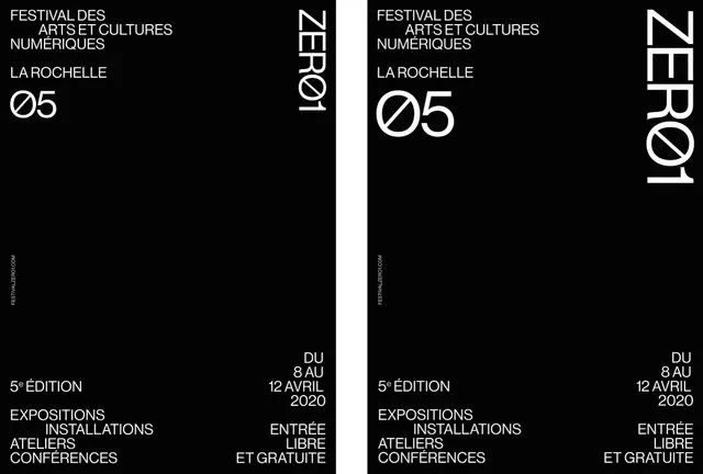
ZERO1 Editorial Layout
A high-contrast, minimalist black and white layout featuring bold typography and a structured grid.
Summary
A high-contrast, minimalist black and white layout featuring bold typography and a structured grid.
Visual description
The design features a stark black background with white text arranged in a strict grid. It uses large vertical 'ZERO1' wordmarks and a structured list of names and categories.
Key takeaway
The layout demonstrates how extreme contrast and oversized typography can create a sophisticated, high-end editorial feel.
Reuse notes
Use this grid structure for high-impact minimalist posters or portfolio layouts.
StyleMinimal, Swiss, Monochrome, Boxed, Technical
ColorMonochrome, High Contrast
TypeSans Serif, Oversized, All Caps, Condensed
MoodProfessional, Bold, Technical
Palette
#E3E3E3
#050505
#5C5C5C
More like this
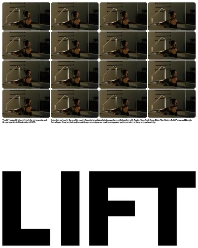 LIFT Identity System
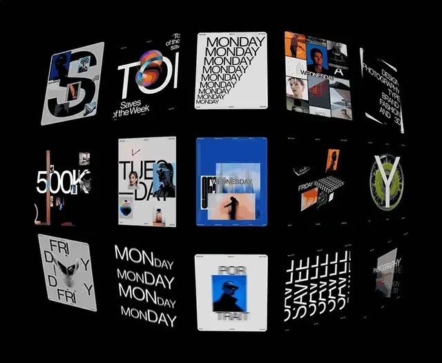 Modern Typography and Branding Identity Collection
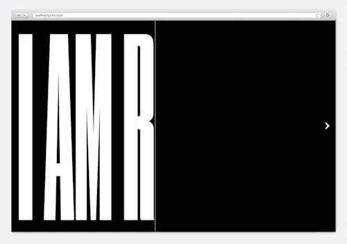 Condensed Wordmark Design
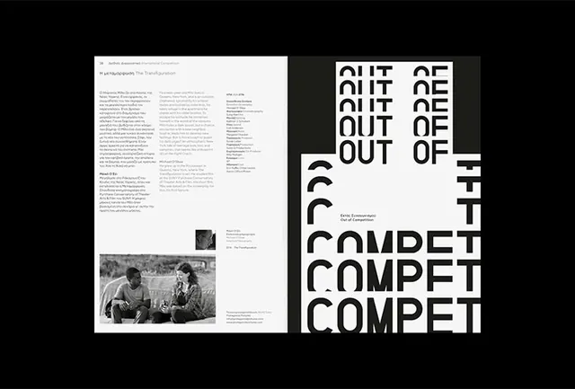 Typography and Layout Composition
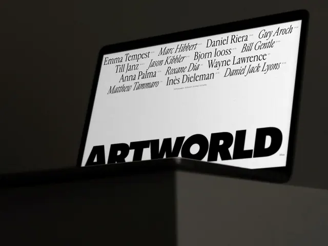 ARTWORLD Wordmark and Typography Layout
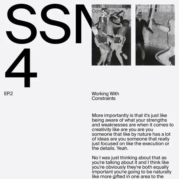 Working With Constraints Editorial Layout
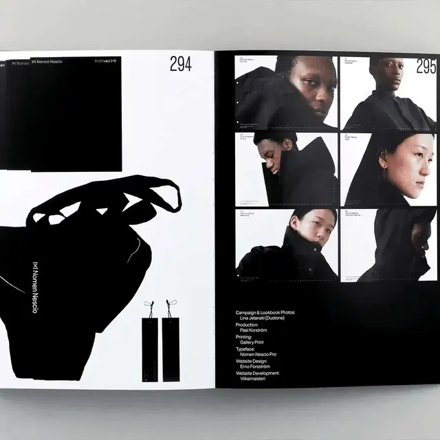 Editorial Layout with Portrait Collage
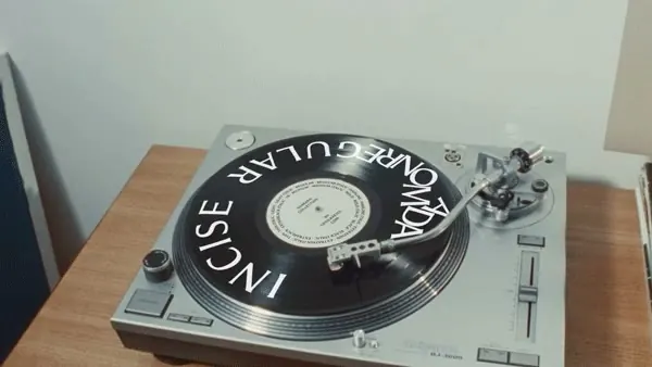 Vinyl Record Graphic Design Mockup
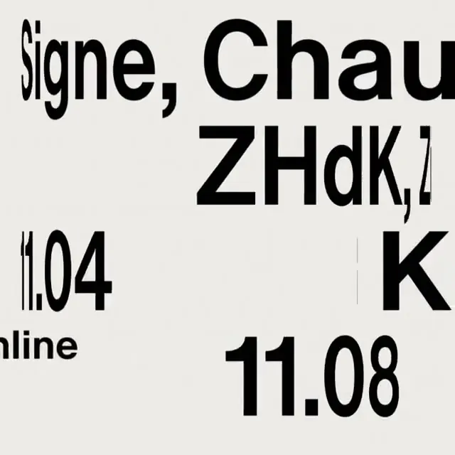 Typography Collage
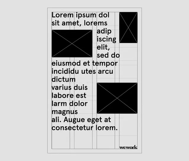 Swiss Style Typography Layout
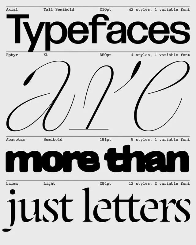 Typeface Comparison Poster
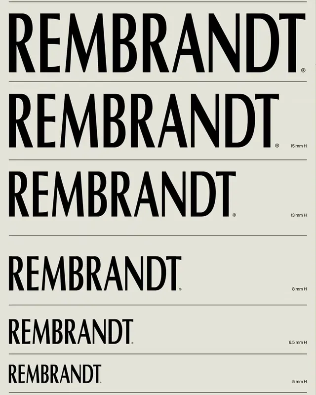 Rembrandt Wordmark Variations
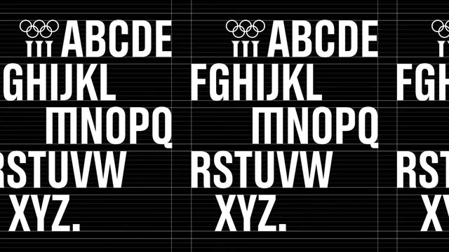 Alphabet Grid Type Specimen
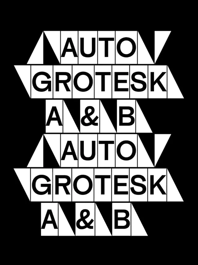 Auto Grotesk A & B Type Specimen
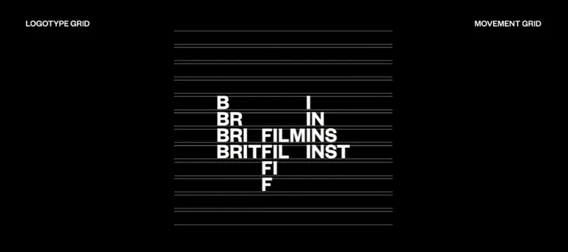 Logotype Grid System
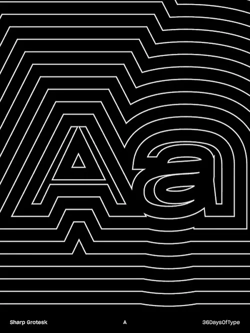 Abstract Line-Art Typography
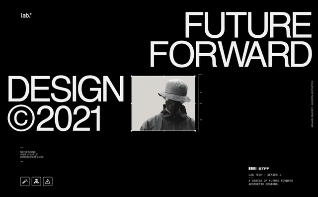 Future Forward Design Reference
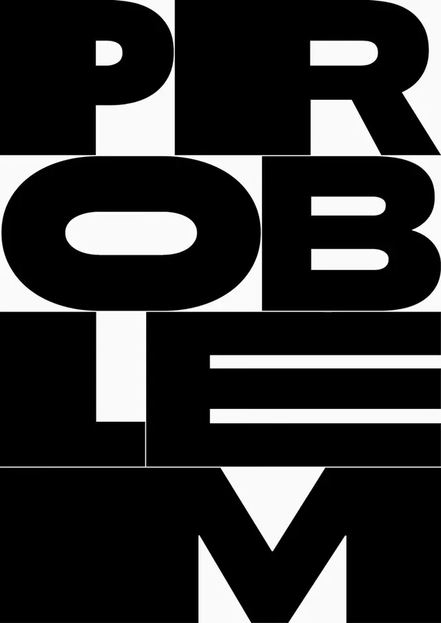 PROBLEM TYPE Wordmark
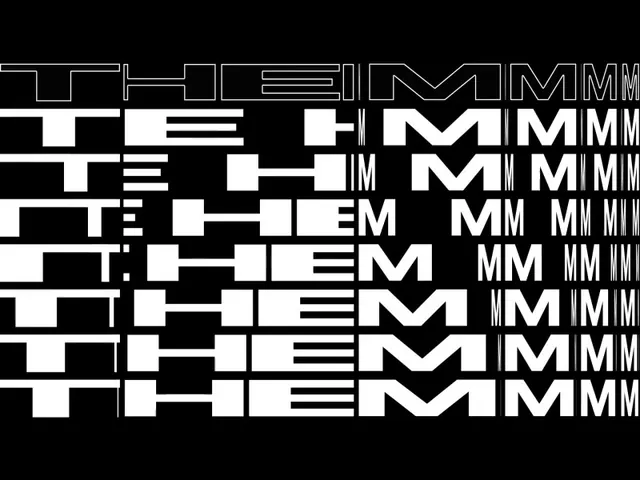 Typography Grid Study
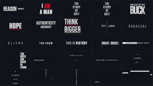 Typography and Layout Design Reference
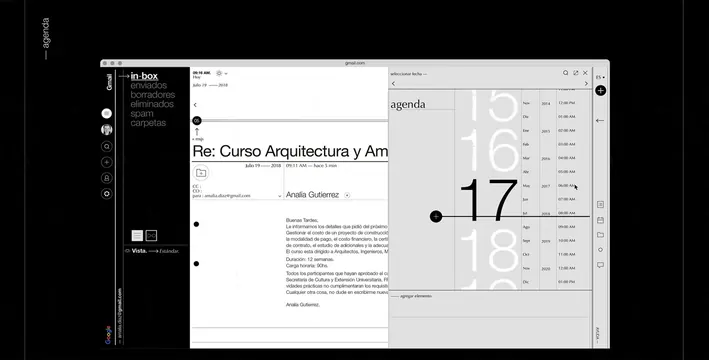 Editorial Layout Design Reference
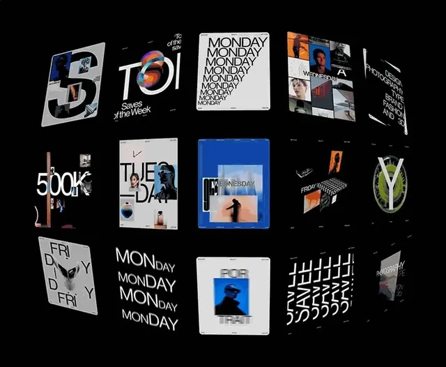 Typography and Logo Identity Collection
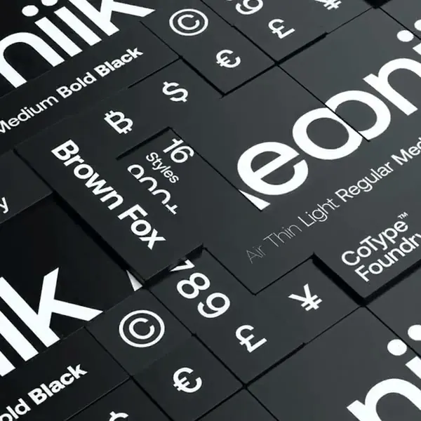 Typography and Symbolism Grid
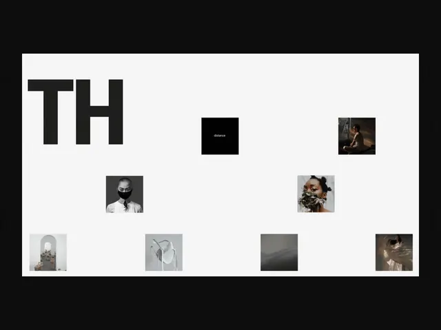 TH Wordmark and Layout