Material Design component picker—animation
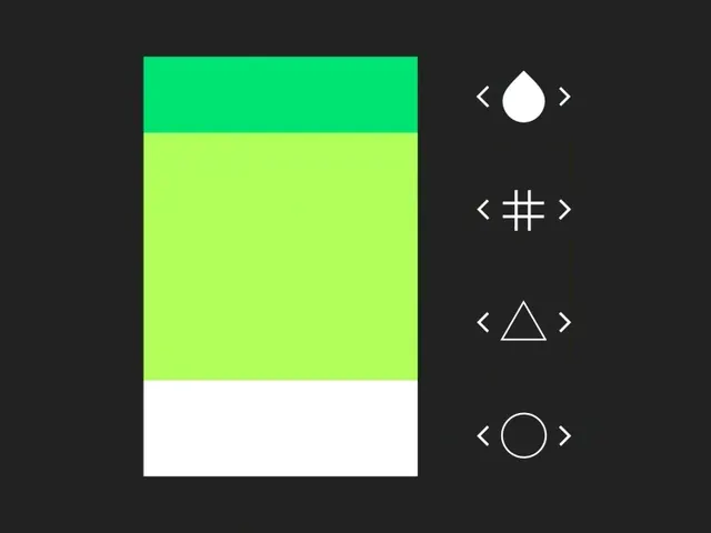
Animated UI component interface showing a vertical color picker with shape selection buttons and navigation arrows.
Summary
A frame from an animated Material Design component showcase displaying a color palette on the left and a set of shape picker buttons on the right.
Visual description
Dark background. Left side: vertical color gradient transitioning from bright lime-green at the top, through yellow-green, to white at the bottom. Right side: four white outline symbols (droplet, grid, triangle, circle) arranged vertically with left/right navigation chevrons between each. Clean, flat design with no shadows.
Key takeaway
Organized component layout with visual separation; bright accent colors against dark background create clear affordances for interaction.
Reuse notes
Reference for design system components, color pickers, and Material Design UI patterns; useful for documentation of interactive controls.
More like this
 Raycash fintech brand identity and motion design (slide 3)
 Stacked colorful mobile app cards
 Apple Creator Studio launch video frame
 Neon green asterisk icon
 Brooklyn Wordmark Logo
 Web-animation library showcase with scattered rounded-rect cards on black
 Cyan motion graphics repeating text animation
 Abstract Motion Graphic and Identity Layout
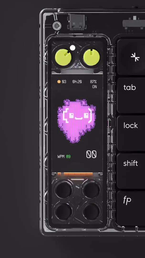 Smartphone UI Mockup with Abstract Graphics
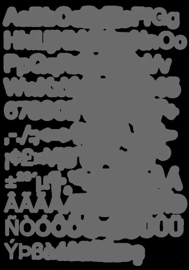 Rounded sans type specimen
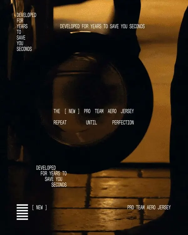 Pro Team Aero Jersey promo frame
 Circular Wordmark Logo
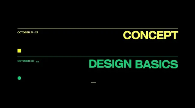 Minimal black title slide CONCEPT and DESIGN BASICS
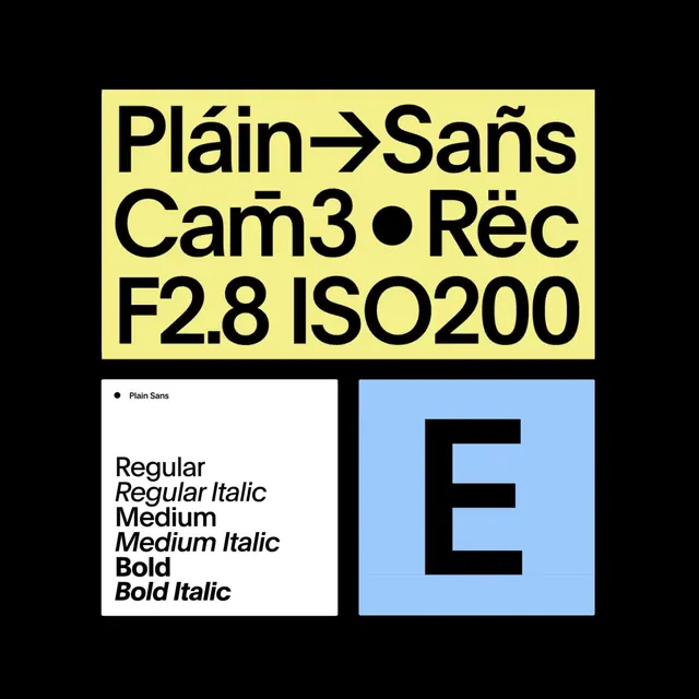 Type Specimen and Graphic Layout
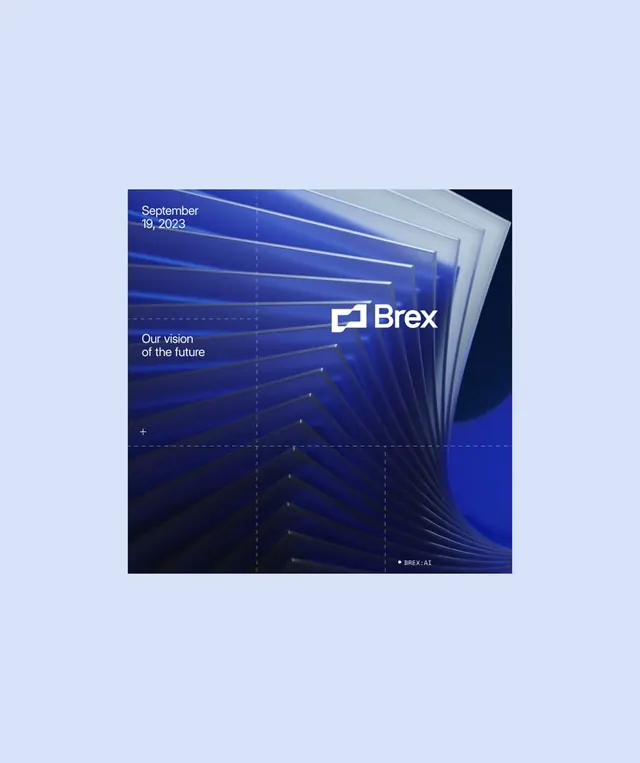 Brex AI brand identity motion graphic with layered geometric planes
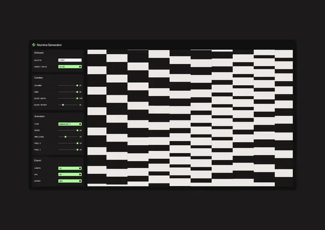 Dark fintech UI with neon accent
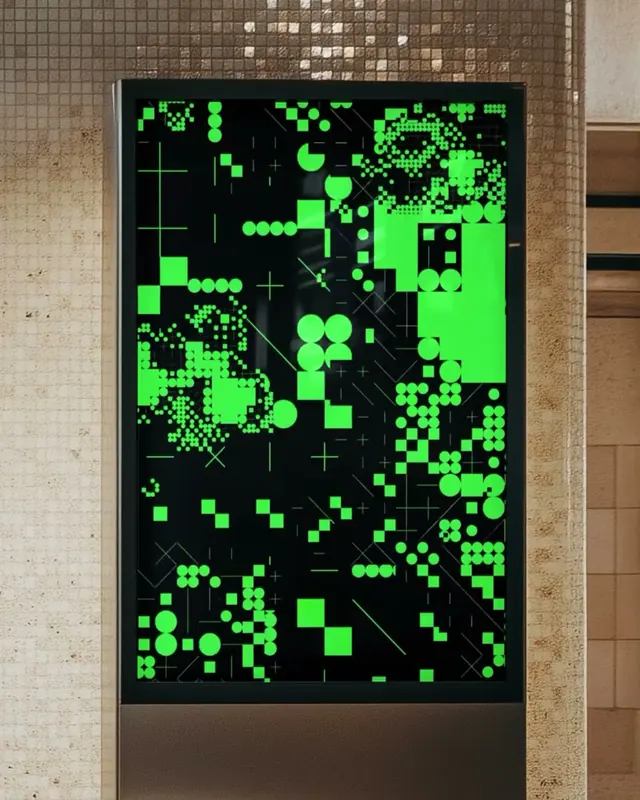 Neon Green Generative Abstract on Public Digital Screen
 Cordis biometric music and motion visual identity (slide 5)
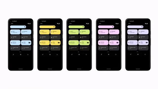 Android color theming across device lineup
 UI Design for Scale Up Tool
 Abstract Geometric Dot Grid
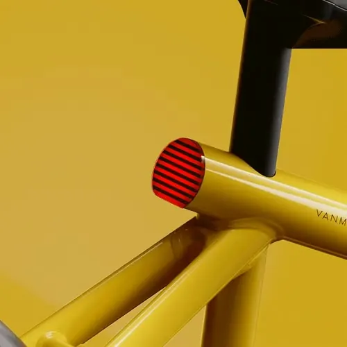 VanMoof yellow frame integrated taillight
 Wired Italy neon green bar pattern cover
 R.P. scanline type promo