Never Let Go Typography Study
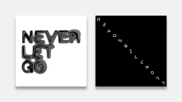
A side-by-side comparison of two contrasting typographic treatments: a playful, textured wordmark and a minimalist, diagonal layout.
Summary
A side-by-side comparison of two contrasting typographic treatments: a playful, textured wordmark and a minimalist, diagonal layout.
Visual description
The left side features a white box with 'NEVER LET GO' in a heavy, textured, 3D-effect sans-serif font. The right side features a black box with 'NEVER LET GO' arranged diagonally in a thin, spaced-out sans-serif font.
Key takeaway
Demonstrates how the same message can be transformed through contrasting weights, textures, and spatial arrangements.
Reuse notes
Use as a reference for exploring extreme typographic opposites in branding.
ColorHigh Contrast, Monochrome
TypeDisplay, Sans Serif, Oversized, All Caps
MoodBold, Technical, Professional
Tagstypography, contrast, layout, graphic design
Palette
#F2F2F2
#050505
#737373
More like this
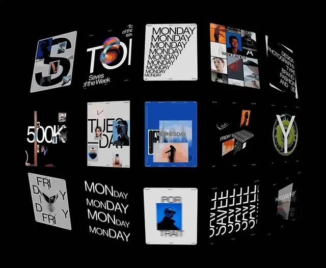 Modern Typography and Branding Identity Collection
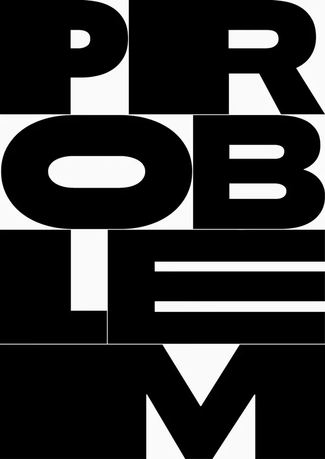 PROBLEM TYPE Wordmark
 Typography Collage
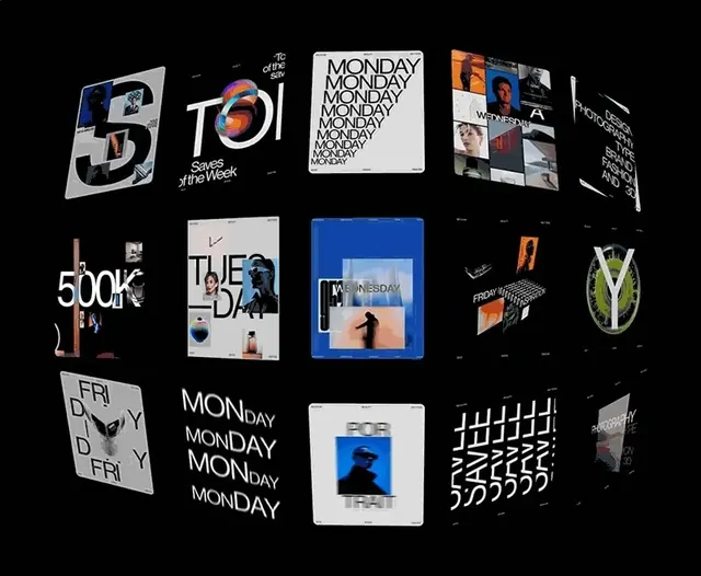 Typography and Logo Identity Collection
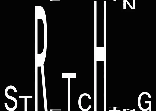 Abstract Typographic Composition
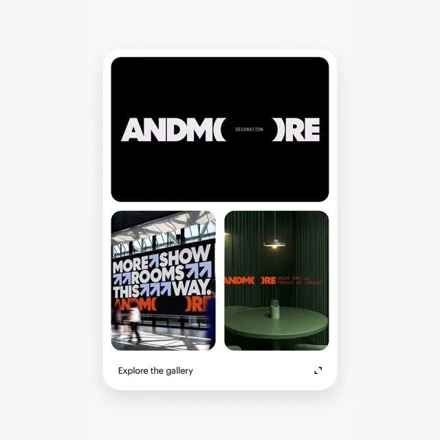 ANDMORE Identity System
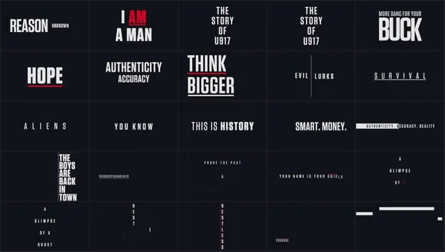 Typography and Layout Design Reference
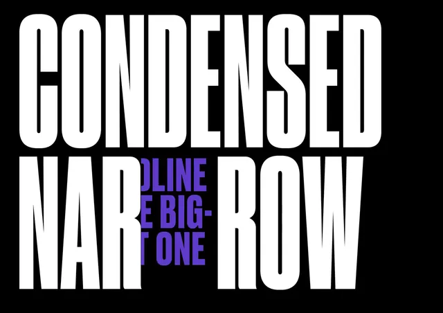 Condensed Narrow Type Specimen
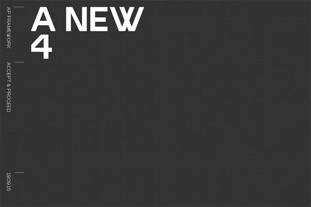 A New 4 Typography Layout
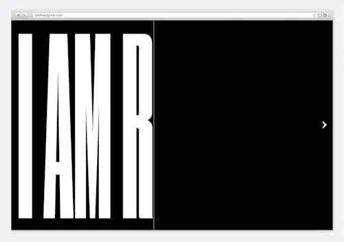 Condensed Wordmark Design
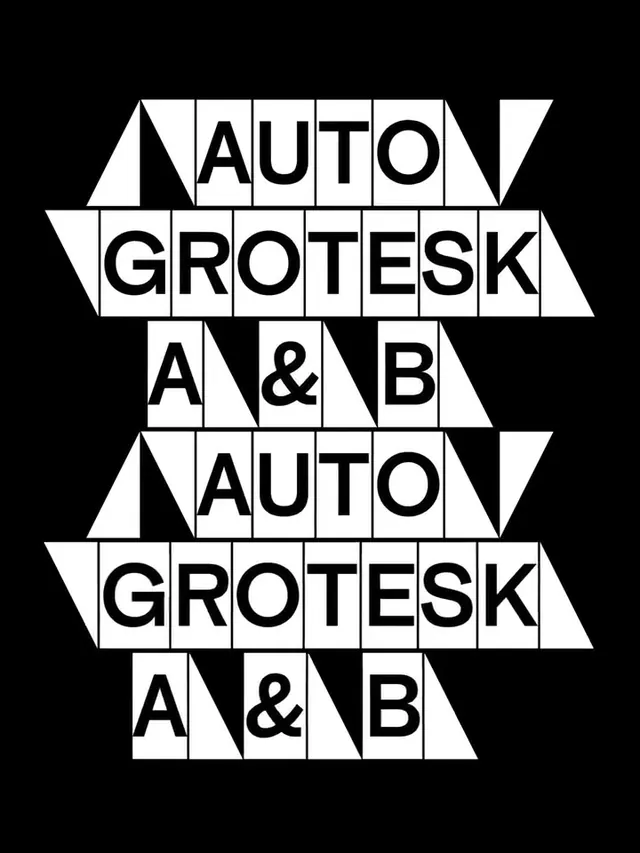 Auto Grotesk A & B Type Specimen
 Curated Design Reference Board
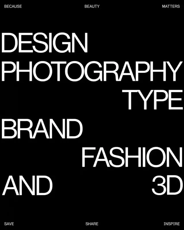 Typography Layout Composition
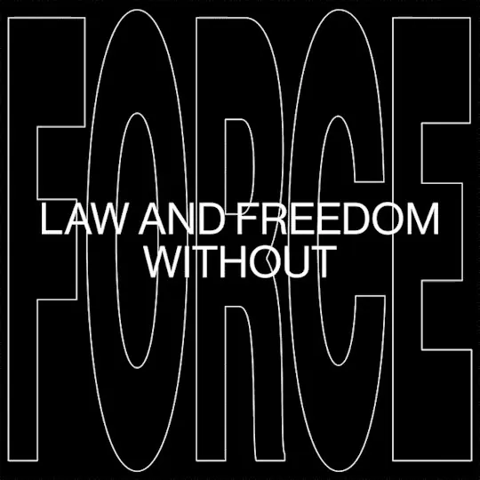 Law and Freedom Without Wordmark
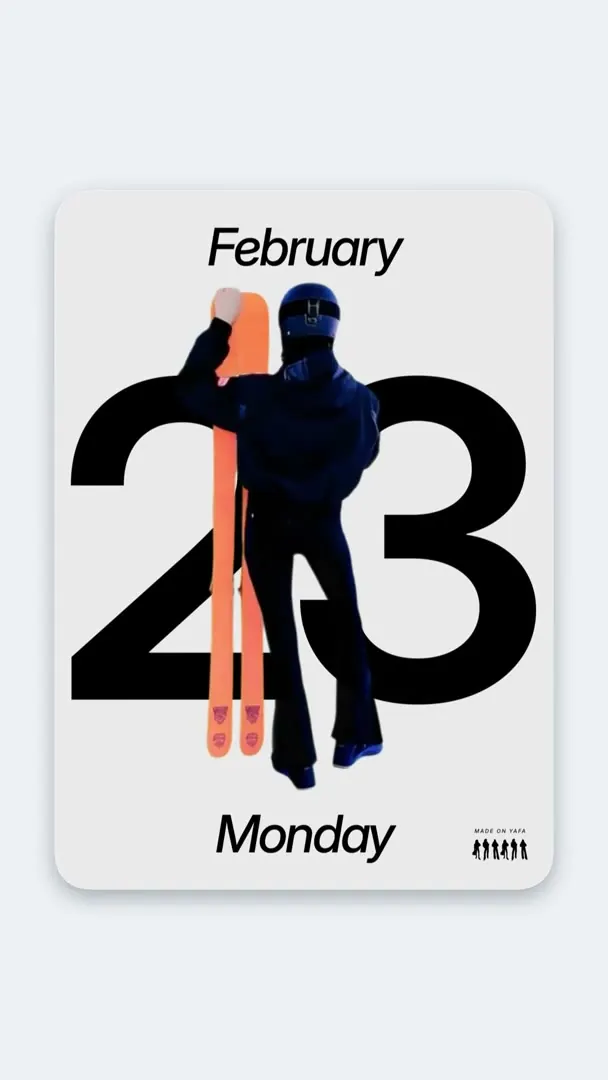 Collage Calendar Design
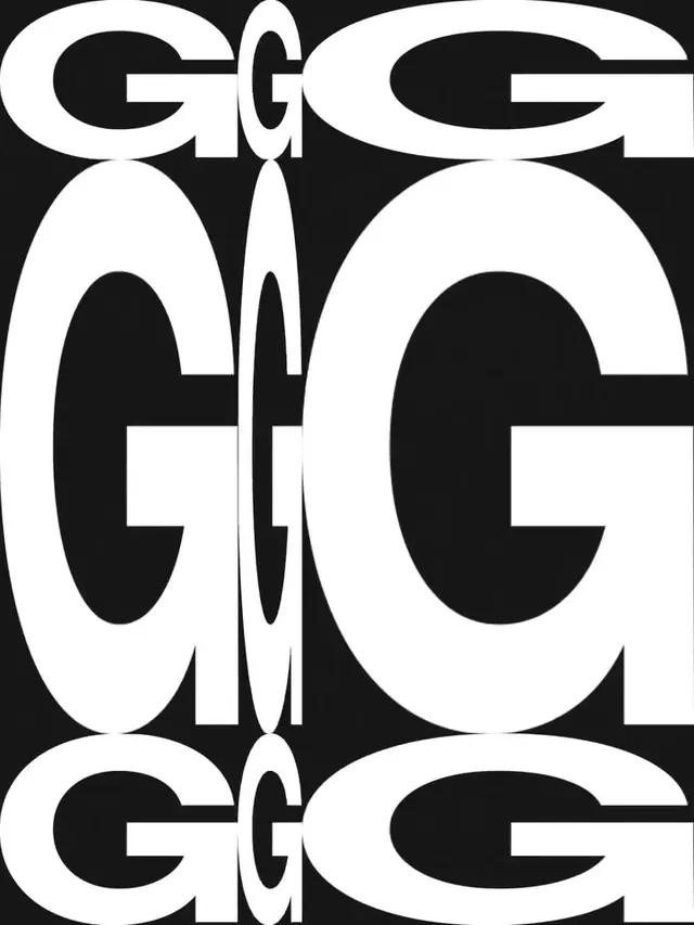 Geometric Letterform Pattern
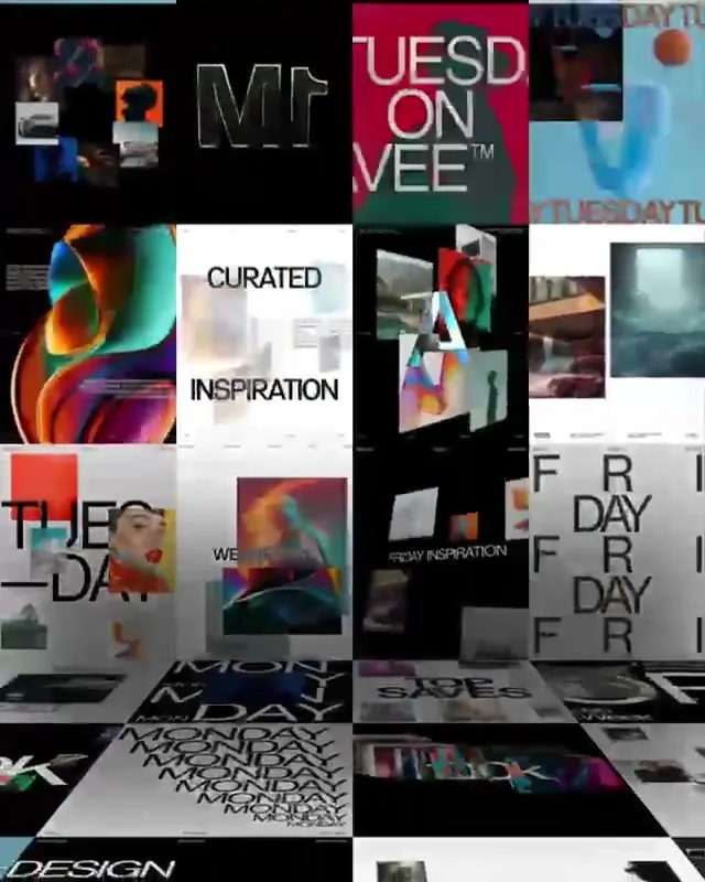 Design Inspiration Moodboard
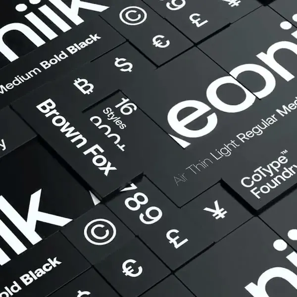 Typography and Symbolism Grid
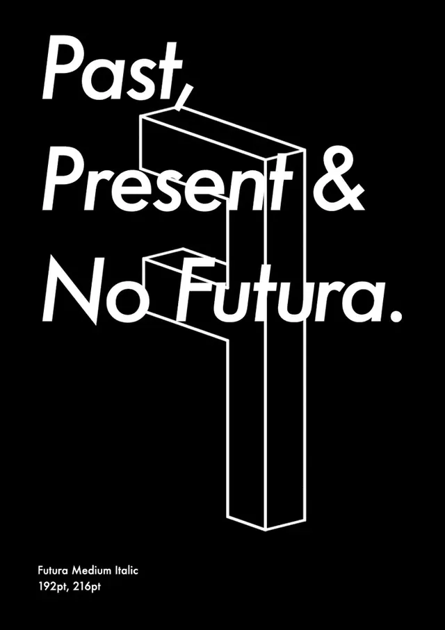 Past, Present & No Futura Typography Layout
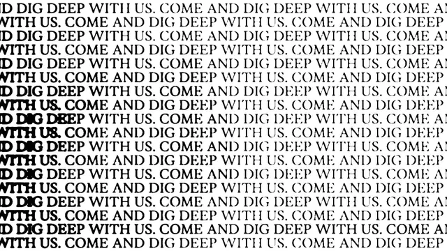 Repetitive Text Pattern
 Social Innovation Wordmark
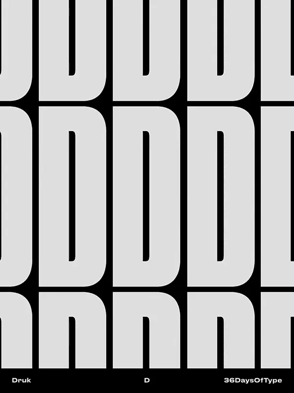 Monogram Pattern Design
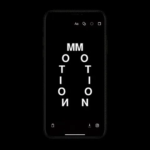 MMOTION Mobile Display
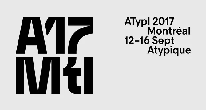 ATypI 2017 Montréal Identity