Identity exploration with curved letterforms and typography
Abstract identity design composition featuring oversized curved mark with repeated typography text.
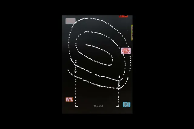
Summary
A brand identity exploration showing an abstract curved letterform mark alongside repeated typographic text. The composition balances a bold geometric icon with structured type repetition.
Visual description
Center frame captures a large, organic curved mark (likely a stylized letter or symbol) rendered in black against a dark background. Below and to the right, the word "TYPEFACE" repeats in rows across a lighter section, creating texture and rhythm through repetition.
Key takeaway
Pairing a distinctive abstract mark with systematic type repetition creates visual hierarchy and brand consistency. The mark draws attention; the type system provides substance and structure.
Reuse notes
Ideal for creative studios, design agencies, or brands developing a distinctive visual language. Works well when you want both a memorable icon (the mark) and a systemic approach (the type).
More like this
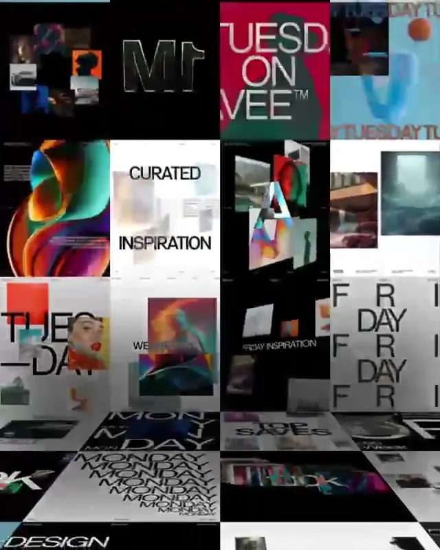 Design Inspiration Moodboard
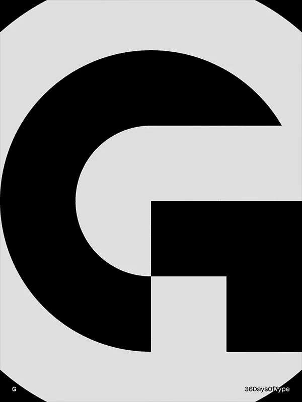 36 Days of Kinetic Type
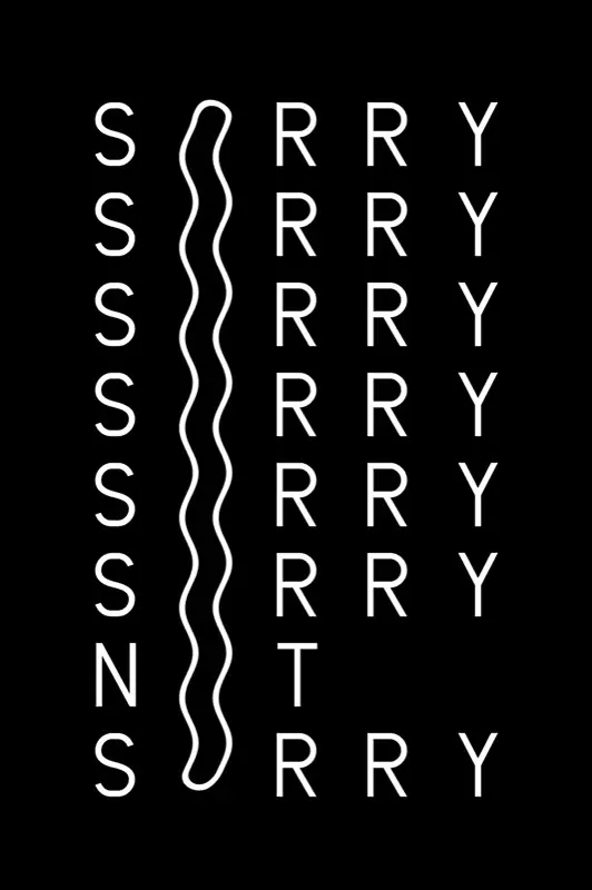 Animated text video with minimal typography
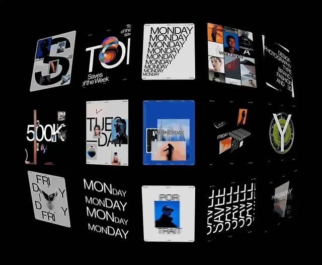 Modern Typography and Branding Identity Collection
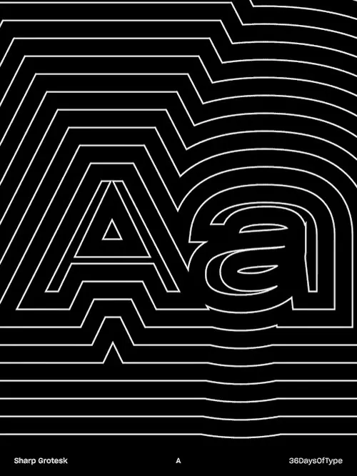 Abstract Line-Art Typography
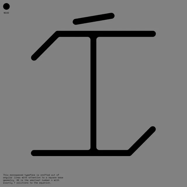 NO32 geometric monospace typeface display
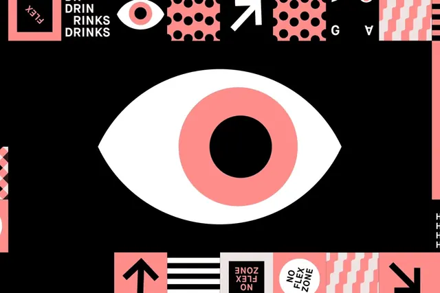 Abstract Eye Identity System
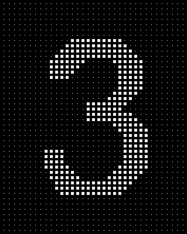 Dot-grid numeral three motion frame
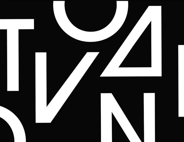 Ovation Typography Animation
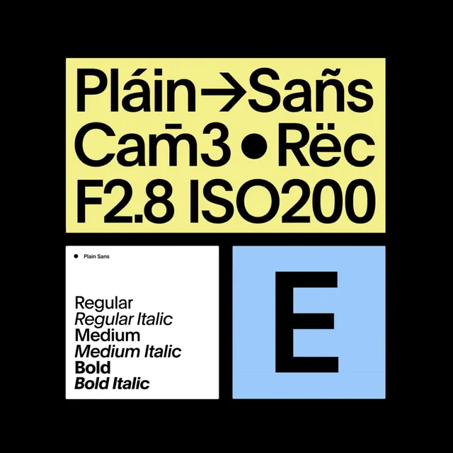 Type Specimen and Graphic Layout
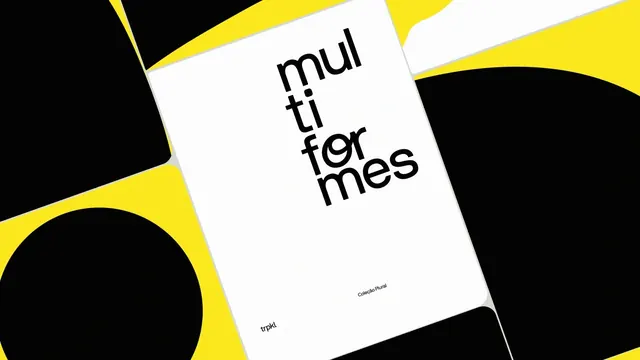 Multi for Mes Typography Design
 Animated abstract dashes motion pattern
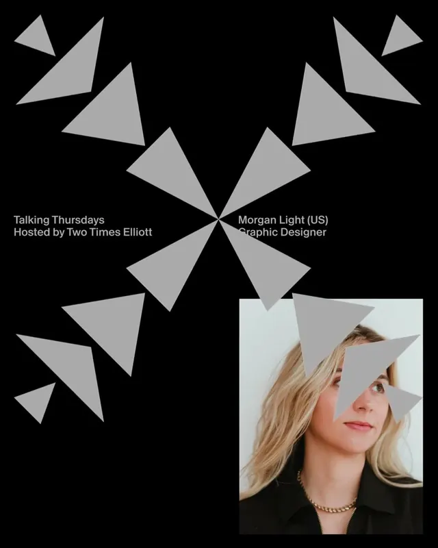 Talking Themselves Event Poster
 Raycash fintech brand identity and motion design (slide 8)
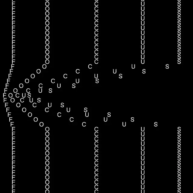 Kinetic typography animation staggered columns
 Abstract Line Art Composition
 Neon yellow frame motion
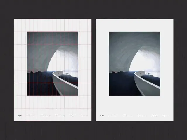 Animated tropical grid transition study
 36 Days of Type: Animated letterform
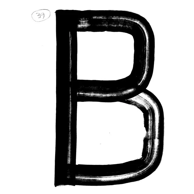 Brutalist Letter B Type Specimen
 Kinetic motion graphic animation still
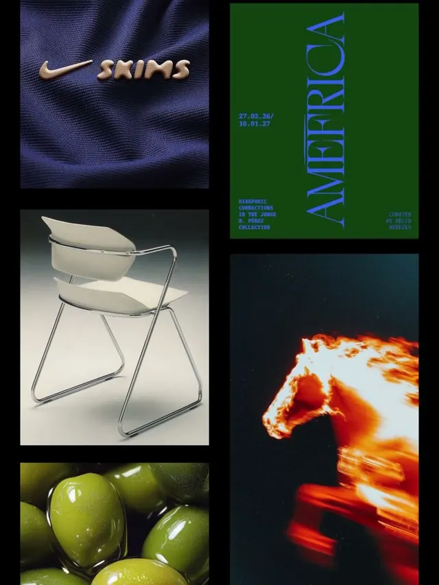 Graphic Design Reference Board
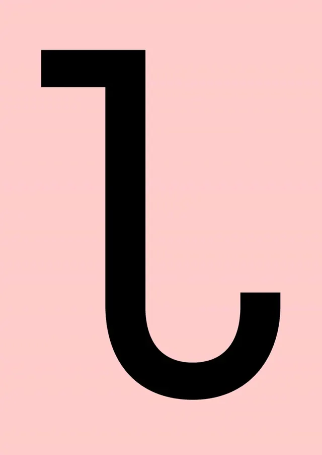 Black U-shape on blush pink background
 Spatial 3D typography motion graphics