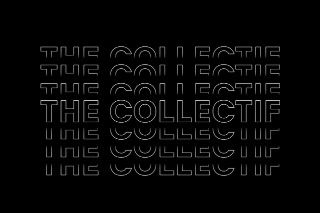
The Collectif outline typeface stacked
The words "THE COLLECTIF" repeated and stacked in an all-caps outline serif typeface against a black background.
Summary
An outline serif typeface spelling "THE COLLECTIF" layered vertically in a repeating pattern on a black background, showcasing a visual identity system.
Visual description
Black background with white outline letterforms stacked and slightly offset vertically. Each instance of "THE COLLECTIF" is rendered in a crisp serif typeface with just the stroke visible, creating an optical rhythm through repetition. The outlines are consistent in weight and spacing, producing a clean, geometric composition.
Key takeaway
Using outline type and strategic repetition creates depth and visual interest while maintaining clarity and legibility as a core identity device.
Reuse notes
Strong reference for brand identity systems, type-forward design, or applications needing a distinctive typographic mark. The outline treatment works especially well for striking monochromatic presentations.
More like this
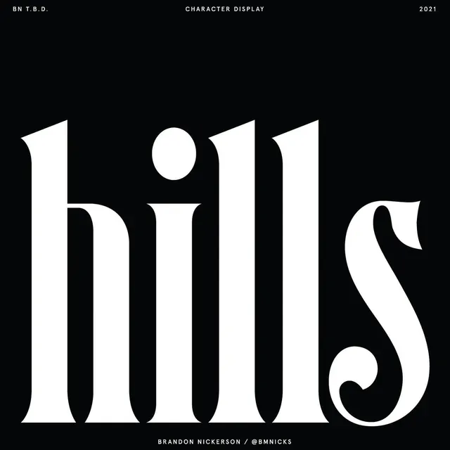 Type specimen: 'hills' serif display
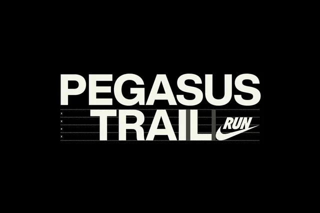 Nike Pegasus Trail blueprint typography
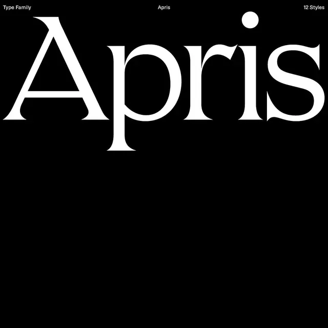 Apris typeface specimen dark
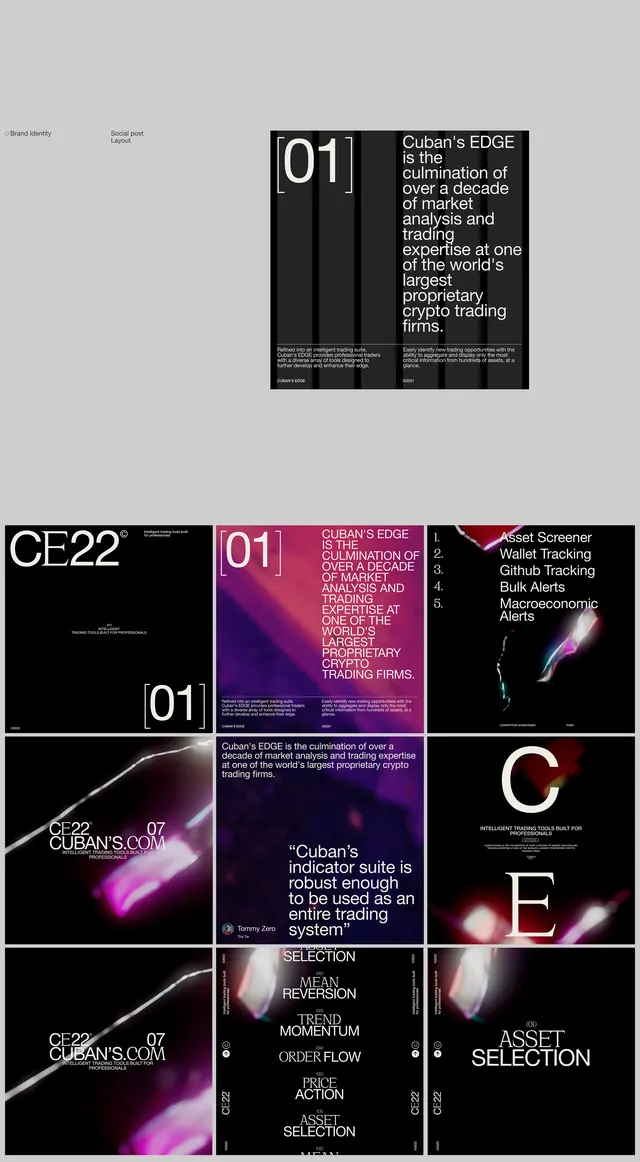 Crypto trading platform type system
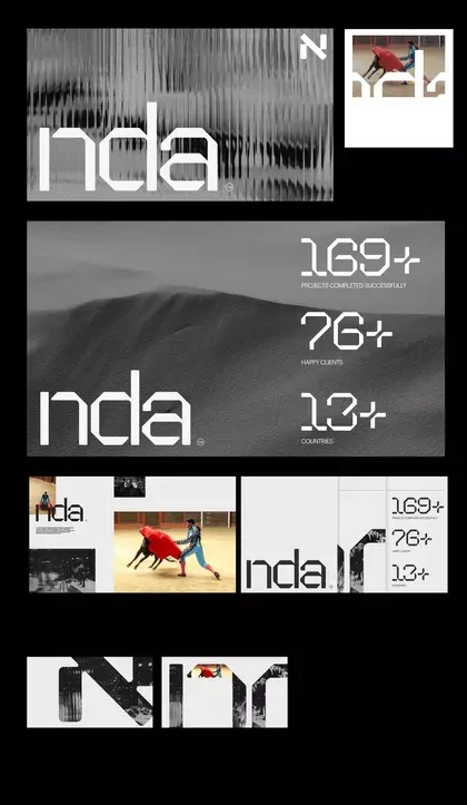 NDA monochrome type system
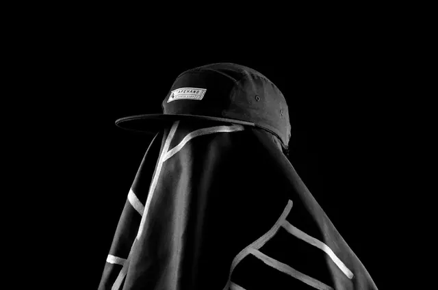 Monochrome Sportswear Mockup
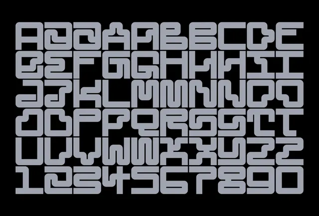 Modular pipe alphabet specimen
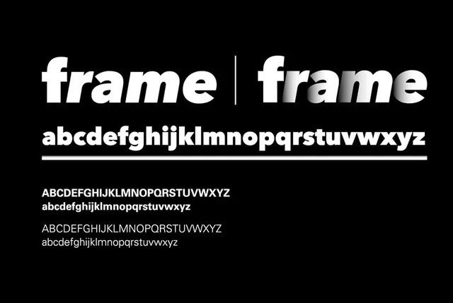 Frame typeface specimen with weight variations
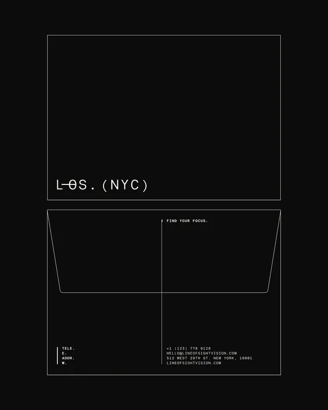 Minimalist monochrome graphic with geometric frames
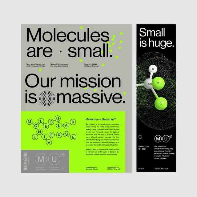 High-contrast type poster with neon-green accent
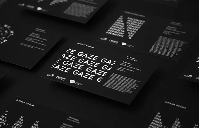 Data-Dense Typography Layout
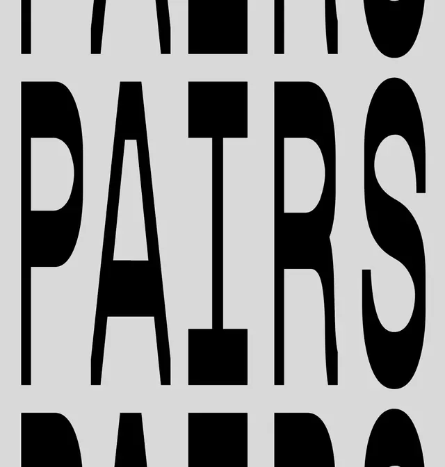 Bold display typeface with geometric characters
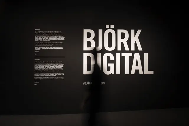 Björk Digital Wordmark and Layout
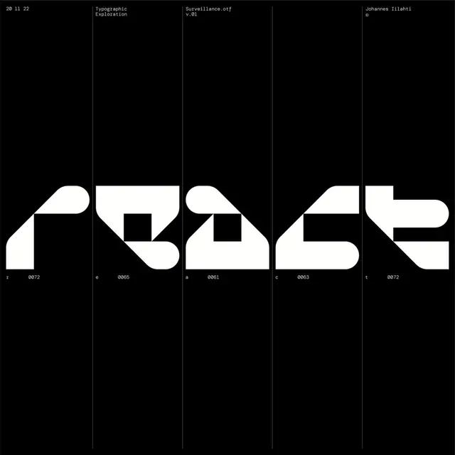 Geometric Type Specimen
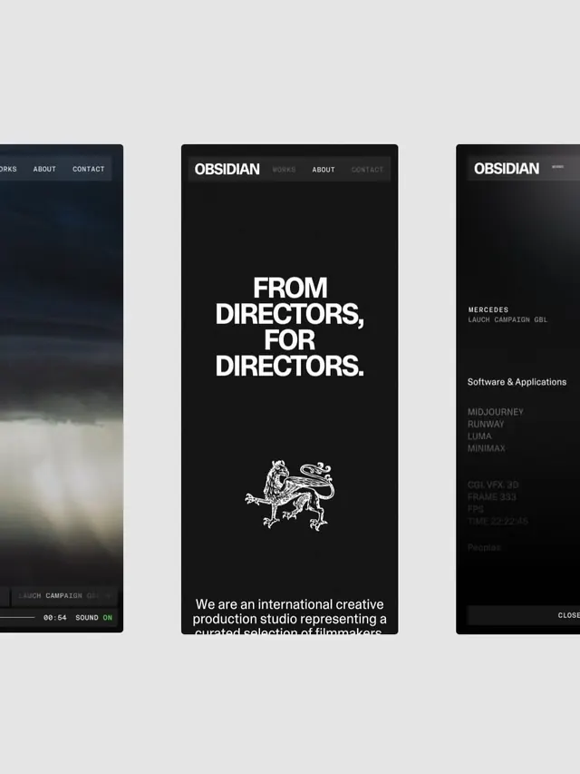 Creative studio website dark hero with dragon emblem
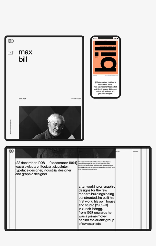 Max Bill biography: minimalist CV layout system
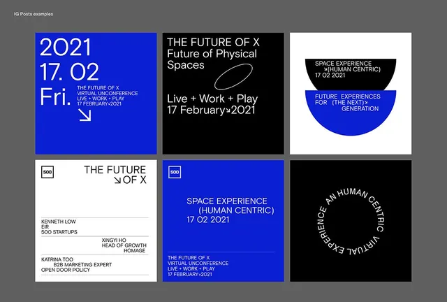 The Future of X conference poster grid
 HK Repro typeface specimen
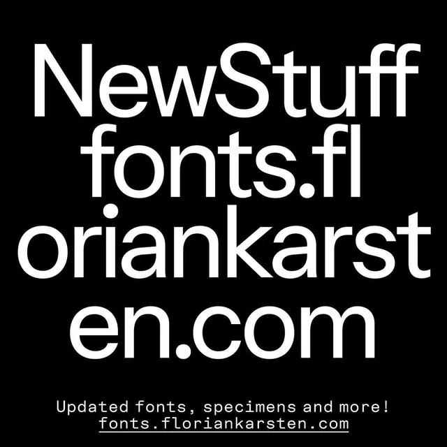 Typographic poster with font specimen and website URL
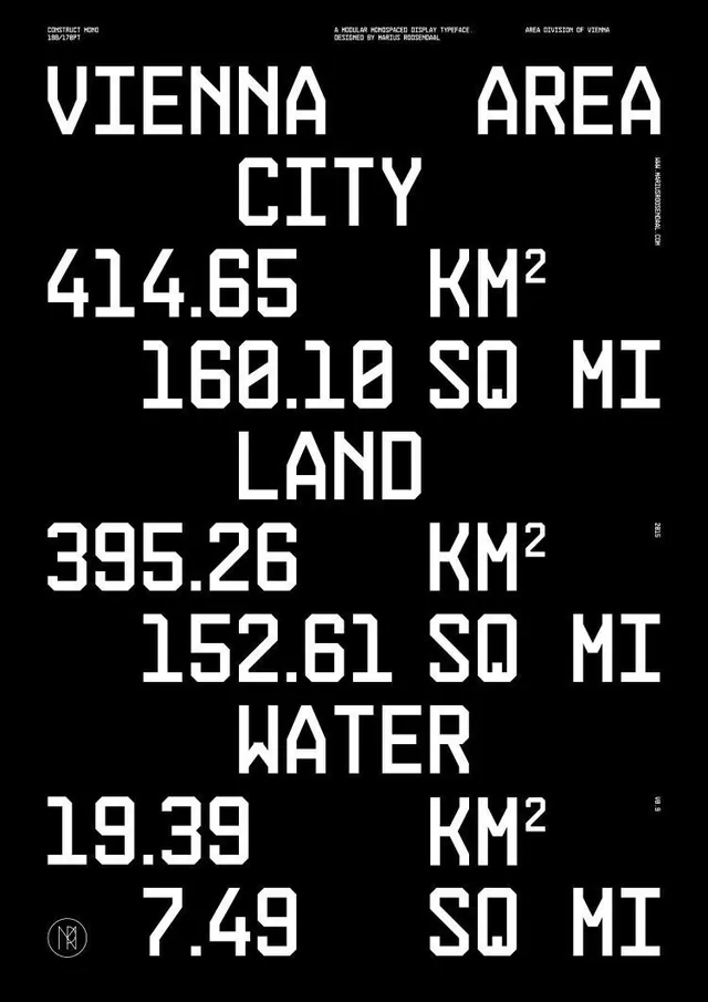 Construct Mono Vienna area type poster
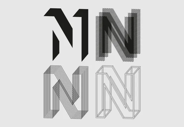 Typographic study with geometric variations
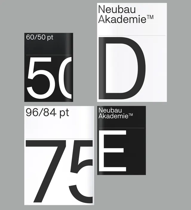 Neubau Akademie typeface test kit layout
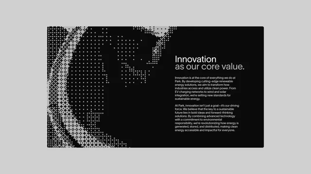 Park renewable energy brand innovation statement with pixelated world map
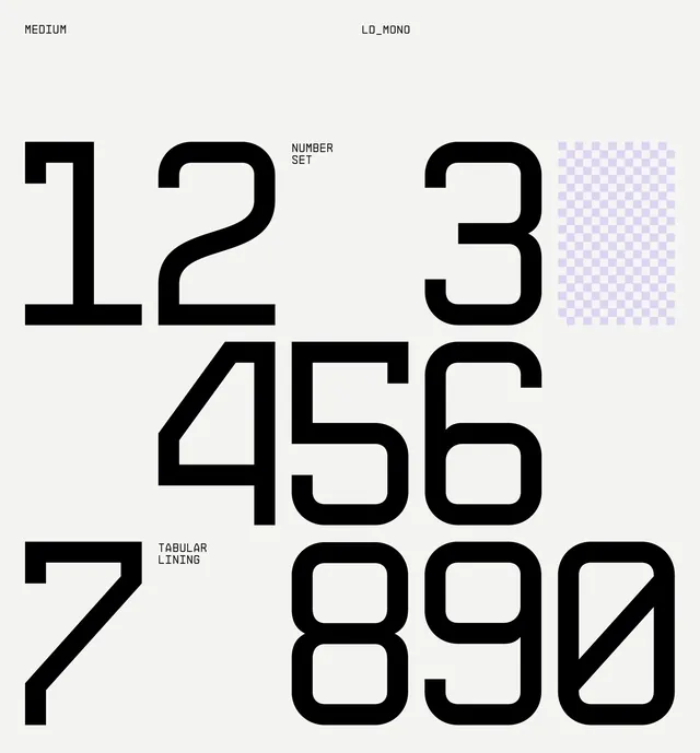 Oversized numbers type specimen