Bold Wordmark Identity
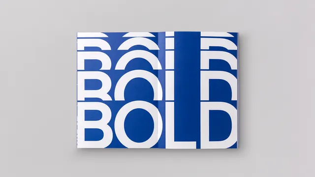
A high-contrast typographic identity featuring the word 'BOLD' repeated in a stacked, grid-like layout.
Summary
A high-contrast typographic identity featuring the word 'BOLD' repeated in a stacked, grid-like layout.
Visual description
The design features the word 'BOLD' repeated four times in a 2x2 grid. It uses a heavy, blue sans-serif typeface set against a white background with a distinct blue vertical divider.
Key takeaway
The design demonstrates how repetition and heavy weight can create a strong, memorable visual impact.
Reuse notes
Can be used as a pattern, a brand mark, or a layout inspiration for bold editorial headers.
ColorHigh Contrast, Monochrome
TypeSans Serif, Oversized, All Caps
MoodBold, Professional, Technical
Tagstypography, grid, repetition, blue, white, block
Palette
#D1CFD1
#164494
More like this
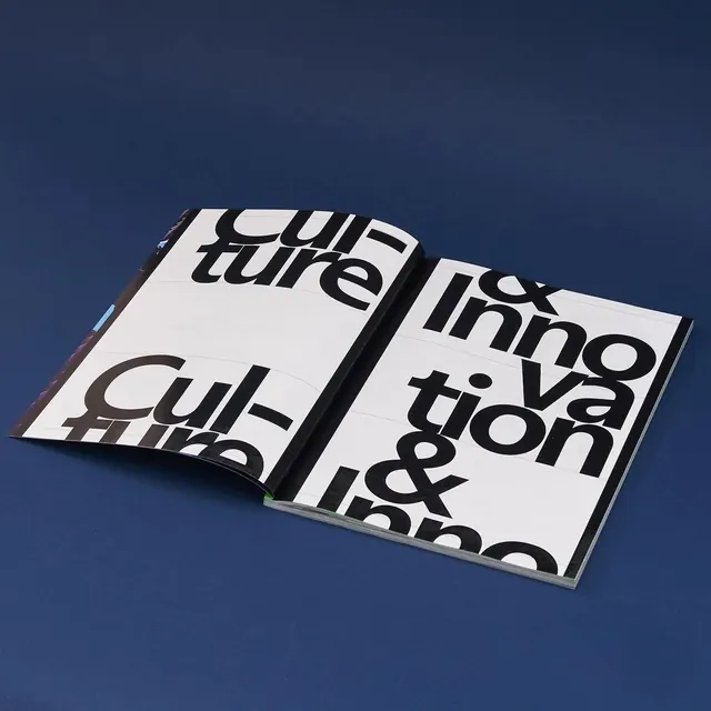 Culture & Innovation Editorial Spread
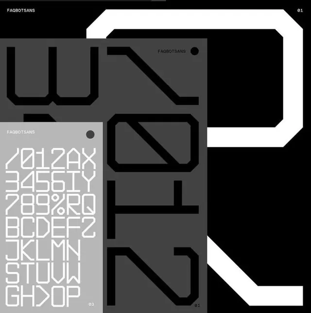 Geometric Typography Identity System
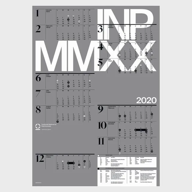 2020 Calendar Infographic Design
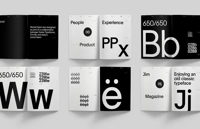 Minimalist Typography and Logo Grid
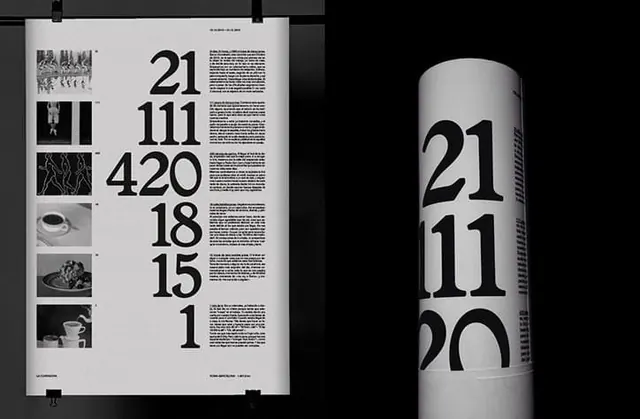 Data-Driven Typography Layout
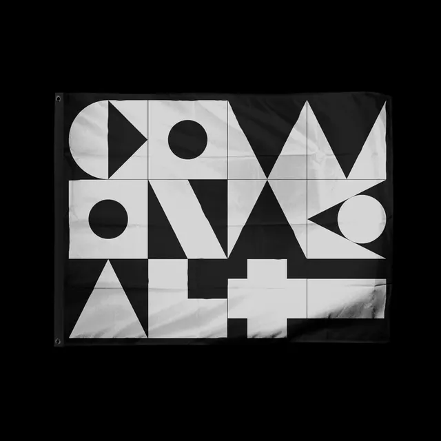 Geometric Typography Composition
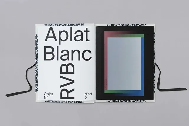 Aplat Blanc Typography Specimen
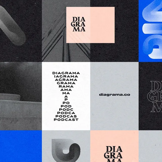 Diagrama Identity System
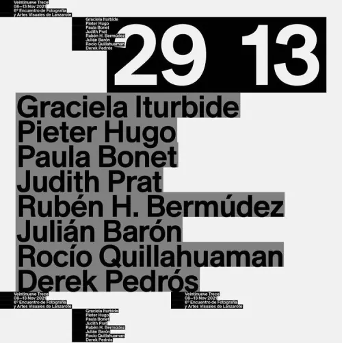 Typography-Driven Poster Design
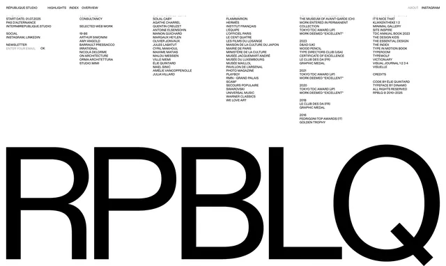 Typography and Wordmark Layout
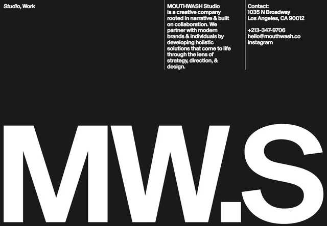 Studio MWS Identity Design
 Timeline Typography Design
 LUNDON Typography Design
 ZERO DOIS Identity System
 Misplaced New York Identity System
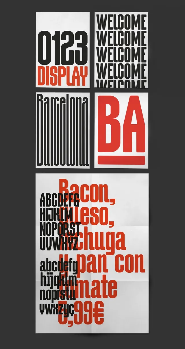 Swiss Typography and Grid Layout Study
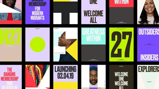 Grid-Based Graphic Design Reference
 Geometric Abstract Typography Design
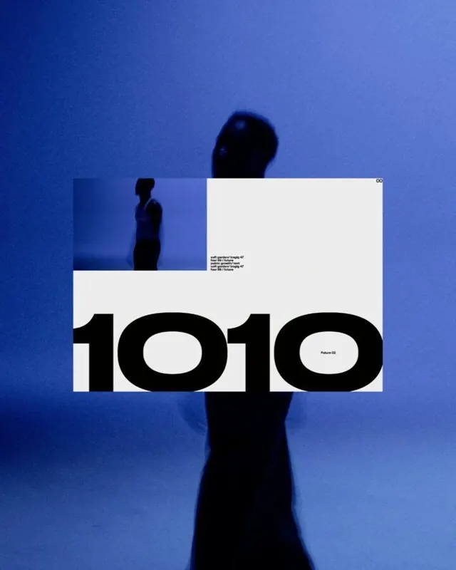 1010 Graphic Design Mockup
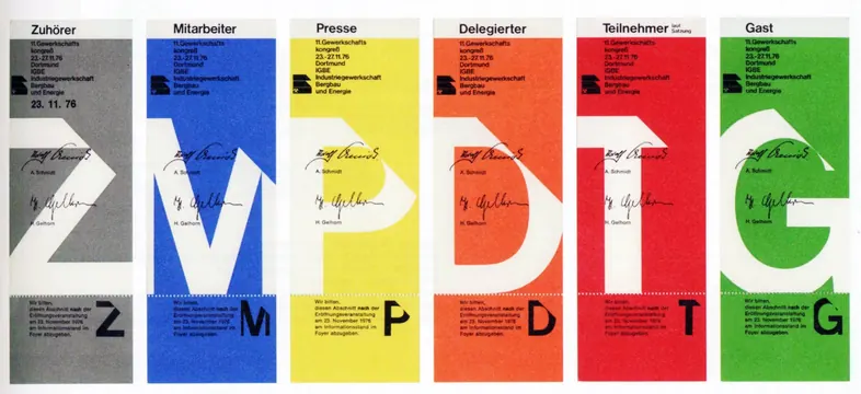 Typography and Color Grid System
 Reality. Wordmark and Layout Study
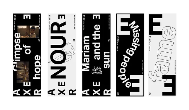 Typography and Graphic Design Reference Board
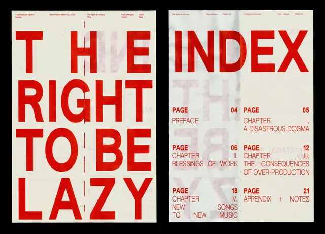 The Right to be Lazy Editorial Spread
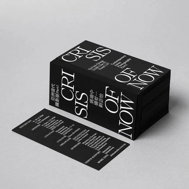 Black and White Typographic Packaging