Minimalist light typography study
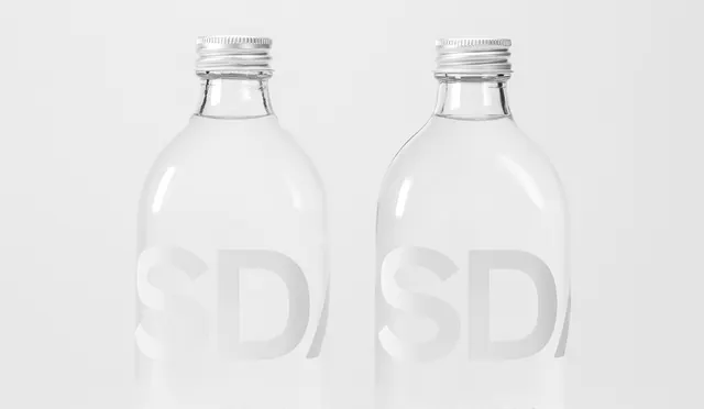
Ultra-minimal composition featuring clean sans-serif letterforms in soft gray tones on a near-white background.
Summary
An extremely restrained design using a single light gray tone across the entire composition. The focus is entirely on typography and spacing.
Visual description
Nearly monochromatic composition with very subtle value differences. Light gray sans-serif type floats in generous white space. The letterforms are the sole visual element. Text alignment is clean and considered, with careful attention to spacing between letters and lines. The overall effect is serene and meditative.
Key takeaway
Extreme minimalism and a monochromatic approach can create sophistication through restraint. Typography and white space become the entire design system.
Reuse notes
Ideal for luxury brands, minimalist design studios, or premium services. Works well for art-related institutions or design-focused companies. The monochromatic approach is demanding—needs confident typography to carry the entire design.
More like this
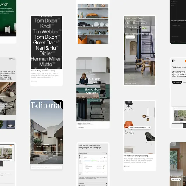 Editorial and Layout Design Collection
 Gola.us Nordic album cover mockup
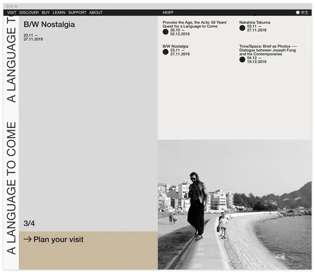 HKIPF exhibition layout with vertical type and archival photography
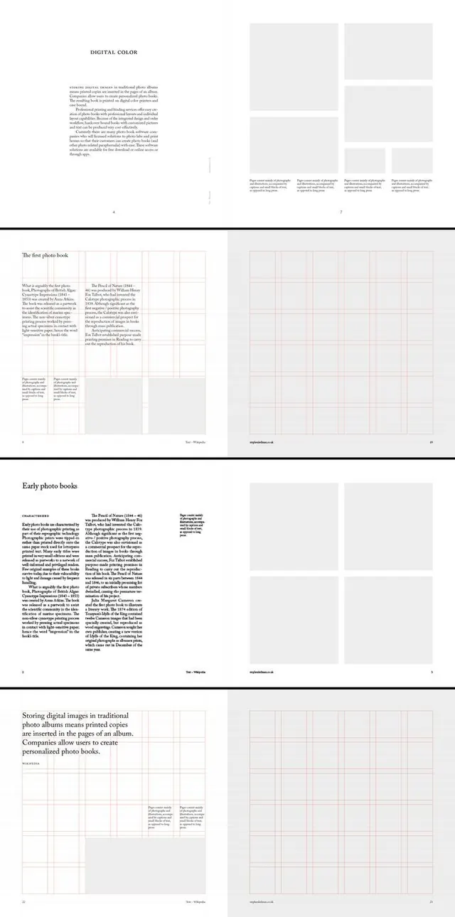 Editorial book layout with typography grid
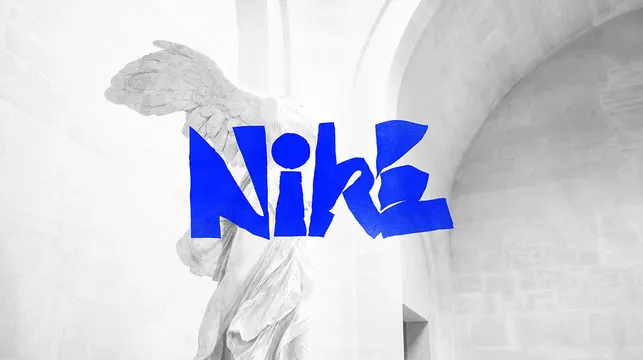 Minimal white typography layout study
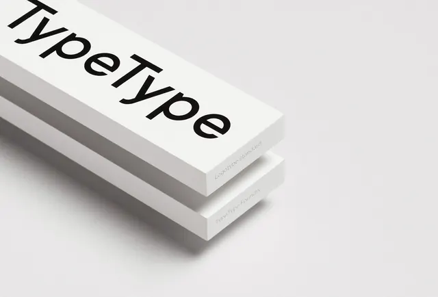 TypeType logotype on stacked white paper specimens
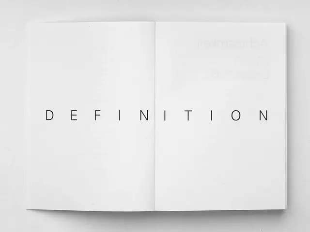 Definition Wordmark Mockup
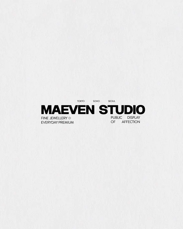 Maeven Studio jewellery brand wordmark with geographic tags
 Editorial fashion portrait with geometric layered clothing
 Architectural Sketch Identity
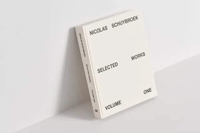 Minimalist Editorial Book Mockup
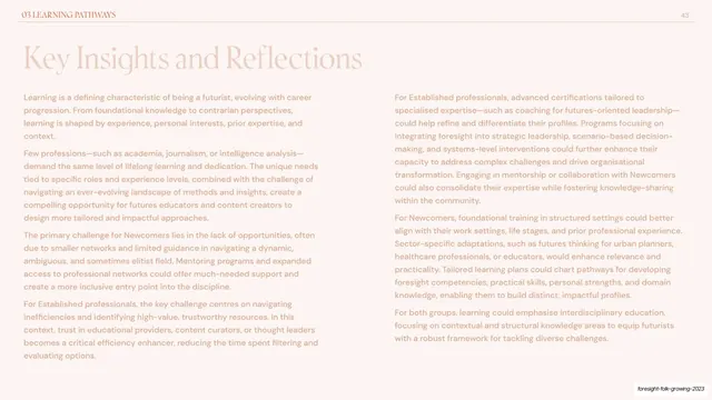 Key insights and reflections two-column essay
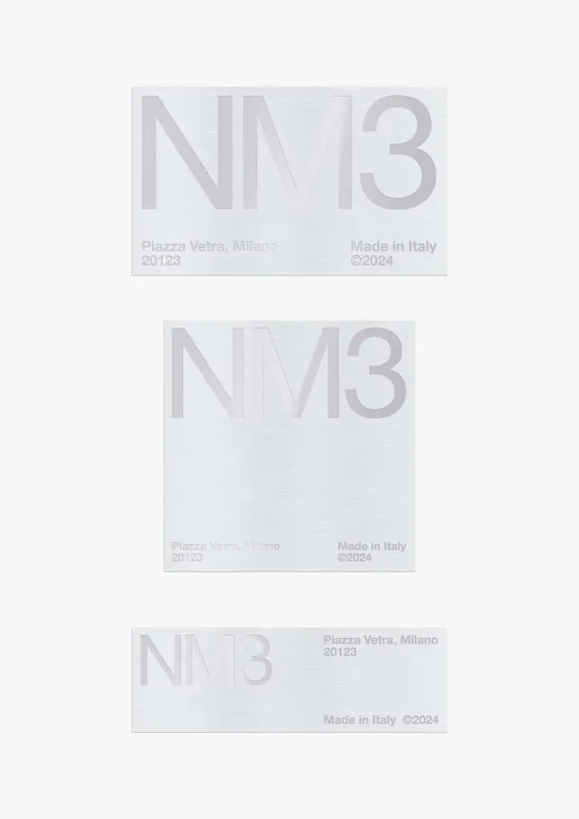 NM3 business card design variations
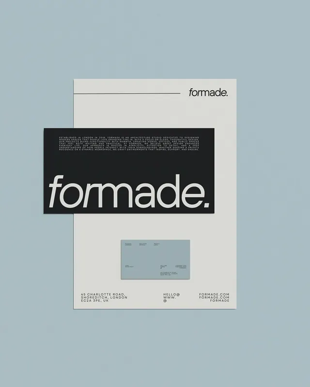 Minimal swiss identity system
 Minimal season announcement typography
 Inspirational text typography composition
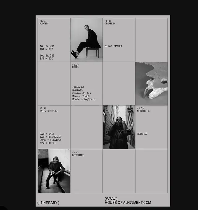 Editorial grid with monochrome photography
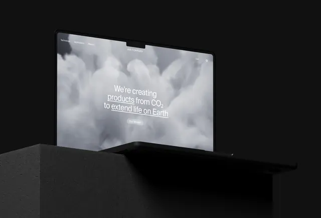 Air Company brand identity
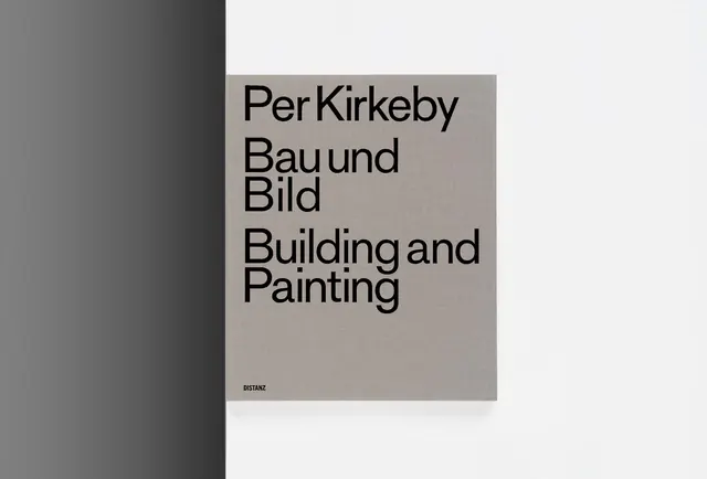 Per Kirkeby book cover design
 Minimal interior architecture with archway and natural light
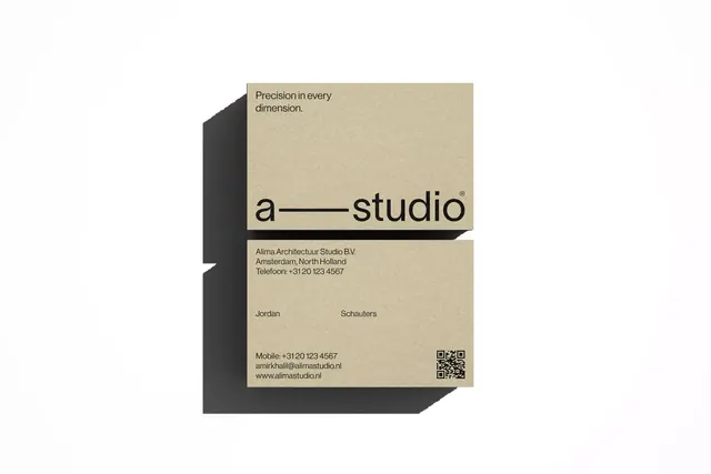 Business card with isometric 3D shadow effect
 Minimal editorial wordmark
 Minimal editorial poster
 Minimal monochrome photograph