Dual-Tone Geometric Identity System
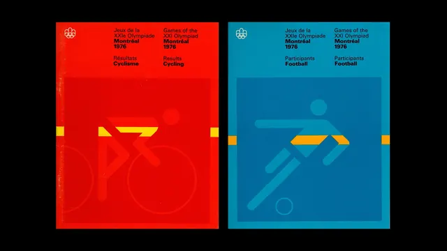
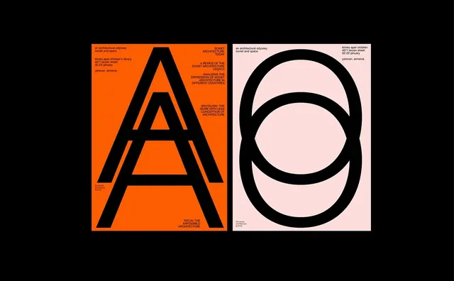
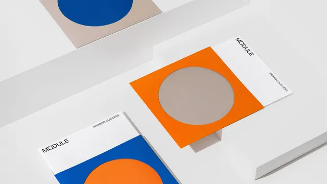
A side-by-side visual comparison of two brand identities featuring bold primary colors, geometric shapes, and structured typography.
Summary
A side-by-side visual comparison of two brand identities featuring bold primary colors, geometric shapes, and structured typography.
Visual description
Two rectangular blocks, one red and one blue, featuring white sans-serif text and yellow geometric accents. The designs use heavy line work and overlapping shapes to create a structured, balanced layout.
Key takeaway
The design demonstrates how high-contrast color blocking and geometric consistency can create a cohesive brand identity.
Reuse notes
Apply the layout structure for contrasting brand variations or dual-product marketing materials.
StyleMinimal, Geometric, Boxed, Corporate Clean
ColorHigh Contrast, Vibrant
TypeSans Serif, All Caps
MoodBold, Professional, Energetic
Palette
#E30C05
#040405
#058BB0
#056E9E
#E8B21C
More like this
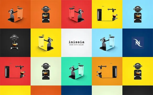 Inmedia Brand Identity Grid
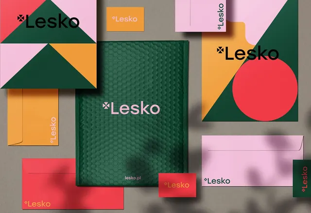 Lesko Brand Identity System
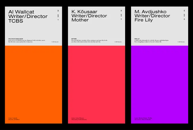 Corporate Identity Color Blocks
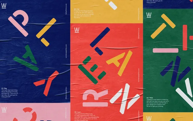 Multi-color Brand Identity Grid
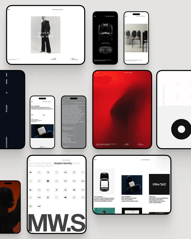 Minimalist Corporate Identity and UI Design
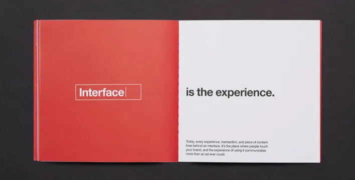 Interface is the experience. Editorial Spread
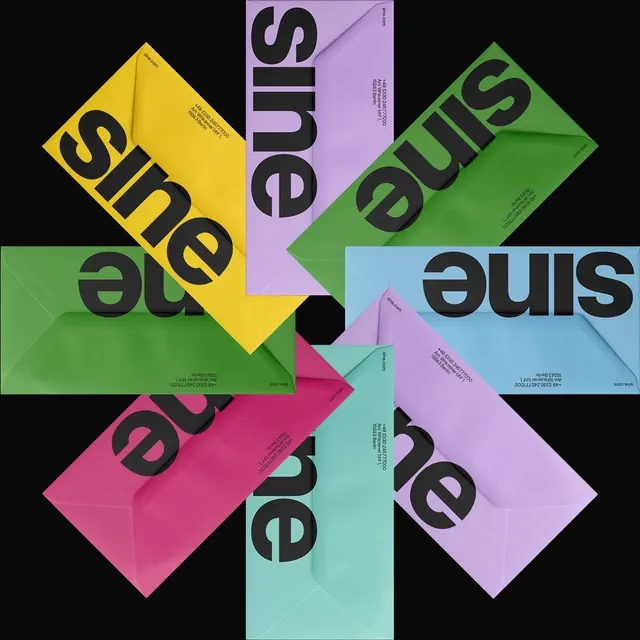 Sine Wordmark Identity System
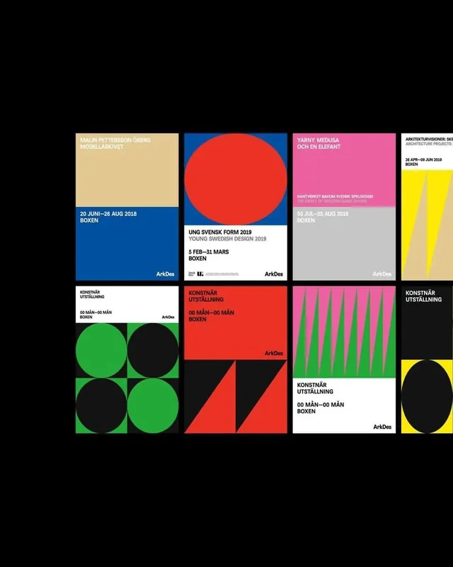 Geometric Identity System Grid
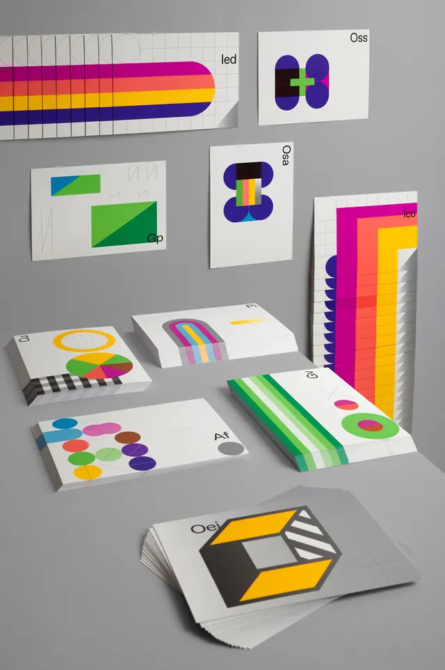 Geometric Identity System and Mockups
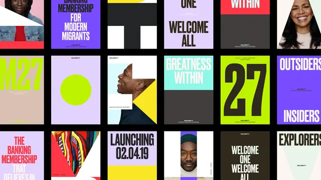 Grid-Based Graphic Design Reference
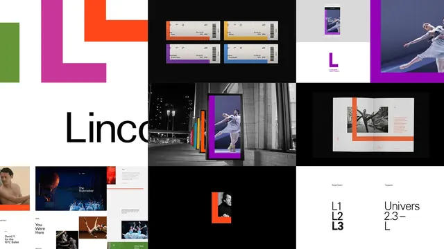 Geometric and Typographic Identity System
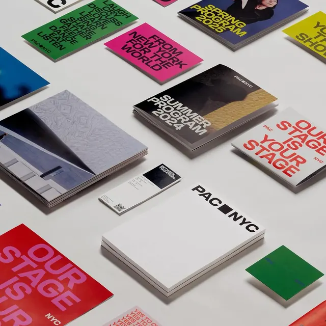 Brand Identity Mockup Collection
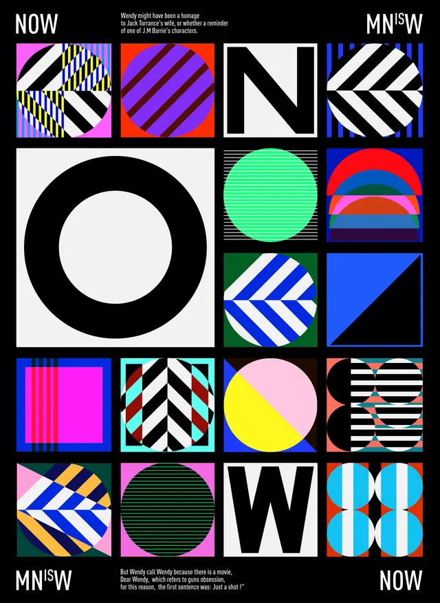 NOW Wordmark and Identity System
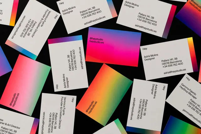 Geometric Gradient Identity System
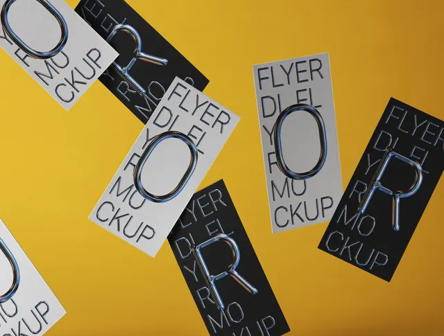 EYER.UK Identity System
 Visual Reference Moodboard
 Geometric Abstract Identity Design
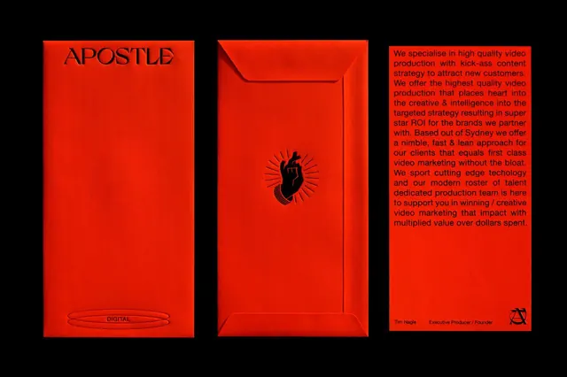 Red triptych brand identity with envelope icon
 Mobile App UI and Brand Identity Layout
 h&h discovery logo variations
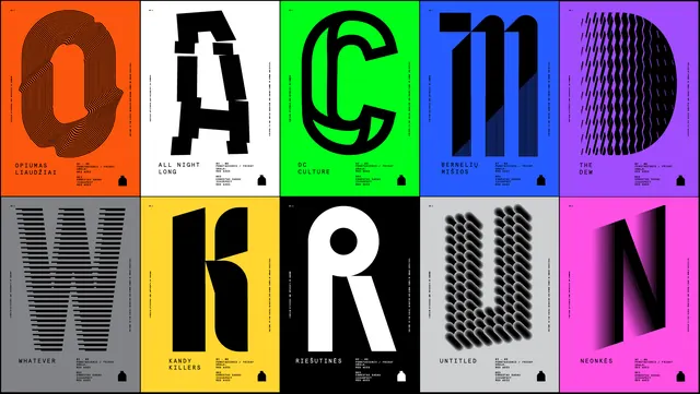 Modern Typography and Logo Grid
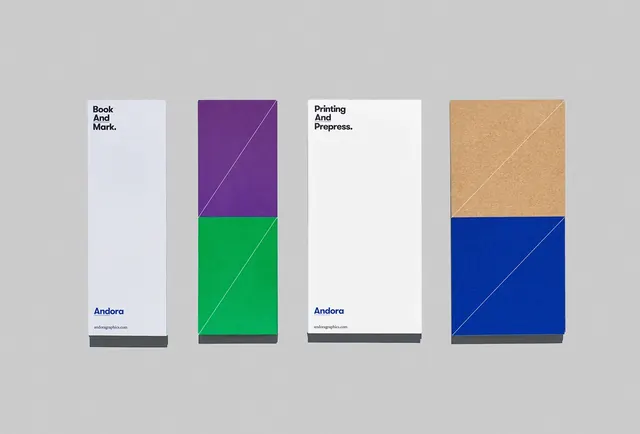 Geometric Block Identity System
 Geometric Typography Identity
 Geometric Identity Mockup