Watch Brand Mobile UI Comparison
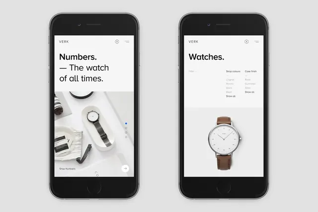
A side-by-side mobile mockup showing two different UI designs for a watch brand, contrasting a lifestyle-heavy layout with a minimalist product focus.
Summary
A side-by-side mobile mockup showing two different UI designs for a watch brand, contrasting a lifestyle-heavy layout with a minimalist product focus.
Visual description
Two smartphone mockups display a watch brand interface. The left screen features a lifestyle photograph of a watch on a table with text, while the right screen shows a centered product image with a clean, white background.
Key takeaway
The design demonstrates how to balance lifestyle imagery with clean product presentation in a mobile commerce context.
Reuse notes
Use as a reference for high-end e-commerce layout structures and minimalist product display.
StyleMinimal, Light Mode, Editorial
ColorLight, Monochrome
TypeSans Serif, Oversized
MoodPremium, Elegant, Professional
Tagsmobile app, e commerce, watch, luxury, ui ux
Palette
#E3E3E3
#262626
#8F8F8F
More like this
 Side Table MIDAS Advertisement
 Mobile App Interface Mockup
 GUBI Furniture Product Page
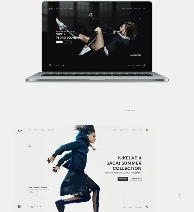 NikeLab x Longchamp Collaboration
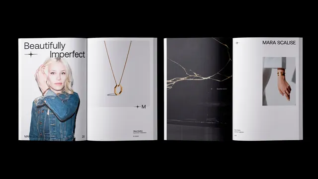 Jewelry Brand Identity Presentation
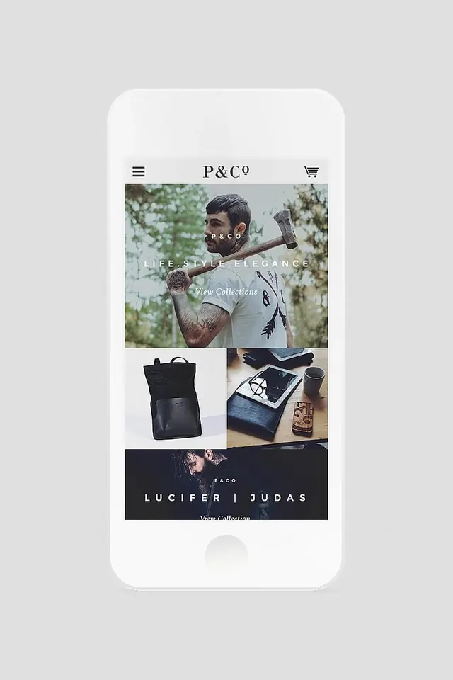 F&O Brand Identity Mockup
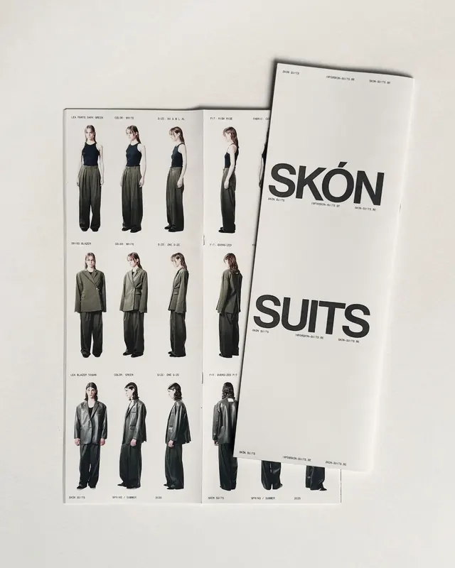 Skón Suits Brand Identity
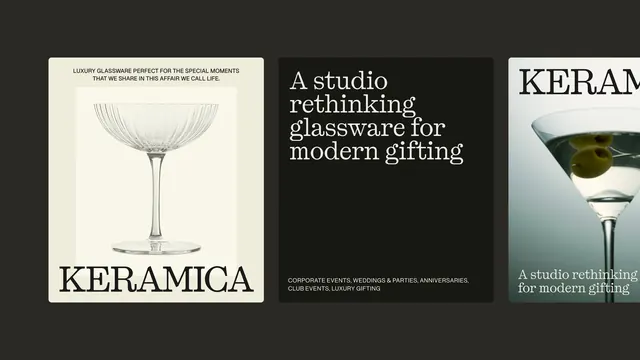 KERAMICA Brand Identity and Product Showcase
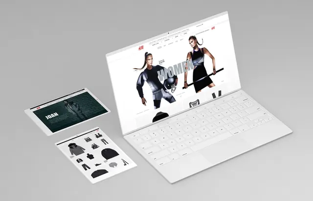 Tech Product Mockup Spread
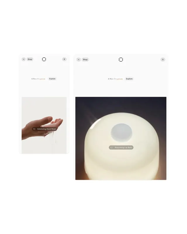 Minimalist Mobile App UI Design
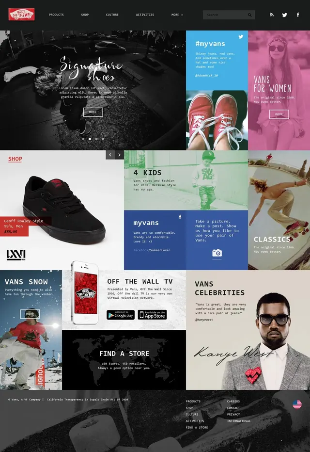 Fashion and Lifestyle Brand Identity Collage
 Product Showcase UI Mockup
 Ligne Editorial Layout
 Maeven Studio jewellery brand wordmark with geographic tags
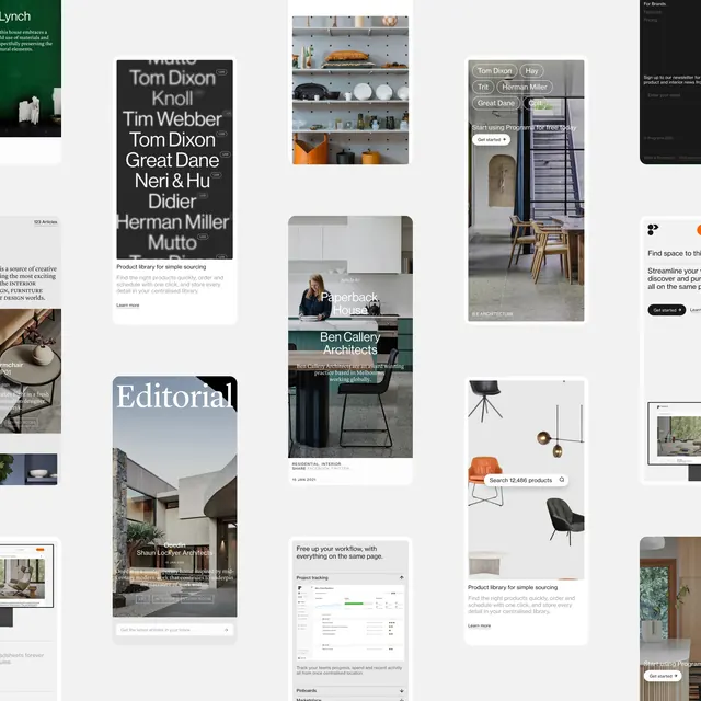 Editorial and Layout Design Collection
 Jeans E-commerce UI Mockup
 Century Art Editorial Layout
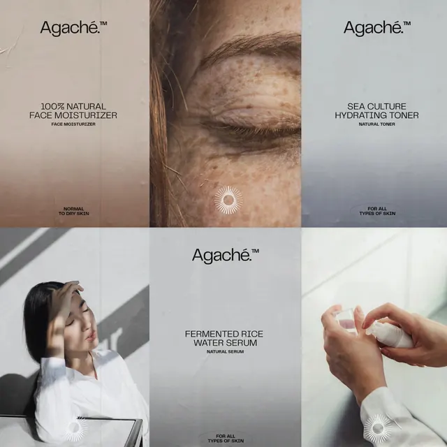 Agaché Skincare Branding and Product Visuals
 Definition Wordmark Mockup
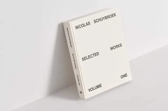 Minimalist Editorial Book Mockup
 Minimalist Furniture Catalog
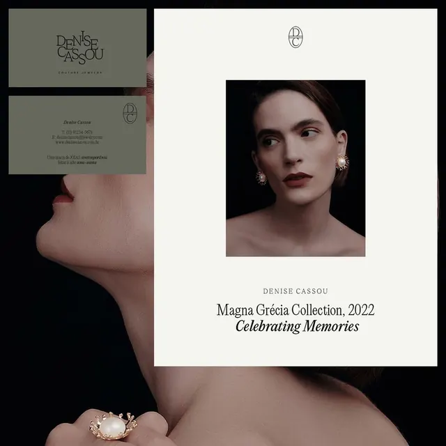 Magna Grecia Collection 2022 Editorial Layout
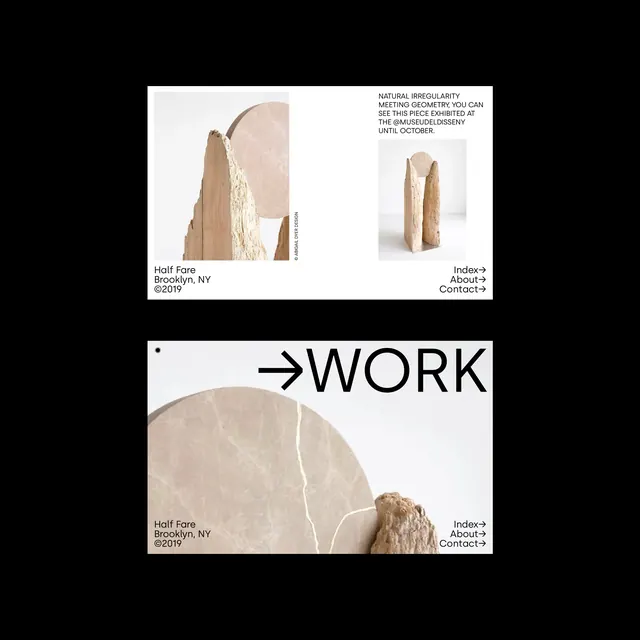 Minimalist Editorial Portfolio Layout
 Minimalist Lighting Product Gallery