Kaposvár Wordmark and Layout
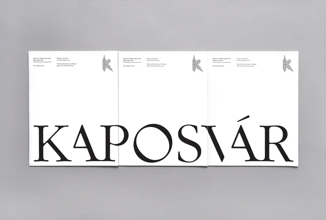
A minimalist typographic layout featuring a large, high-contrast wordmark with smaller secondary text blocks above it.
Summary
A minimalist typographic layout featuring a large, high-contrast wordmark with smaller secondary text blocks above it.
Visual description
The design features the word 'KAPOSVÁR' in a large, high-contrast serif typeface across three panels. Above the main text, smaller blocks of text and small graphic icons are arranged in a structured, grid-like layout.
Key takeaway
The design demonstrates how to balance oversized display typography with dense, smaller information using a clean grid system.
Reuse notes
Use this layout style for high-end editorial headers or minimalist brand identity presentations.
StyleMinimal, Swiss, Monochrome, Boxed
ColorMonochrome, High Contrast
MoodElegant, Professional, Bold
Tagstypography, layout, grid, minimalism
Palette
#D4D2D4
#262425
More like this
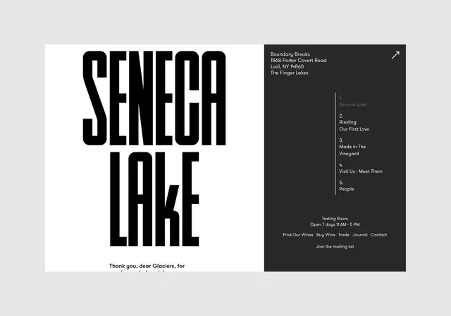 Seneca Lake Typography Layout
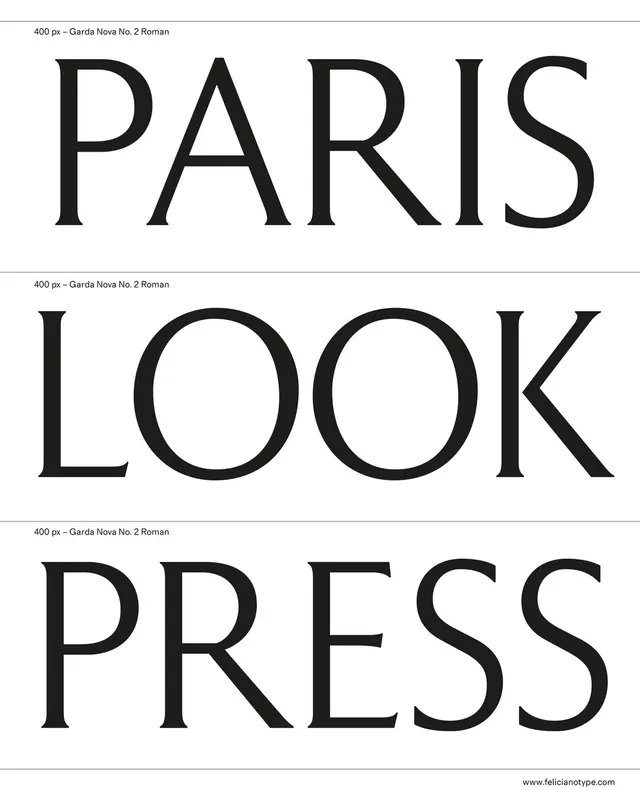 Paris Look Press Typography Layout
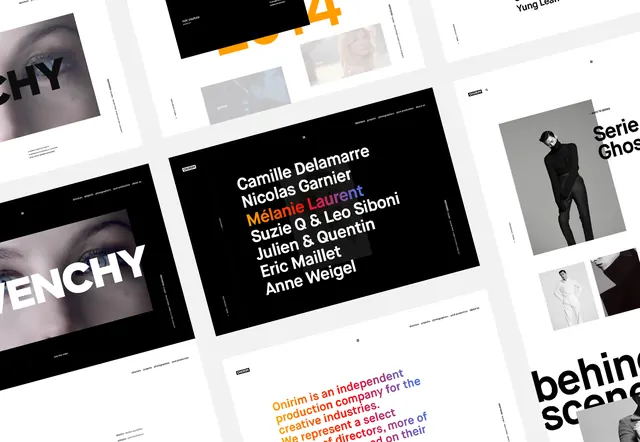 Typography and Layout Design Reference
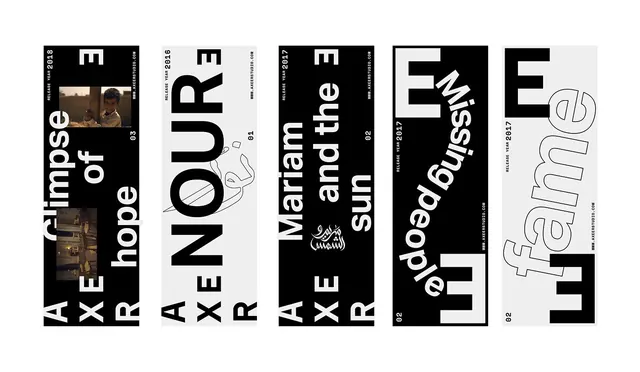 Typography and Graphic Design Reference Board
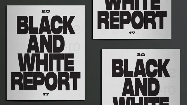 Black and White Report Layout
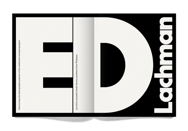 ED Lachman Identity Design
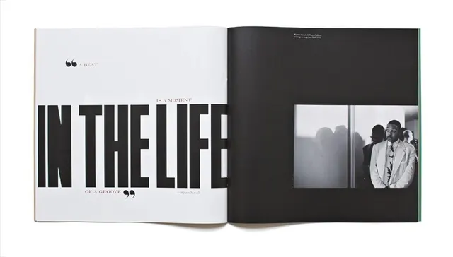 In The Life Editorial Spread
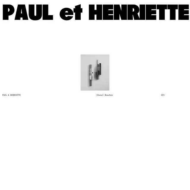 Paul et Henriette Editorial Layout
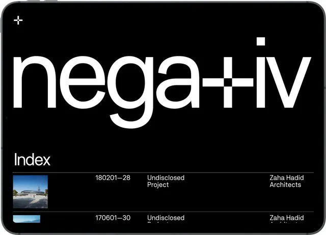 Nega+iv Index Layout
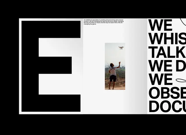 Editorial Typography and Photography Layout
 Editorial Typography and Photography Layout
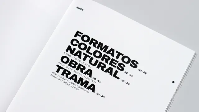 Typography Layout Design
 Large Scale Number Typography
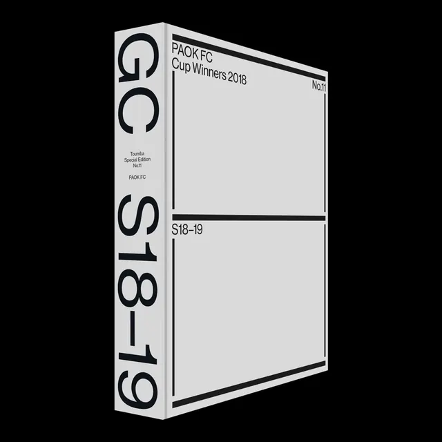 Graphic Design Cup Winners 2016
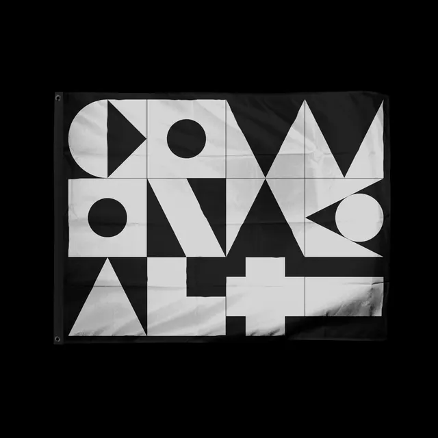 Geometric Typography Composition
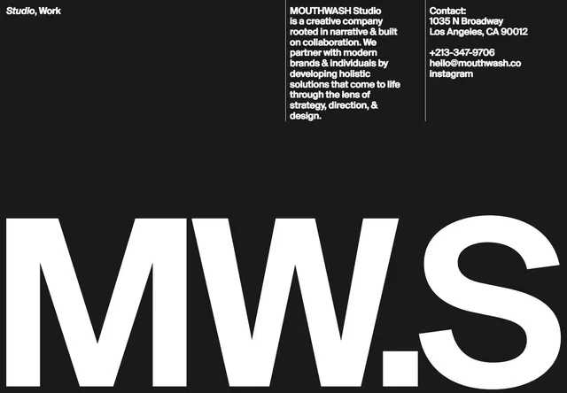 Studio MWS Identity Design
 One and One Editorial Layout
 Gallery Typography Layout
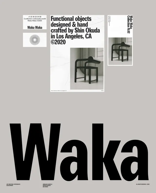 Waka Exhibition Poster
 Abstract Graphic Identity Grid
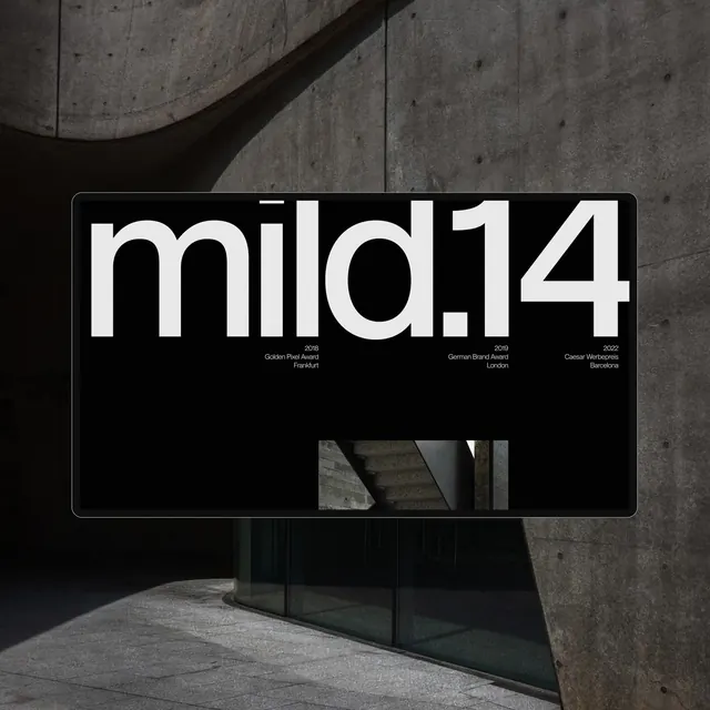 mild14 Wordmark Mockup
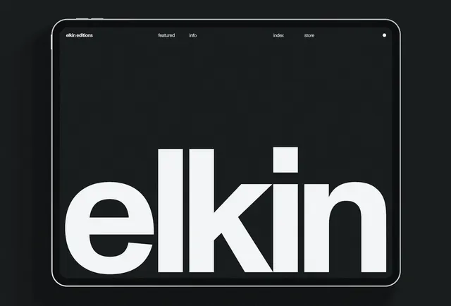 elkin Wordmark Design
 Editorial Table of Contents Layout
 Bold Wordmark Mockup