ReThink Wordmark Variations
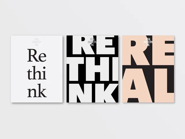
A series of three typographic treatments for the word 'ReThink', showcasing different weights, layouts, and color applications.
Summary
A series of three typographic treatments for the word 'ReThink', showcasing different weights, layouts, and color applications.
Visual description
Three horizontal rectangular blocks displaying the word 'ReThink' in various styles. The first is a light-mode layout with thin and bold weights; the second is a high-contrast black and white block; the third uses a warm peach background with a heavy, bold typeface.
Key takeaway
Demonstrates how varying font weights and color blocks can create distinct brand personalities from a single wordmark.
Reuse notes
Use as a reference for establishing typographic hierarchy and bold visual identities.
ColorHigh Contrast, Monochrome, Warm
TypeSans Serif, Oversized, All Caps
MoodBold, Professional, Technical
Tagstypography, branding, wordmark, lettering, layout
Palette
#EDEAE8
#1A1617
More like this
 Vertical Typography Layout
 Sharp Grotesk Type Specimen
 BT Grula Type Specimen
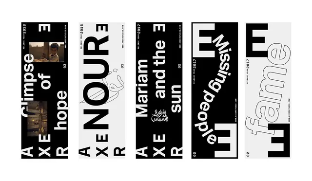 Typography and Graphic Design Reference Board
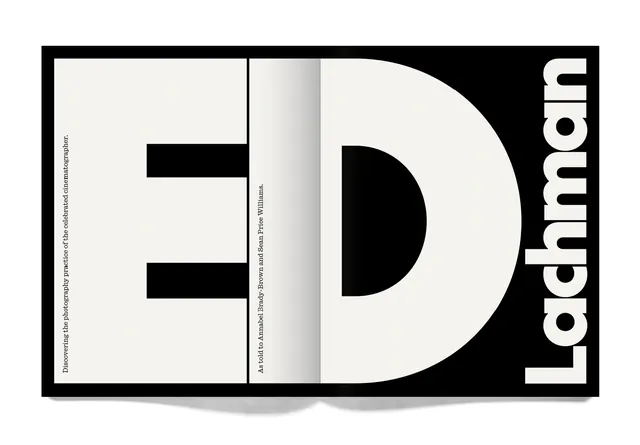 ED Lachman Identity Design
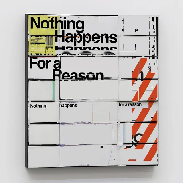 Nothing Happens For a Reason Typography Layout
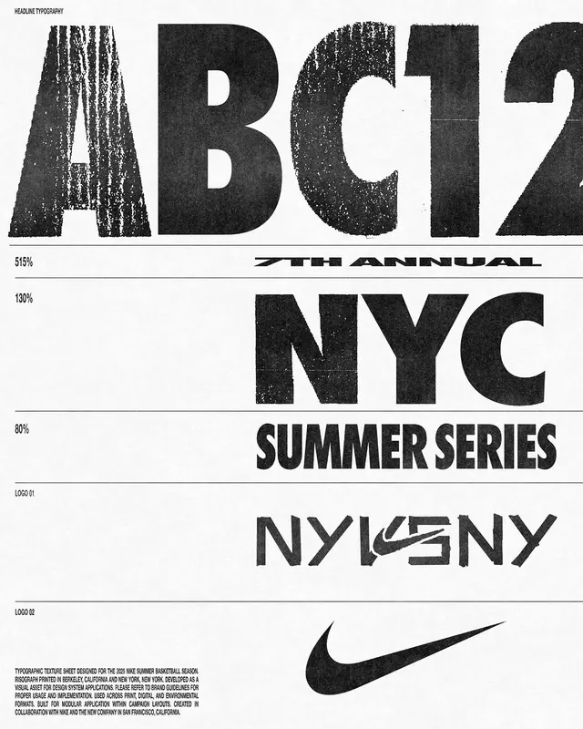 Typography and Logo Compilation
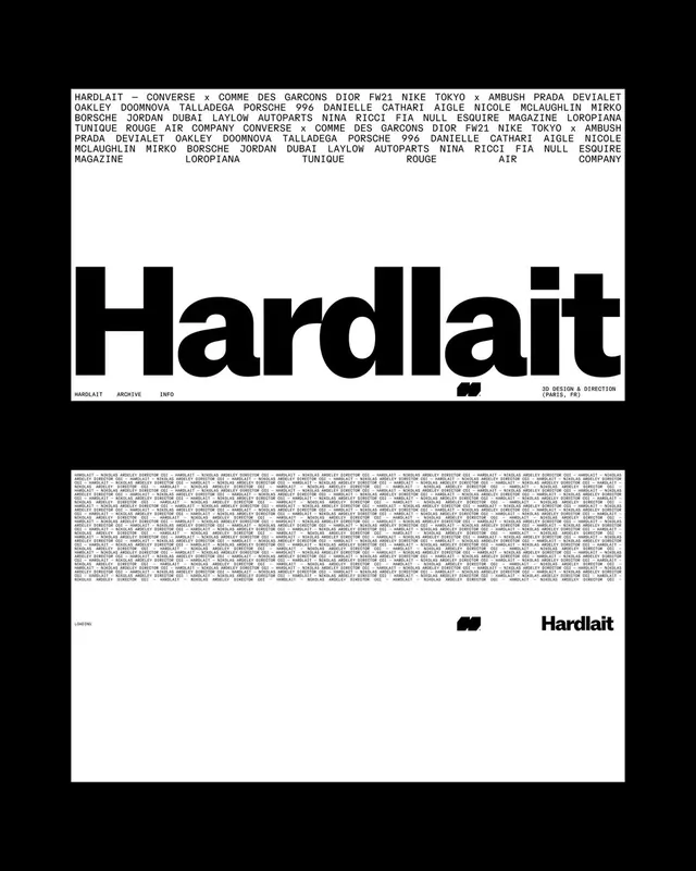 Hardlait Identity System
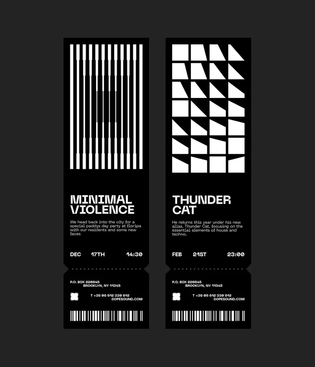 Minimal Violence and Thunder Cat Identity
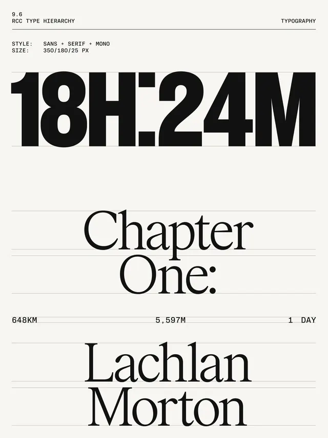 Chapter One Editorial Layout
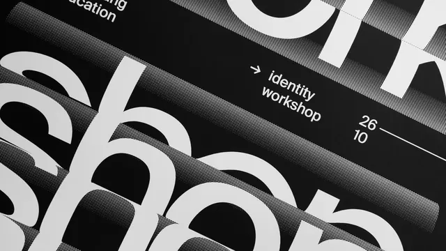 Identity Workshop Typography Layout
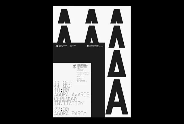 Typography and Layout Identity System
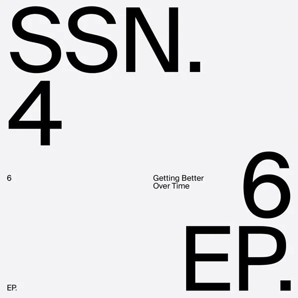 SSN.4 6EP Typography Layout
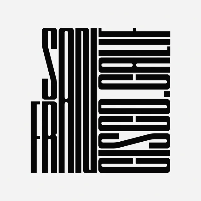 Vertical Typography Composition
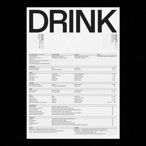 DRINK Typography Layout
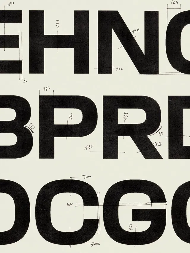 Bold Typographic Grid Layout
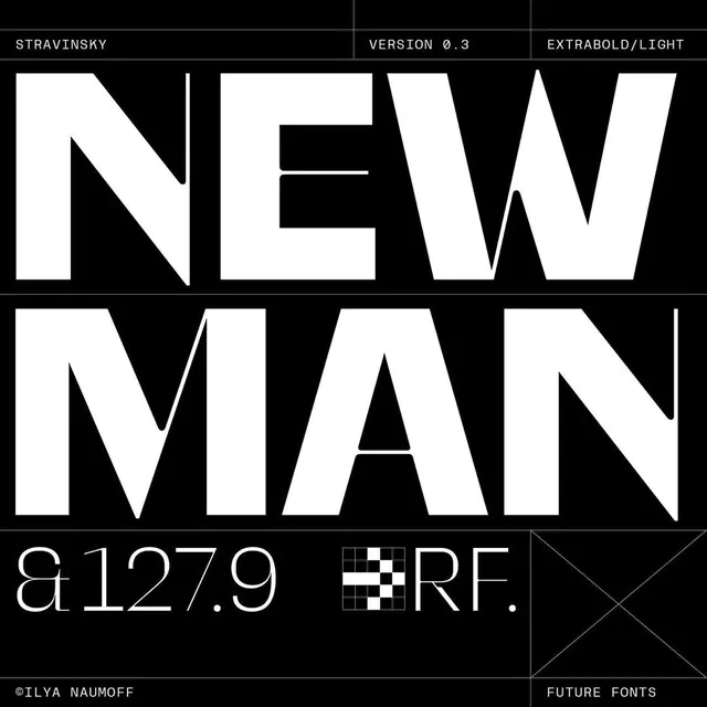 New Man Typography Layout
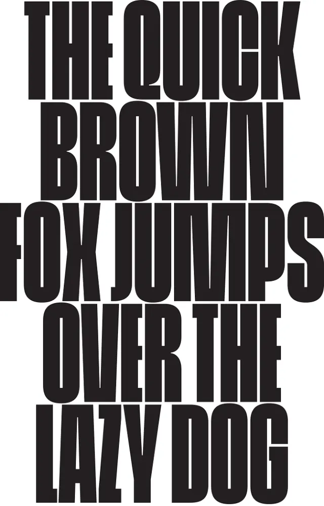 Typography Pangram Layout
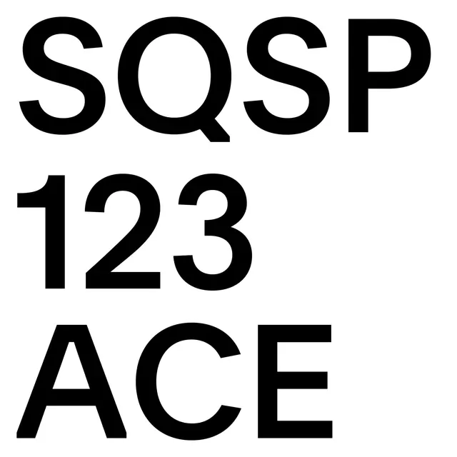 Typography Type Specimen
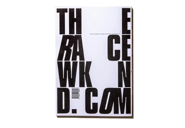 The Raw Kind Typography Layout
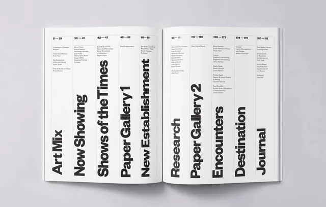 Typography Layout Grid
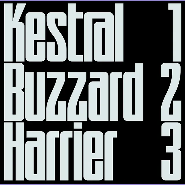 Typography Layout Study
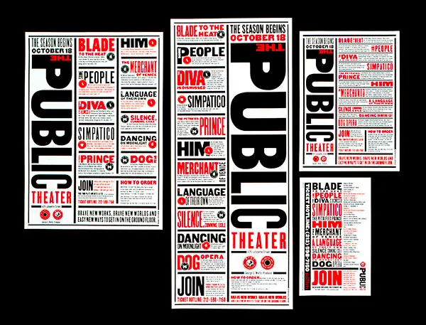 Typography Grid Layout
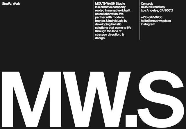 Studio MWS Identity Design