DIF Identity Design Process
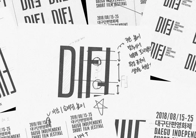
A collection of design sketches and brand identity elements for the Daegu Independent Short Film Festival, showing the evolution of the 'DIF' wordmark.
Summary
A collection of design sketches and brand identity elements for the Daegu Independent Short Film Festival, showing the evolution of the 'DIF' wordmark.
Visual description
The composition features multiple overlapping white sheets showing the 'DIF' wordmark in a heavy, condensed sans-serif typeface. Technical annotations, including measurement lines, handwritten Korean text, and geometric sketches, are layered over the typography. The palette is strictly monochrome, utilizing black ink on a light background.
Key takeaway
Using technical drafting marks and handwritten annotations can add a sense of process and authenticity to a brand identity presentation.
Reuse notes
Use this aesthetic when presenting a brand's developmental phase or when designing for arts and film festivals.
More like this
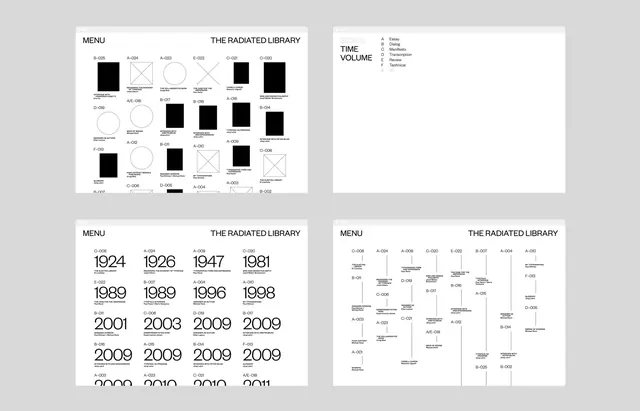 The Radiated Library Design System
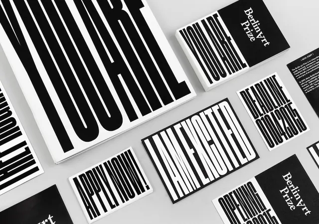 BerlinYrt Prize Identity Mockup
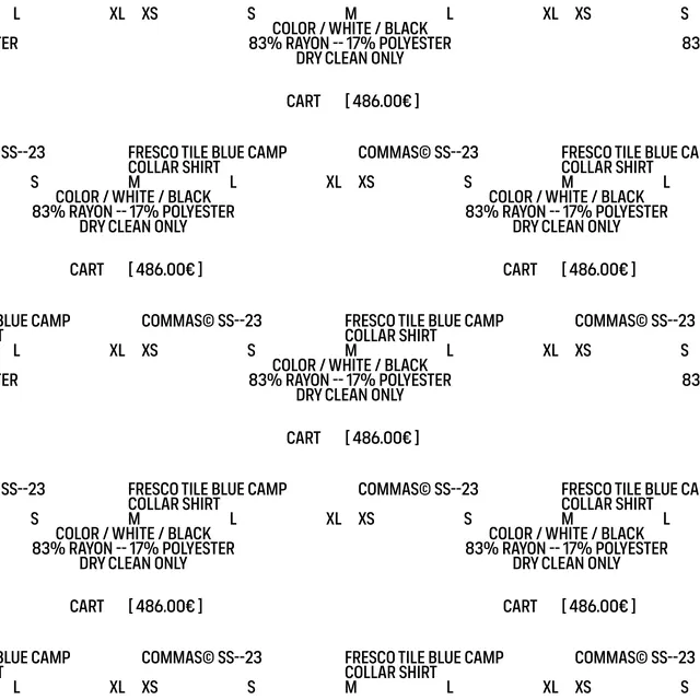 Repeating fashion product-spec text grid
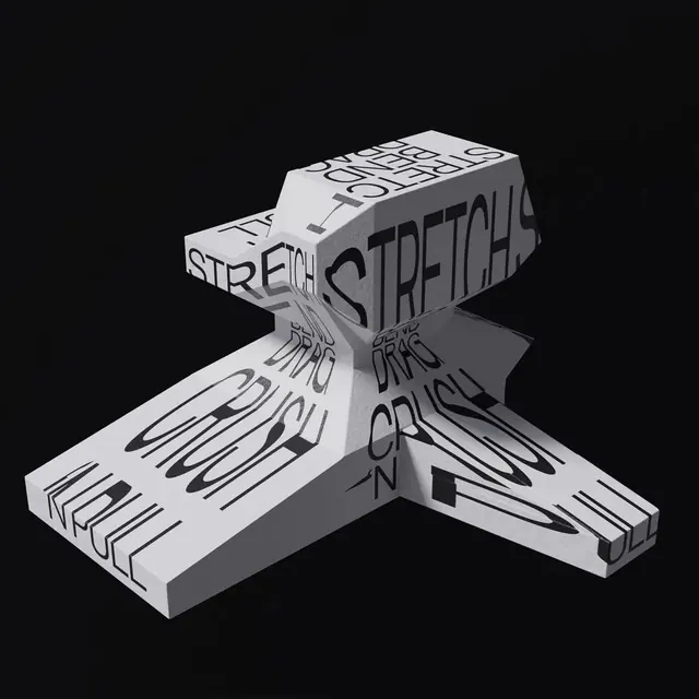 Typographic 3D Form
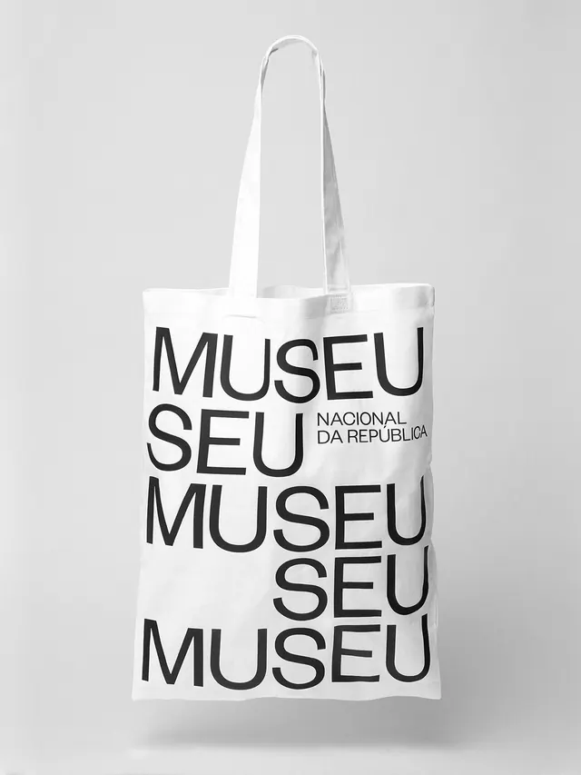 Museu Nacional da República Tote Bag Mockup
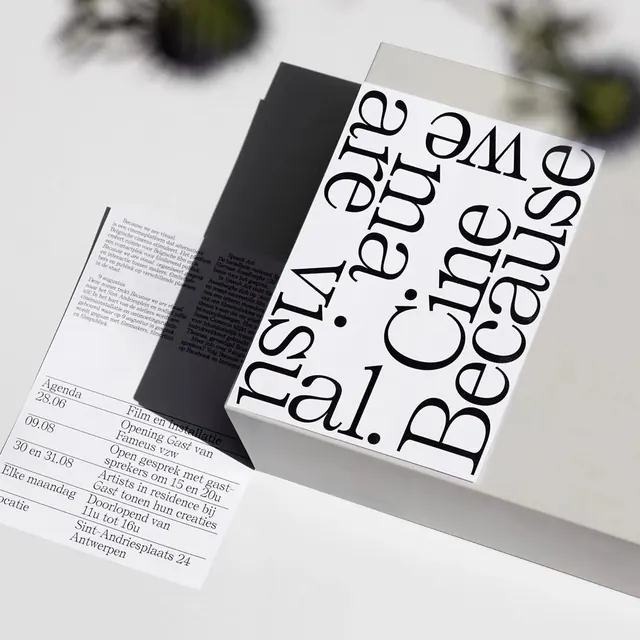 Typographic Mockup with Agenda and Box
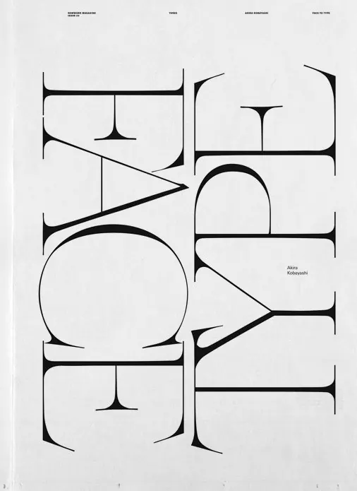 Interlocking rotated serif type poster
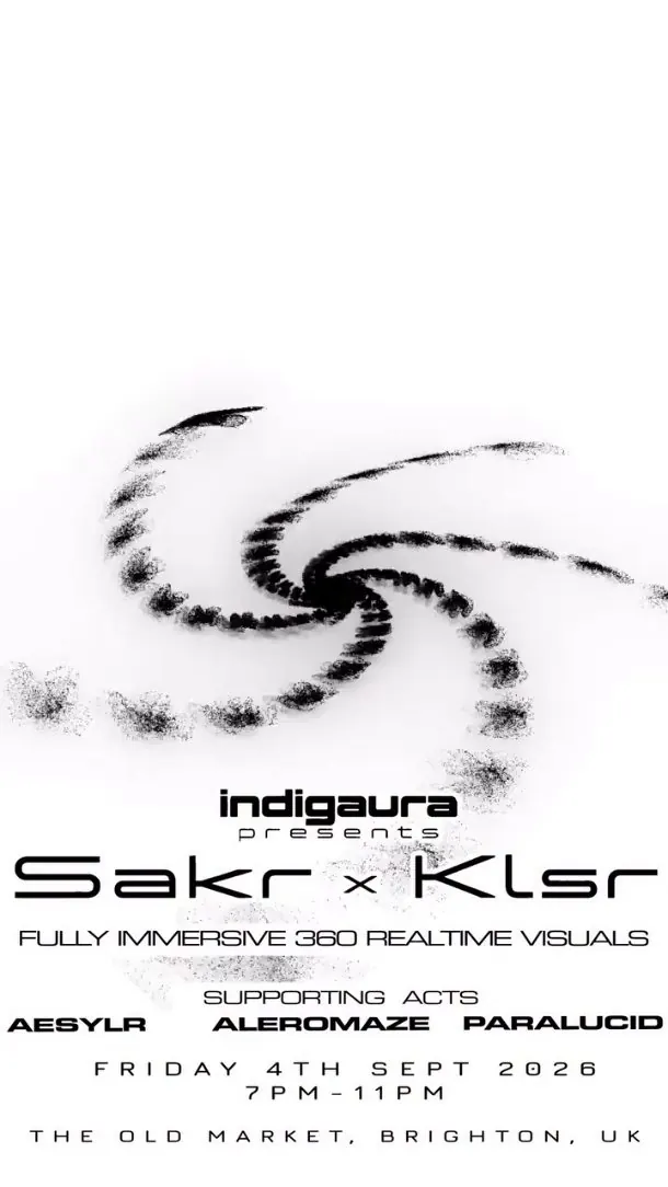 Indigaura Sakr x Klsr event poster
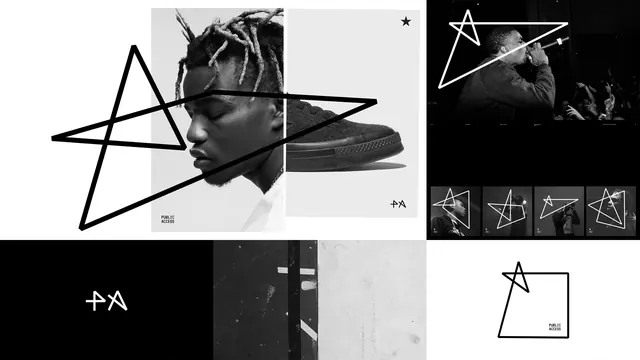 Monochrome Identity and Editorial System
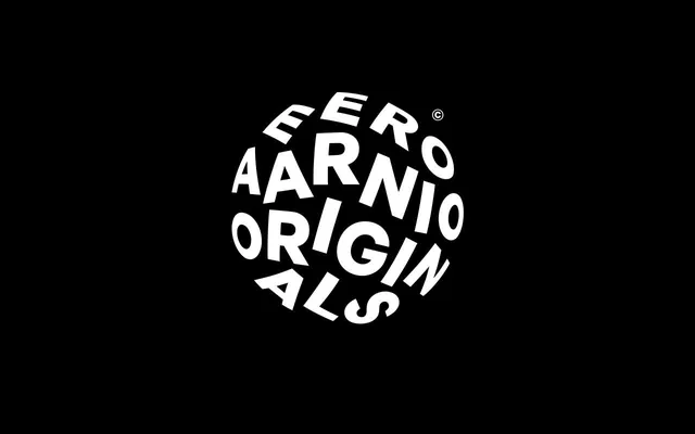 Circular Typographic Wordmark
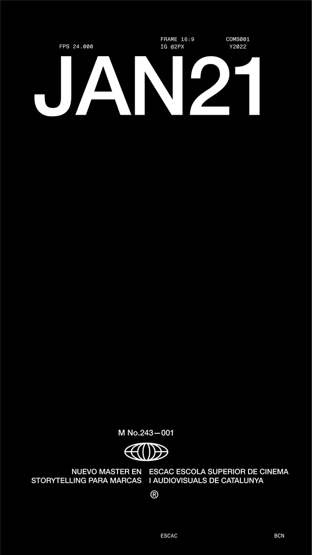 JAN21 Poster Design
 Minimalist Basketball Typography Poster
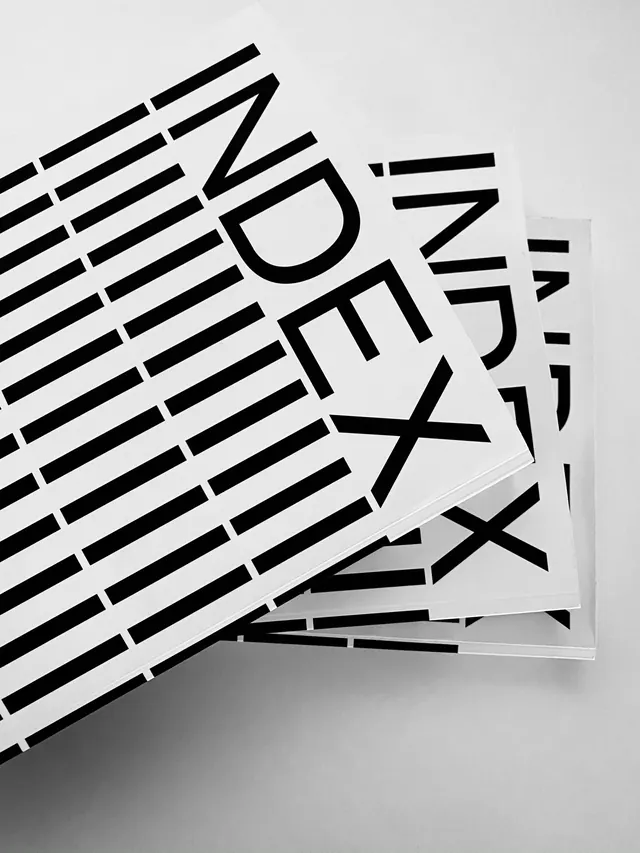 INDEX magazine covers with dashed-bar pattern
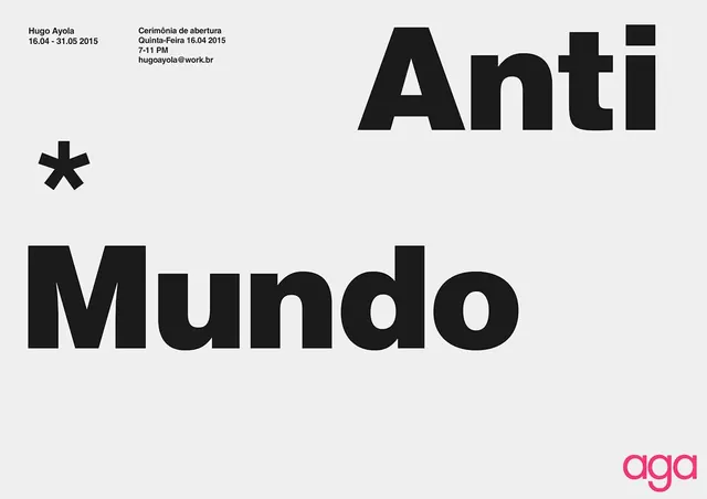 Anti Mundo Poster
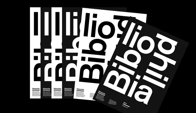 Biblio-philia Poster Series
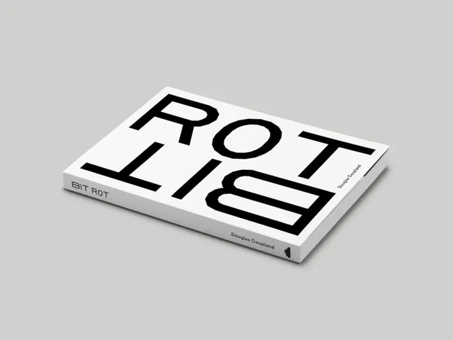 Bit Rot Book Mockup
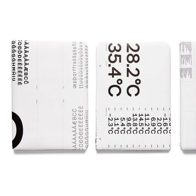 Type Specimen and Data Visualization Mockup
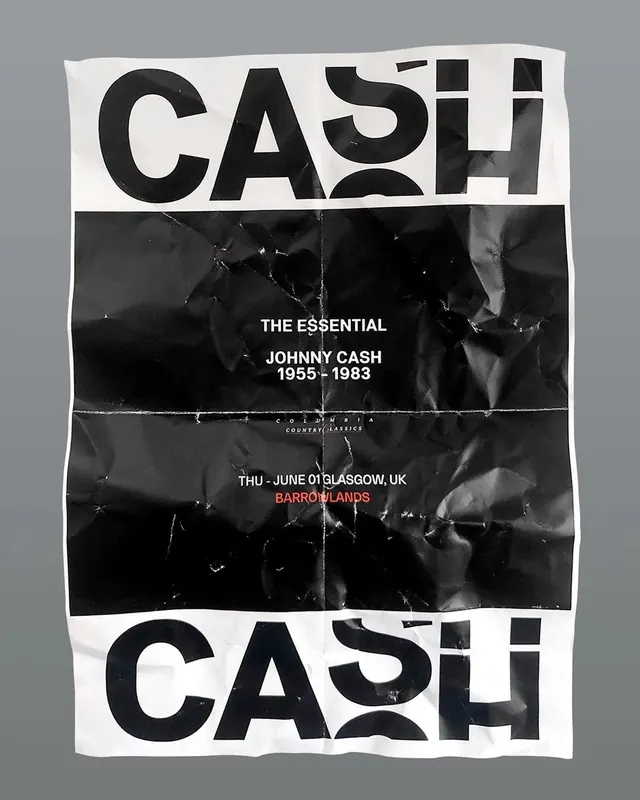 Johnny Cash The Essential Poster
 Nike Air Max Day Logo Process & Sketches (slide 12)
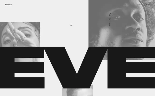 EVE Design Layout
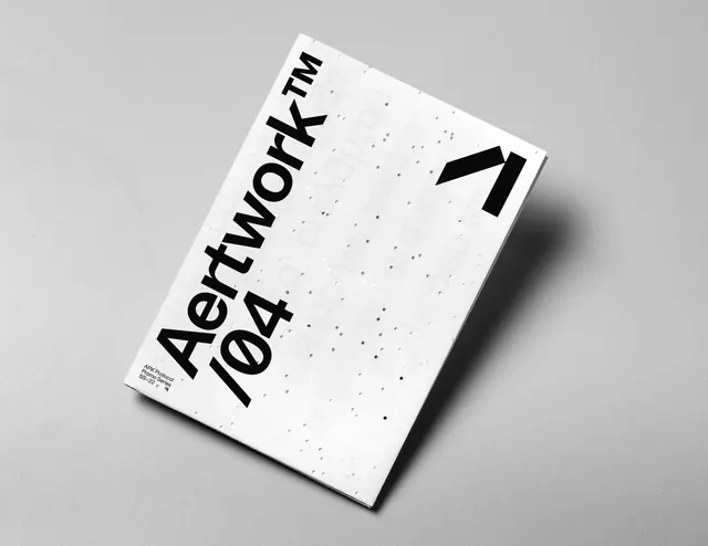 Aertwork 104 Mockup
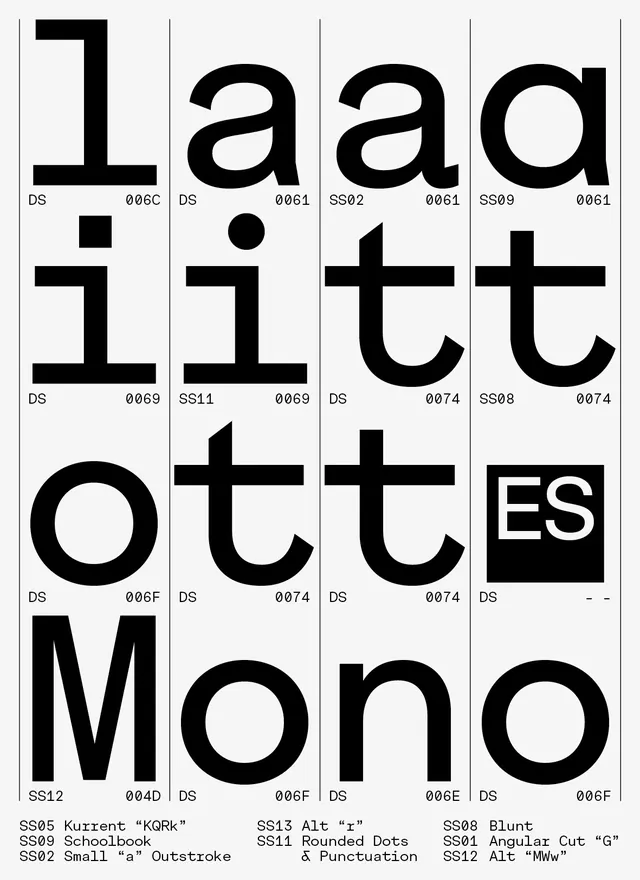 Type Specimen for Mono Font
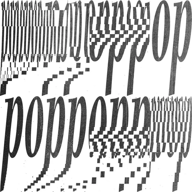 Glitched italic serif typography dissolving into halftone
 Metal Carabiner with Engraved Branding