AppKit Design Reference
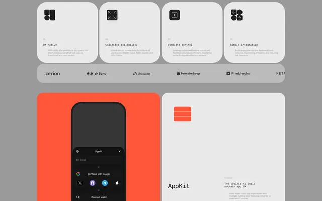
A design showcase featuring feature cards, a partner logo bar, and mobile UI mockups for a developer tool.
Summary
A design showcase featuring feature cards, a partner logo bar, and mobile UI mockups for a developer tool.
Visual description
The layout uses a grid of rounded-corner cards containing black icons and sans-serif text on a light grey background. A bright orange section features a dark mobile UI mockup with 'Sign in' and 'Continue with Google' options. A horizontal bar displays logos for zerion, zkSync, Uniswap, Pancakeswap, Fireblocks, and MATA.
Key takeaway
Use high-contrast icon cards and a distinct accent color to separate feature explanations from product mockups.
Reuse notes
Apply this when presenting technical software capabilities and ecosystem integrations in a clean, modular way.
More like this
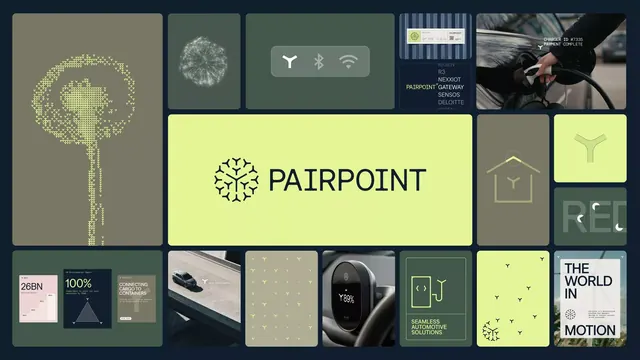 Tech mood-board grid with lime accent logo
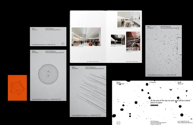 Minimalist Data and Editorial Design Reference
 Grid of Stylized Keycaps
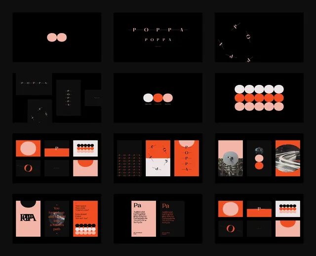 Minimalist Geometric Identity System
 Geometric logo with minimal color accent
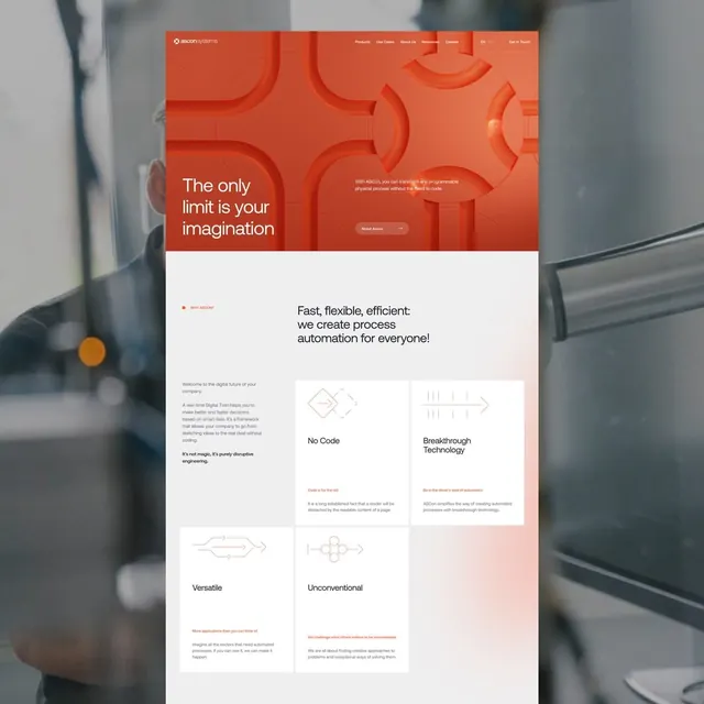 SaaS hero with burnt-orange geometric shapes and features grid
 Mineral brand identity modular grid
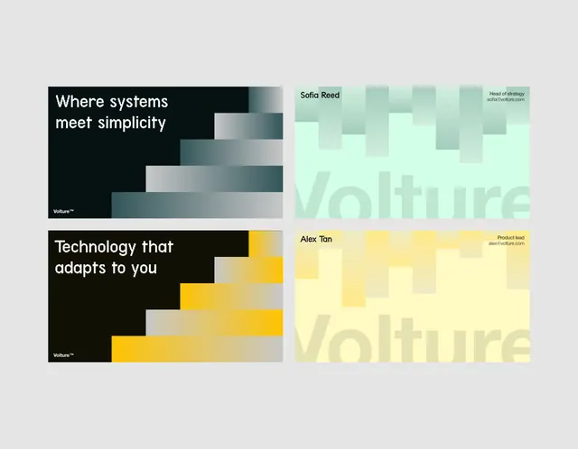 Geometric stepped blocks in teal and yellow
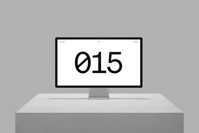 Minimalist Monitor Mockup with Number Display
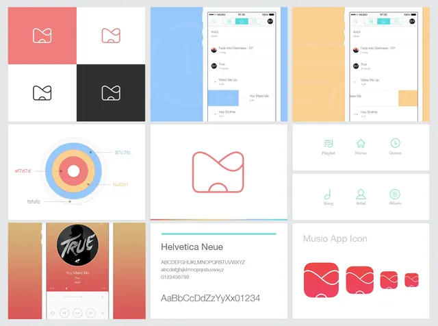 Modern UI and Branding Identity Collection
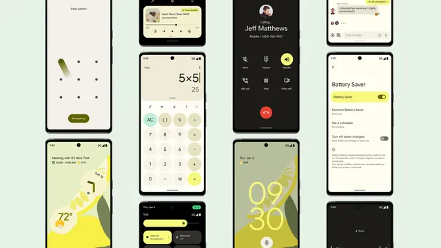 Mobile App UI Design Showcase
 Weather Report UI Component
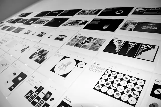 Grid-based Identity System and UI Elements
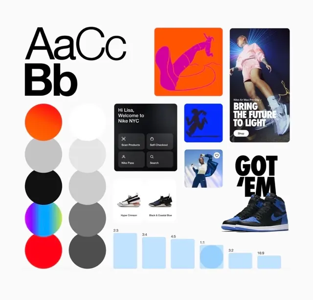 Graphic Design Elements and Typography Reference
 Engineering programs grid portfolio
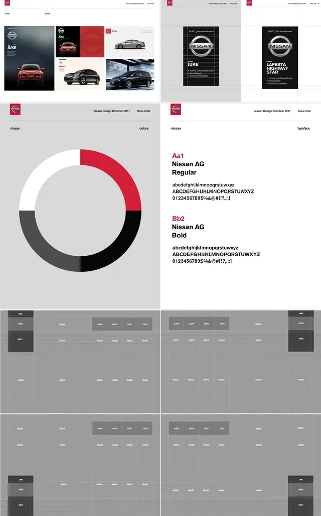 Minimalist Corporate Identity and UI Design Reference
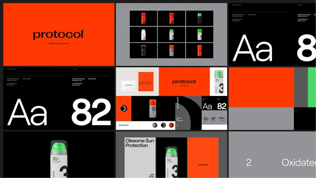 Protocol Identity System and Typography Layout
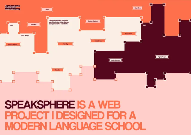 Speaksphere diagram with warm-toned flowchart
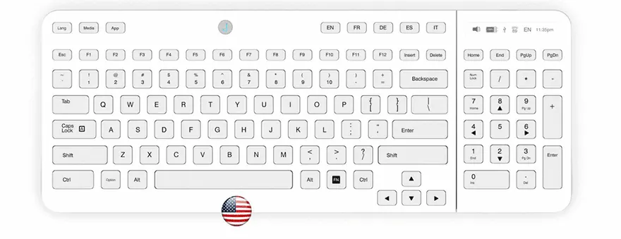 Keyboard Interface Mockup
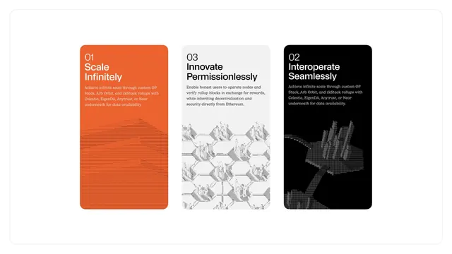 Three-card blockchain feature layout with schematic diagrams
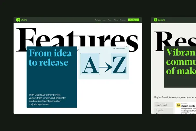 Corporate-clean minimal abstract graphic
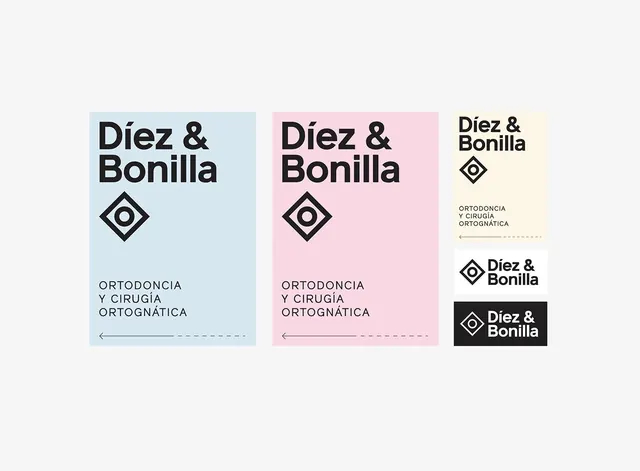 Diez & Bonilla Orthodontics Identity System
 Minimal geometric abstract graphic
 Mobile UI Design Case Study